Question
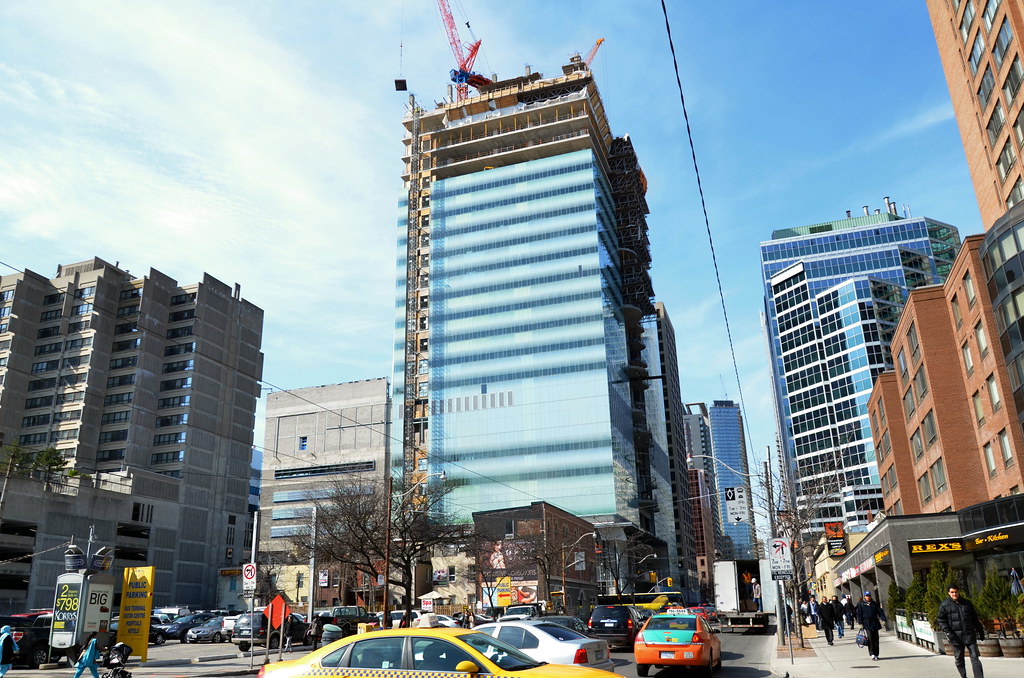
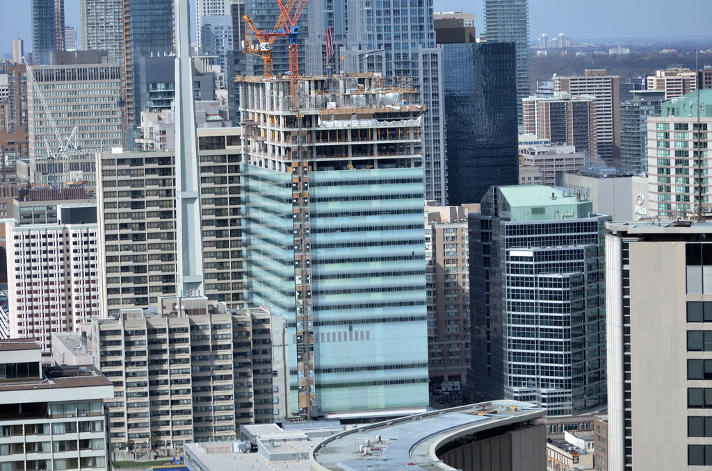
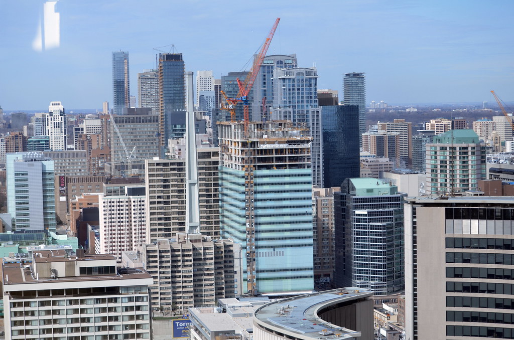
Looks like another right-angled block with whitish/green glass frosting and tacky curvy windows to give it some 'depth'.
I'll admit I don't have the architectural knowledge some of you do, but why don't you explain in architectural terms why this white block is somehow architecturally and aesthetically pleasing.
Have you been downtown to see this building in person?
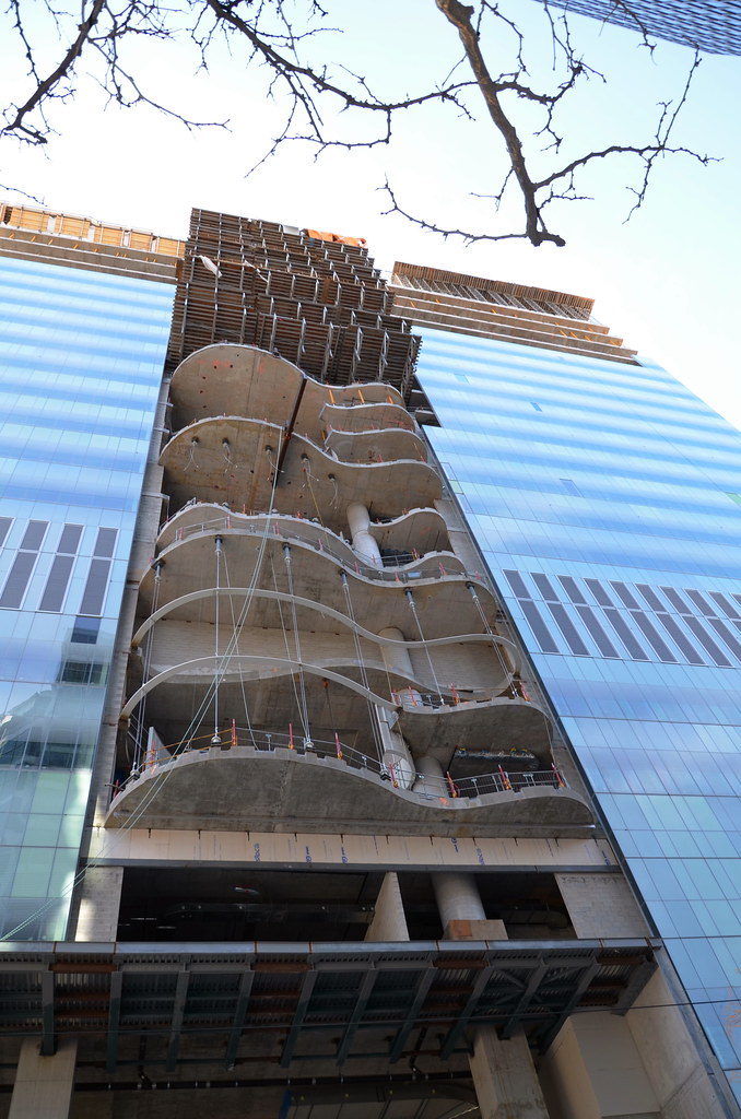
At present the curved glass is not yet installed, so how can you form an opinion on it?
I will give you my opinion of the building formed from what I see on site, in context.
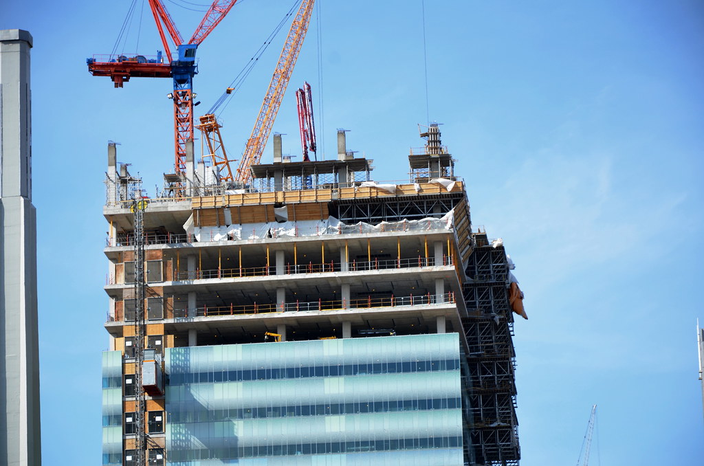
I work on Bay St and given that the majority of tall buildings along this city canyon are badly detailed, dull and grey, this building stands out as bright and colorful. It may not be slender and super tall, but the curtain wall is slickly put together with real 'depth' in the complex, but subtle coloration behind the white frit.
To these eyes the overall impression is a fresh one, unlike any I have seen in Toronto.
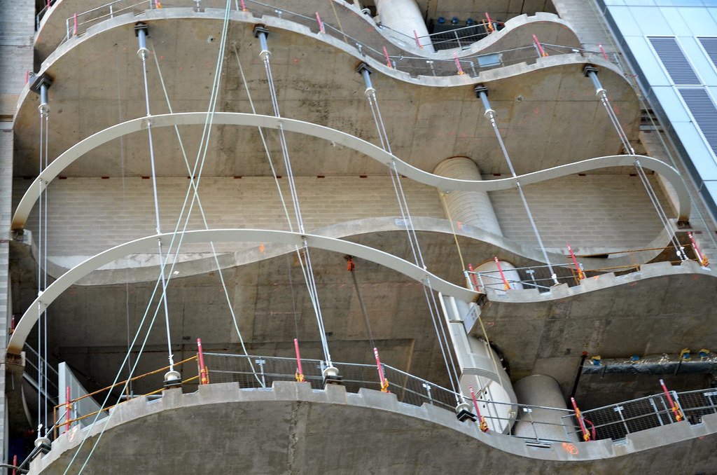
I cannot comment on the 'tacky' curved glass, as I have not laid eyes upon it, but the curved concrete forms do provide animation and articulation to a very large street facade. They seem to have strung up some cables this week, which will no doubt hold the glass, which may be similar to the structure on the glass box of the opera. Some other posters may be able to comment with more specific info on this system.
But to answer your question, my non-architectural take on this is, it is a quality project, which enhances the city context, while thus far demonstrating a high level of design and construction. The colors look great and the curved glass has never been done like this anywhere else in Toronto, perhaps even Canada.


