Toronto Peter Gilgan Centre for Research and Learning | ?m | 21s | Sick Kids | Diamond Schmitt

If I could tear down one building in Toronto it would be the brown building in the above pictures. It takes up so much of Yonge and does so little for the street. I don't think I've ever spent any money in it's retail.
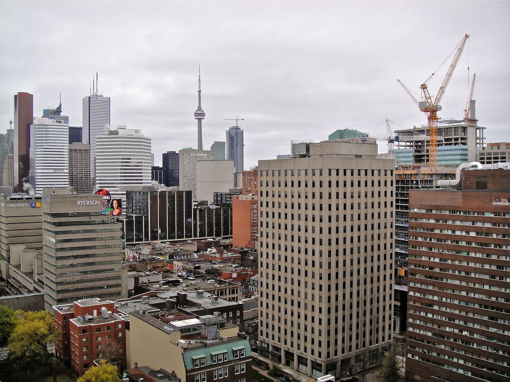
Is that brown building the affordable community housing where the old guys in wheelchairs are always hanging out front? Some buildings serve a purpose beyond aesthetics and speculation opportunities for the Asian robber-barons.
 
Is that brown building the affordable community housing where the old guys in wheelchairs are always hanging out front? Some buildings serve a purpose beyond aesthetics and speculation opportunities for the Asian robber-barons.

That's the one. Fellowship Towers. The retail isn't the most exciting in the city, but I do like the textures all along that block.

And I quite like 415 Yonge. I wish we had more office buildings of that size scattered around the city, away from the traditional nodes
 
No disrespect (taste is a very personal thing) but that brown building with the duct work on top (along with the mish-mash of curtains, blinds and retrofitted wall-shaker AC units) is something you'd see in the run down areas of Sao Paulo or Bucharest... In reply to Taal #450...
 
No disrespect (taste is a very personal thing) but that brown building with the duct work on top (along with the mish-mash of curtains, blinds and retrofitted wall-shaker AC units) is something you'd see in the run down areas of Sao Paulo or Bucharest... In reply to Taal #450...

Oh no disrespect at all, and you're right ... maybe that's why I like it ?

To be honest I don't love the ducts at the top, the rest of the building I do !

I think what differentiates it is how the windows wrap around each floor, you don't really see that all too often, I like the texture colour of the brown brick as well.

Meh, maybe I'm alone on this one.
 
Not so taal; count me in as pro-brown-brick-pile. It's reminiscent of a time when slapping on spandrel willy-nilly wasn't the default response to the challenge of cladding an exterior form (i.e. Aura). Heck, I'm even pro-ductwork!
 
Not so taal; count me in as pro-brown-brick-pile. It's reminiscent of a time when slapping on spandrel willy-nilly wasn't the default response to the challenge of cladding an exterior form (i.e. Aura). Heck, I'm even pro-ductwork!

Yikes, i hope your not one of those guys that also likes crooked wooden hydro poles, cluthered with overhead transformers and wires:eek:
 
Crown Realty owns 415 Yonge--they have a history of flipping their properties to condo developers. I think something really tall here will happen, if the boom continues.

Lets hope not unless they plan to replace the 200,000 square feet of office space .......

If some of you had it your way and all these older office buildings (supposedly not so attractive ones) north of Queen would get replaced by residential space; Just wait and see how the area will turn out, it'll be relatively devoid of life during the week, implying many businesses won't be able to survive ...

You'll have more people living here while working further south in the core, or even more likely somewhere in the 905 ... oh Toronto, you have it so backwards ...
 
Vancouver's Westend has very little office space yet is always busy, day or night.

Sure there are exceptions, Queen West is probably an example here to a certain degree (grated there is office space south of it stretching westward). But generally speaking it doesn't work, or at the very least its not as ideal and you can't built great neighborhoods that way.
 
Oh no disrespect at all, and you're right ... maybe that's why I like it ?

To be honest I don't love the ducts at the top, the rest of the building I do !

I think what differentiates it is how the windows wrap around each floor, you don't really see that all too often, I like the texture colour of the brown brick as well
Meh, maybe I'm alone on this one.

You know, based on your take on that building, I'm gonna give it a chance and check it out later this week!
 
7100128851_59e909a9c5_b.jpg

The wraparound window, a Modernist signature that's also seen at Dickinson's recently renovated 111 Richmond West, crops up several times in steve/eve's photo, updated to different forms - Ryerson's brutalist campus buildings, the Eaton Centre, and D+S's hospital.
 
The wraparound window, a Modernist signature that's also seen at Dickinson's recently renovated 111 Richmond West, crops up several times in steve/eve's photo, updated to different forms - Ryerson's brutalist campus buildings, the Eaton Centre, and D+S's hospital.

You're right! I believe it is the the contrast between vivid brown brick and the windows that make the entire building stand out more to me.
 
Wraparound windows used to be a feature of First Canadian Place ( also shown in that photo ), albeit in an unexpected form ... until the recent recladding.
 

Back
Top