Toronto Peter Gilgan Centre for Research and Learning | ?m | 21s | Sick Kids | Diamond Schmitt

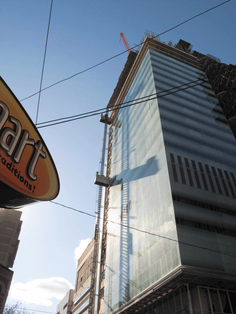
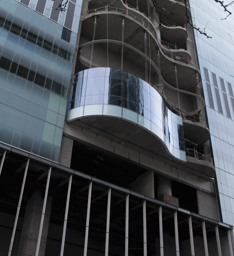
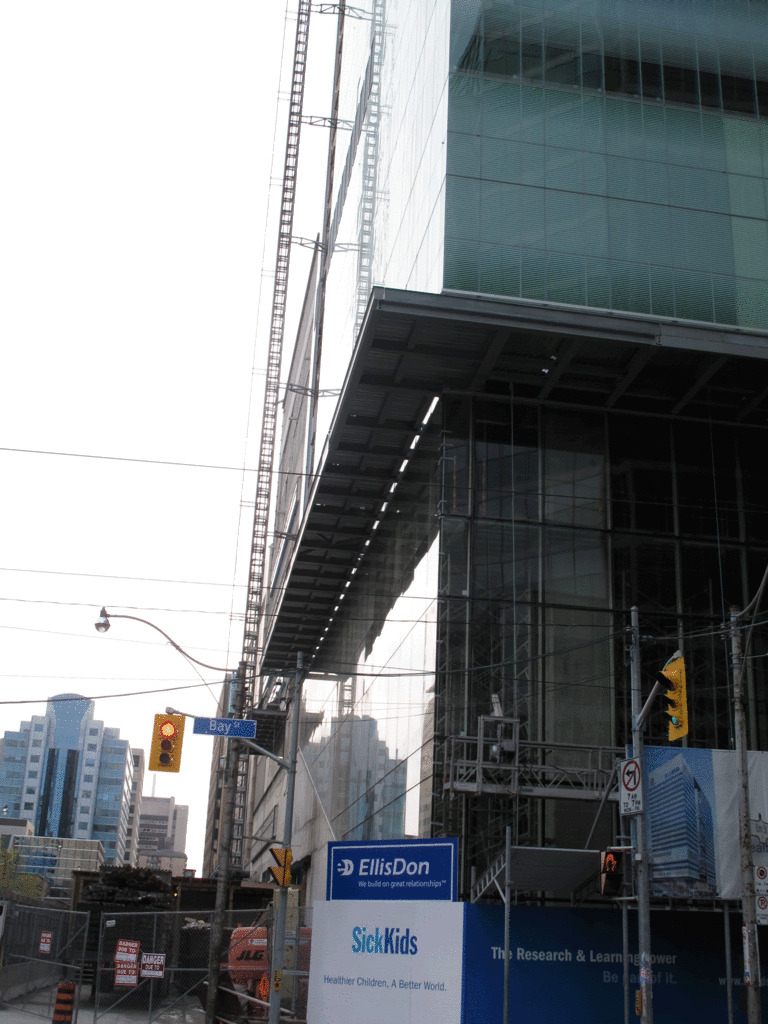
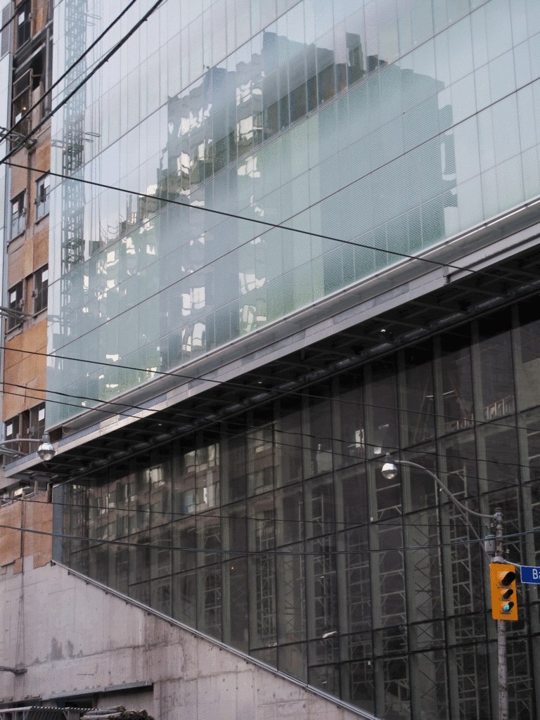
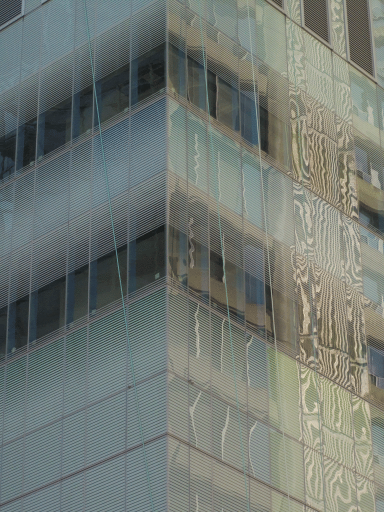
28 April 2012: Did colour-blind folks choose the glazing? Really an unfortunate choice. (Maybe they took the "Sick" Kids literally? Looks like vomit!)

069kn.jpg
Anything about this little "infill" project at all strike you as quasi-promising?
 
with the light green perhaps they are trying to pick up some of the oxidized copper look from the 80s SickKids hospital to the west? I dont mind it; much better than grey.
 
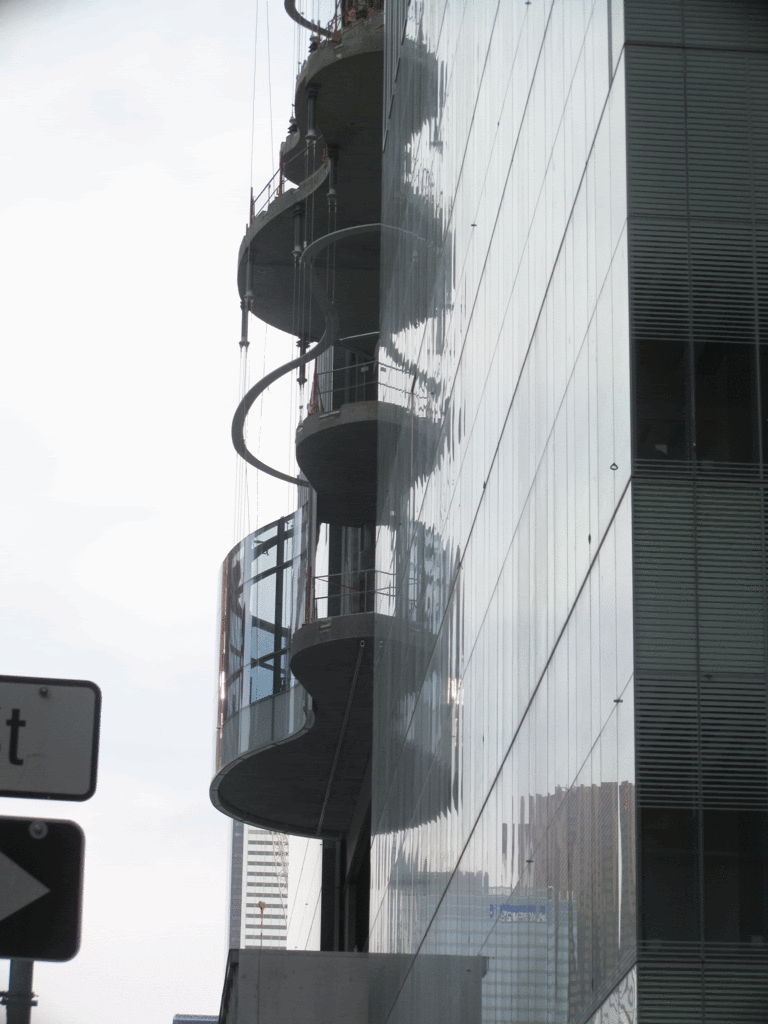
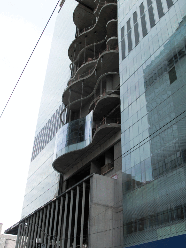
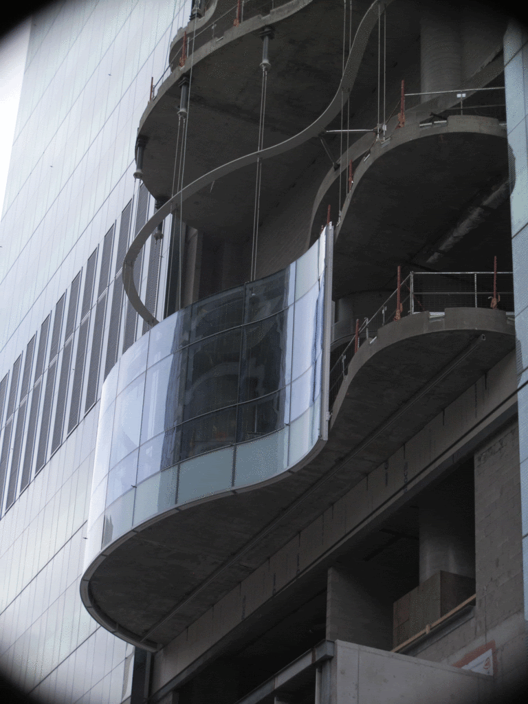
I rather like the colour. I much prefer it to the YWCA shelter at Elm and Elizabeth, which is too blue to my taste. I'm impressed with the curved windows so far. However, I'll wait to see how the building looks when completed before consigning it to the aesthetic dustbin or putting it on a pedestal. The inside has to be better than the McMaster building (SickKids research building at NE corner Elm and Elizabeth) which was a depressing place to work.
 
28 April 2012: Did colour-blind folks choose the glazing? Really an unfortunate choice. (Maybe they took the "Sick" Kids literally? Looks like vomit!)

what a strange remark.
there isn't a building in the city with a more complex and subtle appearance at the level of colour, and the rich and muted palette is not remotely reminiscent of the substance you've unfortunately linked it to.
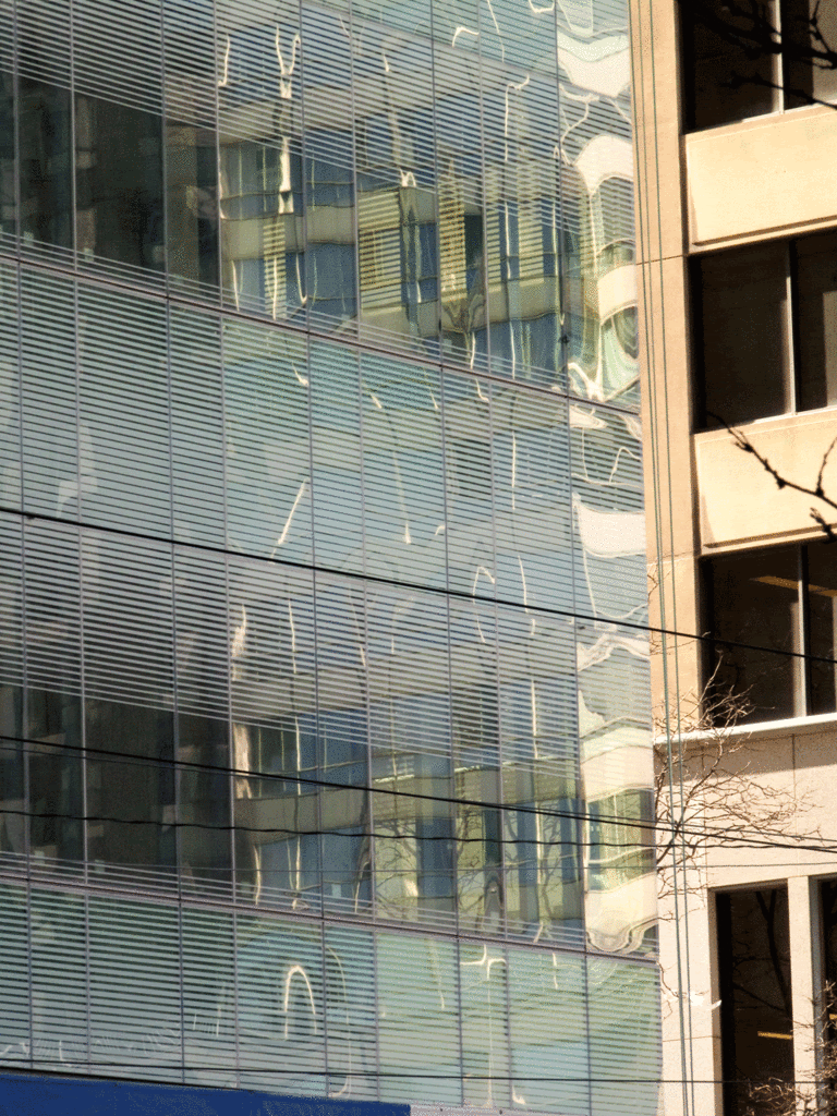
mainly what one perceives is a gorgeous glass curtain wall that has an extraordinary luster and gleam, with the primary colours being a shimmering pale ice-mint green, iridescent blue-white and hints of light yellow, all experienced in the form of gradients, due to the white fritted glass being deployed.
not the kind of building or palette i would associate with your off-colour reference.

8b282153.gif

a1cf553d.gif

cea0fc09.gif
 
28 April 2012: Did colour-blind folks choose the glazing? Really an unfortunate choice. (Maybe they took the "Sick" Kids literally? Looks like vomit!)

Looks a lot better than those NimbyTect drawings at least......oh welll guess it wont be renderporncrap
 
what a strange remark.
there isn't a building in the city with a more complex and subtle appearance at the level of colour, and the rich and muted palette is not remotely reminiscent of the substance you've unfortunately linked it to.
mainly what one perceives is a gorgeous glass curtain wall that has an extraordinary luster and gleam, with the primary colours being a shimmering pale ice-mint green, iridescent blue-white and hints of light yellow, all experienced in the form of gradients, due to the white fritted glass being deployed.
not the kind of building or palette i would associate with your off-colour reference.
Don't bother, he will pick apart anything that isn't aA.
And I agree wholeheartedly with your comment. This is a great addition with great cladding and I'm sure it'll be just as nice on the inside. If it's anything like the newish Donnelly Centre at College and University it'll be a great space for researchers.
 
The colour is sea-foam green, surely!

Colour is personal. If anything other than grey or black is chosen somebody will find fault with it. Get over it already.
 
I love the fritting on this building -- the soft blurring is not an effect I've seen before in the city, and it really softens the building appearance.
 
Colour is personal. If anything other than grey or black is chosen somebody will find fault with it. Get over it already.

Lots of people also have problems with that most understated, workhorse colour - grey.

Colour is a code-language, too: there's a logic to using bright primary colours ( Tellytubbies primary colours in environments designed for small children; bright red for warning and street signs; the startling yellow/black contrast for biohazards and police lines; bright primary colours for temporary structures such as cranes on construction sites; etc. ) for certain contexts and not for others. And colours have both heritage value ( the famous Don Valley Brickworks red brick used in our town for generations doesn't automatically qualify as a heritage colour in other cities ) and associations to other things ( the J Cloth hues of the YWCA on Elm; the blue insulation look of Gehry's titanium blue AGO wing, etc. ).
 
That's the thing that bothers me about both the YWCA and the AGO. The color of the finish is too close to the color of Blueskin vapor barrier. As a result, both of those buildings always look unfinished to me. Sick Kids glazing is my favorite in the city right now.
 
That's the thing that bothers me about both the YWCA and the AGO. The color of the finish is too close to the color of Blueskin vapor barrier. As a result, both of those buildings always look unfinished to me. Sick Kids glazing is my favorite in the city right now.

Yep. No kidding. The south side of the AGO constantly looks like it's awaiting a late shipment of covering.
 
I find the blue titanium on the AGO quite striking. Maybe this is a case of people in this city having been exposed to Blueskin products too much due to the construction boom?
 

Back
Top