You are using an out of date browser. It may not display this or other websites correctly.
You should upgrade or use an alternative browser.
You should upgrade or use an alternative browser.
Toronto Pace Condos | 146.3m | 42s | Great Gulf | Diamond Schmitt
- Thread starter Observer Walt
- Start date
ChesterCopperpot
Senior Member
And a new tower cluster starts to develop.
Marcanadian
Moderator
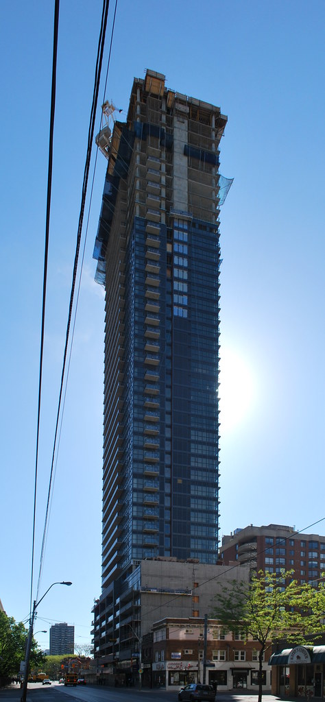 Pace Condos by Marc, on Flickr
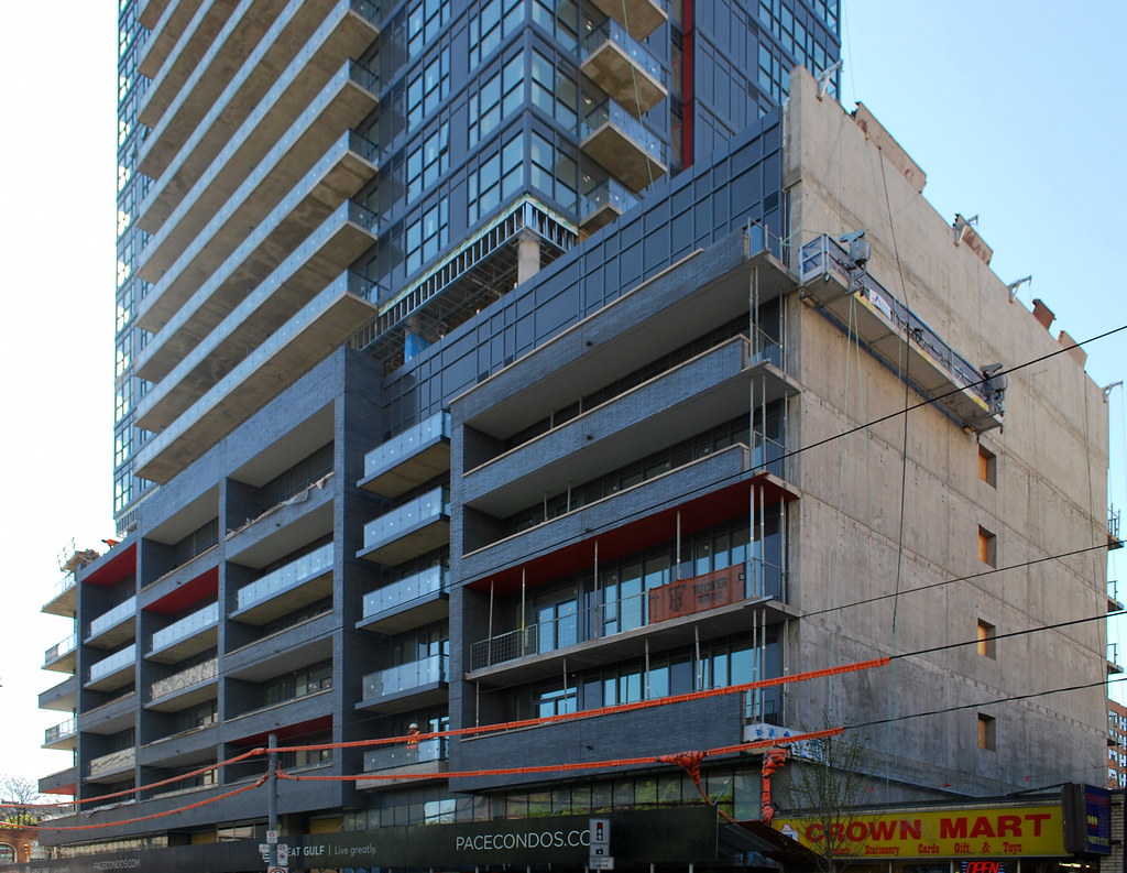 Pace Condos by Marc, on Flickr
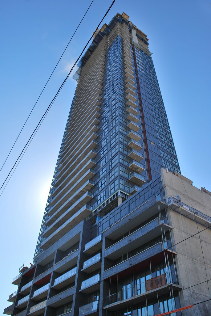 Pace Condos by Marc, on Flickr
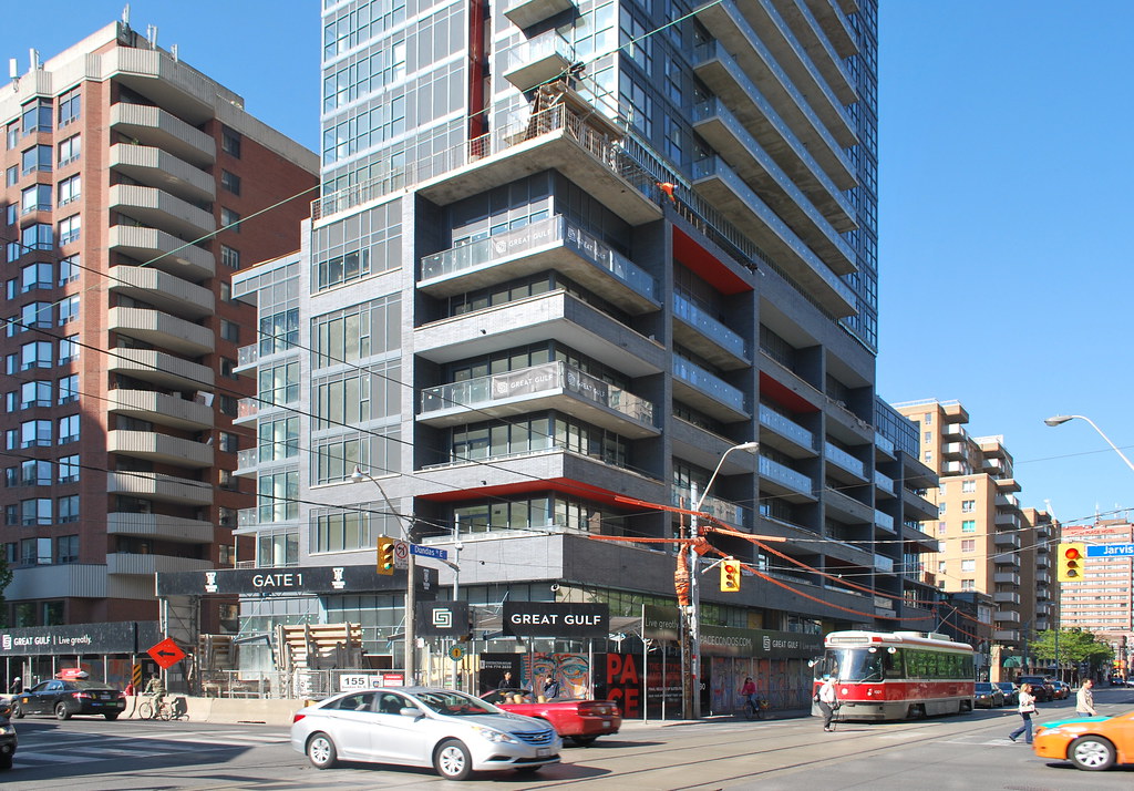 Pace Condos by Marc, on Flickr
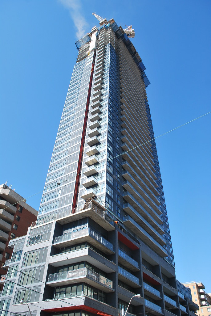 Pace Condos by Marc, on Flickr
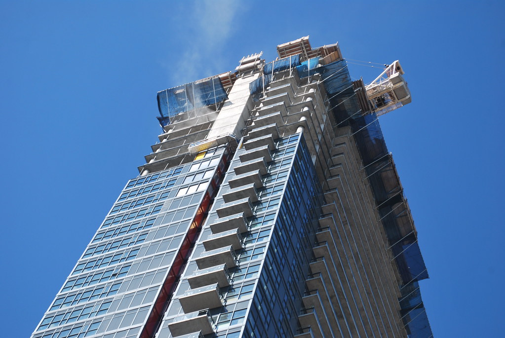 Pace Condos by Marc, on Flickr
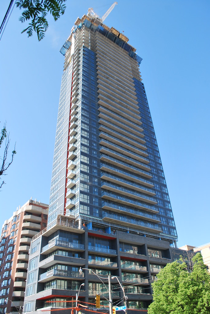 Pace Condos by Marc, on Flickr
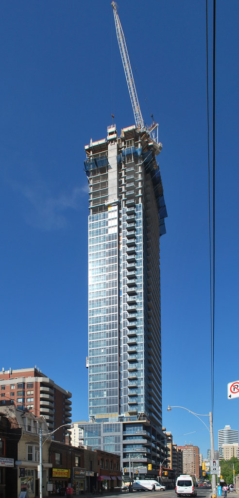 Pace Condos by Marc, on Flickr
modernizt
Senior Member
This thing is bleak. DSAI projects are letting me down a lot lately.
Miscreant
Senior Member
Member Bio
- Joined
- Oct 9, 2011
- Messages
- 3,616
- Reaction score
- 1,795
- Location
- Where it's urban. And dense.
It's nothing to write home about, but I think the podium meets the street quite nicely.
Torontovibe
Senior Member
This thing is bleak. DSAI projects are letting me down a lot lately.
I don't like the colour or design of this tower either but I do like it from an urban planning, point of view. This tower's real benefit is that it is the (well, one of the) first step in taming the wild, wild east side. For many people, including developers, going east of Yonge/Church Streets was a no-no. It was just too sketchy an area for most people to venture over. Just recently, all that is starting to change. The new retail will help animate the streets too. Clearly, developers have lost their fear of the east side, as many new towers are now going up or are proposed. Now we will have a huge, new area to add restaurants, bars, stores and all the things that make urban life fun.
This building serves a higher purpose than just providing places to live, that's why I'm kind of giving it a pass. I just hope that the trainload of new condos are not going to be minimalist, grey, spandrel boxes. That would just be depressing. Lots of new stores, cafes, restaurants and bars, would be fantastic. (excluding Subways & nail salons)
Last edited:
kotsy
Senior Member
Pace Condos by kotsy, on Flickr

Pace Condos by kotsy, on Flickr
Pace Condos by kotsy, on Flickr
Pace Condos by kotsy, on Flickr
Pace Condos by kotsy, on Flickr
blur
New Member
Although this building is nothing special from an architectural poV, contextually it works well for the area. I actually like the dark colour combination with the band or red running up both sides of the tower. The dark brick on the podium is well defined and blends in well with the tower portion.
If the balconies were recessed into the facade of the tower, this would look so much better. Kind of like on the X condos.
If the balconies were recessed into the facade of the tower, this would look so much better. Kind of like on the X condos.
stjames2queenwest
Senior Member
I like it. Like most projects it could be even better. But it has a GREAT profile, and though it is not super colourful and is still blue/ grey, it is a much darker, sophisticated blue/grey than most. It really adds to the skyline from many different points of view. It is an improvement to the area, and as mentioned several times it is a big stepping stone as far as "taming the east side"
It has some great Artscape units, and has something to give back to the non elite.
I just hope that the rest of what comes to this node can live up/ surpass Pace's contribution.
It has some great Artscape units, and has something to give back to the non elite.
I just hope that the rest of what comes to this node can live up/ surpass Pace's contribution.
Dane
Active Member
Benito
Senior Member
This is looking great so much better than I expected. It is a real addition to the neighborhood.
skycandy
Senior Member
This is looking great so much better than I expected. It is a real addition to the neighborhood.
Agreed. Pleasantly surprised, especially with the red enhancements. Black and red are a sexy combination. Too bad the red isn't a little more obvious (particularly the red vertical stripe). Perhaps Grid is getting it's cue from the red-bottomed balcony idea, except using blue. Certainly makes for a more interesting upward street view.
Miscreant
Senior Member
Member Bio
- Joined
- Oct 9, 2011
- Messages
- 3,616
- Reaction score
- 1,795
- Location
- Where it's urban. And dense.
Yeah, the red looks fantastic.


