You are using an out of date browser. It may not display this or other websites correctly.
You should upgrade or use an alternative browser.
You should upgrade or use an alternative browser.
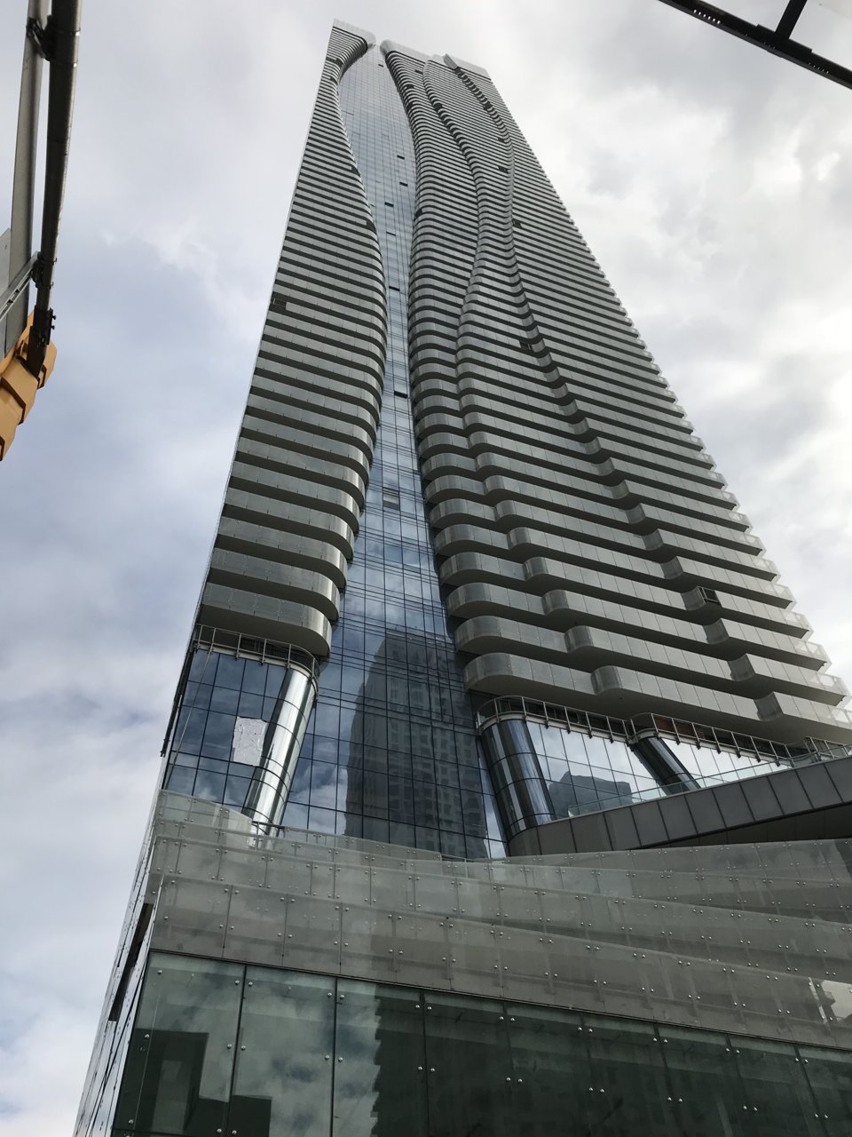
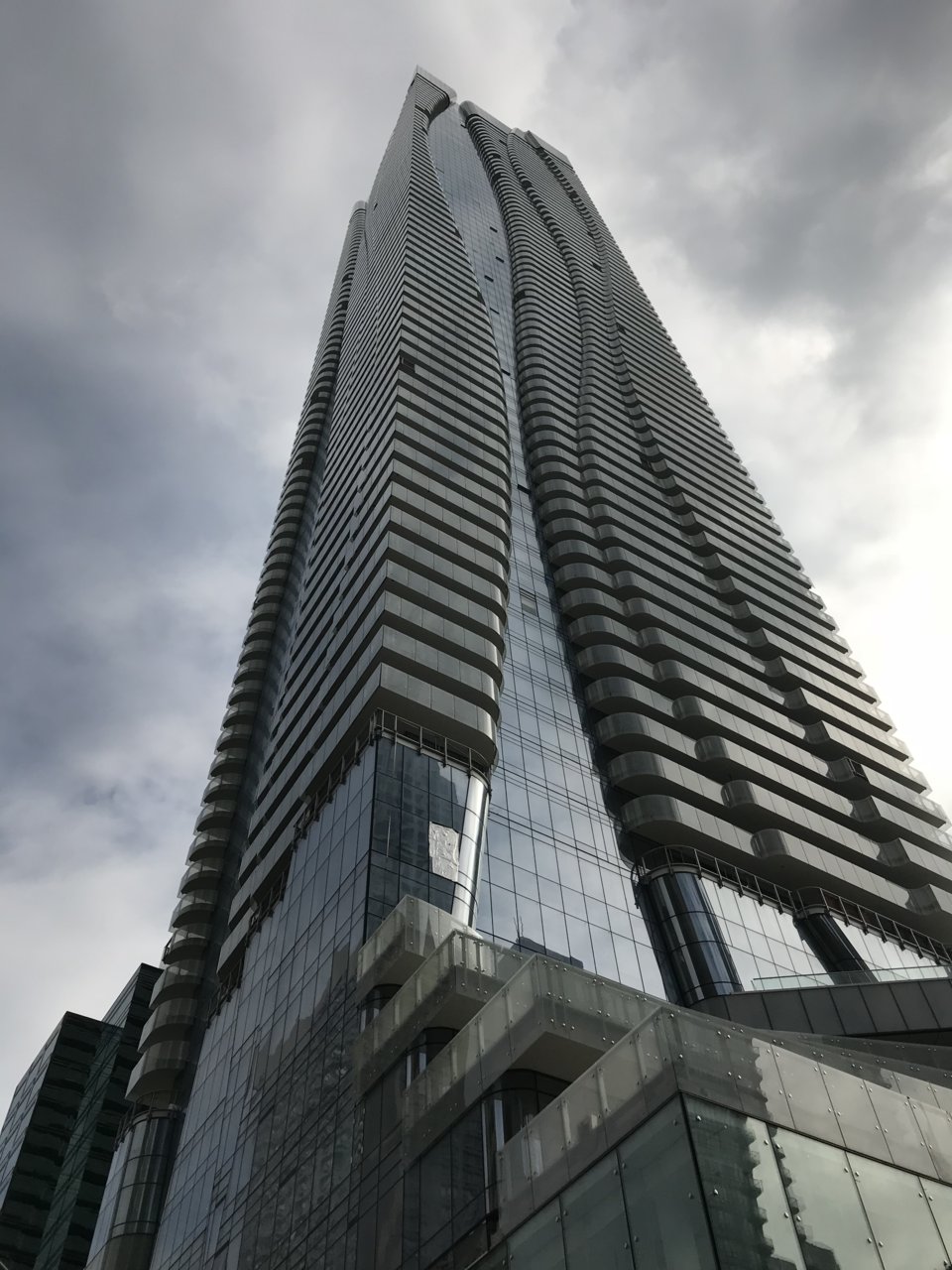
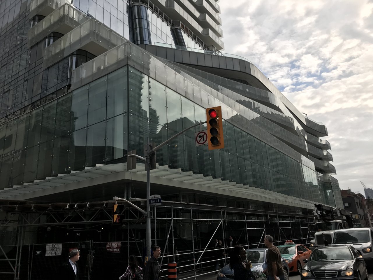
Toronto One Bloor East | 257.24m | 76s | Great Gulf | Hariri Pontarini
- Thread starter iSlutsky
- Start date
111
Active Member
Benito
Senior Member
Today.
Attachments
-
 0B9206F2-53D7-41F2-8A47-9C083FC9075C.jpeg198.1 KB · Views: 676
 -
 C7D33FC0-1AFE-4954-B89B-AB7737A2ED1A.jpeg199.8 KB · Views: 735
 -
 3C443FFA-BD91-46ED-A5FC-08A8ACF396CD.jpeg208 KB · Views: 646
 -
 E43FBE16-CF88-4A0D-BD4E-941ED4552679.jpeg226.4 KB · Views: 894
 -
 F6639D8C-CFF3-4C24-B3A2-229019F5B9A3.jpeg182.9 KB · Views: 670
 -
 79BE5C20-097B-4C61-8A8A-1778EB97FEE1.jpeg244.9 KB · Views: 723
 -
 2199F881-26A7-4D3B-863F-6DAB281CC84E.jpeg210.3 KB · Views: 686
Avenue
Active Member
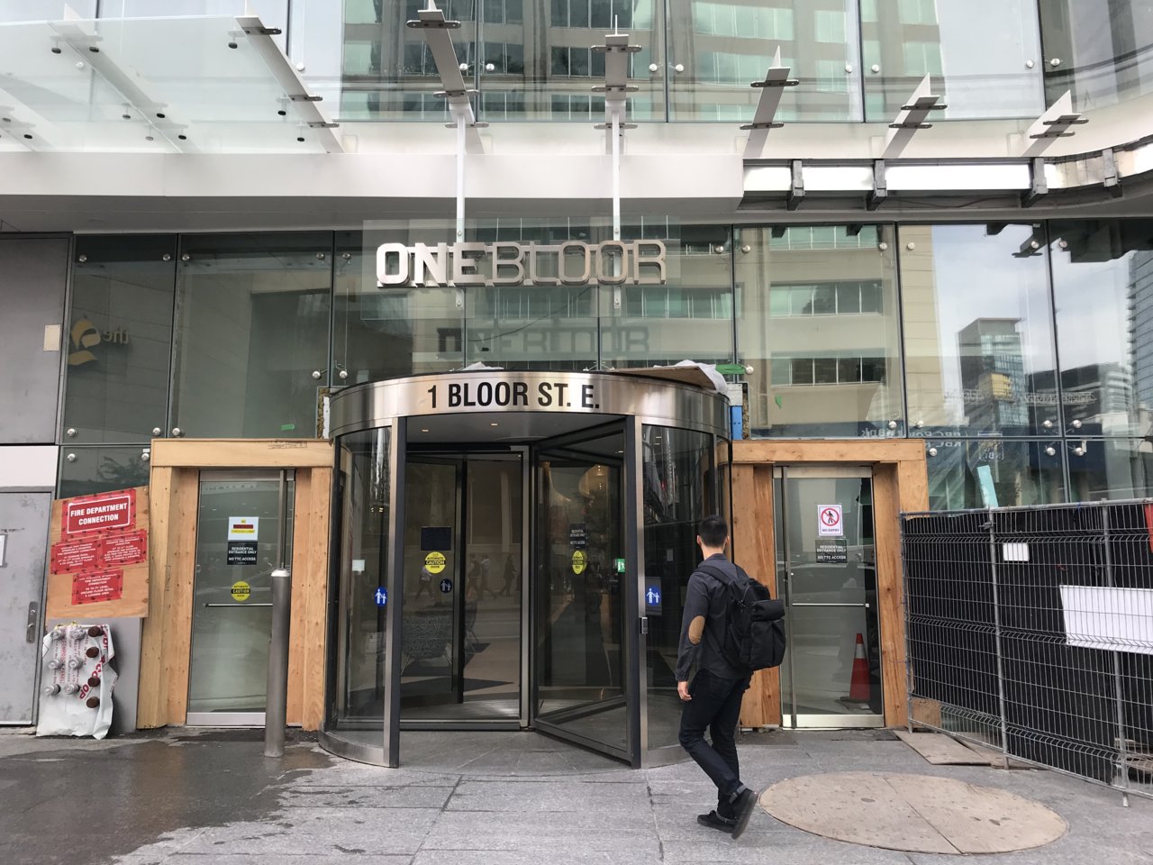
Is this entrance (the whole revolving door with "1 Bloor St. E." sign on it) temporary? It's so ugly.
Benito
Senior Member
Is this entrance (the whole revolving door with "1 Bloor St. E." sign on it) temporary? It's so ugly.
I doesn't seem temporary to me.
kotsy
Senior Member
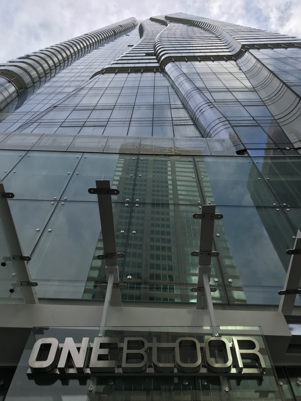
The two horizontal strips that the One Bloor sign is attached to should really be another colour. The R looks so much like a B.
officedweller
Senior Member
yeah, looks odd.
It's suspended from awning brackets that are not centred on the revolving door.
So the ONEBLOOR signage is not even centred on those brackets.
Then there's the cross bars interfering with legibility.
They'd be better off affixing the sign to the roof of the revolving door on a pedestal.
It's suspended from awning brackets that are not centred on the revolving door.
So the ONEBLOOR signage is not even centred on those brackets.
Then there's the cross bars interfering with legibility.
They'd be better off affixing the sign to the roof of the revolving door on a pedestal.
tripwire
Active Member
The ONEBLOOR signage isn't great, but I have more problems with the black "1 Bloor St. E." sign on the revolving door. At least the ONEBLOOR attempts at being glamourous, the other is just so generically bland, and I think the building deserves a lot better.
TransitBart
Senior Member
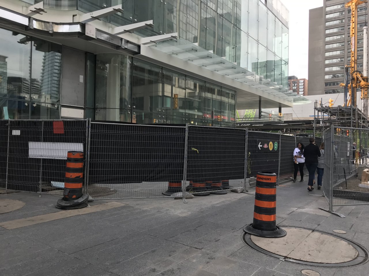
Those views won’t exist in 4 years when the One is built. Enjoy now. Good to have these photos.
madknife
Active Member
The ONEBLOOR signage isn't great, but I have more problems with the black "1 Bloor St. E." sign on the revolving door. At least the ONEBLOOR attempts at being glamourous, the other is just so generically bland, and I think the building deserves a lot better.
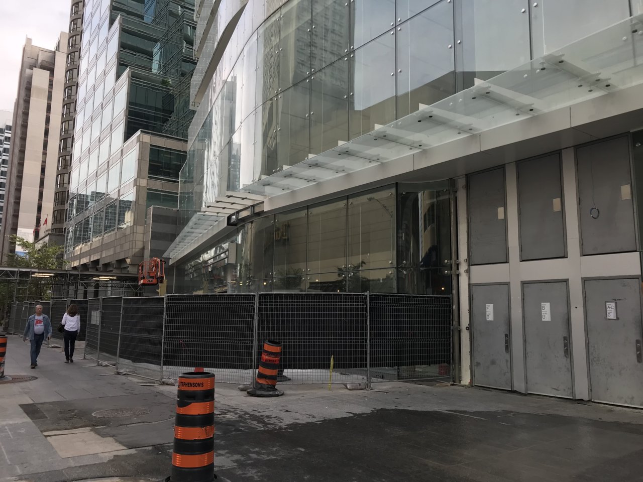
Maybe it's just me but everything just screams cheap in this building... From the entrance to the kitchen island in the units... Such a waste for such a great location...
julesomar
New Member
IMHO, the entire entrance, signage included, is just cheap and a disservice to the building overall.The ONEBLOOR signage isn't great, but I have more problems with the black "1 Bloor St. E." sign on the revolving door. At least the ONEBLOOR attempts at being glamourous, the other is just so generically bland, and I think the building deserves a lot better.


