Toronto One Bedford | ?m | 32s | Lanterra | KPMB

24 November 2010:

dsc01993f0.jpg
 
Now there's a consensus I could happily pile in on.

42
 
So what's going behind this cheeky facade? Is it part of the retail space?
Looks like the upper windows are fake as they are positioned inline with the floor slab of the 2nd floor (unless there is just a 2 foot space behind it).
 
It's not so much ridiculous as whimsical. People buy colourful doors and shutters from other countries while on holiday and stick them on the wall of their living room when they get home. This is just a collection piece from another era, like the Ottawa tin house example a couple of pages back. If one takes oneself, I mean architectural integrity, too seriously to enjoy it, too bad.
 
It's not so much ridiculous as whimsical. People buy colourful doors and shutters from other countries while on holiday and stick them on the wall of their living room when they get home. This is just a collection piece from another era, like the Ottawa tin house example a couple of pages back. If one takes oneself, I mean architectural integrity, too seriously to enjoy it, too bad.

The incorporation of the facade could have been better handled, such that the windows don't line up with a floor slab. It wouldn't be a challenge. This was the facade of the studio of an important Toronto architect, John Lyle, not just some meaningless facade saved for a whimsical touch. It's too bad for the people who don't realize this; their city's history is being cheapened to the level of some frivolous door or shutter.
 
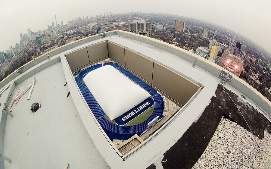
Hah-- it took me a minute to figure that one out. Great shot. And what a terrifying place to stand, my God!
 

Back
Top