Toronto OCAD U: Rosalie Sharp Pavilion | ?m | 3s | OCADU | Bortolotto

Speaking of tacked on...

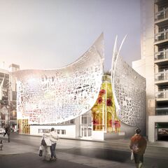
...I assume they went with the singular versions on those installations, as opposed to the double ones depicted in the renderings, because of cost constraints? Or better pigeon management? Or both?
 
Likely cost. OCAD isn't swimming in cash...

Overall this is a huge improvement on what was there before, especially opening up the corner. I appreciate the harmony with the AGO and I'll assume the interior has been improved (it needed it).
 
This would look fine on any other site, but across from the AGO it comes across as a wannabe.
It doesn't have the right sloping angle to complement the Gehry AGO and its verticality actually detracts from / interrupts the AGO' canopy's transition to a shallower angle.

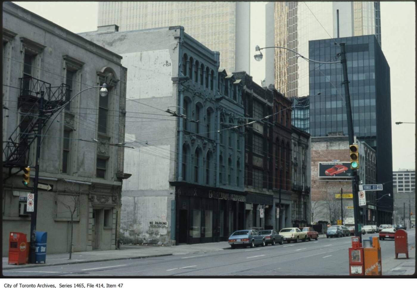
It's a bit like the Mies wannabe that used to sit kitty corner to TD Centre on the Bookfield Place site (corner of Bay & Wellington). You can see that one here:
2017127-wellington-west-yonge-1980.jpg

 
Last edited:
Likely cost. OCAD isn't swimming in cash...

Overall this is a huge improvement on what was there before, especially opening up the corner. I appreciate the harmony with the AGO and I'll assume the interior has been improved (it needed it).
With all due respect, I can't get behind this current upgrade. Sure, it may have improved function...but when I look at, and missing the red that was there, it's not a good sign to me. Perhaps if they revist it to make it look more like what we see in the renderings, I might change my mind. But it looks like some nondescript beige building which seen better days with silver wings attached to make it look "new".
 
With all due respect, I can't get behind this current upgrade. Sure, it may have improved function...but when I look at, and missing the red that was there, it's not a good sign to me. Perhaps if they revist it to make it look more like what we see in the renderings, I might change my mind. But it looks like some nondescript beige building which seen better days with silver wings attached to make it look "new".
I mean if decorative "wings" on a building is "nondescript" then sign me up. Sure it's not as it could have been but nondescript is a far-cry off imo
 
I mean if decorative "wings" on a building is "nondescript" then sign me up. Sure it's not as it could have been but nondescript is a far-cry off imo
Imaginative, nondescript or otherwise, I am still seeing it as tacked on. Sorry. :(
 
I for one appreciate its presence and consider it a nice improvement on what was otherwise an unremarkable corner.
And I appreciate that...even when I have the issue of it could've been much better. Sorry again, for coming at this with the glass half empty here.
 
I'll take it as is, with the proviso that I wish there had been more to it. Unfortunately one has to get used to at least a certain amount of superficiality in the renovation of buildings in this city..
 
It’s unique and gives the building character. It makes the AGO seem less “plunked down” and more like the centrepiece of a community where people care about architecture and design.

It’s one of those rare moments in Toronto where the people responsible for the building genuinely seem to enjoy architecture and design as opposed to being obsessed with making construction as cheap as possible. “Value engineering” is too often a euphemism for being stingy and cheap.
 
Last edited:

Back
Top