Automation Gallery
Superstar
oh no, it's not at least 50 storeys tall.
Who cares, but height still scares many
oh no, it's not at least 50 storeys tall.
Unfortunately because its original proposed height caused hissy fits..... it got re-designed and shortened to this current crap
Old rendering from Dec/2008
Who cares, but height still scares many
19 January 2013:


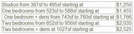
Anyone have any idea what they are charging for units?