You are using an out of date browser. It may not display this or other websites correctly.
You should upgrade or use an alternative browser.
You should upgrade or use an alternative browser.
Toronto Massey Tower Condos | 206.95m | 60s | MOD Developments | Hariri Pontarini
Benito
Senior Member
Logan
Active Member
 old town hall toronto.jpg by patrick murphy, on Flickr
Marcanadian
Moderator
Saturday:
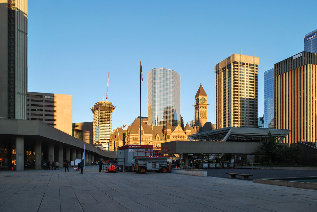 Nuit Blanche 2017 by Marcus Mitanis, on Flickr
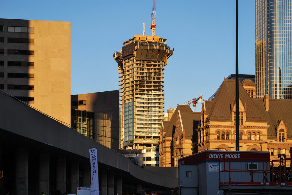 Massey Tower by Marcus Mitanis, on Flickr
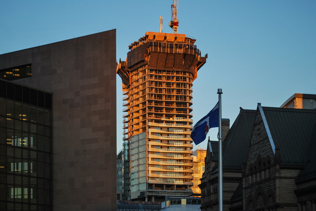 Massey Tower by Marcus Mitanis, on Flickr
 Nuit Blanche 2017 by Marcus Mitanis, on Flickr
 Massey Tower by Marcus Mitanis, on Flickr
 Massey Tower by Marcus Mitanis, on Flickr
ChesterCopperpot
Senior Member
This morning


MetroMan
Senior Member
old town hall toronto.jpg by patrick murphy, on Flickr
This is going to be such a fantastic view of this tower. I hadn't thought that it would become a part of Nathan Phillips Square's growing surrounding skyline.
skycandy
Senior Member
Sleek =


East side diaphanous balcony glass...


East side diaphanous balcony glass...
Attachments
TonyV
Senior Member
I just LOVE this development!
Keyz
Active Member
Benito
Senior Member
Today.


Attachments
-
 D9ECF7A9-1418-4B16-BDEB-FE4D8DD40972.jpeg222.2 KB · Views: 405
 -
 95F0B525-2A02-403B-A471-6888A103D69B.jpeg176.8 KB · Views: 642
 -
 799D888A-307C-4E76-9632-A68D6315C349.jpeg208.4 KB · Views: 405
 -
 A55E3FED-AB1E-4235-9FC4-014D804CD3B0.jpeg242.2 KB · Views: 576
 -
 04F417F3-4384-4990-8A3B-E4F18B3B6540.jpeg204.3 KB · Views: 829
enrigue8
Active Member
The neo-futurism architecture at its best !

ptbotrmpfn
Senior Member
Black rails would have been so much better. Good god that looks bad as it gets repeated. But the rest is, ok. Not my personal favourite design for this area and for its height. It’s kinda just ... ok fo me.
Yegger
Active Member
However much I love this development, I still can't help feeling it would have been much better using a stone material (white terra cotta for example) for the balcony treatment than the white fritted glass.
![IMG_7381[1].JPG](http://cdn.skyrisecities.com/forum/data/attachments/113/113483-f15d9a18e16eca760f7a46ad7a7544c6.jpg)
![IMG_7384[1].JPG](http://cdn.skyrisecities.com/forum/data/attachments/113/113484-c7bcd49660720f238255b3f71e87d09c.jpg)


