ZachBalbino
New Member
Beautiful Pictures Razz! I like how the balconies create movement on on the building
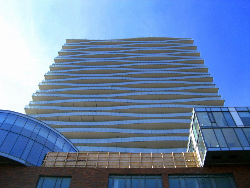
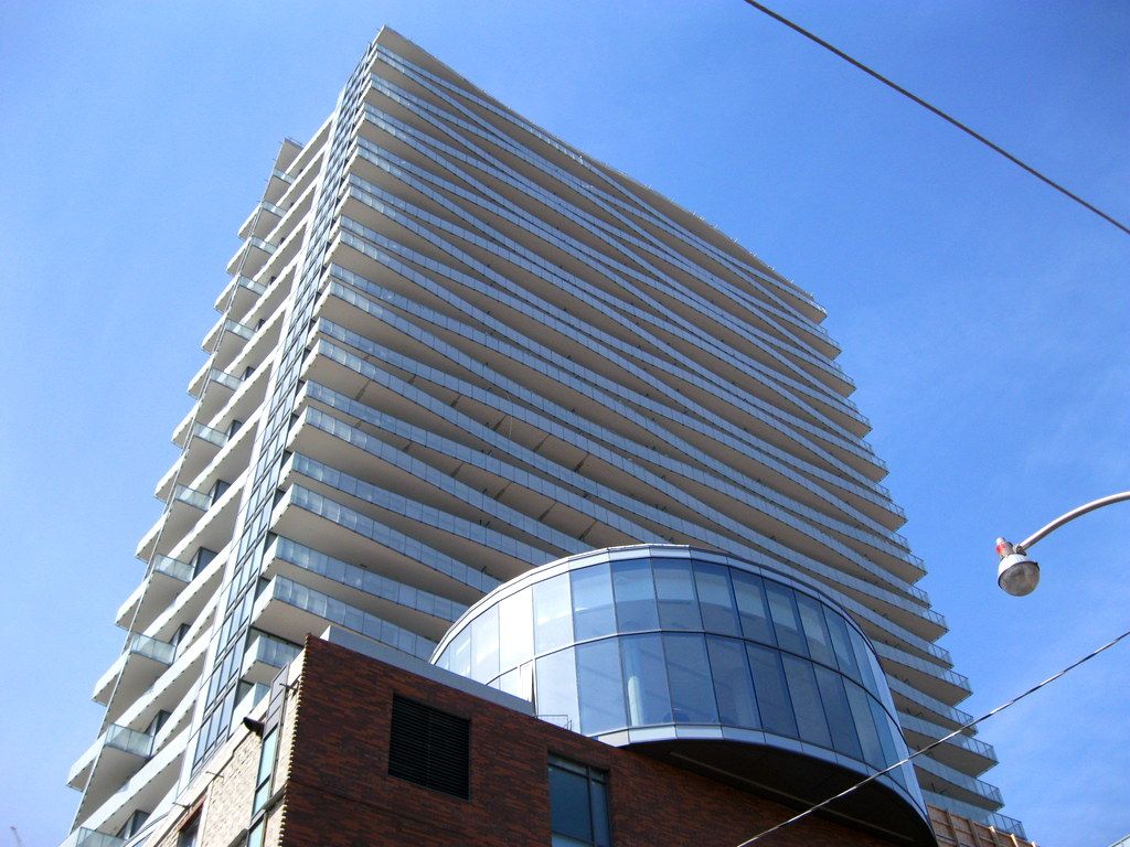
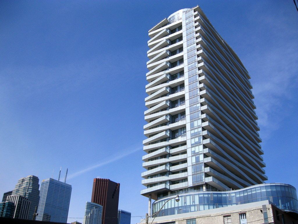
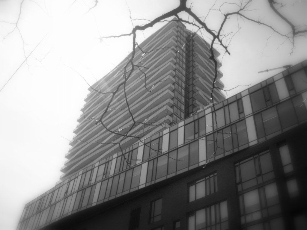
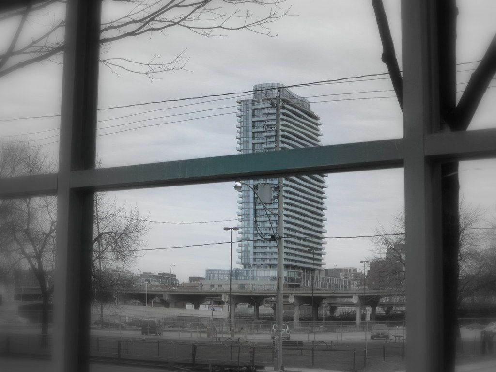
Can we get past the slab comments already? Why is a slab inherently bad?? Personally I think it's slab-tastic from afar, and wave-alicious up close... as all the amazing pictures posted here demonstrate very well.
(no offense shorty)
Shorty calls it a slab. I call it a wall. Every gorgeous skyline view shot that Razz posts is marred by this thing.
'Wave-alicious'?
I suppose for those on the roof seats of the passing tour buses gawking chin straight up as they pass..perhaps. Other than that, it just ain't cutting it, and somewhere out there is a 'star' architect with a 'star' ego that gets a fail on this one.
(No offence tewder)
Missed your meds today gran?
In any case, I'm not sure why Clewes gets a 'fail' on this one. Context (with aA as their architects) initially proposed a taller tower with a significantly smaller floor plate, then were goaded into the slab by the City and SLNA. Yet somehow this is an aA 'fail?'

The tower proportion in relation to the rest is so wrenchingly wrong it literally puts knot in my stomach every time I see at a distance.
I vaguely remember seeing an early picture when this thing was supposed to be more of a slender and taller point tower. It was drop dead gorgeous... And then the compromising started. And we all ended up with this squatty fat thing.
I'm still not sure why 'squatty' and 'fat' are inherently bad (and no, I'm not wrestling with any personal body issues here). Regardless, I'm certainly not downing pepto over the fact we didn't get yet another slim point tower here... and 1960s-era blocks? Kinda cool actually.
... BUT, I still hope Granny will give me a cookie if I disagree with her