skycandy
Senior Member
Undulating prep along podiums....seen out front and back (next two pics).

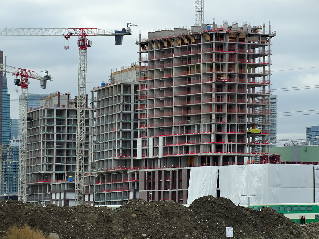
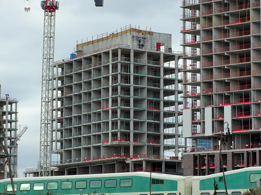


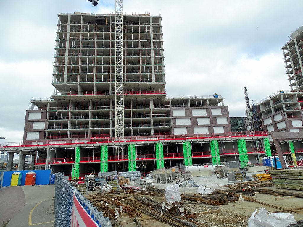
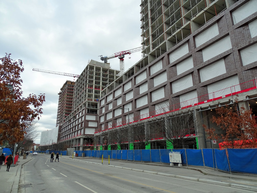
Agreed ^
Medium ironspot 46 is a lovely brick if used in moderation and in the right location, but it's kind of overkill here. It just lacks that distillery district red punch that is needed to make it feel like part of the area. I'm worried because these three buildings, in addition to block 7 will all use the same brick which will feel pretty monotonous once completed. Fortunately blocks 3&4 & block 20 seem to be shaking the materials up a bit.
I get the impression that the developer / architect community sees bright red brick as very passé - I'm sure if you conducted any kind of public poll you'd find that the general consensus would cite red as a favourable choice given that there's so much historic red brick in the city.
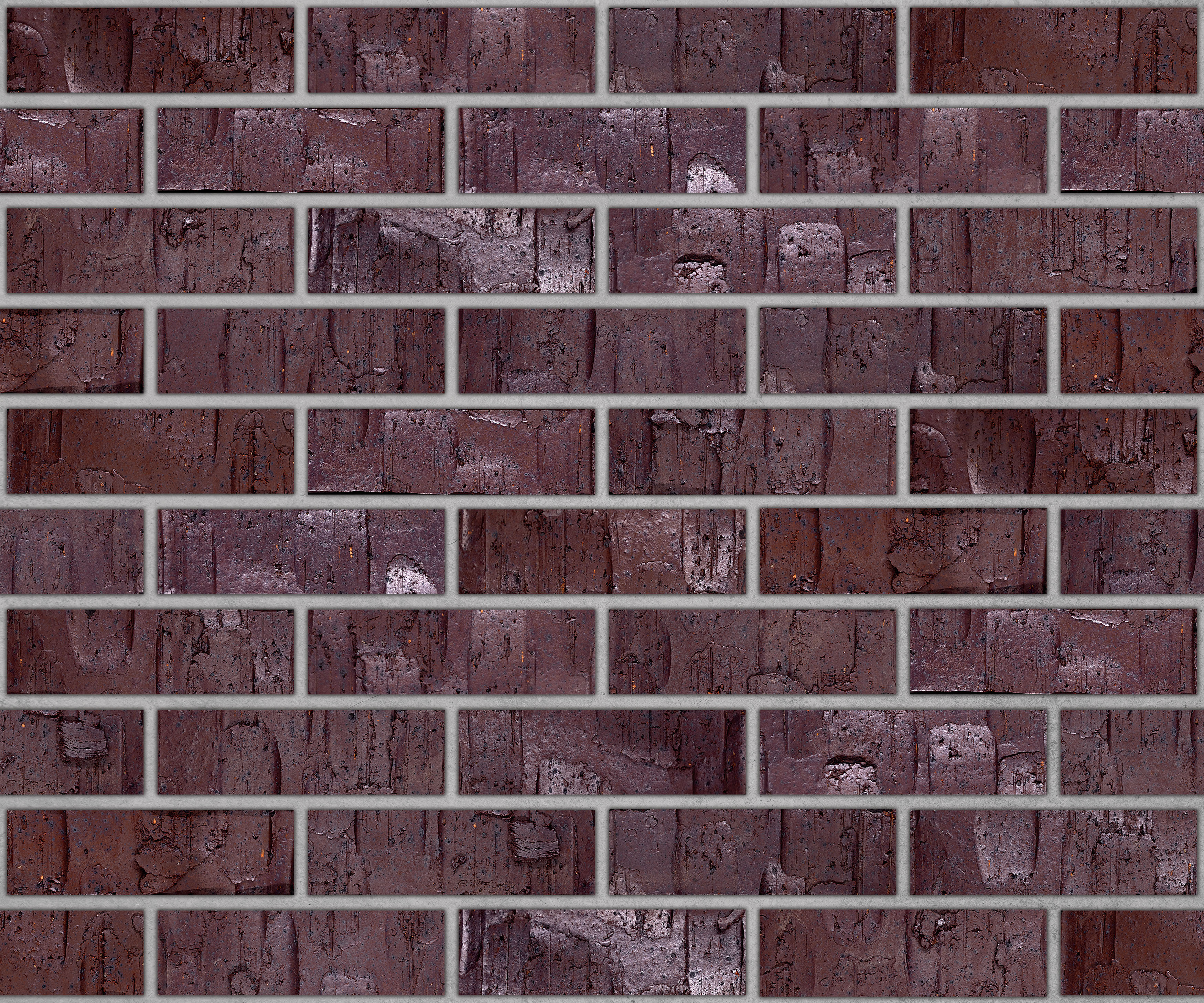
Sadly the design world has a tendency to dismiss what the public prefers. There's also a tendency to want to do something new instead of sticking with what's proven to work. The result is an association of red brick with buildings of a certain age and a reluctance to use it in new buildings. This dark coloured brick is better than black or grey but a brighter colour would be better still. Same with Mirvish Village - it's a fantastic project that would be even better with some brighter colours.Agreed ^
Medium ironspot 46 is a lovely brick if used in moderation and in the right location, but it's kind of overkill here. It just lacks that distillery district red punch that is needed to make it feel like part of the area. I'm worried because these three buildings, in addition to block 7 will all use the same brick which will feel pretty monotonous once completed. Fortunately blocks 3&4 & block 20 seem to be shaking the materials up a bit.
I get the impression that the developer / architect community sees bright red brick as very passé - I'm sure if you conducted any kind of public poll you'd find that the general consensus would cite red as a favourable choice given that there's so much historic red brick in the city.
That's what frustrates me. I still really like this project and Mirvish Village, but it's as if some things were purposely done to avoid a clear resemblance to older methods. There are talented architects but I feel like, even with outstanding projects, there are some elements where they stubbornly stuck with the principles of modernism. My argument is: who cares? If it looks good, creates/protects a sense of place, and functions around people... that's all that matters.Sadly the design world has a tendency to dismiss what the public prefers. There's also a tendency to want to do something new instead of sticking with what's proven to work. The result is an association of red brick with buildings of a certain age and a reluctance to use it in new buildings. This dark coloured brick is better than black or grey but a brighter colour would be better still. Same with Mirvish Village - it's a fantastic project that would be even better with some brighter colours.