Toronto London On The Esplanade Condos | 102.1m | 33s | Cityzen | Burka

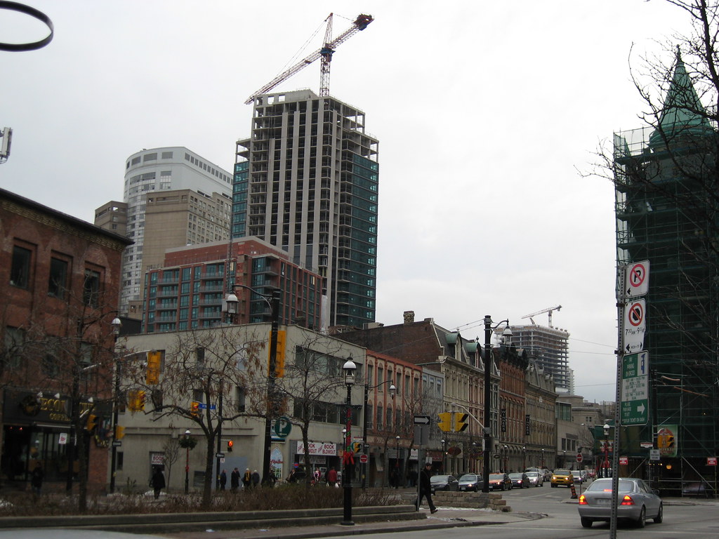
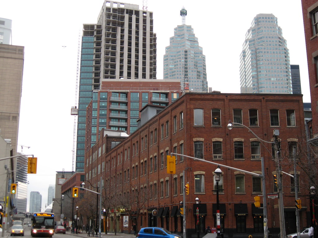
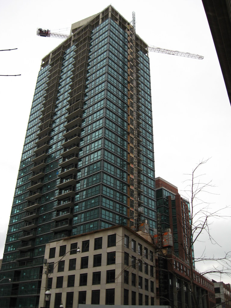
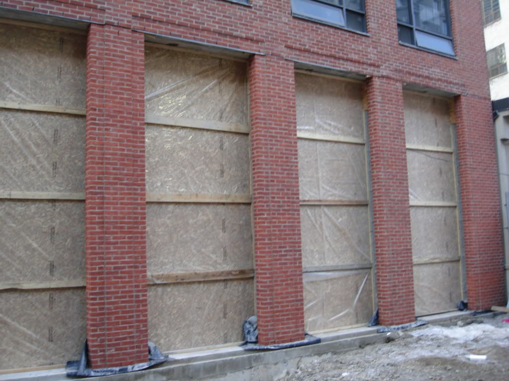
I passed by the site last week and I have to say the building looks terrific. As strange as it may sound, it really does look like it belongs there, hard to imagine the site was once a parking lot.
 
December 2 2008 update

From outside Royal York Hotel

IMG_2846.jpg
 
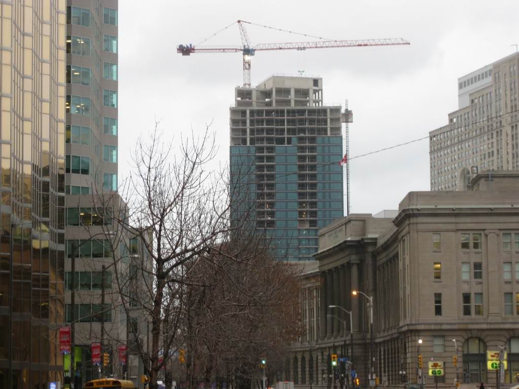
December 11

From Front St looking southwest with Telus rising in the background.
3106603596_08dcb388b3_b.jpg


From Esplanade looking west with Telus on the left.
3106603602_c88de9bb78_b.jpg


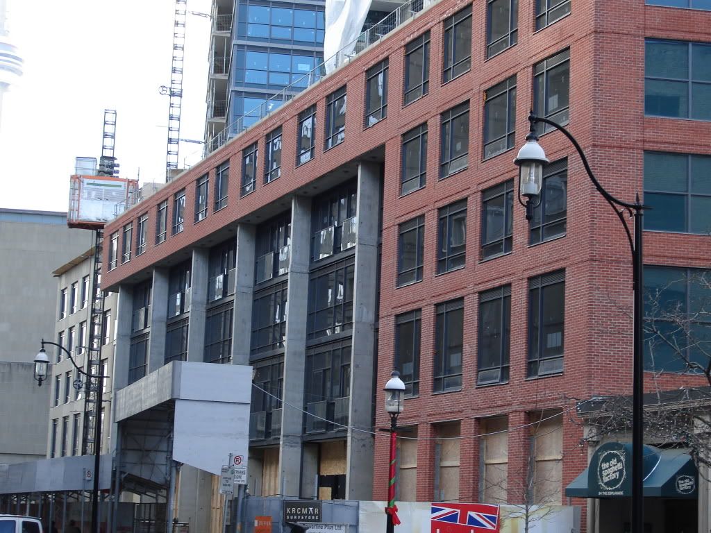
Esplanade and Scott.
3106603606_a481d7449f_b.jpg
 
Like this project a lot too - I think it both suits the area, but it also fits in very nicely and is not overbearing in any way.. Funny that when you look at the building it almost looks as though it has been there for quite some time..maybe it s just me though. thanks for posting the images...

p5
 
Like this project a lot too - I think it both suits the area, but it also fits in very nicely and is not overbearing in any way.. Funny that when you look at the building it almost looks as though it has been there for quite some time..maybe it s just me though. thanks for posting the images...

p5
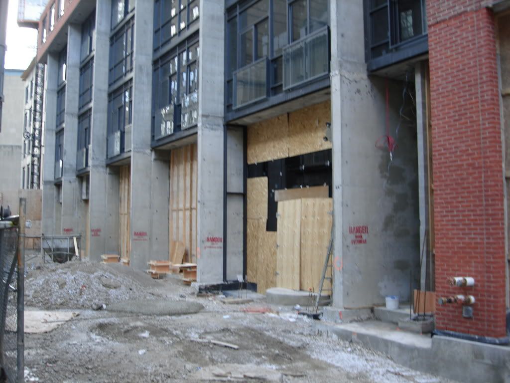
No it's not just you at all! I was going to post the same thing, but you said it well enough.

I particularly like the dark glass against the cladding.
 
I find it looks okay, though what I do find unfortunate is that further west on Front Street, it isn't that great as a view terminus, I'd say almost unfortunate. As Front is angled north between Bay and Yonge, "London on the Esplanade" acts as the view terminus for Front St. W. All the way at Spadina, it is visible, and IMO, looks rather unimpressive.

It looks better close up. At least they went with blue glass and almost fits on that stretch of Esplanade.
 
I don't think I quite like the building itself, as a standalone structure, but I do like the way that it incorporates into the neighbourhood. If the same thing were built at, say, Yonge + Eg or somewhere in North York I would despise it, but on the Esplanade it just blends in really nicely and seems to work
 
Looks fine,nothing that really distinguish itself from other box designed downtown condos,the glass has a nice feel to it though.The condo look is more suitable for Yonge and Finch though.Doesnt have the "details" to make it look like it fit into the adjoining buildings.
 
DEC10-08014.jpg

DEC10-08013.jpg

DEC10-08064.jpg


The spaces in the podium seem to be a little small, compared to the larger restaurants and bars on The Esplanade. I wonder what they plan to put in these smaller spaces. I hope it's something interesting. Does anybody know if Scott St. will also have retail or restaurants?
 
Last edited:
thank you for the pics, Vibe, and welcome to the forum....:)
 
What ever happened to the glass shortage that they were talking about:confused: I forget
 
Last edited:
what a nice surprise

i gotta say, this building turned out ALOT better than i thought and suits the neighbourhood very well. a nice little, once-was-a-lot-now-is-a-bridge to old toronto.

hopefully, VU will also live up it its potential
 
I agree. There have been several great projects completed recently, and nearing completion, this ranks among the best. The render didn't inspire me at all and the name of the project made me cringe so I'm happy to eat my hat over this one. The brick on the low-rise is just smashing.
 
this is definally the best construction boom toronto has had ever had............. not like the sventies where three quarters were boxes and ugly. while now three quarters of the buildings are slim and have used good materials(london on espandle)for one example
 

Back
Top