Toronto London On The Esplanade Condos | 102.1m | 33s | Cityzen | Burka

So, what'd you do with this, then?
2005_10_city_hall-thumb.jpg

That building does have lots of visual interest at least, although I do not necessarily like it from the perspective of urban-ness. My appreciation of it is like a good dose of cod liver oil. I still don't read any of those qualities in the west facade of the St. Lawrence Centre.
 
The St. Lawrence Centre is positively timid compared to Boston City Hall. It makes me wish that our Front Street box were twice the concretion it is.

42
 
That building does have lots of visual interest at least, although I do not necessarily like it from the perspective of urban-ness. My appreciation of it is like a good dose of cod liver oil. I still don't read any of those qualities in the west facade of the St. Lawrence Centre.

Well, it's got a reasonable sculptural form with its fly tower and all--but maybe, ultimately, the question is whether Brutalism always have to be showboatingly ultra-Brutal to be credible? Maybe that makes it neither-fish-nor-fowl for some, but I'm kinda sanguine t/w this not-necessarily-unsophisticated "Gentle Brutal" approach now that it's settled in after 40 years. What, indeed, is the problem?

It seems that the knocks here come from both ends: (a) those who hate Brutalism, and (b) those who find the so-called "minor" to be expendable (cf. my "we got Old City Hall, so who needs those grubby Victorian Yonge Street storefronts" hypothesis)
 
... yet not every victorian building is equal to every other victorian building, and must we like or accept each and every one simply because it is victorian?

I don't hate the Front Street facade of The St. Lawrence Centre and it seems to fit in rather nicely to its setting in terms of scale and how it meets the street etc. The exposed west facade, however, is another issue altogether. In its lack of Boston City Hall-type visual interest and in its lack of coherence with the main facade (which has windows for example) it just ends up feeling unfinished like the back-alley sides of Victorian buildings that we are never meant to see.
 
Horror vacuii rears its head again - even the St Lawrence Centre management falls prey to it, with their "blank"space-filling advertising billboard. There are windows on the west facade; the larger proportion of unadorned concrete on that side merely creates a different rhythm from the Front Street side, that's all - I think the photo posted earlier shows that the building holds together quite well as a whole.

As Brutalism goes she's a pretty, dainty little thing, like Revell's rather feminine City Hall. Embracing her with a nice design hug might have been a better approach than building that moat. Brutalism isn't leprosy, and you don't need to isolate it behind a cordon sanitaire. The forces of FauxMo have been driven to the outer reaches of the city, or have circled their wagons in stubborn resistance at the Bridle Path and in Forest Hill, and our connection to the aesthetic that produced the Centre and the O'Keefe has never been clearer than now, evinced by all the contemporary buildings going up around town. My only point is that we could have done better here, by seizing the possibilities that adjacency to these two cultural buildings offers, and doing something more imaginatively in tune with the spirit that created them.
 
The exposed west facade, however, is another issue altogether. In its lack of Boston City Hall-type visual interest and in its lack of coherence with the main facade (which has windows for example) it just ends up feeling unfinished like the back-alley sides of Victorian buildings that we are never meant to see.

So there aren't west-facade windows, big deal. There's architectural sculpting there, all the same. And as for "back-alley sides of Victorian buildings"--well, it may say something that the generation which designed (or inspired, for that matter) the likes of the StLC was also the first to appreciate the architectural qualities of those Mary Anne backs of Queen Anne buildings. So, think of it in those terms...
 
Horror vacuii rears its head again - even the St Lawrence Centre management falls prey to it, with their "blank"space-filling advertising billboard. There are windows on the west facade

No, I have Horror-what is latin for 'ugly facade'? Not all empty spaces are equal, though I agree that successful ones can have impact or offer visual interest. I just do not see that at work here. Then again I also do not see the elusive windows referred to...
 
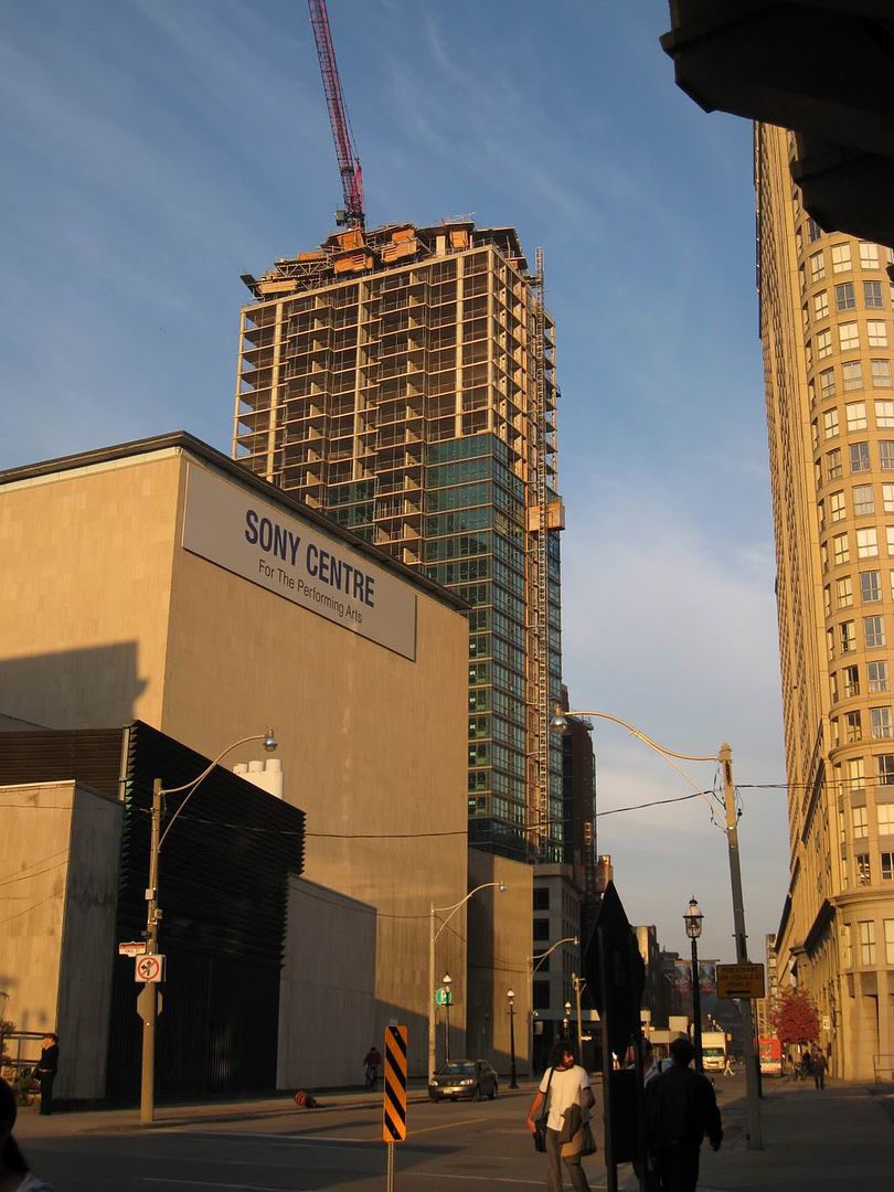
November 4 2008 update

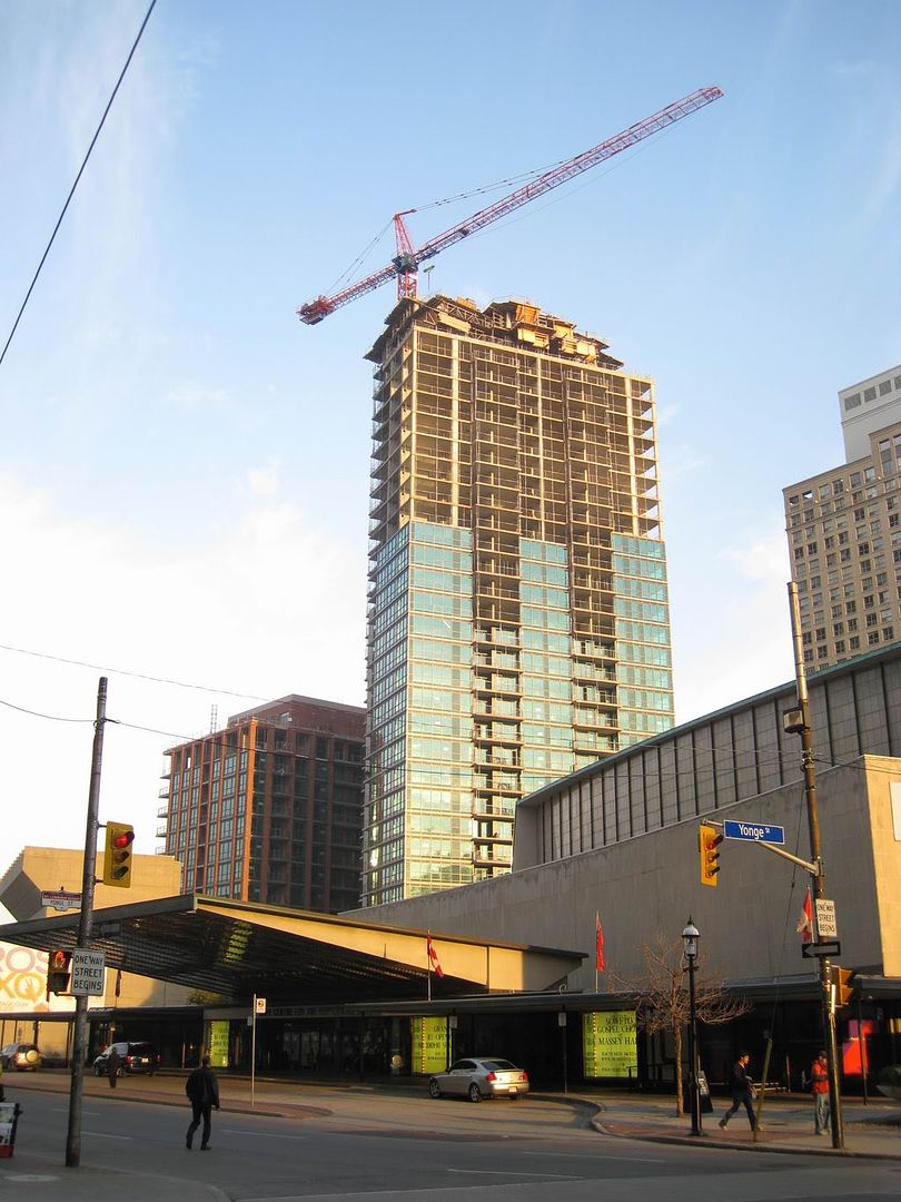
construction seems to be well underway / near complete on the taller tower ~ :)

Northwest View
IMG_2441.jpg


The less seen Southwest View along The Esplanade
IMG_2442.jpg
 
Last edited:
Thanks for the pictures. Again, I love the emerging contrast between LOTE and the O'Keefe/St. Lawrence Centres.
 
There's a chapter in Unbuilt Toronto about the genesis of the St. Lawrence Centre.

The 1962 proposal - Toronto's Centennial project - was for an entire district of theatres, schools, museums and art galleries in an arc from Yonge and Front to Richmond and Jarvis, building on the success of the O'Keefe and creating a proto-Entertainment District.

To the east of St. James's Cathedral ( subsequently turned into a park ) was to be a precinct for arts schools such as the National Ballet School. South of this, between King and Front ( where Market Square is now ) was to be an art gallery, lecture rooms and a market building ( built, but now the site of a redevelopment proposal ) behind a refurbished St. Lawrence Hall ( done! )which would be turned into a museum ( an idea that still gets revived ... ). A 1,500 seat theatre would occupy this block, at the north-east corner of Front and Church.

An office tower, accommodating arts organizations, would be built north of the O'Keefe, with a plaza to the south of it. On the east side of Scott, where Berczy Park was eventually created, there would be a repertory theatre ( proto-Soulpepper! ) and a small concert hall.

Very South Bank, or Lincoln Centre, or Place des Arts. Hugely ambitious, it remids me of that multi-use thing that was planned for the O'Keefe/Hummingbird/Sony Centre recently that bit the dust.

The whole scheme was pared down in stages, and the design for the western part was scaled back so that by 1966 it consisted of a two-building proposal that used the space where the St. Lawrence Centre now stands and the Berczy Park site to the north of it - consisting of a theatre and a town hall, which were eventually combined in the building we now see.
 
Had a good look at LOTE (the thread topic) today and really like it. The subtle contrast of the opaque green and reflective green glazing, the small turn away from the N/S axis... and most of all, the podium. Simple, timeless, perfect fit for the street.

Would love to have seen this kind of streetwall mixed into the Cityplace towers... add some mature trees, a few restaurants, a bit of shopping.... Bremner/Fort York Blvd. is welcoming to residents and non-residents alike.
 
There's a chapter in Unbuilt Toronto about the genesis of the St. Lawrence Centre.

Interesting post US, thanks.

Isn't there an exhibit on now that shows many of these never-built plans? Toronto has seen its fair share of them. Quite a different city it might have been.
 

Back
Top