You are using an out of date browser. It may not display this or other websites correctly.
You should upgrade or use an alternative browser.
You should upgrade or use an alternative browser.
Toronto King Charlotte | 114.9m | 32s | Lamb Dev Corp | a—A
- Thread starter carturo15
- Start date
TheKingEast
Senior Member
toddegan
New Member
I'm guessing my interior unit and pool pics were against the rules? My apologies, not sure why however...?
Automation Gallery
Superstar
Huh? why if you took them?I'm guessing my interior unit and pool pics were against the rules? My apologies, not sure why however...?
toddegan
New Member
ot sure, good shots as well, maybe because i'm listing it 'soon' and mentioned that as if i'm attempting to solicit a sale which i'm not so, regardless I was just curious. The pool looks awesome and the building really is very well built I must say.
toddegan
New Member
And so they are, I didn't see that and thought it was in this thread. Thanks, all the best.
Red Mars
Senior Member
Pic taken Dec 1, 2018
From Mercer St. and BlueJays Way.

From Mercer St. and BlueJays Way.

concrete_and_light
Active Member
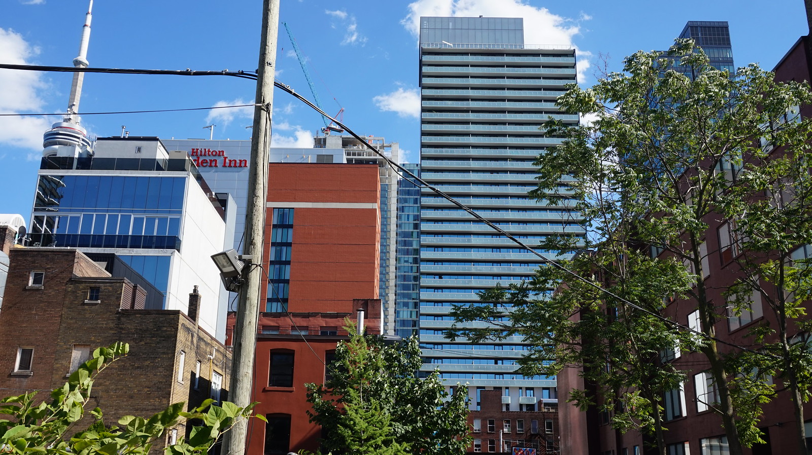
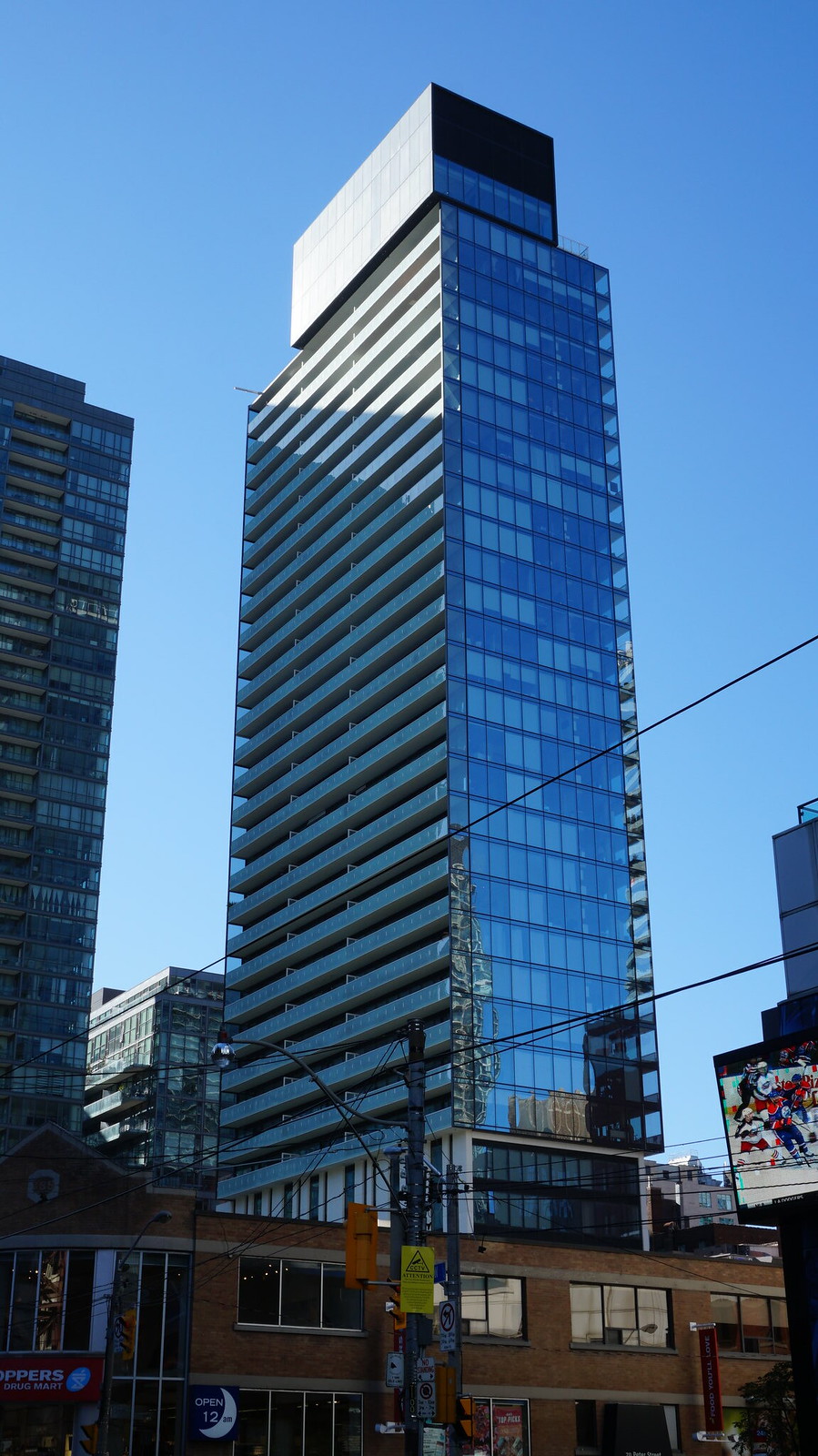
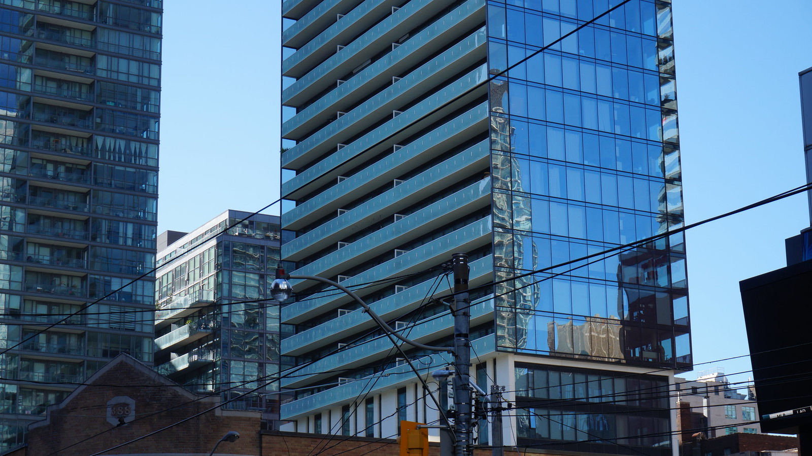
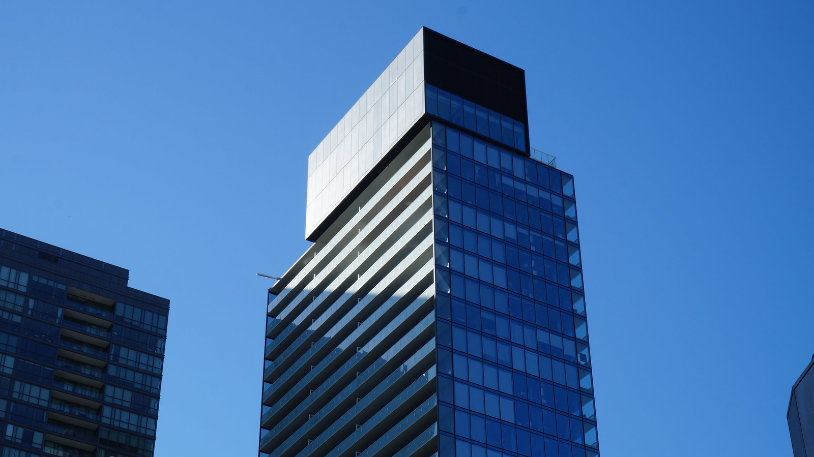
As Toronto glass box condos go, this is a really nice one. Everything's so crisp.
innsertnamehere
Superstar
the restaurant is pretty nice too.As Toronto glass box condos go, this is a really nice one. Everything's so crisp.
condovo
Senior Member
Curtainwall glazing makes all the difference. This building looks great.
DavidCapizzano
Senior Member
Still looking crisp. Probably my favourite tower in the entertainment district.
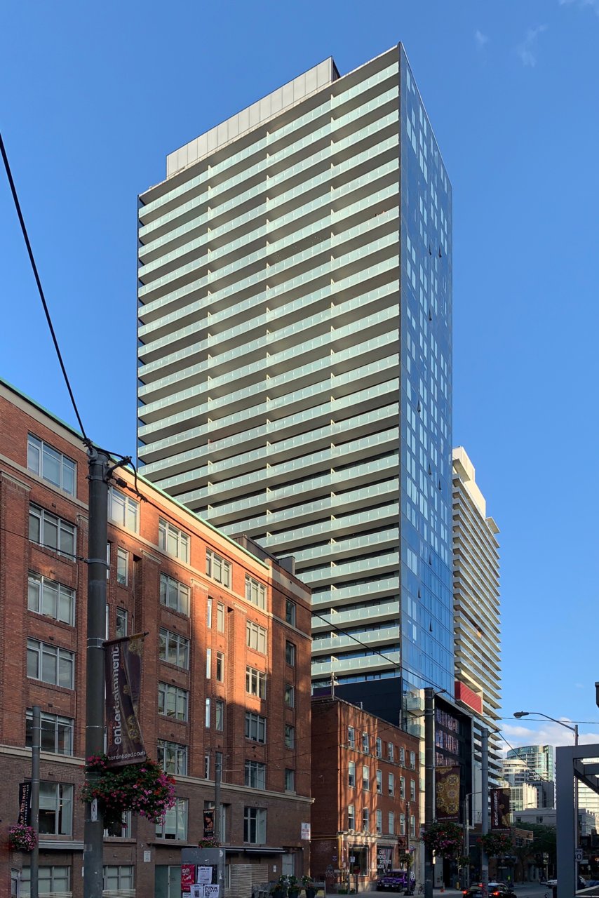
TheKingEast
Senior Member
The tower is great. I don’t know how I feel about the ground level and the retail space.
.dwg
Active Member
My experience of Khao San Road's space is that it's one of the more interesting little retail spaces in a newer development in the area - sectionally interesting as a double height space. It's definitely crammed in there but that's what makes it interesting. The project has a tiny floorplate but they managed to squeeze in that space, and a restaurant (not a dry cleaner, Subway, etc.) has made good use of it. It's rare to have a retail unit that isn't a more transparent glass but I do like how the restaurant has added wood screens and created their own motif behind the glazing which sort of supports the notion of it as a blank space to be given expression by its tenant.
I do wish we had more retail units in the city that were not fully glazed or where masonry, etc., came down to grade, with a setback retail entrance and shop windows like we used to see in older buildings - it gave the street more texture. That said, I think this is one of the better examples of a storefront / street fronting retail unit that employs glazing as its main architectural expression.
I do wish we had more retail units in the city that were not fully glazed or where masonry, etc., came down to grade, with a setback retail entrance and shop windows like we used to see in older buildings - it gave the street more texture. That said, I think this is one of the better examples of a storefront / street fronting retail unit that employs glazing as its main architectural expression.
