Toronto Harris Square | 50.29m | 13s | Urban Capital | Saucier + Perrotte

I'd like to stick that building on Doug's front lawn...
 
A fence going up between Underpass Park and Harris Square.

PXL_20210121_234103194.MP.jpg
 
The murals, the guardian sculptures. Cork town commons. Underpass park. Definitely one of the nicest places downtown. Sure the buildings could have more colour and it’s winter. But it’s a nice area
 
The murals, the guardian sculptures. Cork town commons. Underpass park. Definitely one of the nicest places downtown. Sure the buildings could have more colour and it’s winter. But it’s a nice area

I didn't say it's not a nice place -- it is in fact hands down my favourite new neighbourhood to come out of the condo boom -- I said it's grey. Which it is unless you're standing in the park (which, yes, like every other park on earth is obviously not grey -- I figured that could go unsaid) or under an overhead motorway that has had murals painted on its supports. Otherwise, it's a simple statement of fact that there is a very subdued colour palette among the new buildings (which is what I was commenting on), as is evidenced by the array of photos I posted above.
 

It's interesting that you have somehow failed to show any of the colour on buildings around. Not saying theres a rainbow on every building but you dont show any in your pics.

1. Canary Commons, bronze/gold gladding and the rainbow windows.
2. Red on the George brown buildings
3. Red on the YMCA building.
4. The brown and black clad buildings by King st. Sure they aren't colourful but they are not grey.
5. The two red brick buildings at front and cherry.
6. All the sculptures and art
7. Underpass park
8. If we are stretching it the storage green lot


Also it's the middle of winter on a cloudy day so any place is going to look a little drab.
To have to list it like that shows just how obscure colour is in this end of town. The only thing we can say it's far from the only end of town with this issue.
 
Indeed. Most of Toronto during the winter is exceedingly grey and monochromatic. All the glass in the towers downtown and elsewhere just reflects the leaden skies. The fact that the glass tends to come in glacial blues and greens doesn't help matters much.

That said, this neighbourhood in particular is one for which I have high hopes that it will come into its own, becoming a desirable destination for those who want to live in the core. I already like the architecture and the public spaces; it just needs more vegetation and people to animate the area. More amenities need to happen. It's coming along though.
 
And to be fair as well, this end of town has some of the most interesting and compelling architecture. It feels like our little Copenhagen, which we can't say for the other ends of town.
 
Indeed. It also reminds me of some stunning modern residential architecture I saw in Amsterdam a couple of winters ago. Sleek, striking. Although they tend to also play up dramatic colour more than we do here. Sadly.
 
Indeed. Most of Toronto during the winter is exceedingly grey and monochromatic. All the glass in the towers downtown and elsewhere just reflects the leaden skies. The fact that the glass tends to come in glacial blues and greens doesn't help matters much.

That said, this neighbourhood in particular is one for which I have high hopes that it will come into its own, becoming a desirable destination for those who want to live in the core. I already like the architecture and the public spaces; it just needs more vegetation and people to animate the area. More amenities need to happen. It's coming along though.
b36d5507-edd6-42db-a2d4-53950a6339a4-jpeg.298590

Source: ADRM

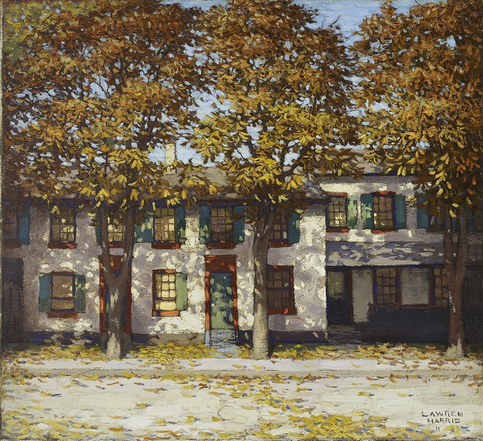
Because we go gray weather-wise for many months a year, we should pay more attention to providing colour in public spaces. In @ADRM's photo above, I'm left wondering why Lawren Harris Square couldn't have street furniture colours keyed to the colours he employed in his paintings, given its immediate dull-coloured surroundings, and the fact that Harris was one of Canada's greatest visual artists?

There's this Harris painting in the AGO's collection, 'Houses, Richmond Street', for example, from which the reddy or orangey browns from the door frames and lintels, or the blues and greens from the shutters, could be painted on the benches or applied as wraps around the planters. The yellow at the base of the Harris Square building (most of which is till to be revealed) could already represent the colours of the leaves in this painting.

default.jpg

Source

Or, why is there no public art piece in that square, again, given whom it's named after? Have an invitational competition among half a dozen artists to create something for the square that could relate to Harris work in some recognizable way. Some future Section 37 money (or equivalent funding) from something in the area should really go towards making something to liven up that space.

42
 

Back
Top