Toronto Gläs Condos | ?m | 16s | Lamb Dev Corp | a—A

Well, to each his own, but for me the experience of walking past hudson is much richer and more interesting than walking past glas. Of the two, I find glas somewhat the duller. On the south side, Glas is a brick wall and garage entrances, not especially graceful or well handled (but it doesn't matter, because their current prominence is temporary). On the Oxley side, it is a sheer wall with a cool (quite beautiful) metal and glass face to the street, with repeating doorways. I think glas is amazing, for a building that faces onto an extremely unimportant street, but if that same facade faced onto King Street I would be mad as bees.

That's why I don't think there's any point or anything to be gained from the comparison. It doesn't tell us anything new about either building. I might as well say "glas is better than Polo Club II" or "hudson is better than One Sherway". What's the point in the comparison?

And, without wanting to be unkind, if I had one wish it would be to ban words like "ugly" and especially "suburban" in the absence of greater explanations when talking about buildings - they don't really add much meaning, apart from and indication of personal preference. I don't mean this in a negative way, but I do feel that discussions would be enriched if these were avoided. Obviously, you can do as you please, but the word "suburban" in particular is an epithet that has precisely no meaning when used on this forum. If you feel that hudson is suburban, you'd really need to explain what that means. Since it isn't surrounded by a plot of greenspace and a drive up to the building, I have no idea what you are trying to say.
 
Last edited:
Well, to each his own, but for me the experience of walking past hudson is much richer and more interesting than walking past glas. Of the two, I find glas somewhat the duller. On the south side, Glas is a brick wall and garage entrances, not especially graceful or well handled (but it doesn't matter, because their current prominence is temporary). On the Oxley side, it is a sheer wall with a cool (quite beautiful) metal and glass face to the street, with repeating doorways. I think glas is amazing, for a building that faces onto an extremely unimportant street, but if that same facade faced onto King Street I would be mad as bees.

That's why I don't think there's any point or anything to be gained from the comparison. It doesn't tell us anything new about either building. I might as well say "glas is better than Polo Club II" or "hudson is better than One Sherway". What's the point in the comparison?

And, without wanting to be unkind, if I had one wish it would be to ban words like "ugly" and especially "suburban" in the absence of greater explanations when talking about buildings - they don't really add much meaning, apart from and indication of personal preference. I don't mean this in a negative way, but I do feel that discussions would be enriched if these were avoided. Obviously, you can do as you please, but the word "suburban" in particular is an epithet that has precisely no meaning when used on this forum. If you feel that hudson is suburban, you'd really need to explain what that means. Since it isn't surrounded by a plot of greenspace and a drive up to the building, I have no idea what you are trying to say.

We may be approaching things from two different perspectives based on this and previous posts. I think your argument is that Hudson succeeds architecturally because it succeeds functionally and more so than Glas as it has a more challenging program. That's valid. My emphasis, however, is on the aesthetic 'function' of architecture and how that finds expression in the two adjacent, contemporaneous buildings.

I contend that the comparison is valid and worth exploring, just as I believe that aesthetics in architecture more generally are worth exploring and discussing. While, granted, Hudson is more complex programmatically, it falls short aesthetically IMO, especially compared to Glas next door. And so, by my calculation, it falls short architecturally. There's no reason why Hudson couldn't look more like Glas (not that I'm arguing that all buildings should look the same, just that they should look less like Hudson and more like Glas). It likely wouldn't impact on its functionality whatsoever.

I believe that most of us are here, on this site and others like it, because we're more excited by how buildings look than by how they function. I don't think there's anything wrong with that just as I don't think discussions on aesthetics in architecture are any less valid than discussions on functionality.

I agree that I threw out the word 'ugly' without further elaboration. It was a clumsy, and lazy, expression of my visceral distaste for Hudson, in pictures and in person. By 'ugly' I meant to say that I find it joyless, clunky, chunky, all business and no pleasure, in its proportions, materials, and detailing. It houses people yet doesn't seem to delight in doing so. It may function well but, for me, that's not enough.

Let's not shy away from debating how buildings look just because we might have strong opinions and might disagree forcefully. Or because 'looks' can't be quantified as readily as 'function.' After all, there's artistry as well as practicality in architecture. That said, we ought not drop words like 'ugly' or 'suburban' without further explanation.

And for the record, I never used the word 'suburban' in describing Hudson.
 
Last edited:
condovo, that's a great elaboration, and gratefully received.

My "suburban" comment was aimed more at simuls, but I do believe that the suburban/urban dichotomy as expressed here often is merely a slur that in the absence of further elaboration has no meaning.
 
The epithet "suburban" is so often linked to what's bruited as bad design that one wonders if the people who use the term are suggesting that bad design actually belongs somewhere - in the suburbs, especially - rather than belonging nowhere at all. It's as if every time they spit out the word they're trying to purge some evil spirit from our midst and dump it, in another form, somewhere north of the 401. Jumpin' Jack Diamond, that most urban of architects, regularly gets the laying-on-of-hands from this crew - though perhaps there's some sort of mass oedipal rejection-of-daddy thing going on there as well given the age demographic.

I believe there are actually some quite nicely designed buildings north of the 401.

As for the Hudson/Glas debate - well, they're by different architects so they're bound to look somewhat different ( even though they're both resolutely Modernist in their philosophies ), and they're on different sites and therefore engage the city on different terms. I love the sheer audacity of the north side of Glas because it's not at all what I expect to see there, and I love the inny-and-outy texture of the Hudson as it addresses that busy intersection with complexity rather than bulk; both seem to play against the easy solution, and against preconceptions.
 
Don't forget Glas's most underrated elevation: the east side (visible from Pearl in the downtown core)
 
just saw some listings for resale at glas. most units on the south side of the building seems to have balconies with gas-hookup for bbq, where as the north side only has balconies for units on the higher levels (probably penthouse units).

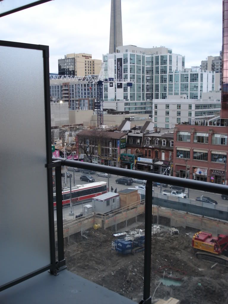
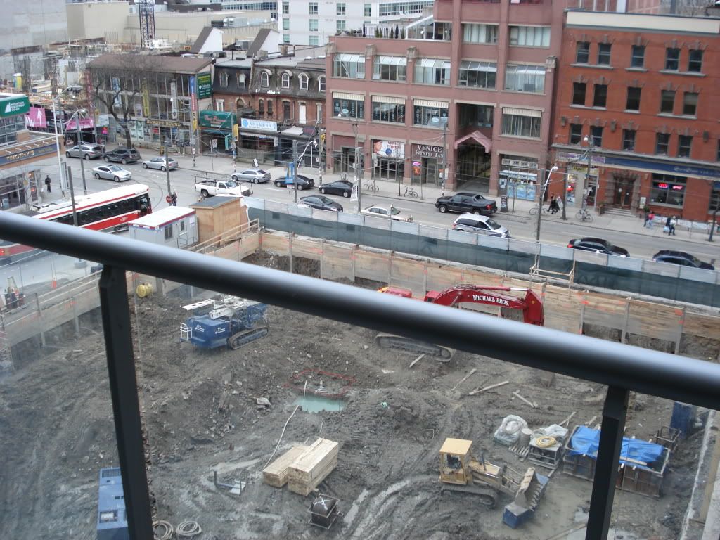
While the units that I saw on the south side of the building were awesome, along with an amazing view of the urban skyline, it's unfortunate that the view will be shortlived with the upcoming construction of 32storey charlie.

very unfortunate that purchasers will end up having a crummy view of their neighbours in the opposite building with a sketch alley/road below.

DSC01831.jpg

DSC01828.jpg
 
Last edited:
^^ and the overwhelming noise for the next 2-3 years ugh!

I was looking at the teeny tiny 410 sq ft units back in June. They were listing at $216K. Just saw a listing for the same size for $249K! :eek:
 
Saw a 1bed on MLS going for $270K I'm sure it will sell for more than that.

i just went to see that listing a day ago. it's a very nice unit with upgraded appliances everywhere. front load washer/dryer, gas stove, an ACTUAL rangehood (not one combined with microwave), rainshower etc. very much loved the gas hookup on the large balcony for bbq with the stunning view of the city and CN tower. charlie was what broke the deal for me. the view will be completely obscured by both charlie and the other building beside it
 

Back
Top