Toronto First Canadian Place Rejuvenation | 298.08m | 72s | Brookfield | MdeAS Architects

Some details like cross bracing or tubes like the NYTimes building would have improved the podium, I think. I appreciate minimalism, but it looks way too basic.

23540539.JPG
 
I get the Lego argument, but the project as a whole looks amazing. You can't get the full effect from a photo. It gleams, and makes the tower seem all that much more impressive.
 
The protective scaffold is starting to come down at street level. Most of the supports on the roof have already been removed.

The podium is growing on me, slowly. It plays off Mies' banking hall across the street, although obviously not as impressive.
 
The protective scaffold is starting to come down at street level. Most of the supports on the roof have already been removed.

The podium is growing on me, slowly. It plays off Mies' banking hall across the street, although obviously not as impressive.

I've posted in the Retail threads about the changes going on inside, but an update here is timely. Lots of stores either moving out or relocating within the mall, a trend I expect we will continue to see as the indoor reno progresses. The entire concourse area in the northeast corner that used to house the post office, the Source, the newsstand, and the GAP is now covered with hoarding; reports are that all or some will be the new home of the Rexall that's currently located further west on the concourse level. On the upper level, Fairweather is gone, to be replaced by a Lasix place. Harry Rosen is expanding. Through all of this work continues on the floor replacement. The central elevator bank area is close to being done. The fountain is currently closed off.

On the outside, there is still some finishing work to be completed. There are currently exposed connections on the Bay-King corner--presumably they will be bringing back new versions of the ticker boards that used to be located there. The sidewalk isn't looking too hot--lots of broken tiles.

I agree that the play off the Mies pavilion across the street is better with this new iteration (but I'll still be the curmudgeon and long for the missing old BMO building....)
 
Will the sidewalk be replaced ?
 
Gotta say, with all the hoardings etc coming down, the podium is looking pretty clean and sharp. The BMO signage, which I first thought was too large, now actually seems to dilute some of the "Lego Effect", and the whole thing sits better.

It should look even better when the new ticker is installed on the SE corner.
 
It should look even better when the new ticker is installed on the SE corner.

They have to cover that unfortunate indentation.

I think this recladding turned out great. My little wish would have been to have the communication towers redone.
 
Best looking office tower (and still the tallest) in Canada IMO. Show me a better one if you disagree.
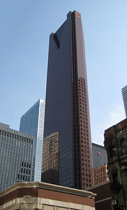
FCP's the best for you and that's cool.
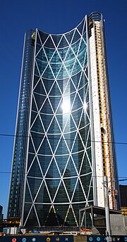
Personally though I'd take these five office towers over it;
250px-Scotia_Plaza_2009.JPG

220px-TD_Centre_View_from_Yonge_and_King.JPG

Royal_Bank_Plaza,_Toronto.jpg

448px-EAP-east-facade.jpg

180px-BowAug25_2011.jpg

images from Wikipedia
 
Last edited:

Back
Top