Toronto First Canadian Place Rejuvenation | 298.08m | 72s | Brookfield | MdeAS Architects

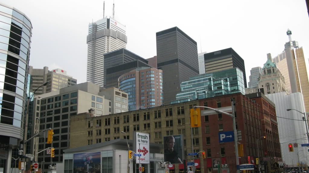
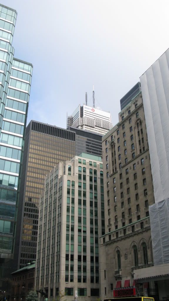
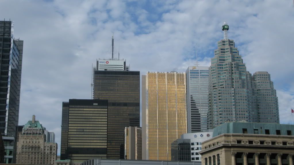
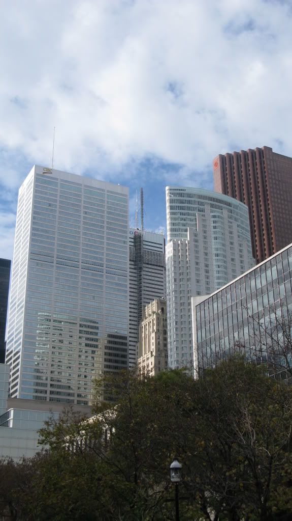
Everytime I see this project I get more and more excited about how amazing it's going to look!
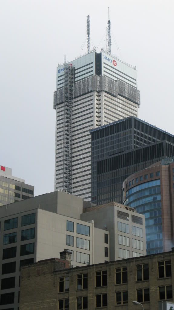
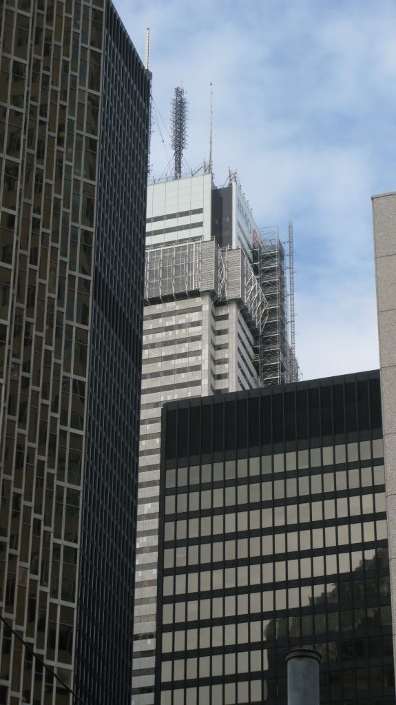
IMG_2106.jpg


IMG_2107.jpg


IMG_2109.jpg


IMG_2154.jpg


IMG_2121.jpg


IMG_2112.jpg
 
LEDs up the black corners would look great at night.

I don't think it would look that great if LEDs lit up the black corners from top to bottom. It would be too much. If they had a faded effect going up the top third or quarter of the building that could be cool. Scotia Plaza could also really use some nightime illumination. It's always so dark.
 

I LOVE THIS SHOT!!!! freakin dead on center with these skyscrapers! it actually looks sorta balanced there :D (these big CBD towers don't always look good together in terms of size, shape, design, cladding, etc...)

and nice render reaperexpress! god i can't wait to see this mess completed! Our cbd looks incomplete without it!!!!
 
(these big CBD towers don't always look good together in terms of size, shape, design, cladding, etc...)

Really? Wow, I always thought the opposite. Their massing, scale and color has always looked good to me no matter what angle I'd look at the CBD from. Its certain building by themselves, like the old FCP, that weren't always very pleasant to look at. I've always preferred our peak-style skyline over say, Chicago's randomness. The photo above is one of the less interesting pics of the CBD imo as I find theres too much of a plateau effect going on.
 
Last edited:
Really? Wow, I always thought the opposite. Their massing, scale and color has always looked good to me no matter what angle I'd look at the CBD from. Its certain building by themselves, like the old FCP, that weren't always very pleasant to look at. I've always preferred our peak-style skyline over say, Chicago's randomness. The photo above is one of the less interesting pics of the CBD imo as I find theres too much of a plateau effect going on.

I like them both for their own reasons, a peak skyline is easier to photograph... :p
But it makes the downtown area look smaller than it is, because they completely dwarf everything around it. Look at LA's skyline..
So they both have their pros and cons in my opinion..
 
Nice to see how quickly the work is going on the tower now! What are they doing to the lobby? I always liked FCP's marble lobby.
 
Really? Wow, I always thought the opposite. Their massing, scale and color has always looked good to me no matter what angle I'd look at the CBD from. Its certain building by themselves, like the old FCP, that weren't always very pleasant to look at. I've always preferred our peak-style skyline over say, Chicago's randomness. The photo above is one of the less interesting pics of the CBD imo as I find theres too much of a plateau effect going on.

don't get me wrong that the cbd looks fantastic from certain angles, but from others, not so much. I don't like how it looks south of the railway tracks,

EX: something looks very unbalanced here. (not exactly the CBD's fault, its the empty spaces in the city that allow this to happen). It's the way the buildings work together that makes them look weird.
This shot isn't the best example of what i mean but it's close.
Photo by Mo-tage on the homepage:
potd-CoreFromRound-Mo-tage.jpg
 
hmm, I see what your saying. That's one perspective that I rarely see. It does look somewhat disjointed, there. Though I feel that's more the exception than the norm. Doesn't help that Scotia, my fav, and B-A are completely invisible from that perspective. From the south west the TD center does dominate a bit too much, I don't find that from other angles though.

But it makes the downtown area look smaller than it is, because they completely dwarf everything around it. Look at LA's skyline..

True enough, theres a peak and then nothing else. Toronto was somewhat similar though not to the same extent. Thankfully our Boom is taking care of that.
 
Come to think of it... the CIBC building could use a reclad too! It's not up to part with all the great high rises around it.
 
i actually don't mind the commerce court cladding as much as some of the smaller buildings such as the hudson bay centre at yonge and bloor, or some of the smaller ones in that area but if your reffering to buildings in the main "cluster" then i agree that commerce court could use a reclad, i also woudn't mind a recladding on brookfield place (td canada trust tower and the bay and wellington tower)
 
Umm, one thing not to forget is Chicago has many more 200m+ sky scrappers throughout their core ... so if their skyline looks bigger it's simply because it is ...
 
I believe we're ahead of Chicago in terms of buildings over 20 storeys, though. Or is that 12 storeys?
 

Back
Top