Toronto First Canadian Place Rejuvenation | 298.08m | 72s | Brookfield | MdeAS Architects

However, and this doesn't really relate to the re-cladding, FCP as an entire site is an atrocious waste of space. That high-res render really brings it to attention. Mostly due to lamented loss of some of the original buildings, I don't know why the tower wasn't pushed back towards that open space fronting Adelaide, enabling retention of the Star Building and the tower at the NW of King and Bay. For a 70+ storey building, the site density and use is embarrassingly weak. Perhaps it was the way of 60s/70s building, but either way I can't even wrap my head around what was being thought at the time.

The original plan incorporated a vast rooftop park that covered the entire footprint of the FCP/Exchange block. It was very grandiose and, in theory, impressive. But, of course, all of the existing riff-raff buildings (it was the early 70s, remember) had to be eliminated because they just didn't fit in with E D Stone's monolithic vision. Eventually, the rooftop park got dropped (I'm not sure why--too expensive maybe?), but the old buildings still got chopped. In the completed version everyone lost.
 
Remember another comparison point of the period, including the form and construction of the tower: the World Trade Center...
 
^ Hey, they can still build a twin to FCP on the corner of Bay & Adelaide...

...oh wait, they did. Just shorter... and shinier.
 
Very nice indeed. I wish they would use black glass for the corner - or panels like the podium at MLS - it will make the "cardinal" facades really detach from the mass of the building.

AoD

Absolutely agree with you here, it would look fantastic with the black panels used on MLS.
 
Looks sharp! :)
3947127509_a5f6ba4779_o.jpg

looks good, i like the dark corners and the white pops
the building color was starting to look like my socks
is height increase in the plan? and podium plan
 
Last edited:
^ Hey, they can still build a twin to FCP on the corner of Bay & Adelaide...

...oh wait, they did. Just shorter... and shinier.

Naw, if 1FCP is an Aon twin with horizontal stripes, 2FCP is a GM twin with granite. Two different kinds of Stone.

Personally, I feel 2FCP is the Lauren Conrad of downtown skyscrapers: utterly boring. 1FCP is the Heidi Montag: utterly ridiculous.
 
However, and this doesn't really relate to the re-cladding, FCP as an entire site is an atrocious waste of space. That high-res render really brings it to attention. Mostly due to lamented loss of some of the original buildings, I don't know why the tower wasn't pushed back towards that open space fronting Adelaide, enabling retention of the Star Building and the tower at the NW of King and Bay. For a 70+ storey building, the site density and use is embarrassingly weak. Perhaps it was the way of 60s/70s building, but either way I can't even wrap my head around what was being thought at the time.

They used all the available density in this configuration. Keeping the Star building or adding height to the corner would have meant a smaller FCP.
 
Even if the old Star building was lost to make way for the mediocre FCP podium, at least the city managed to gain the stunning new Star building at Queen's Quay and Yonge, which, along with Captain John's and Toronto's own World Trade Centre, has created a dynamic downtown intersection. <voice dripping with sarcasm>
 
Perhaps it was the way of 60s/70s building, but either way I can't even wrap my head around what was being thought at the time.

Unfortunately, many architects and planners create visions and concepts that are very non-functional but egotistical in nature. They just want to impress, see their idea built for the sake of it. I think this is one of the things we can give Jane Jacobs a big thumbs-up for: she really recognized when ideas were ego tripping (even Le Corbusier at times, embarassingly enough) and took people to task for it-- simply asking, "Now where is the sense in this idea?" when there really was no sense, but just ego.

It's unfortunate and it leaves its mark but this happens all the time. Generally Toronto seems to avoid the big disasters of "ego" but nobody is immune.
 
It's unfortunate and it leaves its mark but this happens all the time. Generally Toronto seems to avoid the big disasters of "ego" but nobody is immune.

Thats because the planning process doesn't allow planners and architects to get carried away. You no longer work for yourself as a planner or architect, you work for the public.
 
Even if the old Star building was lost to make way for the mediocre FCP podium
The Star Building was lost for the tower itself. (and another 10 storey building) The 17 storey Bank of Montreal Building on the corner of King & Bay was demolished after the tower had reached over 50 storeys tall for the podium.

I do understand the reason for a King Street address instead of Adelaide one eventhough the Adelaide side of the complex was pretty much parking and garbage.
 
The stand-out Star building replaced a row of Georgian/Victorian buildings that were part of the more modest and neighbourly streetscape of an earlier Toronto. That plot of land has seen several built generations, each expressing different values, and continues to evolve. I recall a sense in the early '70s that with this 72 storey tower and a planned second one to the west of it we were getting our own version of the New York World Trade Centre; it was all terribly big league - we'd got a Mies and a Pei and now we were getting this sleek white needle.
 
I just walked past FCP and see they are in process of removing two vertical strips of marble panels from the west side. Looks to me like this is where they will install the supports for the moveable work platform. Seems to be moving right along.
 
Looks great overall, I like the darker colour on the inset corners.

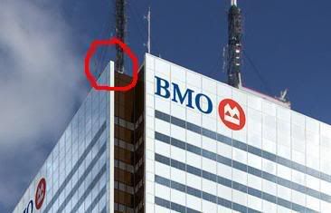
Based on the render, it looks like the white surface extends a bit past the edge, and into the inset corner to form a sort of "lip". I wonder if this is accurate, or just a fanciful exaggeration in the render. I've made a red circle around what I'm talking about:
FCP_corner.jpg


However, and this doesn't really relate to the re-cladding, FCP as an entire site is an atrocious waste of space. That high-res render really brings it to attention. Mostly due to lamented loss of some of the original buildings, I don't know why the tower wasn't pushed back towards that open space fronting Adelaide, enabling retention of the Star Building and the tower at the NW of King and Bay. For a 70+ storey building, the site density and use is embarrassingly weak. Perhaps it was the way of 60s/70s building, but either way I can't even wrap my head around what was being thought at the time.

Completely agree! It's especially frustrating when you realize that the old Bank of Montreal building could easily fit next to the tower, as can be seen in this photo:
1975-corner.jpg
 

Back
Top