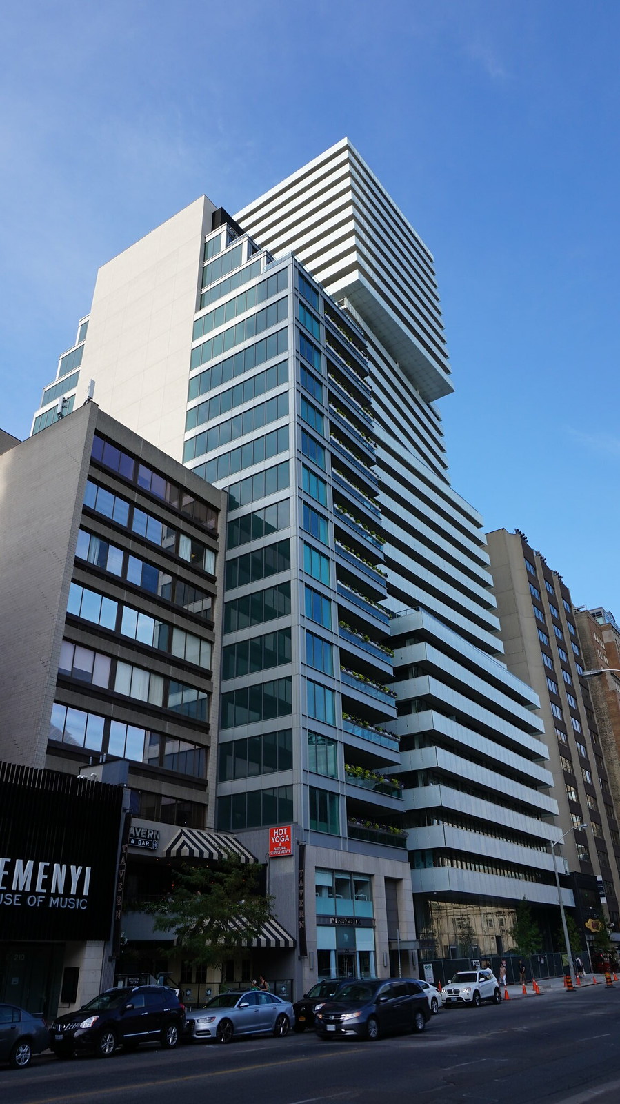
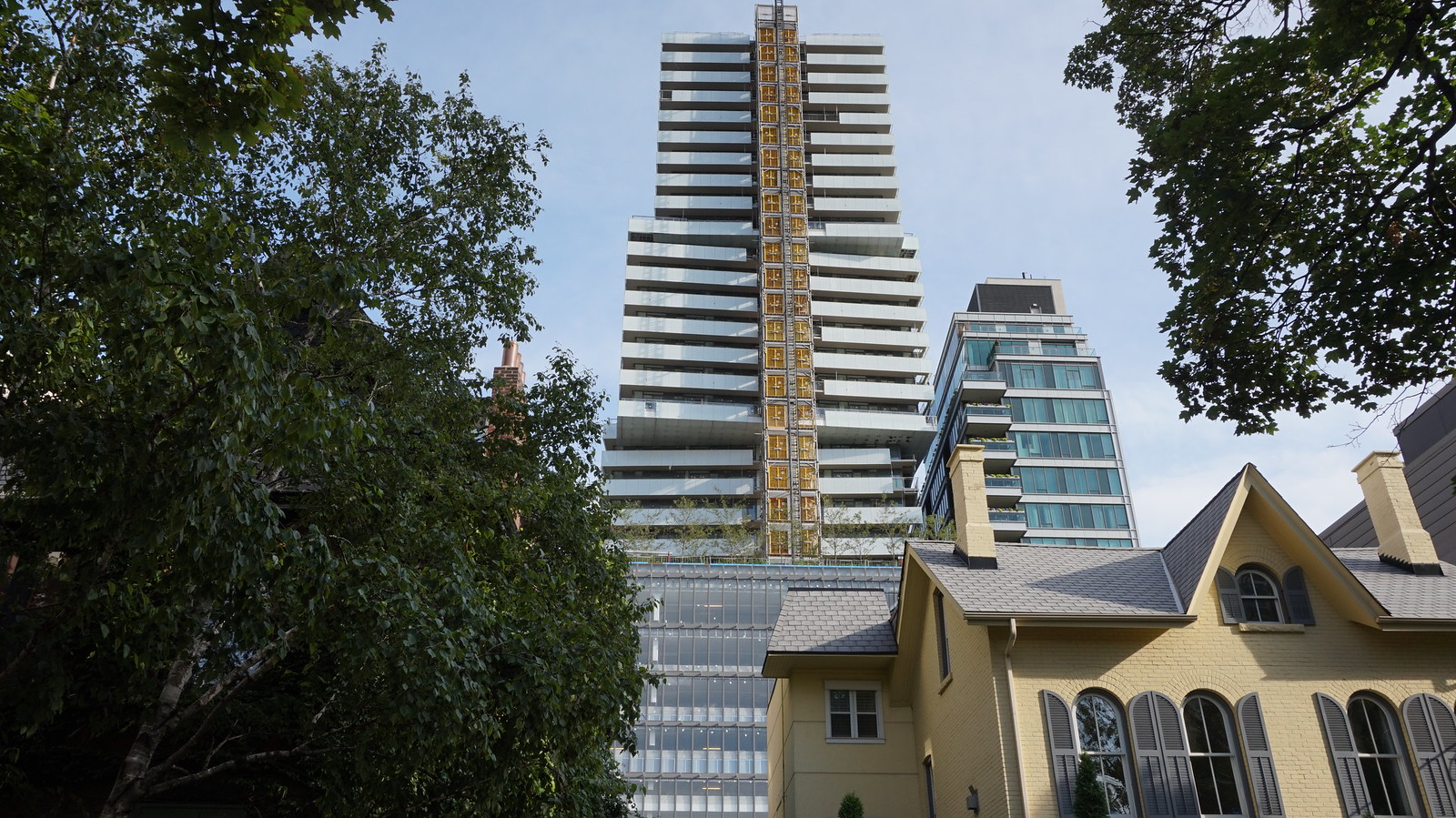
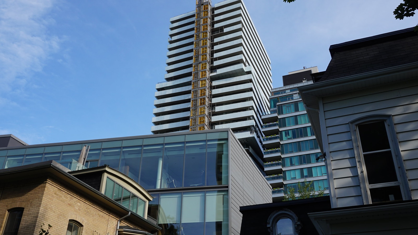
Toronto Exhibit Residences | 99.97m | 32s | Bazis | Rosario Varacalli

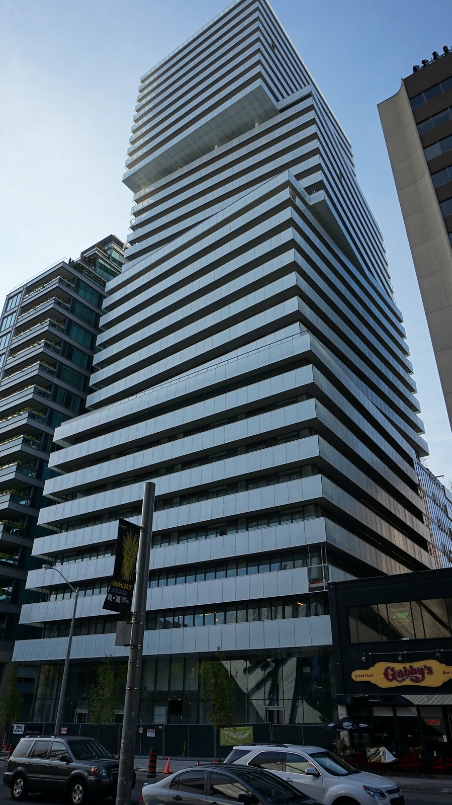
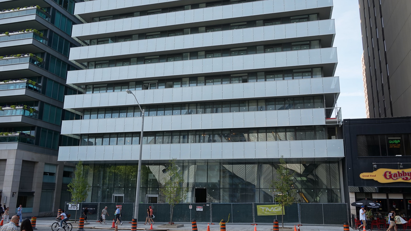
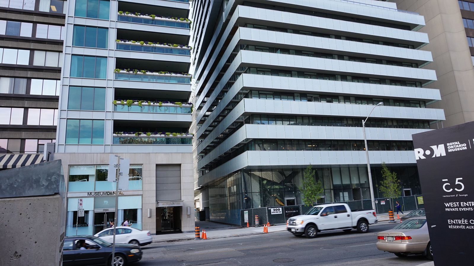
the thing that still blows my mind about this one is how long it took to construct... many buildings nearly triple the height of this that were proposed after construction had already started here were completed sooner. and really this still isnt complete with all the missing panels. think it looks decent if you view it from an angle. straight on it just looks like a mess.
 
the thing that still blows my mind about this one is how long it took to construct... many buildings nearly triple the height of this that were proposed after construction had already started here were completed sooner. and really this still isnt complete with all the missing panels. think it looks decent if you view it from an angle. straight on it just looks like a mess.
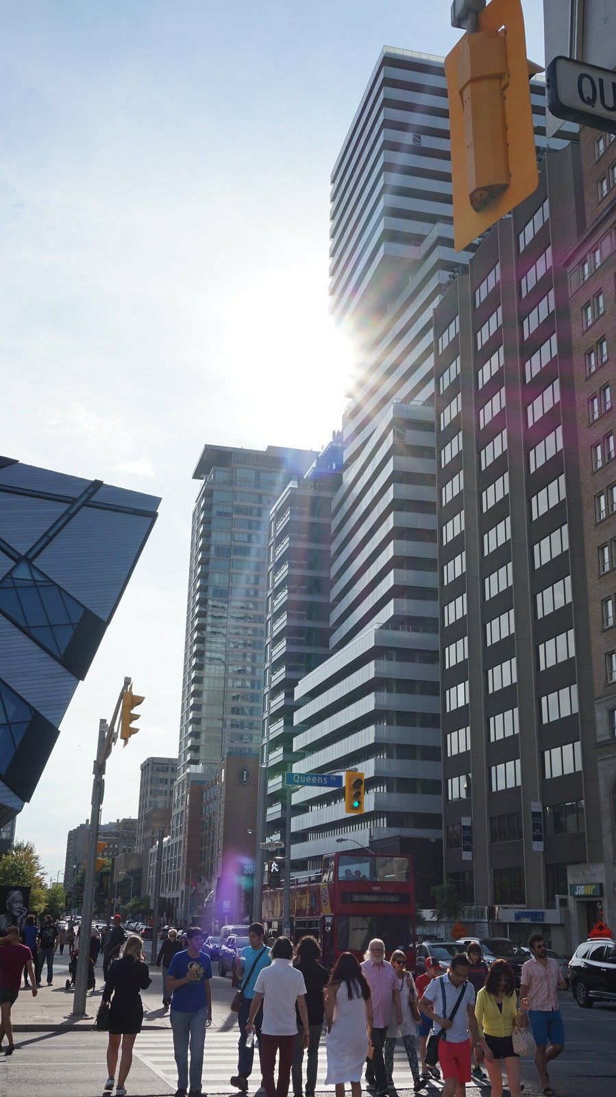
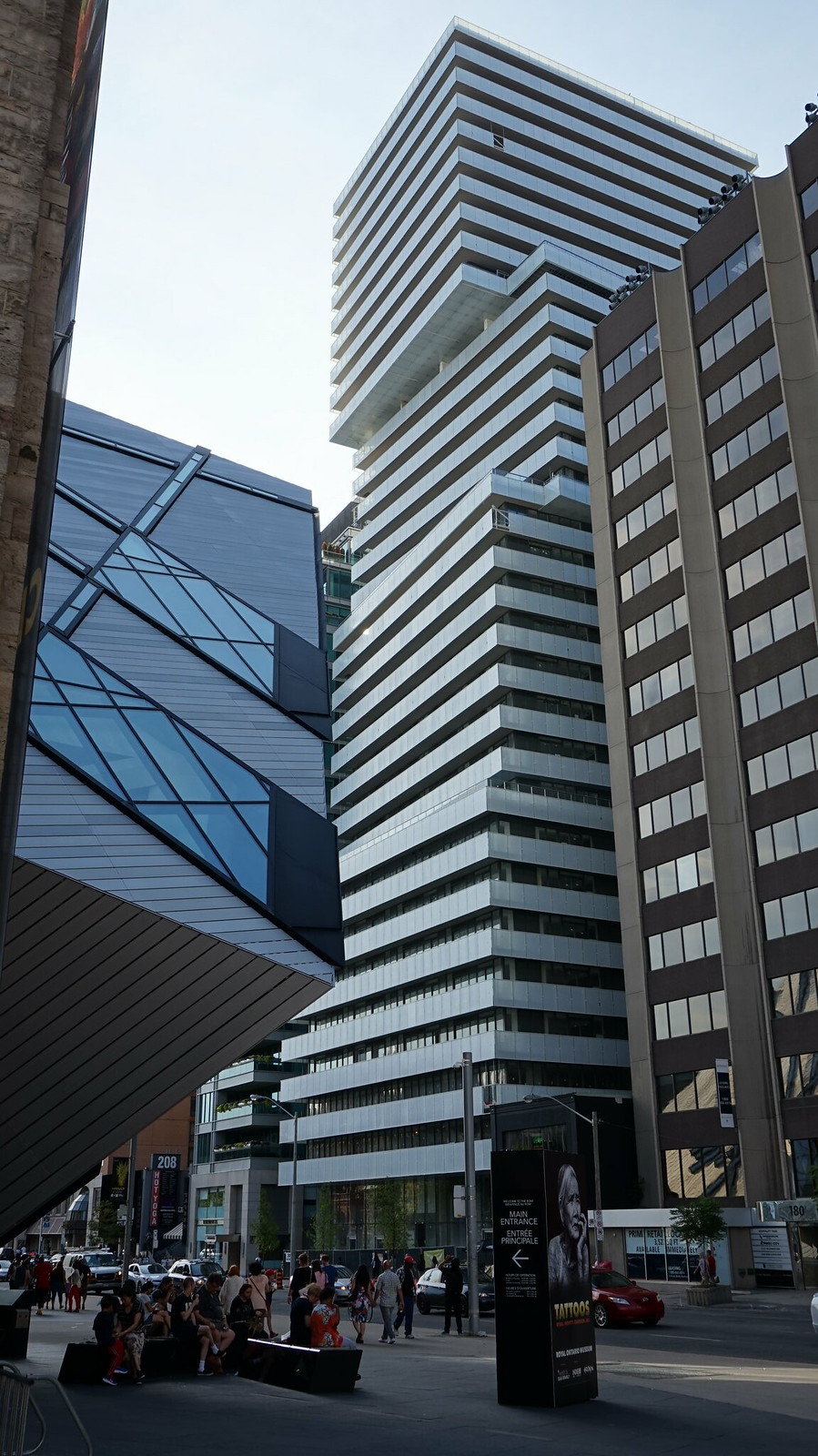
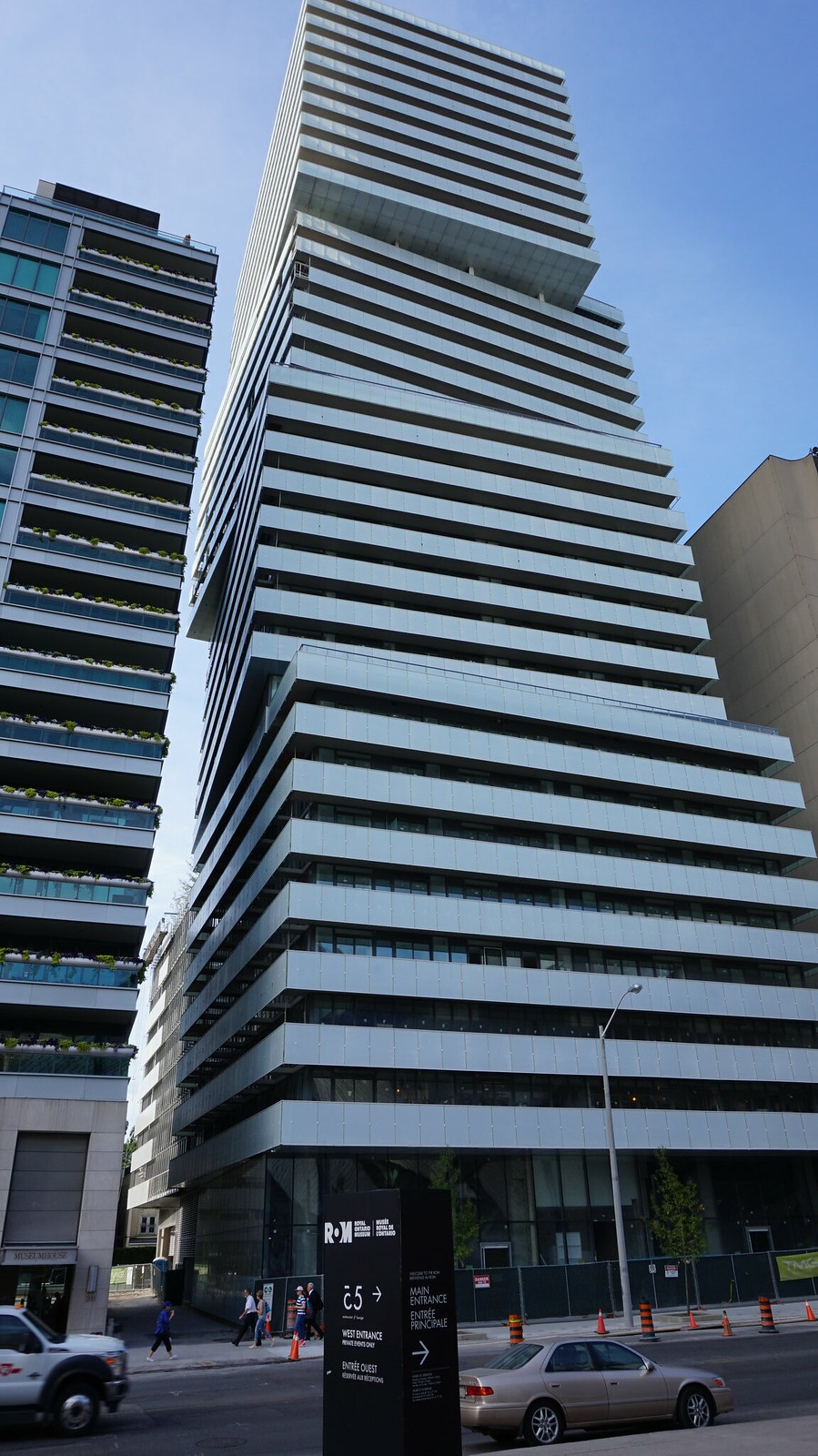
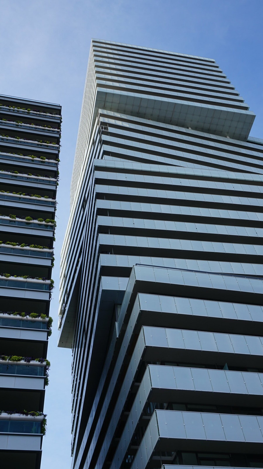
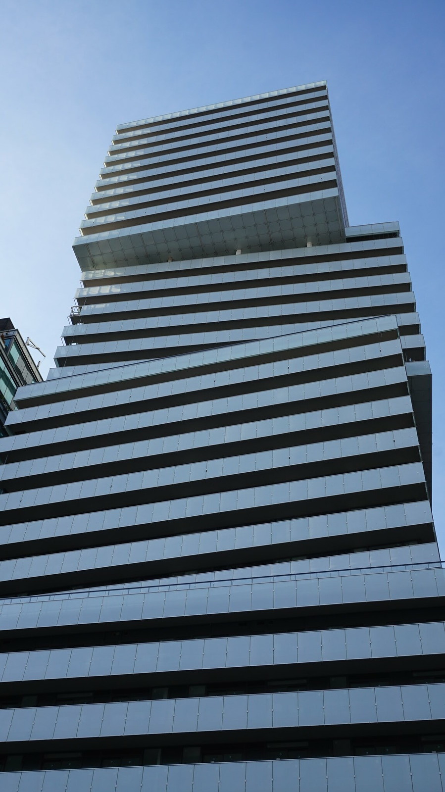
Yeah, I said something similar weeks ago--from a distance the eye, or at least my eye, can't pick up on the difference in depth of each of the blocks, so the building actually appears to be uniform and at that too indistinct. I think just using slightly different balcony glass would have fixed this. From the sides though, I really like it, and I think it fills in the streetwall here on Bloor really nicely.
 
If I were to describe this in one word it would be: awkward (but an awkwardness left to interpretation).
If you catch it from just the right angle, the setbacks and bulkiness of it add character to the otherwise dull stretch of Bloor street adjacent to the ROM. And despite the wealth of development along this stretch of the street in the past decade, this is the only one that contributes something architecturally memorable. (Yes, Museum House and One Bedford are both great on their own, but could have been built anywhere else).
That being said, there are other views where this looks shockingly out of place or scaled inappropriately, especially next to Museum House or anywhere that rear end (vertical parking booty) is visible.
From afar (like North on Avenue Road), where the setbacks appear more subtle, and its bulkiness is less apparent, is where I think it looks best.
 
A few more from this evening. Really growing on me.

Screen Shot 2016-07-19 at 8.52.57 PM.png


And already the best-looking above-grade parking structure of the city, and I imagine it'll look even better by the end of it.

Screen Shot 2016-07-19 at 8.54.10 PM.png


Screen Shot 2016-07-19 at 8.55.52 PM.png


And hoarding is down in front.

Screen Shot 2016-07-19 at 8.56.40 PM.png
 

Attachments

  • Screen Shot 2016-07-19 at 8.52.57 PM.png
    Screen Shot 2016-07-19 at 8.52.57 PM.png
    863.3 KB · Views: 2,296
  • Screen Shot 2016-07-19 at 8.54.10 PM.png
    Screen Shot 2016-07-19 at 8.54.10 PM.png
    1.6 MB · Views: 2,289
  • Screen Shot 2016-07-19 at 8.55.52 PM.png
    Screen Shot 2016-07-19 at 8.55.52 PM.png
    998.1 KB · Views: 2,310
  • Screen Shot 2016-07-19 at 8.56.40 PM.png
    Screen Shot 2016-07-19 at 8.56.40 PM.png
    1.4 MB · Views: 2,265
Garage getting additional cladding. I think I like it better without this cladding.

IMG_1165.JPG
IMG_1164.JPG
 

Attachments

  • IMG_1165.JPG
    IMG_1165.JPG
    336.6 KB · Views: 1,213
  • IMG_1164.JPG
    IMG_1164.JPG
    307.9 KB · Views: 1,221
Getting closer here, and rapidly becoming Instagram-friendly in the process.

Screen Shot 2016-08-21 at 6.35.09 PM.png


Screen Shot 2016-08-21 at 6.33.49 PM.png


Screen Shot 2016-08-21 at 6.32.47 PM.png
 

Attachments

  • Screen Shot 2016-08-21 at 6.32.47 PM.png
    Screen Shot 2016-08-21 at 6.32.47 PM.png
    634 KB · Views: 1,038
  • Screen Shot 2016-08-21 at 6.33.49 PM.png
    Screen Shot 2016-08-21 at 6.33.49 PM.png
    1.2 MB · Views: 1,055
  • Screen Shot 2016-08-21 at 6.35.09 PM.png
    Screen Shot 2016-08-21 at 6.35.09 PM.png
    872.1 KB · Views: 1,055

Back
Top