Toronto Eaton Centre (Ongoing Renewal) | ?m | ?s | Cadillac Fairview | Zeidler

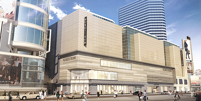
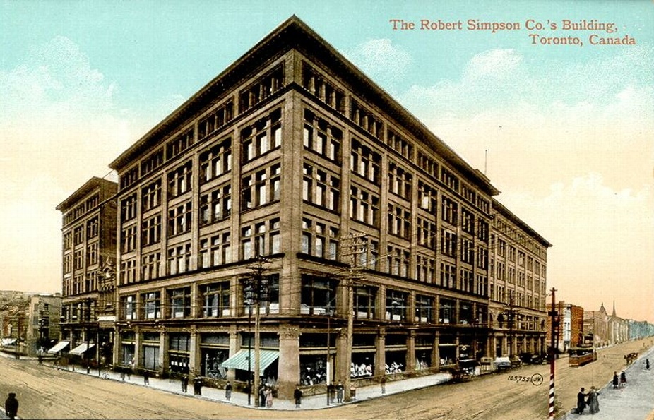
When the panels are lit up they look better. Or atleast less cheap. It's very flashy. Definitely a different aesthetic from those old pictures. I think it's suiting of the square though. Which is in no way classy and increasingly more flashy
 
I really don't like modern aesthetics for department stores. Given the scale involved they almost always end up with a hulking bunker-like presence more fit to be surrounded by suburban parking lots. I much prefer the whimsy and detail of more old-school type urban department stores. Architectural details, windows often to soften the mass, display windows fronting the street, and a certain stateliness are hallmarks that have been lost and not really successfully reinterpreted. funnily enough, I do feel the original Eaton's Centre design was more successful. Still prefer the old Simpson's store though!


Retail Insider posted a found rendering for the Nordstrom space.

1456100711336


Also worth noting, the rendering depicts an updated facade of 250 Yonge (the office tower above Roots). Anyone know if anything is planned here?
 
There are plenty of contemporary examples of department stores with engaging exteriors:

Liverpool - Mexico City
http://www.architectmagazine.com/design/buildings/liverpool-department-storeinsurgentes-designed-by-rojkind-arquitectos_o (personal favourite)

Galleria - Seoul
http://www.unstudio.com/projects/galleria-department-store

Selfridges - Birmingham
https://en.wikipedia.org/wiki/Selfridges_Building,_Birmingham

The current example just didn't bother to even try to be anything but a hackjob.

AoD
 
The current example just applies the Nordstrom template onto the part of the building the store is behind. CadFair haven't demonstrated the desire to push for cohesiveness over branding.

42
 
There are plenty of contemporary examples of department stores with engaging exteriors:

Liverpool - Mexico City
http://www.architectmagazine.com/design/buildings/liverpool-department-storeinsurgentes-designed-by-rojkind-arquitectos_o (personal favourite)

Galleria - Seoul
http://www.unstudio.com/projects/galleria-department-store

Selfridges - Birmingham
https://en.wikipedia.org/wiki/Selfridges_Building,_Birmingham

The current example just didn't bother to even try to be anything but a hackjob.

AoD


Those examples certainly offer bolder aesthetic gestures and better quality. In the end though I still feel that they share the same fundamental problem as the Nordstrom's mess in that they overwhelm their urban context somewhat. Once the novelty of the cladding wears off/becomes dated we are still left with a hulking mass (often blocks long in many cases). The traditional design language of department stores just seems to understand its setting better and mitigate the massing, regardless of specific differences in architectural style:

In all these examples there is strong horizontal and vertical flow, there is division of massing, architectural detail, lots of windows, lots of street presence and connectivity. They create street-wall in an engaging way, not destroying it. I feel that there's just got to be a way to translate this language to modern materials and aesthetics.


Simpsons_Department_Store_circa_1908.jpg


Sak's 5th Avenue

440px-SaksFifthAvenue.JPG


Harrod's:

Harrods-London.jpg


Galleries lafayette:

Galeries-Lafayette-Haussmann-facade.jpg


art-deco-derby-1.jpg
 
I rather like the new H&M. Reminds me of the lost World of Jeans (think that is what it was called)

You're right. We are all premature in our judgments. We can't really assess the new H&M until they've hung clothes over the entirety of the facade, like the old World of Jeans.

WEB-1998-99_unknownworldsbiggestjeanstoredundassqaure.jpg
 

Attachments

  • WEB-1998-99_unknownworldsbiggestjeanstoredundassqaure.jpg
    WEB-1998-99_unknownworldsbiggestjeanstoredundassqaure.jpg
    36.6 KB · Views: 1,004
Last edited:
Too much blank space on the upper levels of the Nordstrom facade, slap some big LED screens on there to liven things up.
 
Too much blank space on the upper levels of the Nordstrom facade, slap some big LED screens on there to liven things up.

Once Sears inevitably evicts the space, those upper floors might be given to either a Nordstrom expansion, another retailer or more office space with windows.
 
…I feel that there's just got to be a way to translate this language to modern materials and aesthetics.

Galleries lafayette:

Galeries-Lafayette-Haussmann-facade.jpg

Galeries LaFayette is far more beautiful on the inside than the outside and I'd be surprised if there's anything even close to holding a candle to it on this continent:

DSC09954.jpg
DSC09951.jpg
DSC09952.jpg
 

Attachments

  • DSC09954.jpg
    DSC09954.jpg
    1.7 MB · Views: 849
  • DSC09951.jpg
    DSC09951.jpg
    1.5 MB · Views: 814
  • DSC09952.jpg
    DSC09952.jpg
    1.6 MB · Views: 840

Back
Top