Last edited by a moderator:
You are using an out of date browser. It may not display this or other websites correctly.
You should upgrade or use an alternative browser.
You should upgrade or use an alternative browser.
Toronto East Pointe Condominiums | 39.93m | 11s | Mutual | Kohn
- Thread starter UT Admin
- Start date
CityPlanTO
New Member
OneCity
Senior Member
The previous plan was certainly more aesthetically pleasing. How are they able to regress on design. Very lackluster, uninspiring proposal for 2018
Last edited:
We should have been posting links to the front page stories about this building…
So, I have edited in a link in the first post for the story that went up at that time, and here's the more recent story looking at the revised plans.
In terms of aesthetically pleasing, @OneCity, unless you get into what it is about that you don't like, I'm not sure if I'm responding to your concerns… but, if you mean that it's all spandrelled window wall in the images, then yeah, that's something we are always sighing over, right? It's the least expensive way to clad a building, and when you're planning a boutique-sized condo in pretty far-flung eastern Scarborough, you have to charge less to sell your units than you do in Central Toronto. To charge less, you have to find ways to build for less. As much as UT types want everything to be top notch, most buildings in this city are going to be built inexpensively, especially out in the economic hinterlands.
Still, we should always push for better!
42
OneCity
Senior Member
It's a standard box with a hidden podium. The previous rendering had atleast a slight bit of movement in the tower with the floors set back and terraced on the way up. Better to keep the extra floor if the developer is just going to regress to a standard box I would never expect anything close to top notch here, but some effort in the design or imagination to leave a new legacy to build off of. This one isn't that bad but aside from the nicer street level retail feature the towers itself has lost some appeal and taken a step back
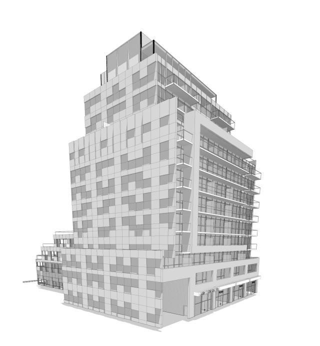
Vs.
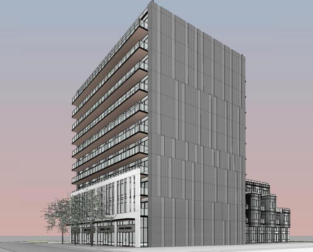
Vs.
Attachments
Last edited:
88drums
Active Member
Looks like an improvement to me, and not just at grade. When a building is doomed to cheap materials, I find that simpler designs are typically the lesser of two evils.
PMT
Senior Member
PMT
Senior Member
The Highland Condominiums: http://highlandcondos.ca/
PMT
Senior Member
Recommended for approval: https://www.toronto.ca/legdocs/mmis/2018/sc/bgrd/backgroundfile-116927.pdf
PMT
Senior Member
PMT
Senior Member
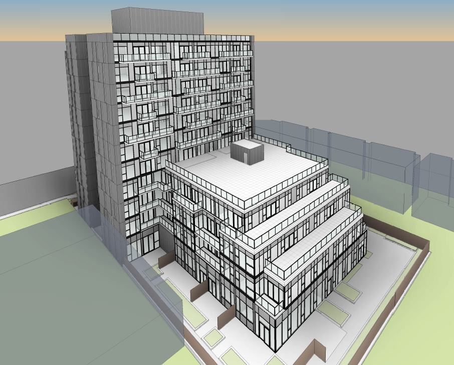
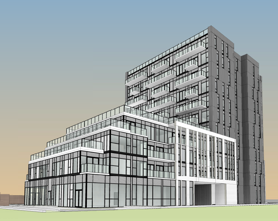
New docs posted January 28:
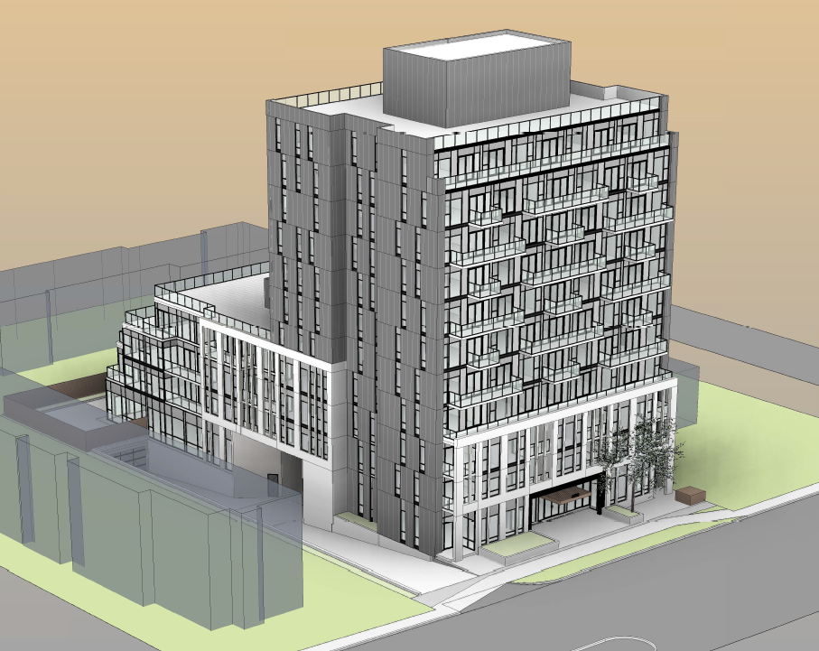
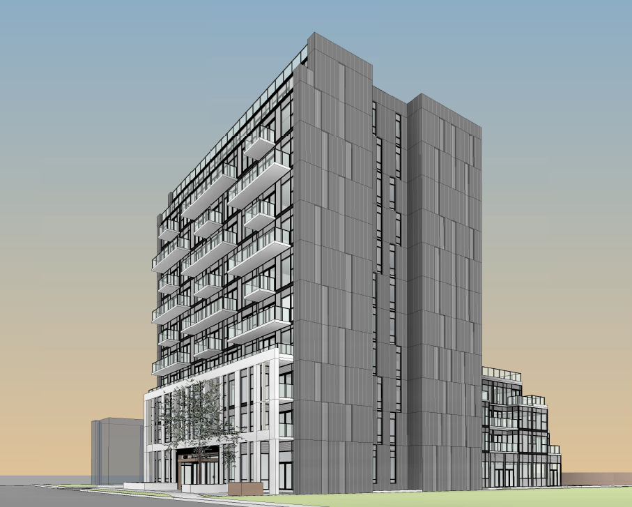
Northern Light
Superstar
That would make a fairly good detention facility.
AlbertC
Superstar
Login • Instagram
Welcome back to Instagram. Sign in to check out what your friends, family & interests have been capturing & sharing around the world.
 instagram.com
Undead
Senior Member
You know it's a crazy market when a one bedroom unit in a bad area is going for 400...
From today:
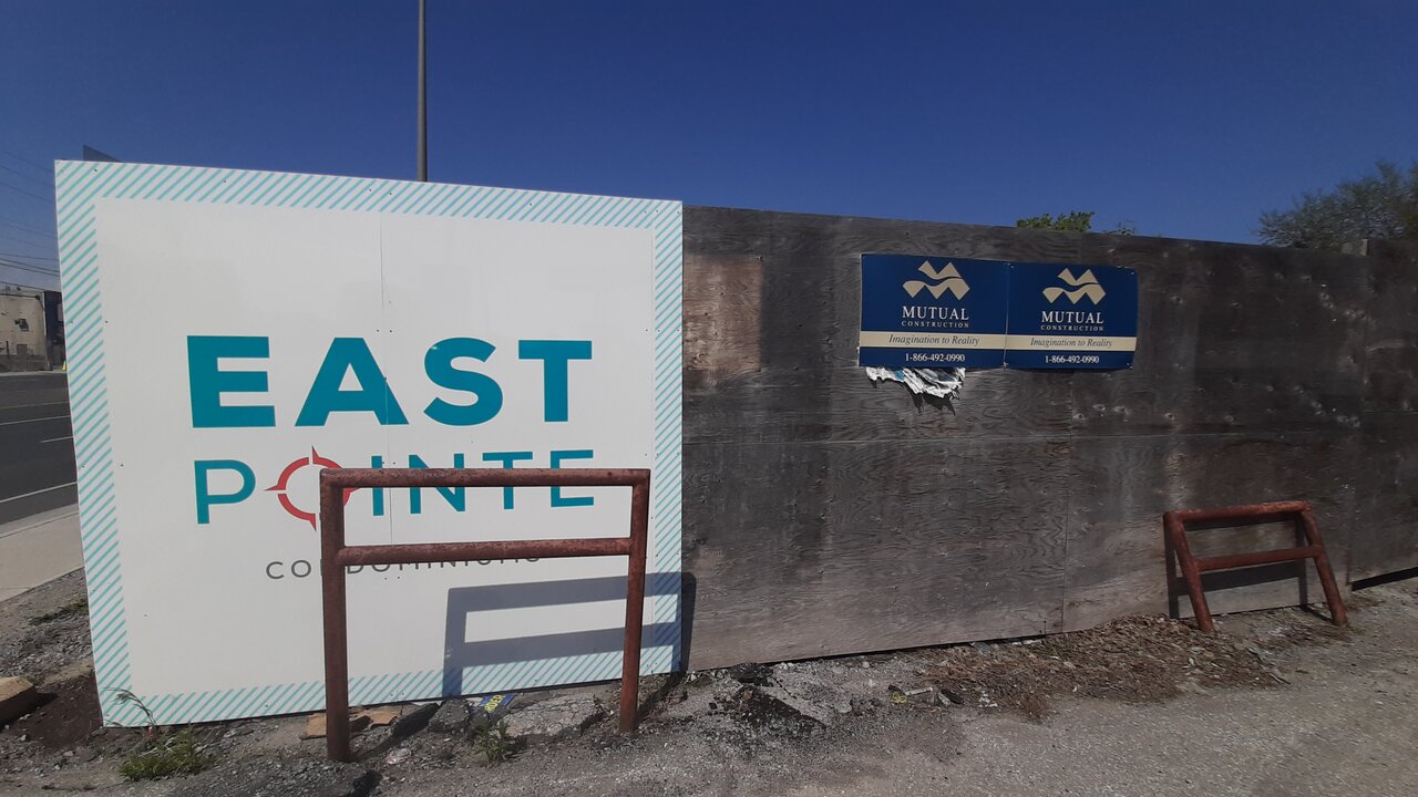
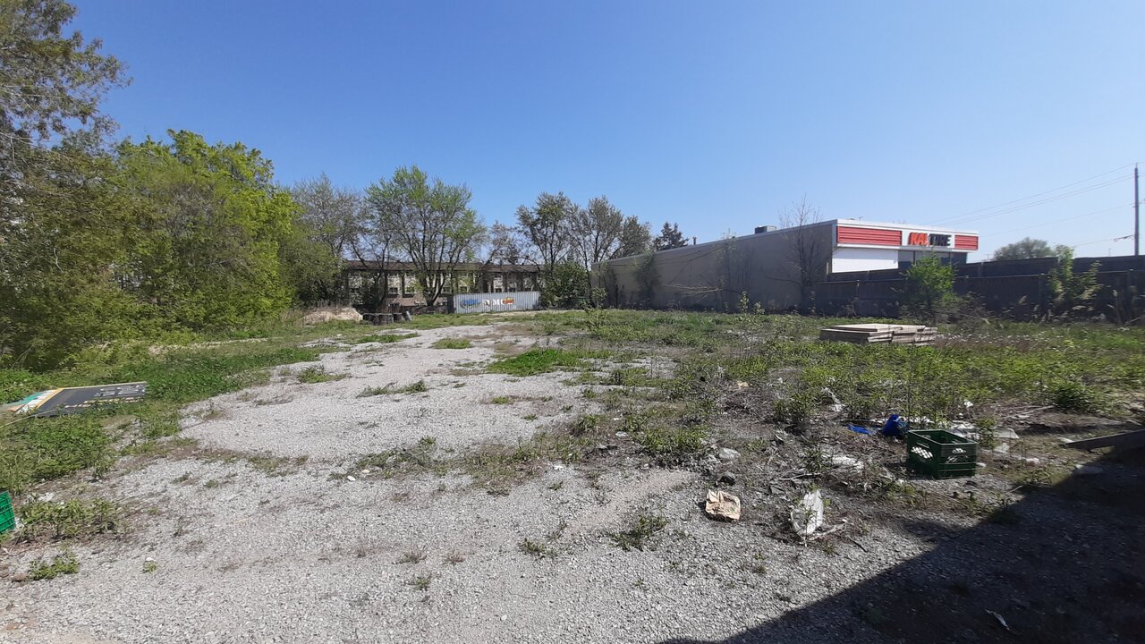
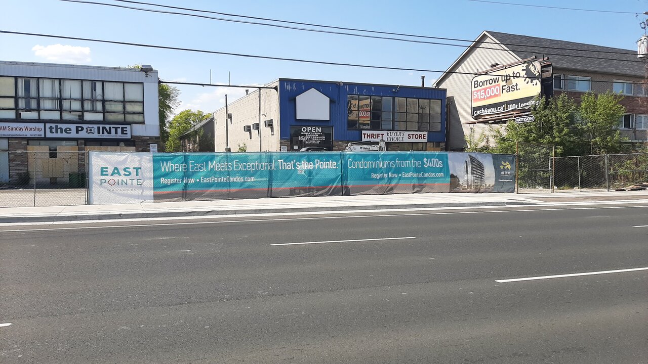
From today:
Patrick Wingert
New Member
I'm confused I am seeing photographs from two different sides of the street-facing each other. The one above is from the opposite side of the street where there is an empty lot and then there is this one?


