You are using an out of date browser. It may not display this or other websites correctly.
You should upgrade or use an alternative browser.
You should upgrade or use an alternative browser.
W. K. Lis
Superstar
junctionist
Senior Member
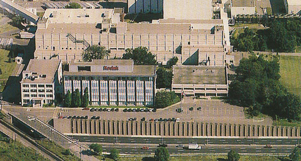
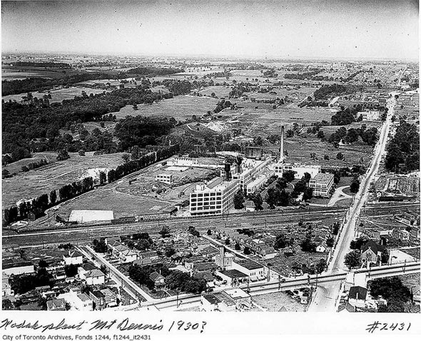
Kodak’s factory had so many buildings when it closed in the early 2000s that it resembled a small university campus. It was well invested in and maintained on the inside. It’s too bad it had to close.
EnviroTO
Senior Member
I focus on standards. I see a circular wheelchair accessible symbol, a new invention for lrt, and the word UP instead of an airport symbol.
sacred
Active Member
You’ve just delayed the Crosstown another year!!!View attachment 309502
I focus on standards. I see a circular wheelchair accessible symbol, a new invention for lrt, and the word UP instead of an airport symbol.
View attachment 309503View attachment 309504
W. K. Lis
Superstar
Your prints have come. Pick up at the Kodak employee recreation building 9.Kodak’s factory had so many buildings when it closed in the early 2000s that it resembled a small university campus. It was well invested in and maintained on the inside. It’s too bad it had to close.

From link.
Tunafish13
Active Member
New "next arrival" boards installed at Sloane and Victoria Park. These pictures are both from the Sloane stop, couldn't get the ones at VP.
p_xavier
Active Member
See Toronto? You're getting a light metro afterall with the Crosstown!I focus on standards. I see a circular wheelchair accessible symbol, a new invention for lrt, and the word UP instead of an airport symbol.
View attachment 309503View attachment 309504
TossYourJacket
Senior Member
I wish Metrolinx has just let the TTC do the signage for this line. As it stands, it doesn't match with Metrolinx's published standards, nor with the rest of the TTC. Just a total mess on all fronts.View attachment 309502
I focus on standards. I see a circular wheelchair accessible symbol, a new invention for lrt, and the word UP instead of an airport symbol.
View attachment 309503View attachment 309504
JSF-1
Active Member
Wow, Metrolinx not following its own guidlines? I am shocked I tell you! Shocked!!View attachment 309502
I focus on standards. I see a circular wheelchair accessible symbol, a new invention for lrt, and the word UP instead of an airport symbol.
View attachment 309503View attachment 309504
DirectionNorth
Active Member
Metrolinx sets standards for itself? Other than "hire more consultants?"I wish Metrolinx has just let the TTC do the signage for this line. As it stands, it doesn't match with Metrolinx's published standards, nor with the rest of the TTC. Just a total mess on all fronts.
EastYorkTTCFan
Senior Member
The person wasn't a consultant they were a wayfinding expert they hired. Then they also got a random group of people from Toronto and outside of the city along with local counsellors to all give the opinion on what symbolys the liked better. It still sounds just as dumb especially when they open up two new projects both the Ubnew Union station bus terminal and the new Kipling station terminal and use none of the wayfinding that they announced. So far all we have seen of it has been their stupid T logo on the crosstown that they are now using on Go bus stops but want everyone else to adopt it too.Metrolinx sets standards for itself? Other than "hire more consultants?"
Allandale25
Senior Member

Toronto and York Radial Railway Group | Saw this post this morning. | Facebook
Saw this post this morning.
 www.facebook.com
Johnny Au
Senior Member
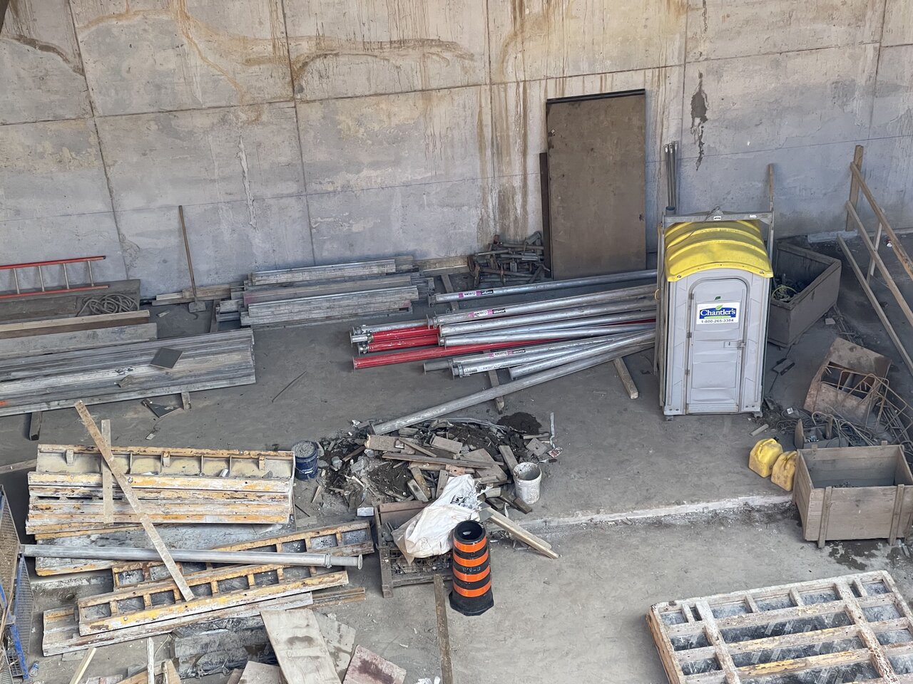
Cedarvale station on April 1, 2021:
Northwest corner:

Middle of Eglinton:

Under Eglinton:


North side:

Under south side:


Northwest corner:
Middle of Eglinton:
Under Eglinton:
North side:
Under south side:
toronto647
Active Member
Drove past Eglinton and Vic Park (O'Connor Stop) earlier today and noticed the "Next LRT Coming in X Mins" electric sign being installed. Was not able to take a picture but was pretty cool seeing the stop (hopefully) almost complete.


