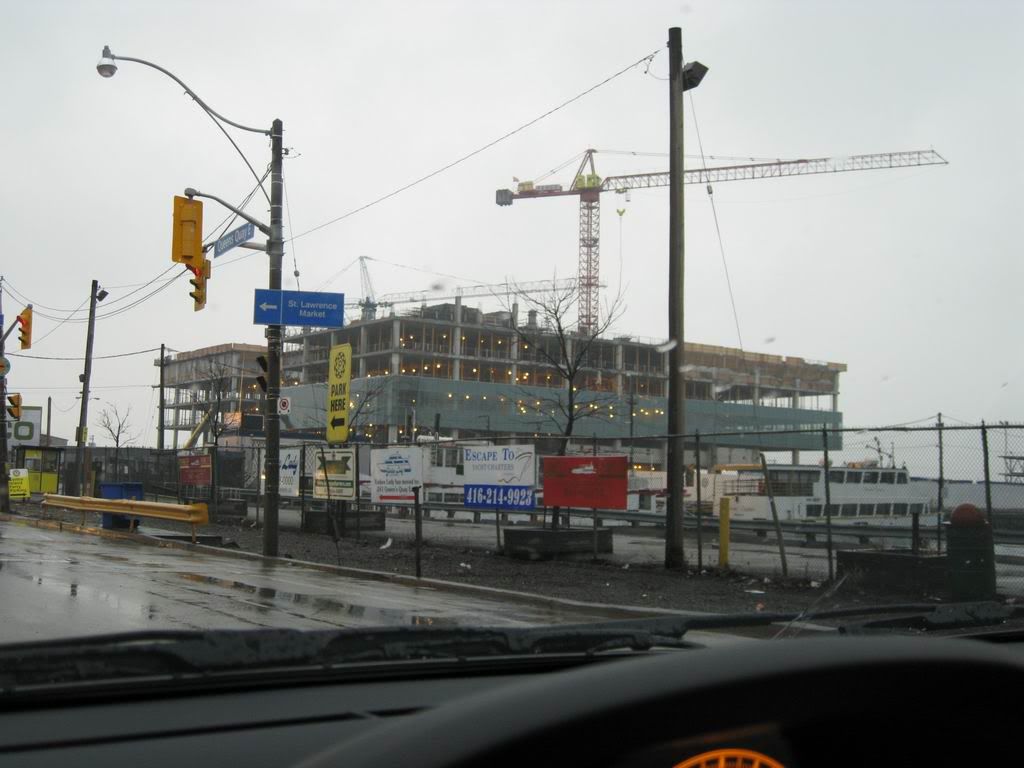
Toronto Corus Quay | ?m | 8s | Waterfront Toronto | Diamond Schmitt

Actually no - compared to the colour changes that take place with Diamond's opera house throughout the day it remains remarkably the same; deep blue doesn't hold the same optical properties as grey - which is, presumably, why Gehry used it. Check out some of the photos on this forum, which have captured the AGO south tower under different lighting conditions - ranging from overcast to bright and sunny - and you'll see that. Or go there in person.

I didn't say it say it has the same properties. I'm just saying the shades of blue can change dramatically. It doesn't remain basically the same.
 
Uh, no. The key word is "purpose-built", even in the mystery Project Symphony era. It was always intended for a media company, which is why it has studios and such.

Even the name "Project Symphony" evokes the idea of something more creative than a 905 office project for the waterfront.
 
Grey is the most versatile colour, made up of equal amounts of the primaries, and has a strong ability to shift in tone. It will, for instance, absorb a colour placed next to it and shift to the complementary colour of that colour, creating harmony through successive contrast.

While expressions of personal taste for other colours ( the bright red Cor-Ten steel planned for Filmport that Project End loves, for instance ... ) are passably interesting - as is grey's power to provoke a sense of moral outrage - this development uses colour differently ... and well.

Torontovibe's claim that "almost every single new building in this city is grey" isn't accurate. Look around.

Tewder sees Libeskind as some sort of knight on horseback riding in to liberate Torontonians from the evil clutches of a shadowy grey-lovin' architectural establishment - but ignores the fact that his Crystal's as grey as grey can be.
 
What about cladding that changes colour, based on the temperature and lighting conditions? So one day it appears magenta or vibrant green (to satisfy urbandreamer) while the next it turns grey or beige (for urbanshocker and the multitudes of Torontonians that don't know how to wear colour.)
 
UD: how about this? Look how the building changes its colours throughout the course of the day - not to mention how it interacts with the light and its surroundings creating a totally new experience.

UN studio, Amsterdam - La Defense Offices, Almere, Netherlands

5fc3cef2447a83b0dfcef9dff833ca49.jpg


2c7f1d29bd67a4eecd3cd308313c6322.jpg


64e69348ca4f05643db13d566261ac13.jpg


e445ef2f8485275231c3959b2154cf18.jpg


I can only imagine the reaction this building will illicit on this board- now if it were ever built here, god I think Urban Shocker might actually die from too much colour exposure!
 
However, I'd like to see some real cladding-"brick" that changes colour.

This sort of cladding material exists, just not here. In some parts of Europe and to some extent in Japan. I don't imagine it ever making its way to Canada, primarily due to costs associated with using it, but also due to most developers fear of using costly materials.

In the case of La Defense in Almere, Netherlands, UN Studio used a special glazing material: "These façades are clad with glass panels in which a multi- colored foil is integrated and, depending on the time of day and the angle of incidence, a variety of different colours are reflected, animating the courtyards."

Maybe someone can explain to me the reasoning behind this essential need or requirement that offices retain a grey and/or neutral palette? I am dumbfounded by the comments that due to this buildings designated purpose, that it must maintain a certain aesthetic, not to mention how people are in complete agreement of how an office must look. Its like a cow is cow because it mooh's; but it must be a cow because it mooh's and it can only be a cow because it mooh's, so therefore it must look like a cow when it mooh's. You dig?

p5
 
Grey is the most versatile colour, made up of equal amounts of the primaries, and has a strong ability to shift in tone. It will, for instance, absorb a colour placed next to it and shift to the complementary colour of that colour, creating harmony through successive contrast.

Grey is lovely. We can all embrace the grey. Other colours are lovely too, and can work in equally creative ways. Relying on grey, however, is the sin of relying on anything: safety.


Tewder sees Libeskind as some sort of knight on horseback riding in to liberate Torontonians from the evil clutches of a shadowy grey-lovin' architectural establishment - but ignores the fact that his Crystal's as grey as grey can be.

No, Libeskind liberates us from a constrained, 'boxy' line of thinking, and is a challenge to our own comfortable and settled preconceptions of a Toronto style. Yippee! Again, it's not about colour. Colour is simply one way in which we limit our design pallet.

I'm not an enemy of Diamond or Clewes or others working here either, by the way. I'm a fan of a lot of their work. However, I'm not going to discount colour or curves or, dare I say it, 'spectacle', just because it is beyond the aesthetic sensibilities of some 'establishment' architects working now in Toronto. Why on earth would I?

It's interesting that outside architects coming to work in Toronto feel such a pull to use colour and boldness in their designs here. Perhaps it is the objectivity of those not native to our context who see clearly the impact these elements will have.
 
Which outside architects? And what colours are they using that we're not? OCAD's tabletop is black and white, the Crystal is grey, Grad House is grey, only the AGO's south tower isn't - but blue isn't a colour that local architects aren't using. They bathe the surfaces of their buildings in bright colours too, on occasion - check out the Kearns Mancini addition to George Brown, or Hariri Pontarini's Waterloo Pharmacy building.

There are no Forbidden Colours - just colour poorly used, or used well. Relying on bright colour to add spectacle to a lacklustre design won't improve it, and is a lazy approach. It's also reasonable to hold up the Waterloo Pharmacy building as an example of how overdesigning something ( in this case applying chintz ... ) adds nothing to a building that's already quite handsome.

Toronto has taken Libeskind, Gehry, Mayne and Alsop in its stride.
 
... What colours are they using that we're not? OCAD's tabletop is black and white...

Have you seen the legs of OCAD?

1243449500_11b632775e.jpg


There are no Forbidden Colours - just colour poorly used, or used well. Relying on bright colour to add spectacle to a lacklustre design won't improve it, and is a lazy approach. It's also reasonable to hold up the Waterloo Pharmacy building as an example of how overdesigning something ( in this case applying chintz ... ) adds nothing to a building that's already quite handsome..

It goes without saying that poor use of colour or form or any design element is simply bad design. In a Toronto context, however, the good use of colour and form is welcomed and very effective in our landscape of tasteful grey and black boxes. Notable exceptions only prove the point.
 
March 7 2009 update

the very wet Corus under construction ...

IMG_3479.jpg
 
I question how much influence a few local buildings designed by starchitects will have on Toronto style. The idea that Libeskind has liberated us from a constrained 'boxy' line of thinking, for instance, implies that we're going to see non-rectilinear buildings popping up all over town.

While the Crystal provides the ROM with a practical north wing, and some great interior spaces, it went way over budget and was enormously wasteful of building materials for a comparatively small addition of display space. I doubt if many architects see it as an influential model for anything they'd want to build locally.

The AGO's Galleria Italia is also a great space, but it is architecture about architecture - stand at one end, look along it ... and you see floor-to-ceiling Douglas fir glulam beams - not the city outside. But boldness of design can be practical, too - consider the Toronto style City Room where the glass gives panoramic views connecting you to the outside wherever you stand. There is much to be said for understated and practical solutions - indeed, it's worth noting that all Gehry's other AGO galleries are 'comfortable and settled' and 'boxy' - as are the classrooms in the OCAD tabletop.
 
"Its like a cow is cow because it mooh's; but it must be a cow because it mooh's and it can only be a cow because it mooh's, so therefore it must look like a cow when it mooh's. You dig?"

This building is designed to serve the host, corus entertainment. To put it in perspective it's design and aesthetic, while certainly an interesting and relevant topic is at most of incedental concern in the larger picture. So yes, it is kind of like focusing on the mooh when discussing the cow.

I agree that buildings need not be constraint by convention but they don't need to be constraint by innovation either. How you view this really depends on the boundary conditions in my opinion. What I mean is that everyone filters their view through their own interests and self-interests. Some will focus on the building in isolation, others on the building in it's context, others on the details or interiors or for users, the aesthetics impact on functionality.
 

Back
Top