Toronto Corus Quay | ?m | 8s | Waterfront Toronto | Diamond Schmitt

Corus not looking to bad from the waterfront.
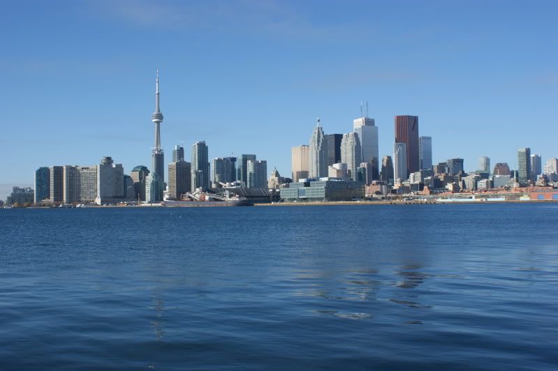
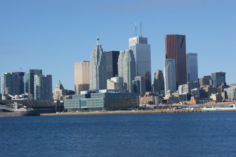
November142009266.jpg


November142009269.jpg
 
I often scratch my head and wonder what happened, how was this allowed to happen and who is responsible. It's probably best I don't open this thread very often.
 
Oh man it`s so horrible. What a mistake this has turned out to be. It would look okay in a business park, fronting a main street, but not on the lake at all.
 
It's not offensive. But it's nothing special.

I actually really wish it had a nautical white form on its roof instead of the mechanical boxes, like that of a Corbusier design... like on the roof of Villa Savoye.
 
It's not offensive. But it's nothing special.

I actually really wish it had a nautical white form on its roof instead of the mechanical boxes, like that of a Corbusier design... like on the roof of Villa Savoye.

I think it's offensive, well, unless you're into Danny Devito. (short and fat) This box just looks too bulky, even from a distance. The colour doesn't help. Maybe if it was clear glass and transparent, it's bulkiness might not be so overwhelming. I'm sorry but this is another mistake by the lake. Critics will not be kind to this structure, I predict. (well, besides US, who probably also thinks Danny Devito is one HOT, little bear lol)
 
I guess it doesn't bother me as much as others on the forum. Its short, true, but the area around it will be similar close to the water, and that is as it should be, a more human connection the water, instead of a wall of condos that block our connection. Its not the nicest looking building, but then again, it has a certain industrial look to it that I do like, and the space around it will really take away I think from many peoples hate of it, once those spaces are open. It fits with the eastside as it is presently, who knows how well it will fit once more east bayfront is u/c or completed.

Just my 2 cents...cheers!
 
How blessed are we to be granted this gift of colour-fullness from the almighty Jack Diamond.
 
It looked gorgeous in the waning light yesterday evening - so solid and substantial - when I swept into Loblaws to buy provisions. The renderings don't do it justice.
 
It looked gorgeous in the waning light yesterday evening - so solid and substantial - when I swept into Loblaws to buy provisions. The renderings don't do it justice.

I agree, in person it is quite something to look at. It will even be better when Sugar Beach and the new waterside promenade is done.
 
I have to admit, it does look better up close, in person but gorgeous? That's not a word I would use to describe this building. lol
 
Seeing that UrbanShocker has never disagreed with one feature of one design by Jack Diamond, I don't think he was being sarcastic.

Considering this is one building of many to come on that stretch of waterfront, I don't think it needs to be an icon. I like it. How it contributes to street life up close will be important (eventually) and if they indeed cheapened out on the pedestrian experience factor, then I will be indeed upset. Priorities, people!
 

Back
Top