You are using an out of date browser. It may not display this or other websites correctly.
You should upgrade or use an alternative browser.
You should upgrade or use an alternative browser.
Toronto CIBC SQUARE | 241.39m | 50s | Hines | WilkinsonEyre
ushahid
Senior Member
ive been following that thread for over 2 years now and there are only a dozen towers that are better than CIBC Square. anyways i can only say that every person has the right to have an opinion. end of the story. 
although you didn't ask me the question, but if you go through the last 10 pages of this thread on skyscrapercity, CIBC Square will start looking generic

got it right
Active Member
When you go to a popular video on youtube there is always 5% who give a thumbs down even when it's a video that is logically impossible to dislike. I have examined those stats a number of times. You're a 5-percenter...no big deal....move on. For me, the question about the design, materials, street entrance, bridges etc is...what's NOT to like? I'm clearly with the majority.I don't follow architecture so I wouldn't know. My point is that this particular design doesn't seem to merit the adulation in this thread. It's not awful or anything. I think it looks fine. The praise is just overblown.
Last edited:
kotsy
Senior Member
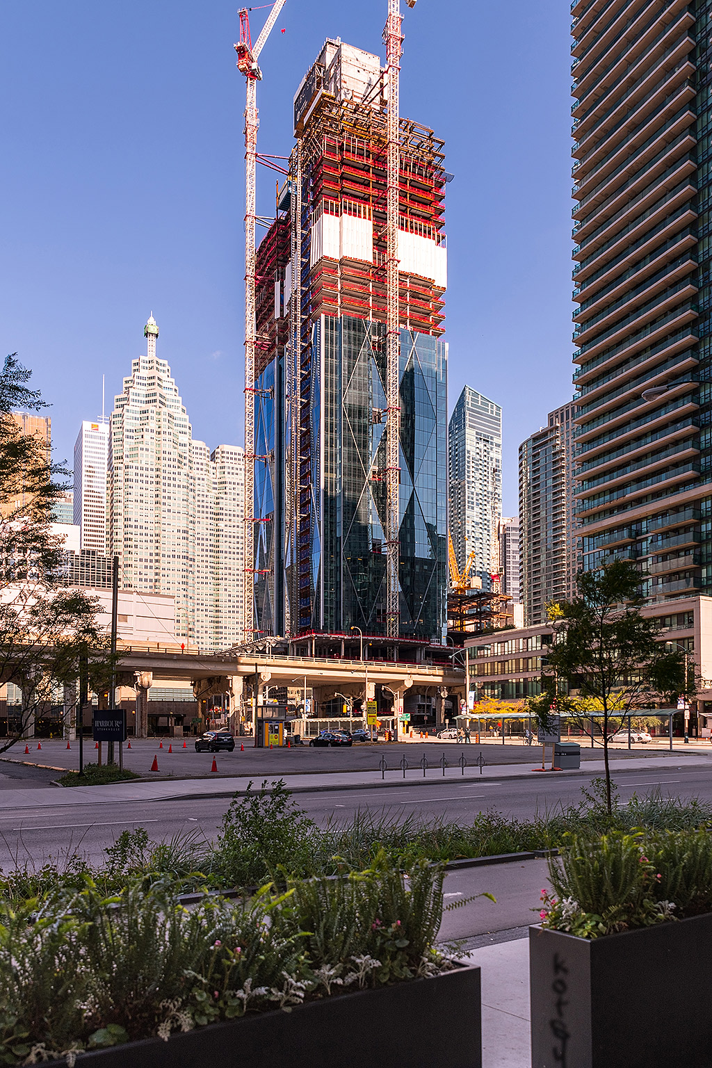
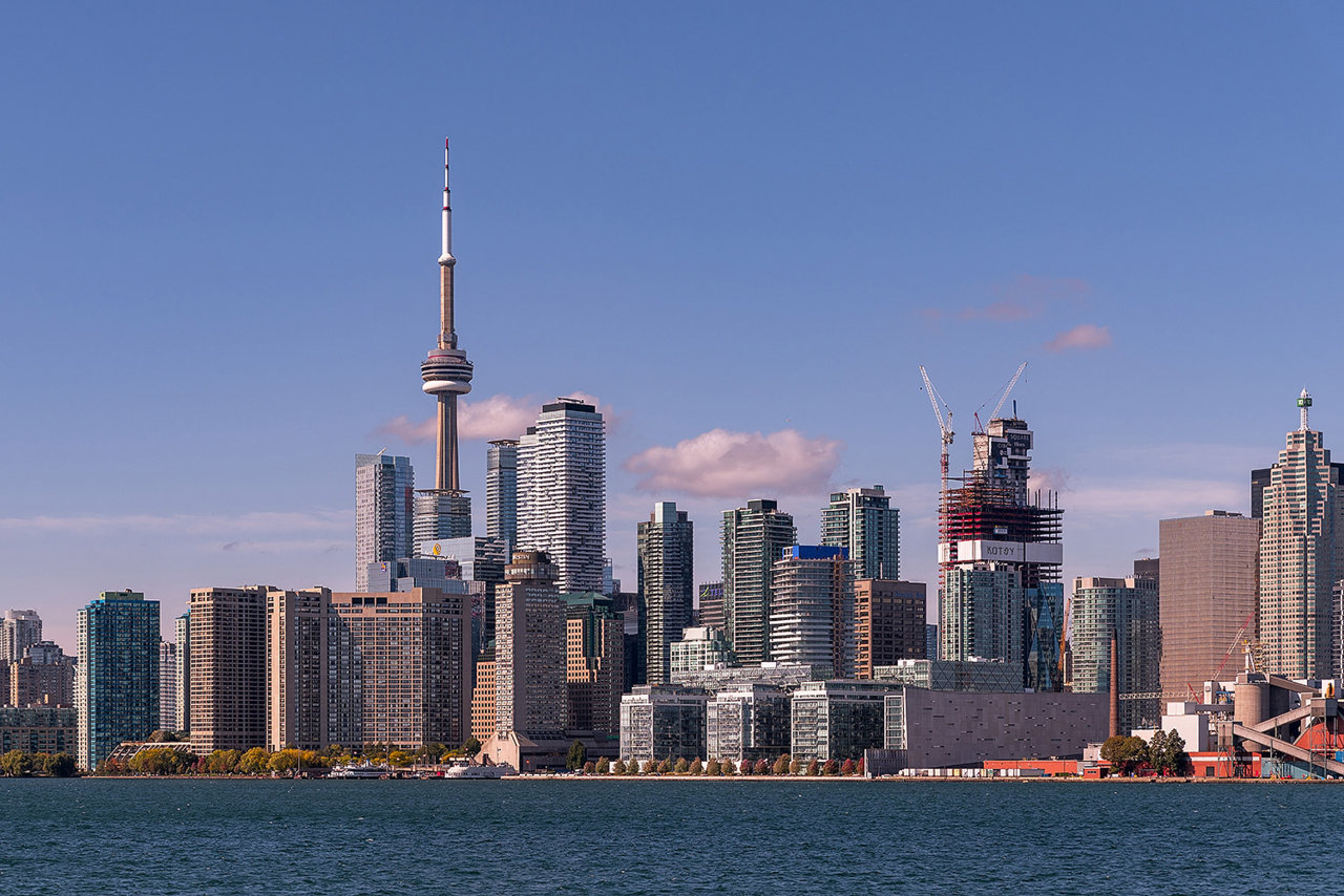
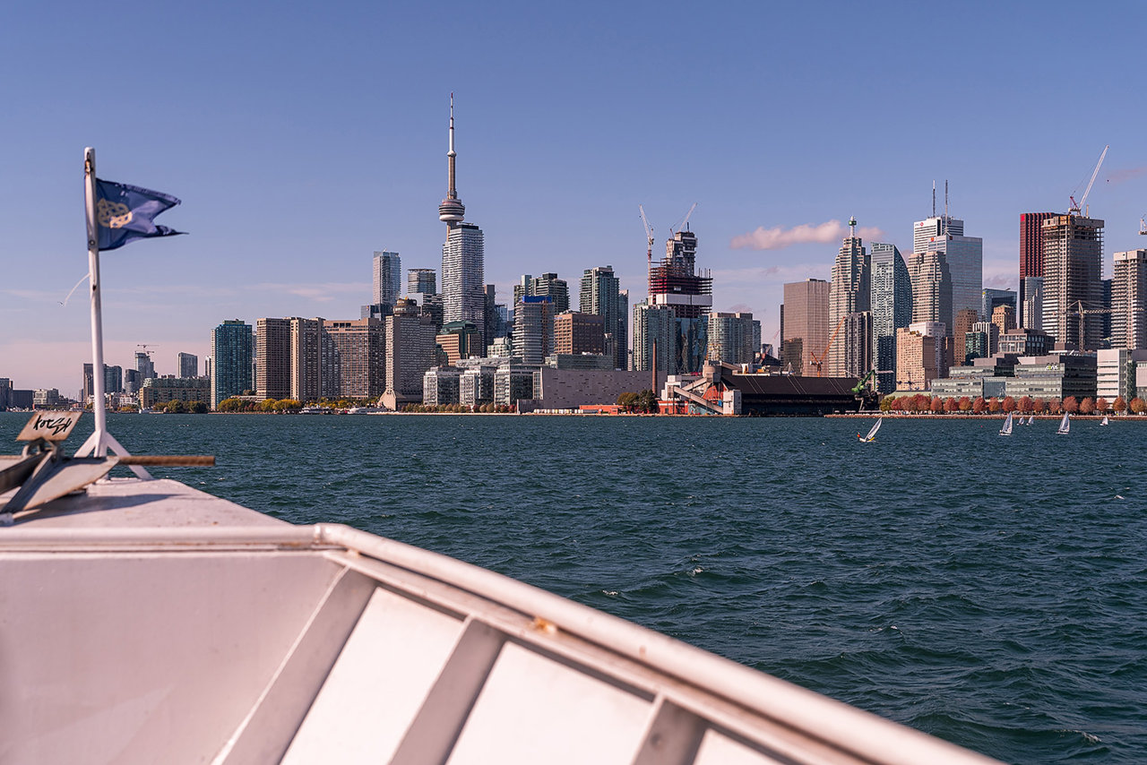
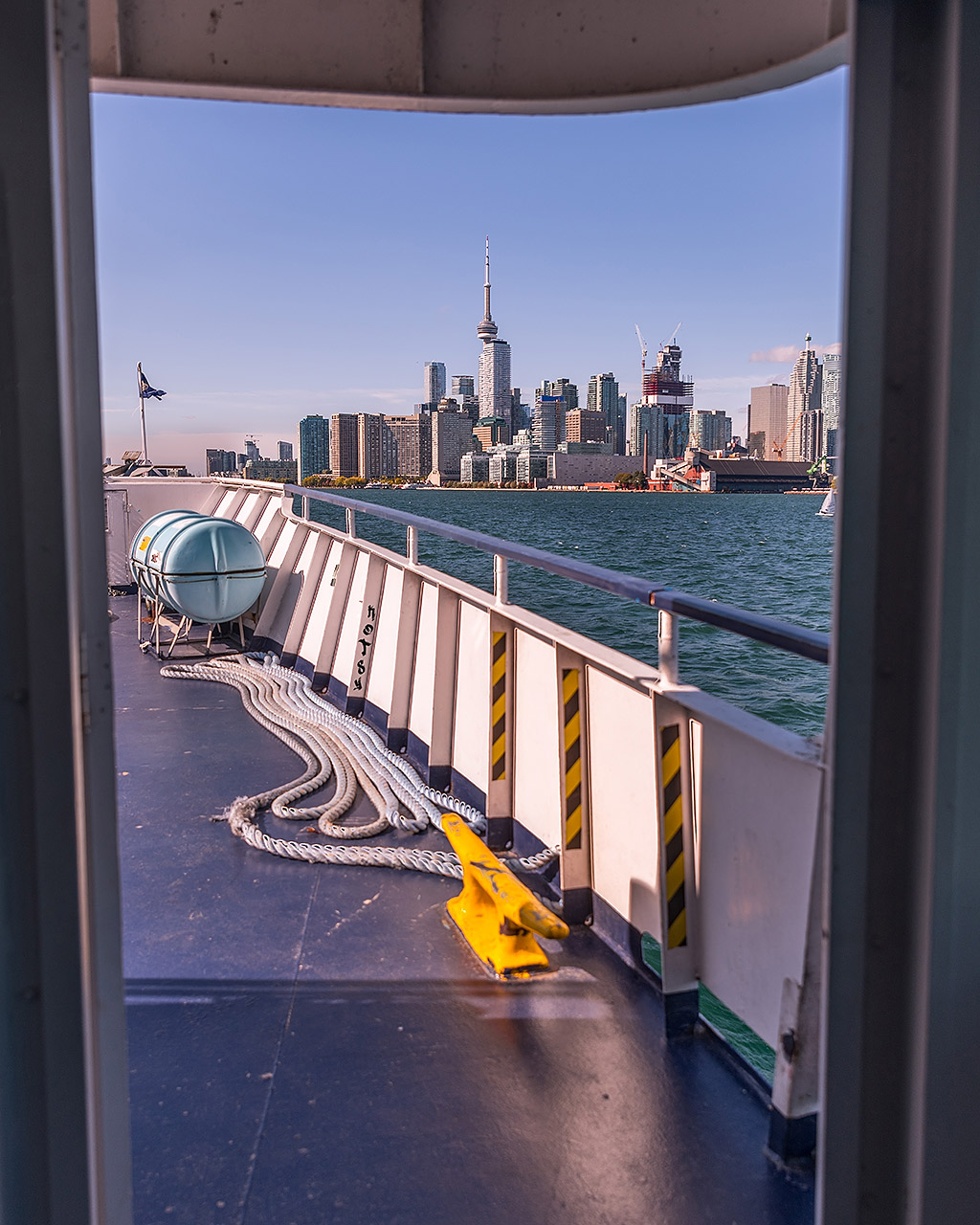
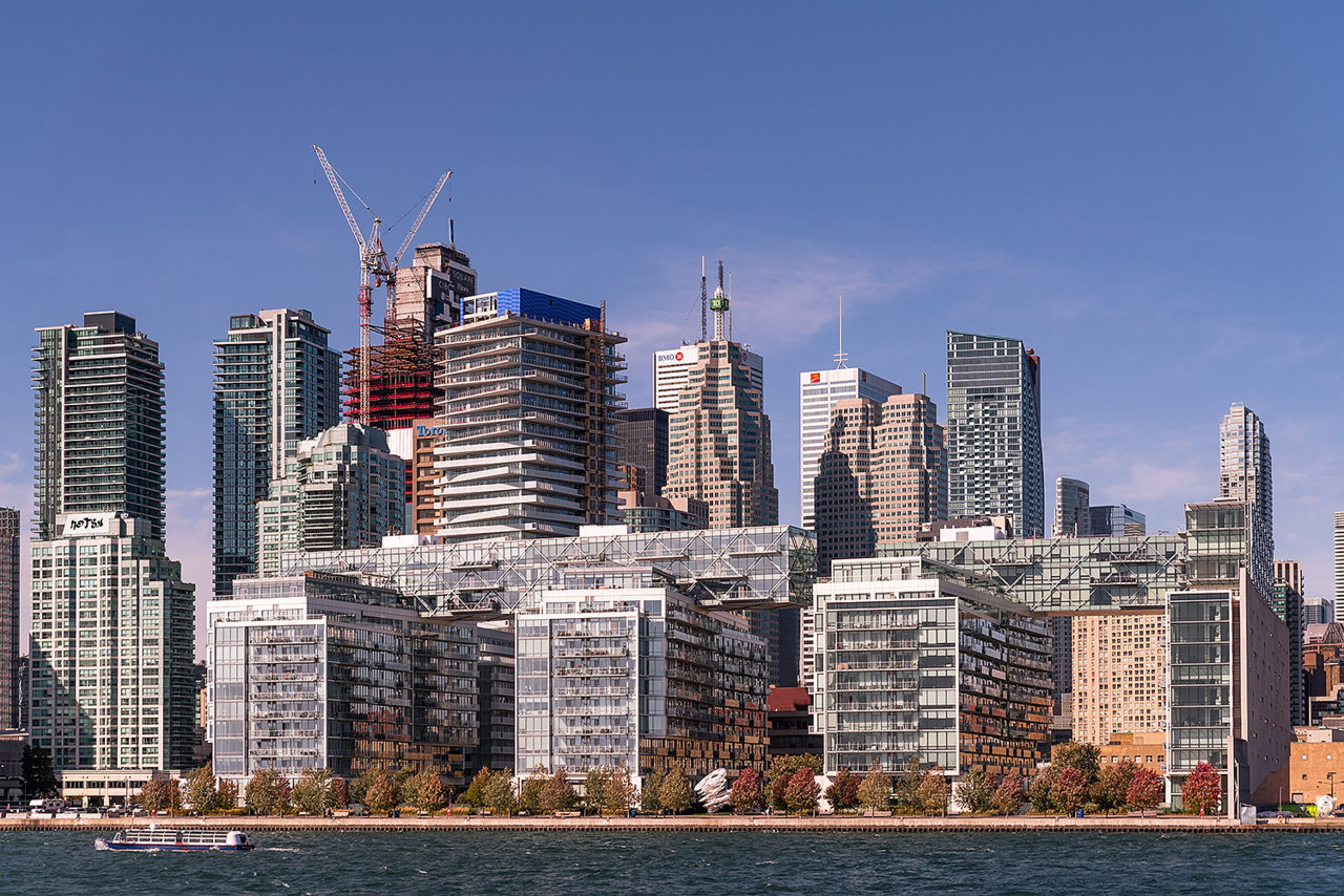
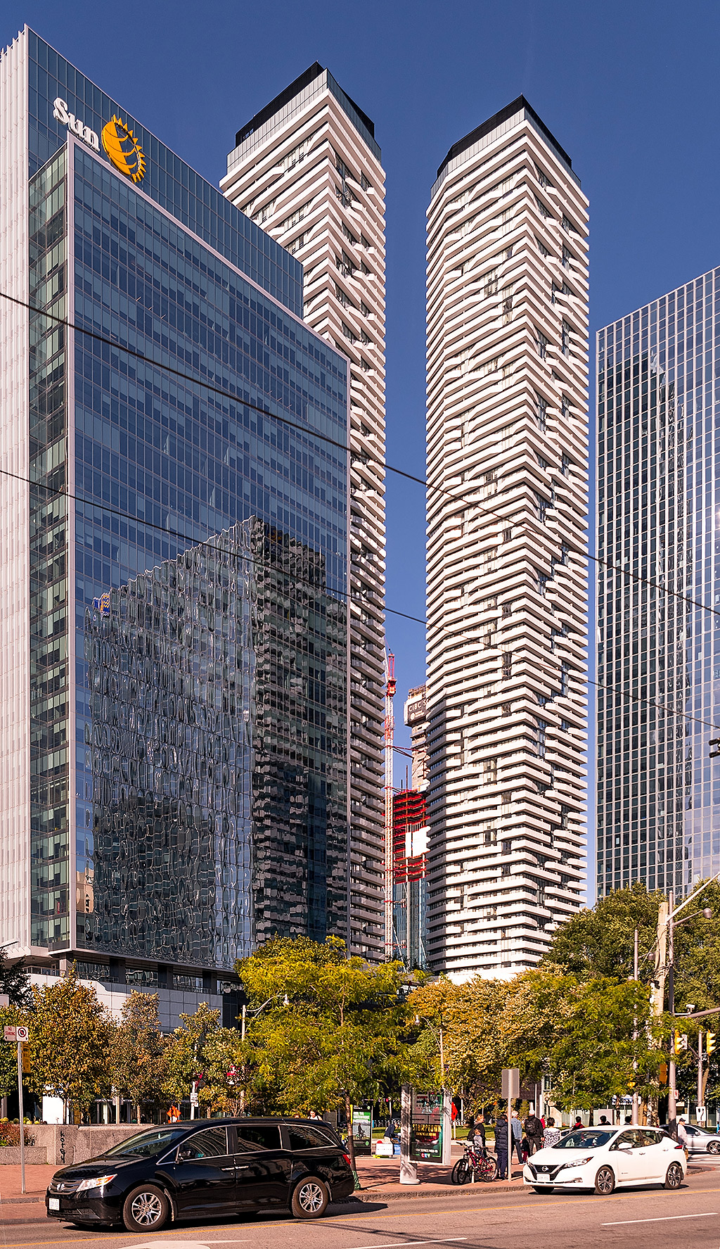
A handful from Thanksgiving Sunday
Last edited by a moderator:
Capslock
Active Member
The conversation about what's special about this project is an interesting one. It's of course subjective so no-one is obliged to love them. I'm with those who ask what's not to like however... As a rule I don't like towers that 'try too hard' with crazy shapes. Dubai is full of these and they are awful. These seem to be striking a nice balance so far.
That said, these towers are office buildings fundamentally, commercial in nature so built to make money. They were never going to be crazy floorplans or shaped like a pineapple. Despite those commercial roots, the facetted diamond facades give the skins a light-catching playfulness and character that personally I don't see anywhere in that thread Obsidian posted and give the building a motif that is certainly distinct from any other building in Toronto and probably further afield. On top of that, the final project also incorporates a new public park over the rail tracks, a new bus terminal, new bridges, and what the renders suggest will be a mighty impressive lobby. So worthy of adulation? Maybe not, but pretty darned classy looking so far.
They could be taller I guess.
It will be interesting to see how the crown turns out of course.
Otherwise, without derailing the thread I'd be interested to know what other currently under construction towers you prefer. I don't doubt there are good ones out there.
Neutrino
Senior Member
When you go to a popular video on youtube there is always 5% who give a thumbs down even when it's a video that is logically impossible to dislike. I have examined those stats a number of times. You're a 5-percenter...no big deal....move on. For me, the question about the design, materials, street entrance, bridges etc is...what's NOT to like? I'm clearly with the majority.
Of course, most people putting in time and effort to seek out content on the web are fans of said content. Most of the time. Otherwise, why bother? People are more inclined to seek "stuff" they already like, what groundbreaking insight. Also, the mere fact of belonging to a majority is not the be all and end all.
@Capslock I liked the Shard when I visited London. Yes, I know it's not under construction.
What's so funny @karledice
Last edited:
G.L.17
Senior Member
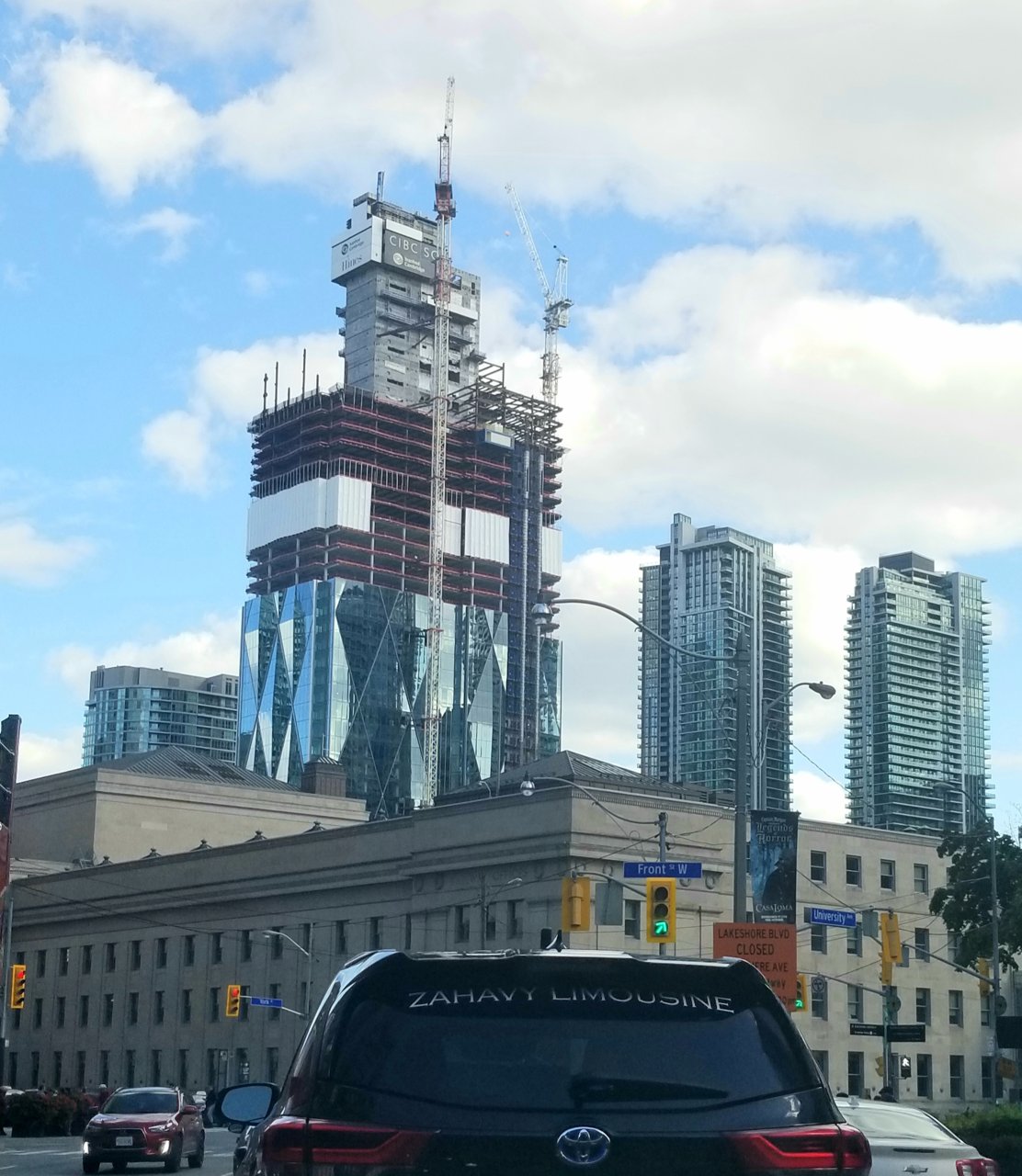
Monday afternoon:
3Dementia
Senior Member
https://urbantoronto.ca/forum/attachments/kot_8470-jpg.209320/
"Cluster shot of the month" - almost mitigates the loss of original core views ;-). Drama, density, growth... good T.O. marketing potential lol.
"Cluster shot of the month" - almost mitigates the loss of original core views ;-). Drama, density, growth... good T.O. marketing potential lol.
A Torontonian Now
Senior Member
Monday afternoon:
Too funny, I was right about to post this one from a similar angle, taken last week:
This project makes the core feel more three dimensional from in front of Union.
travis3000
Active Member
I think CIBC Square is stunning, in my opinion it's....
1) The nicest office tower project to go up in Toronto in the past 25 years
2) Among the top 3 nicest office towers to go up in Canada in the past 25 years
Everybody is of course entitled to their own opinions. There will always be people who disagree even on a topic with almost unanimous agreement.
Red Mars
Senior Member
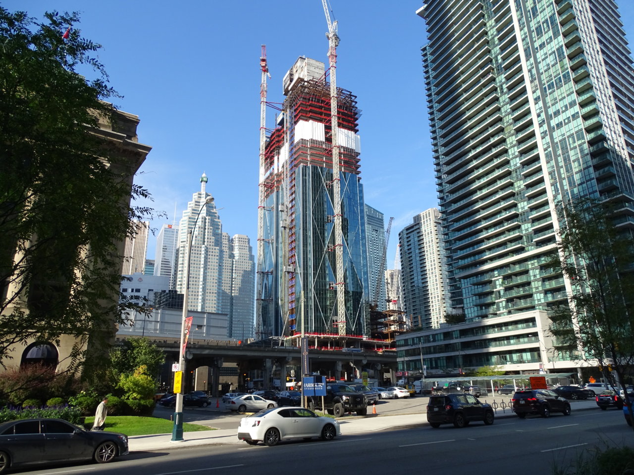
Oct 15, 2019
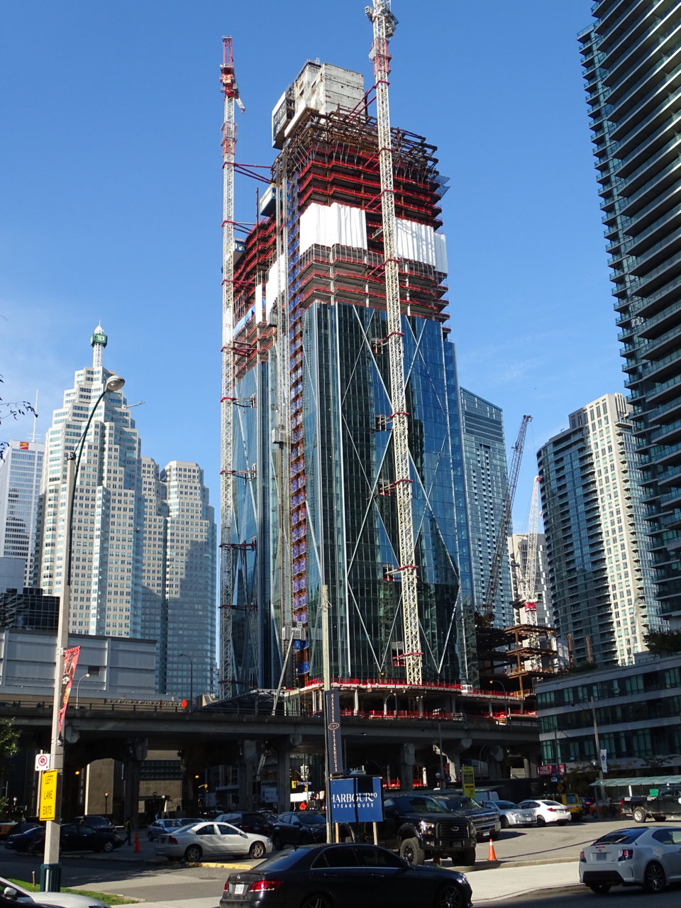
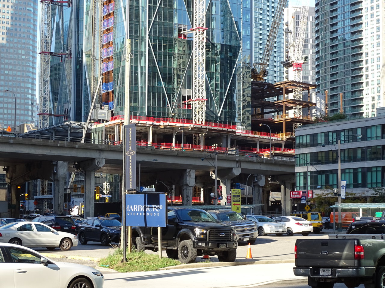
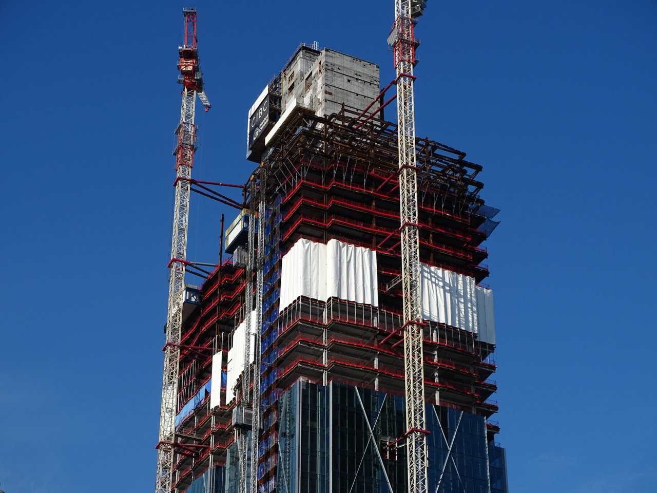
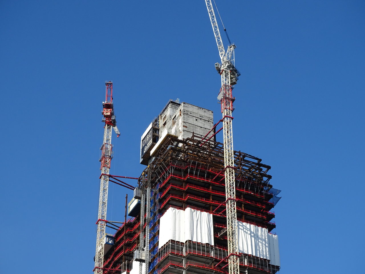
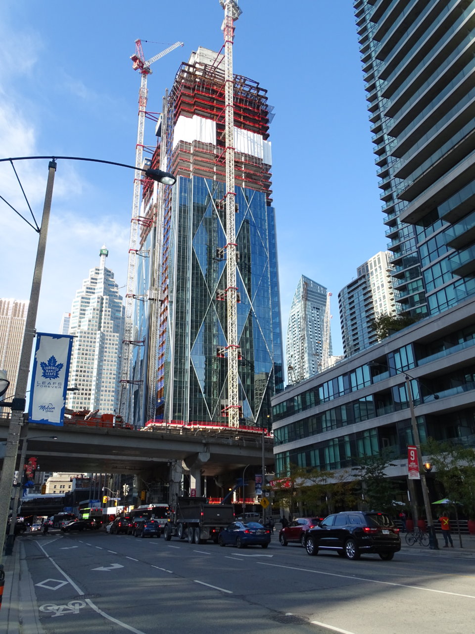
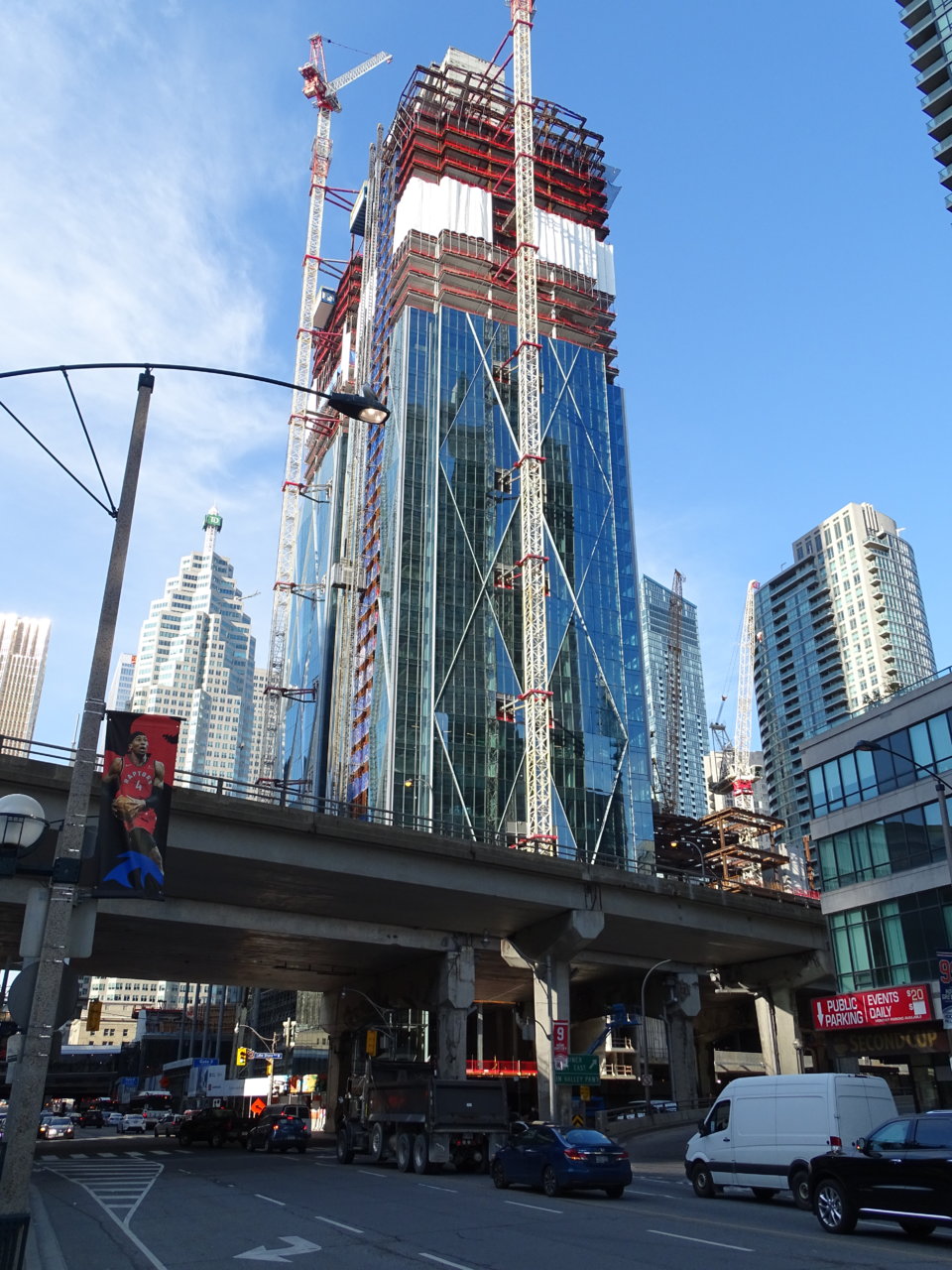
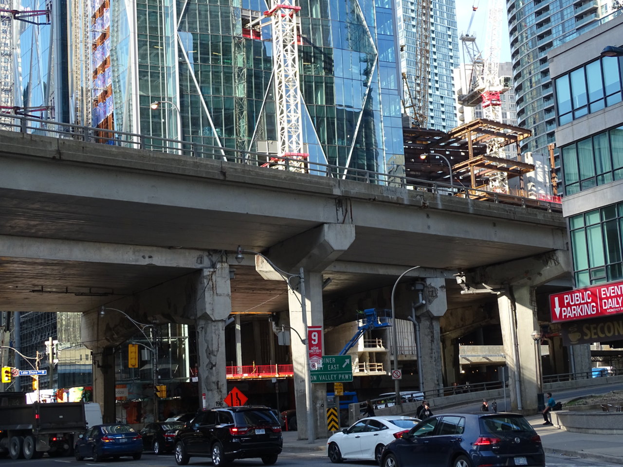
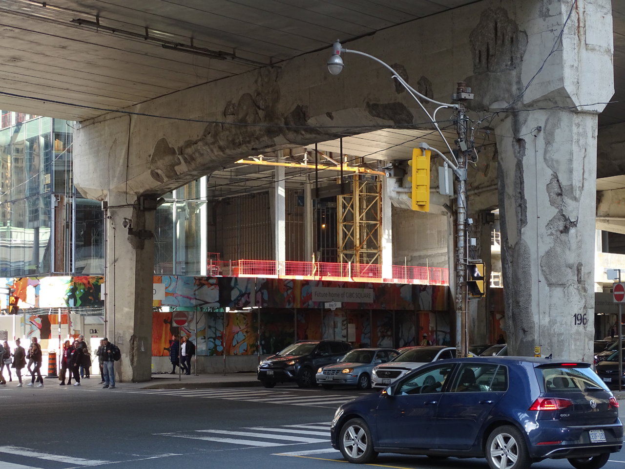
Neutrino
Senior Member
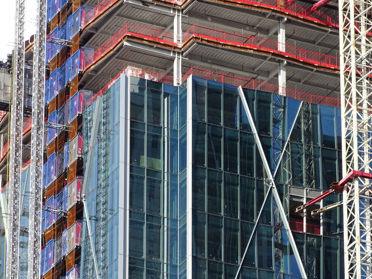
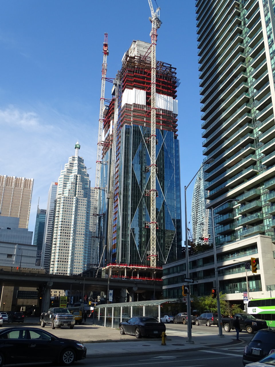
The girth is impressive, I'll give it that.
kotsy
Senior Member
condovo
Senior Member
OMG. It looks like the Gardiner's on the verge of collapse. (Maybe that' not a bad thing.)
Last edited:
skycandy
Senior Member
I find it an interesting question to analyze what we like about CIBC Square as well.
In a basic sense, yes it is a glass box. But since 99% of the planet's buildings are boxes, it's not surprising. I feel what makes this box special, besides the quality glazing and the interconnecting railway park (among other things) is:
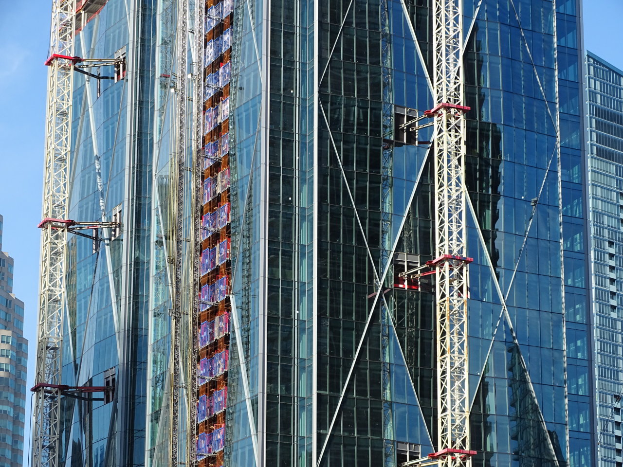
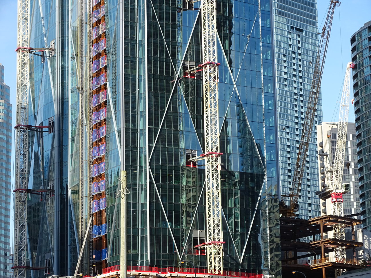
A) the fact the diamond motif is not just diagonal framing to create the effect, but an undulating surface of the entire tower. I admit I was somewhat gobsmacked initially upon seeing the angular steel frames which would support the undulating glazed facets we now see half way up the tower. I'd thought for sure they'd find a way to simplify it. But this wavy surface makes ALL the difference. Downward-facing facets reflect buildings, shadows, etc, while upward ones catch the mood of the sky. It's like an ever-changing Picasso! I see so many people gazing at it or snapping photos even at this early juncture.
B) Let's talk about the lighting. I spent a little time today and estimated the number of spotlights. West and east faces: 276 spotlights per face. North and south sides: 144 lights per face. TOTAL for Phase One tower: 840 spotlights. Perhaps a similar number for Phase Two. I have a sense this will be utterly spectacular. Is there another building in Canada that has done this on a modern tower? (Glad to see The One is going a similar route). Even a car's headlights low beams can be seen for miles away (ever drive in the Prairies?). So I suspect each spotlight should light up the adjacent white framing pretty intensely then diminish as you get farther from each light. The overall effect could be stunning. Not gaudy or tacky but majestic. And after a snow storm or rain (if my garden spots are any indication), some steam should rise from each upward-facing spot to create yet another interesting moody effect for any passerby.
So yes, count me as one who is loving this....
Last edited: