Toronto Burano | ?m | 48s | Lanterra | a—A

Murano's box is relatively inoffensive next to some of the massive, cheaply clad structures we've seen in recent years. Yet it still detracts from the sleakness of the minimalist aesthetic.

Yes. I should have been clear, the mechanical penthouses on top of the two Murano buildings are just fine, as if they don't exist. My only qualm is they light them up at night (the north tower has been dark for about a month) and the lighting leaves a lot to be desired. That's my only quibble.
 
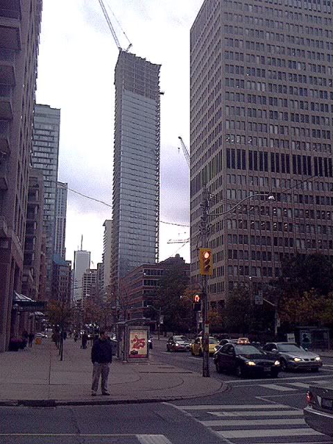
View up Bay St.

IMG00886-20111004-1453.jpg
IMG00885-20111004-1453.jpg
 

Attachments

  • IMG00886-20111004-1453.jpg
    IMG00886-20111004-1453.jpg
    62.1 KB · Views: 354
  • IMG00885-20111004-1453.jpg
    IMG00885-20111004-1453.jpg
    90.8 KB · Views: 361
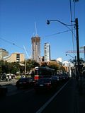
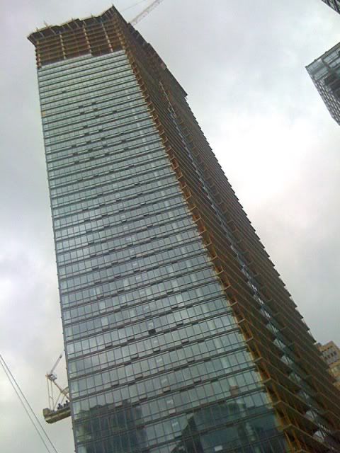
I was cycling home on Friday and grabbed an iPhone image of Burano from College & University. The sky was perfect, I couldn't resist

 
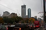
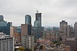
Oct. 12th (west side) from University & College & Oct. 13th (east side) from my POV, respectively. I didn't have time to zoom in and get a better shot of the east side, there were billions of those gnats flying in my face, eyes and mouth. This has got to be pretty much topped off now, except the mechanical level.

 
Just Another Tall Condo

I'm really on the fence so far with Burano but it's not a box so it gets bonus points from me for that alone. We'll see how it all turns out in the end, mainly how the integration with the reconstructed heritage structure fuses with glass.
 
IMO, Burano just fills in a massive hole on the west side of Bay Street, and makes the canyon that much better,
In my honest opinion, Burano definitely isn't the sexiest skyscraper, it's more of a rough, bulky (from certain angles), skyscraper... it'll look less awkward when more things are built around it.
 

Back
Top