Toronto Burano | ?m | 48s | Lanterra | a—A

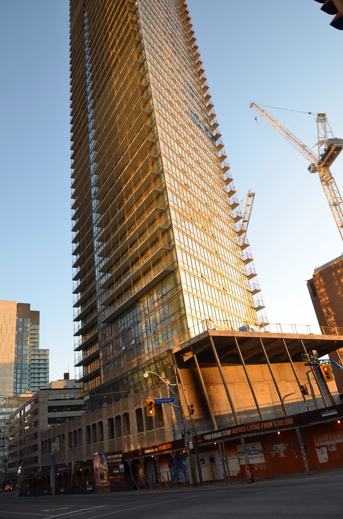
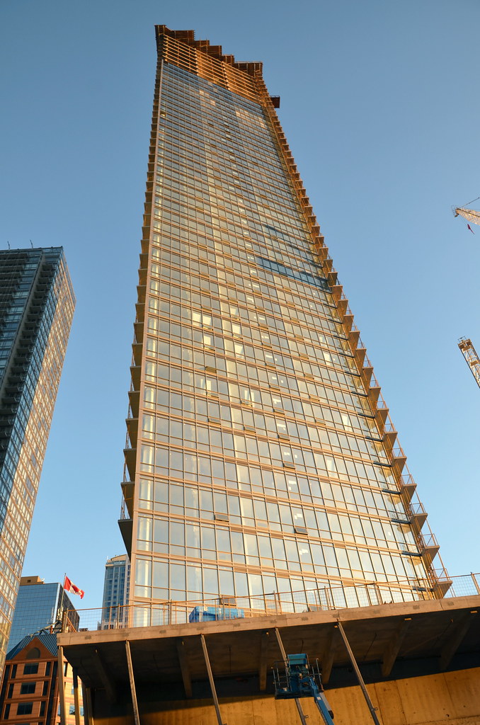
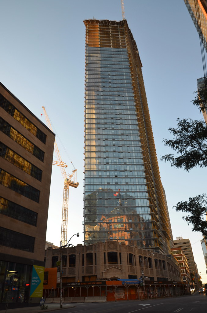
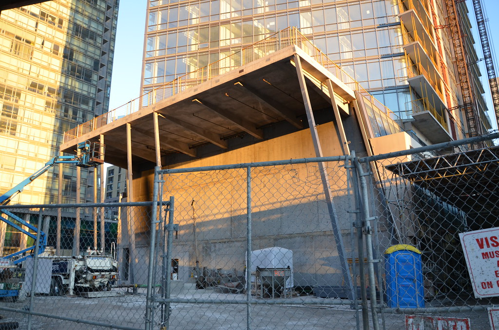
Most of the steel framing for the large glass atrium got installed. This is going to look impressive when it's all glassed in and the back wall gets its enormous piece of artwork! :D

6196879068_3e77ea0bde_z.jpg


6196880556_8c5e4697fa_z.jpg


6196881820_3ec90a6d65_z.jpg


6196883356_ff76dd6fc9_z.jpg


6196885148_3bf0d3a5f2_z.jpg


6196886494_6027cd1c3c_z.jpg


...and some renders to remind us what this will look like when complete :).


Mike in TO's cool photo above has inspired me to unleash a small batch of higher res renderings of Murano than have been available before. Enjoy these, and visit the home page for a fuller story tying recent photos to these images.

To start, here's a tall drink of Burano, seen from the north...

BuranoFullView.jpg


but let's focus on that lobby atrium with the cafe outside...

BuranoNorthStreetView.jpg


and take a closer look at the landmark artwork hanging behind the glass. Its creator is Sandro Martini of Milan.

BuranoBistroDetail.jpg


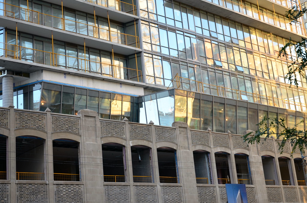
If we turn to the left we take in the view down Bay Street, and get a look at the intersection of the modern podium and the restored facade of the 1925-built McLaughlin Motors Building.

BuranoBayAtriumDetail.jpg
 
Last edited:
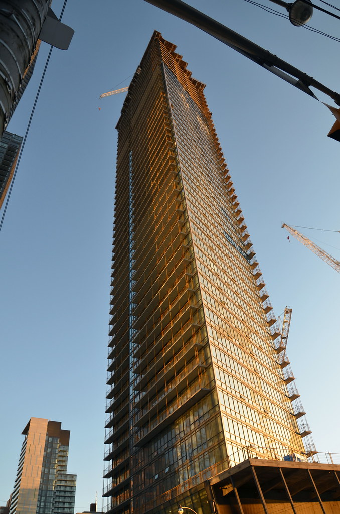
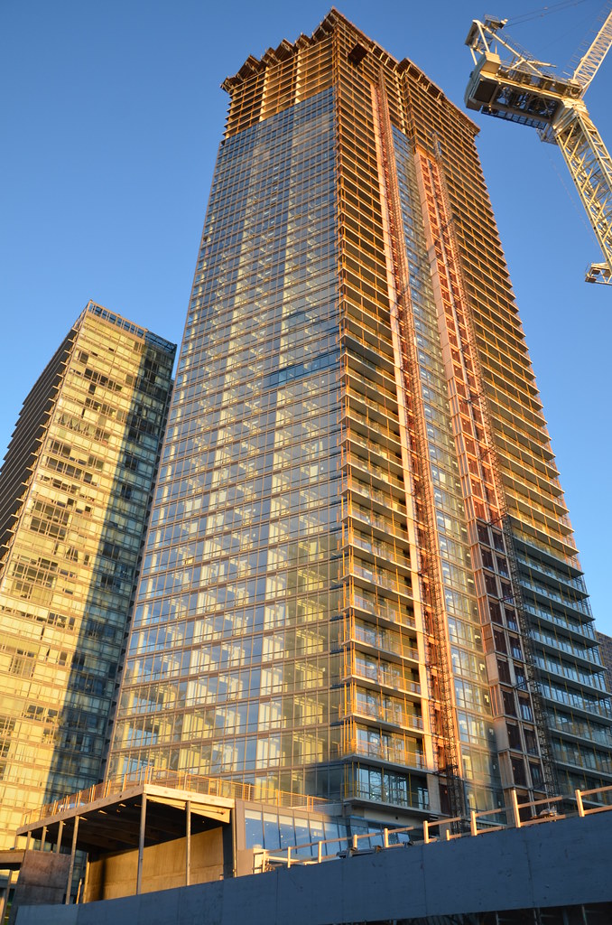
Great shots Jasonzed, damn this thing is tall, it doesn't look that high my my POV. Surely it must be no more than a floor away from the topping off point now, save for the mechanical penthouse. The only thing I don't like so far is that they didn't carry the staggered glass design over from Murano and applied it to this building too.
 
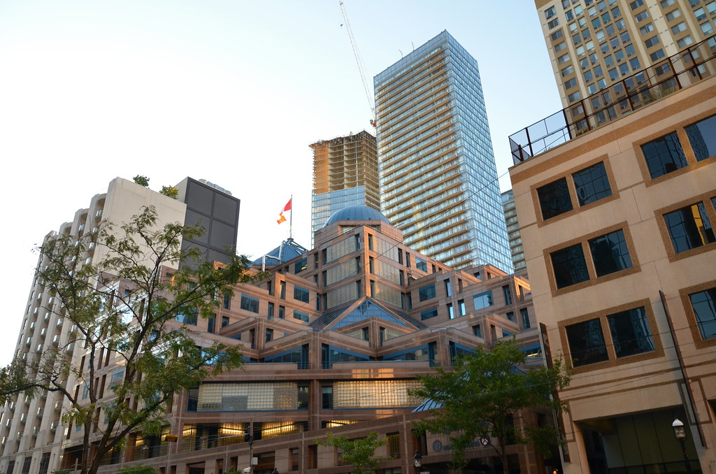
since when was this thing taller than Murano!!!!!! this is intense! and some great similar contrast with the Four Seasons tower on the north end of Bay street.

Burano's highlight is it's geometry, both in the tower and the podium,
Murano's highlight is the cladding imo. the patterns work... when the glass doesn't come crashing down to the streets below.
I'm also looking forward to Sick Kids impact on the Canyon. it's HUGE!

and wow is Shangri-la right in your face!!! dig it!

i'm in Manhattan right now, and i keep thinking of Bay street and how it's our best canyon, but in all honestly, it's completely soft compared to a gazillion of the streets here. i dunno....
 
Last edited by a moderator:
A jewel. Building as sculpture. Thank you, more please. To these eyes, Burano has only become appreciable as the spatial relationships and dialogue with its surroundings have become clear. I do not analyse and deconstruct this building, I feel it. As they say, beauty is an emotion...
 
Yesterday evening, from Glas:


20111004Burano.jpg


42
 
This building is quite a looker, but if the balconies would have been flush with the facade, a la X condos, rather than jut out, it would have been even better. Sort of like the son of Henry Cobb's Hancock Tower in Boston.

Also, I'm still waiting on the rooftop. A cheap mechanical box - especially one oriented at an angle that clashes with the trapezoidal design - could effectively ruin this building.
 
The rendering suggests a similar type design as Murano, hopefully it's lit much better.
 

Back
Top