Toronto Bridgepoint Hospital | 61.87m | 10s | Bridgepoint Health | Diamond Schmitt

You're casting those judgements because you know the history of each. My point is that if you didn't know what you know, and were seeing each for the first time, it wouldn't be clear and I doubt you'd feel the same.

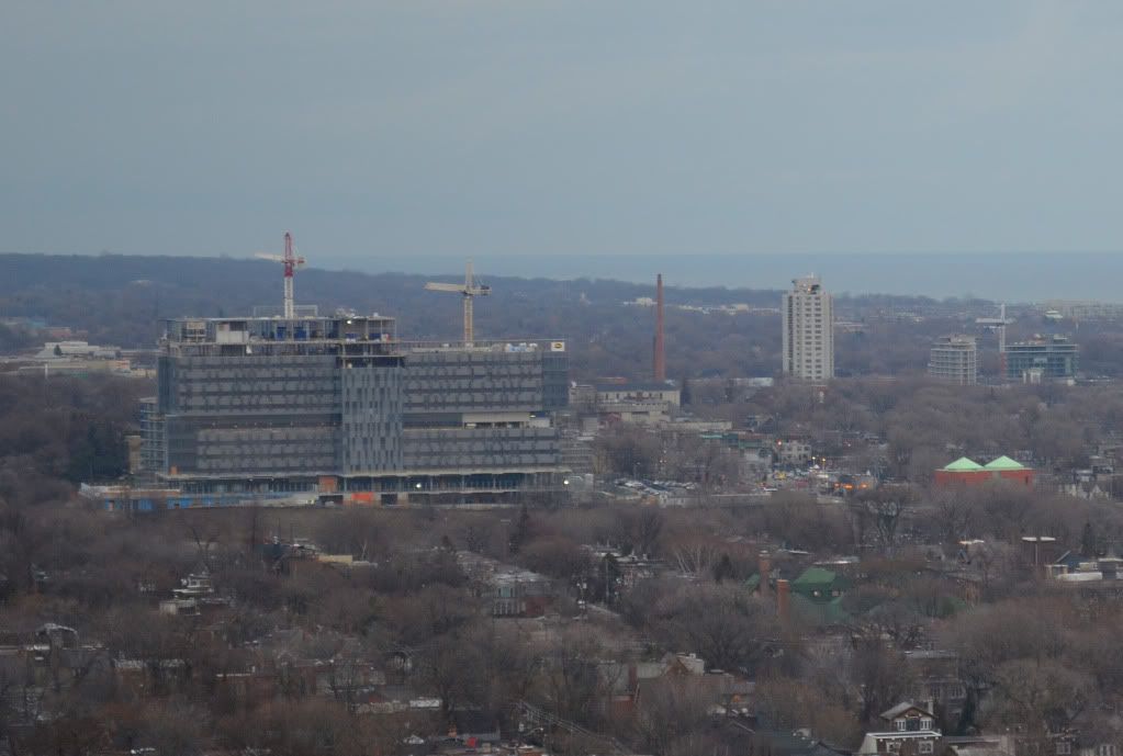
If you later found out that the randomized panels denoting the vertical circulation corridors on Bridgepoint were intended to be uniform, would it change how you felt about the effect?

Anyone who is in any way visually literate can spot the qualitative difference between the large, aesthetically pleasing, tonally differentiated Bridgepoint glass sections, which are a result of the design process, and the mismatched ROM Crystal panels, which are the result of error.
 
No, but the Crystal will undergo its own unique process - one which began with a set of mismatched clothes. You're quick to remind others that one building is not another and that each should be judged by their own merit. If that's the case (and it surely is), why should all buildings age the same?

Nobody said they should, and in the case of the Crystal / Cathedral spire comparison they can't, and that's the basis for the comparison. The Cathedral uses cladding that will heal itself over time whereas the Crystal's mismatched cladding won't.
 
I'm hardly arguing for a haphazard design process, merely that when things go wrong, sometimes the resulting effect is pleasantly more engaging than what was originally planned.

The Crystal's mismatched cladding still reads as a mistake, even without having first seen the renderings, since there is no aesthetic logic to the placement of panels of differing tonal range when the design of the building is considered as a whole. The conclusion that one inevitably comes to is that the aesthetic of the Crystal is about process - i.e. the order in which the panels were applied, or the die lots that were used. The comparison to FCP was to a building that resolved these issues after several attempts ( firstly, in the 1970s, when it was under construction; then more recently when they replaced individual panels; and finally now that the entire building has been reclad in different materials, with a different colour and texture, and a different corner treatment ).
 
But do Bridgepoint's panel locations exactly match those promised in the drawings? Even if this idea is the same, where do you draw the line in terms of the failure of its execution? We're constantly reminded here (both in conversation on the site and in execution around the city) that what someone draws isn't necessarily what will be built. Why would the conceptual stages of our very excellent cultural and healthcare projects be any different?

The proof of the pudding is in the beholding.
 
Some snaps from Dec 23:

6607445345_f9837d3b60_b.jpg


6607445763_86a65a9d95_b.jpg


6607444915_2c3f544a77_b.jpg
 
I think it was in another thread (was it the new Humber River Hospital one?) that some folks speculated that the AFP process that the province is now using for the vast majority of all new hospitals, courthouses etc. was set up in such a way that private consortia bidding for contracts have been and continue to be incented to spend as little as possible on architectural and design excellence. Certainly this project seems like a strong piece of evidence that good architecture can come from AFP projects---but is it a freak exception that proves the rule, or can we look expect further attractively-designed public buildings as more AFP projects come on stream?
 
Great shot. More evidence against those that have nothing but the "NIMBY" term around.

When are they planning on tearing down the current Riverdale Hospital?
 
took a pic of the pool area the other day while on site.
 

Attachments

  • Toronto-20120320-00031.jpg
    Toronto-20120320-00031.jpg
    94.5 KB · Views: 300
On days like this - and I saw that view a few minutes ago from the streetcar - the combination of matte grey cladding and reflective glass creates the impression that the building has captured the sky and packaged some of it up in nice little parcels of light for our enjoyment.
 
I can't imagine anyone would have put this in the running when the project was announced, but maybe the question needs to start being whispered: is this possibly the city's best-looking new-build institutional project of the past decade?

Granted, promising things afoot at the SickKids Tower, so I'll hold my tongue for now, but nothing springs to mind that's quite so sexy that's gone in on the various University Campuses. And I'd certainly put this up favourably against that other high-profile D+S institutional project at the corner of Queen and University.
 
It truly is a lovely building. I just wish it were set back farther from the valley, so it didn't loom so much over the surrounding.
 

Back
Top