Toronto Boutique Condos | 106.37m | 35s | Urban Capital | ZAS Architects

  • Thread starter superdeduperawesome
  • Start date
Nothing wrong University Plaza's massing although I get the feeling you're refering to Boutique. I guess it does look commie block if you only consider the most basic shape. Still, it's street presence beats the hell out of points on a podium. I mean how can a point tower be considered "well design" sitting on top of a podium? There are exception but , in most cases the podium seems no more than an afterthought to fulfill some zoniing obligations.

Of course, this thread is about Boutique and not University Plaza,:confused: Just stating that overall a tall and thin design structure from the streetscape has more sky, more sun, and is more environmentally/people friendly.
 
I totally disagree in regards to tall point towers leading to more sun and being more people friendly. Maybe one here or there but the culmulative effect of dozens likely blocks out more sun than medium rise blocks. Medium rise blocks also give off an aire of greater density even if the podium levels beneath the point towers is nearly the same height. The towers just overshadow the streetlevel.

I just think it's unfortunately this neighbourhood was planned to be more midrise to reflect it's industrial past and is now going to end up as another block of monolithic 40 storey tower blocks. To kill for an area like the old port in Montreal. Oh well, at least it pleases you and I guess there is always Freedland.
 
University Plaza seems "commie block" more in the Stalin-era sense than in the Khrushchev/Brezhnev-era sense...
 
skybean found this flickr pic and posted it over at SSC....several projects in the shot....

3929552443_4a0d20b637_b.jpg


photo originally by alanhyland...http://www.flickr.com/photos/alanhyland/3929552443/
 
Indeed! And yet still so many carparks. I wonder how many more cycles it will take to wipe them all out. Hard to say--inevitably in Toronto booms actually end up creating a few, as sites are cleared for developments that then fall through. So it's a two steps forward, one back situation. That said, when you look at photos of this area from, say, the 1970s, it's amazing how far we've come...
 
Thank you Matrix for all the great photo updates today! :)
 
October 12 2009 update

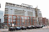
Boutique 1


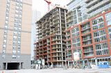
Boutique 2
 

Back
Top