Toronto Bloor-Yonge Station Capacity Enhancement | ?m | ?s | TTC | AECOM

I don't think these are on here anywhere
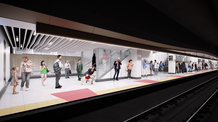
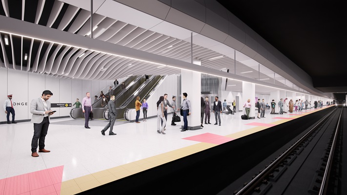
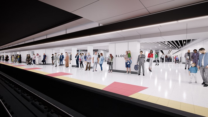
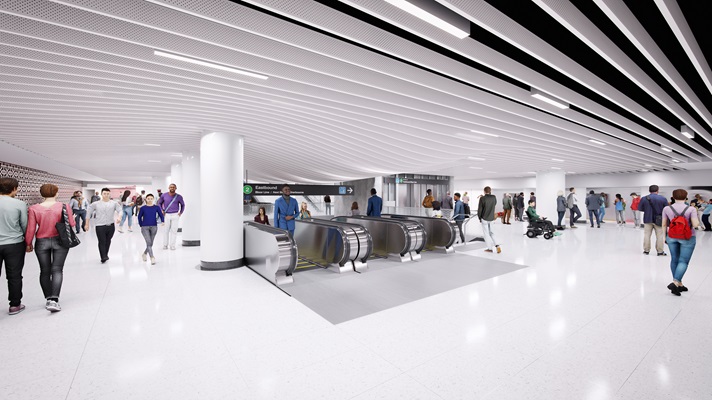
220714_BYCI_Interior_L2 WB.jpg


220714_BYCI_Interior_L2 EB.jpg


220714_BYCI_Interior_L1 NB.jpg


220714_BYCI_Interior_L1 SB.jpg
 

From whence did you fetch these?

IF they're newer than the old ones, it means they actually listened to some things I said (specific enough to see my finger prints)

I suggested this ceiling style, I did not suggest the undulation in it mind you!

I also suggested toning down the garish colours in the initial renders; though I didn't mean to have them just make it all white.
https://www.ttc.ca/about-the-ttc/pr...cts/Bloor-Yonge-Station-Capacity-Improvements

The colours in the original renders were definitely a bit much. I agree this could use something other than white but I think the pop of colour on the floor showing door placement is a simple fun way to make things more interesting.
I do like the ceiling quite a bit, so thanks
 
Not a huge fan of the curvy ceiling slats - it felt unoriginal and gratuitous (frankly it looks like knockoff Calatrava). DO like the attempt to opening up the ceiling to reduce increase the feel of the ceiling height though.

All that white will be a challenge to keeping clean - anything less than perfect will look shabby.

Well, changing the OBC!

Even the province didn't go this route with their own builds - with good reasons.

AoD
 
Last edited:
Not a huge fan of the curvy ceiling slats - it felt unoriginal and gratuitous (frankly it looks like knockoff Calatrava). DO like the attempt to opening up the ceiling to reduce increase the feel of the ceiling height though.

My suggestion took inspiration from Union (subway) station; and was in contrast to the terrible matt finish metallic panels they are using as standard in their renos at the moment. I also suggested the need to try to raise the ceilings for both air flow and a less claustrophobic appearance.

All that white will be a challenge to keeping clean - anything less than perfect will look shabby.

Agreed.
 
While I get not everyone liked the amount of colour in the initial design, completely removing the intuitive wayfinding element they provided is very disappointing. Something in the middle would have been better but nope, we get no colour at all. Form over function I guess.
 
I understand there is no funding for it but seeing renderings of this project without platform screen doors will always be a bit of a letdown, in my opinion.

The cost of PED's for this station is a rounding error on the budget. Email the Mayor, the TTC Chair etc. and make sure they know, you know!

Total cost for PEDs, at this station, with some contingency is ~30M

Total budget for this project, 1.5B

So we're talking about 2% of the budget, tops.

I can tell you there is a fairly large contingency on this project, at this stage, as in more than 10x that number.

It's very do-able.
 
Last edited:
Not a huge fan of the curvy ceiling slats - it felt unoriginal and gratuitous (frankly it looks like knockoff Calatrava).
My suggestion took inspiration from Union (subway) station;
I agree. I don't like the bland & copy-cat feel of the ceiling. The overall aesthetic is boring and feels like it could be anywhere.
Union's ceiling and walls are much better. It is, in my opinion, a bare minimum of what stations should look like. I would prefer more creative interior design but, if Union's design is replicated, I can accept that.
These renderings lack elegance and I'm not happy with the exposed ceiling. I just wish there was a survey I could fill out, but clearly there hasn't been any public engagement despite this project's significance.
 
  • Like
Reactions: DSC
Yes, with ATC, I don't see any reason why we would be undertaking and major station reconstruction without PSD.
I'm sure they could come up with a reason, like wanting to wait until they get new trains on Line 2, or deciding to lengthen the TR trains, In each case the doors might not line up.
 
I'm sure they could come up with a reason, like wanting to wait until they get new trains on Line 2, or deciding to lengthen the TR trains, In each case the doors might not line up.

The best argument is Bloor/Yonge is a terrible place to run an experiment where failure impacts service. The first PSD installation should be something like Highway 407 station as bypassing it impacts few customers.
 
The best argument is Bloor/Yonge is a terrible place to run an experiment where failure impacts service. The first PSD installation should be something like Highway 407 station as bypassing it impacts few customers.

Seeing as this project will carry on til ~ 2032 or thereabouts, there's lots of time to get that experimental station done; but still plan for it here.
 
If they are going to use curving ceiling slats, it should done with purpose - to visually guide riders (platforms-escalators-exits). Done well it might even be more effective than signage.

AoD
 
If they are going to use curving ceiling slats, it should done with purpose - to visually guide riders (platforms-escalators-exits). Done well it might even be more effective than signage.

AoD
Until six months after the reno is complete, several of the fins will be removed for water leak remediation in random locations around the station and it'll look that way for at least two-three years until they get replaced and different fins get taken out leaving a gap-tooth ceiling. That's the normal Toronto subway aesthetic.
 

Back
Top