Toronto Bloor-Yonge Station Capacity Enhancement | ?m | ?s | TTC | AECOM

We are still doing half-measures. The extra platform on Line 2, and better access/distribution to Line 1 will help - but it won't do as much as adding a 3rd and maybe a 4th platform to Line 1.

They need to build a new tunnel further west with two southbound platforms, with doors opening on both sides. Then the existing station can be similar with two northbound platforms.
 
Alas, The TTC did build an expansion at that time! The Yonge St platform was expanded in 1992!

Wasn't that also in anticipation of adding a centre platform on the Yonge line to implement the "Spanish solution"?
I think that was in fashion at the time and why Sheppard Station on Line 4 has a roughed-in centre platorm.
 
Hmm, I thought it was like the first phase, and the outside platforms would be narrowed to make room for the centre platform.

I just Googled and wikipedia (I know not necessarily reliable) says this:

Due to its congestion, the TTC has had to expand the station. In 1992, it took advantage of building construction over the Yonge–University portion of the station to open it out and widen the platforms. This was the first stage of a plan, known as the Spanish solution, to enable trains to open their doors on both sides: the tracks would next have been slewed outwards within the widened station, and a central platform built between them. The TTC does not intend to proceed with that plan.

James Bow also notes that the platform widening project also removed most of the middle columns that ran
between the tracks down the length of the station, which would make addition of a centre platform easier.

However, the TTC was able to make changes to Bloor station to ease some of the crowding, thanks to a new development near the Bloor-Yonge intersection. In 1989, ground broke for a new tower that became the Xerox Centre, located directly above the station. Working with the TTC, the construction lifted the roof off the station, temporarily, and the TTC took the opportunity to widen the side platforms and remove most of the centre columns, theoretically making a centre platform more feasible. The Xerox Centre revamped the original entrance to Bloor Station, giving the south concourse access to Hayden Street as well as Bloor Street East. The hope was that this would reduce overcrowding at the north end of the station, but this did not pan out, as not enough people wanted to leave the station by the south entrance. The total cost of the renovation came to $33 million. The Xerox Centre opened to the public in 1991.

The TTC also took the opportunity to update the look of Bloor station, removing the Vitrolite tiles and installing white ceramic tiles with lighter blue trim. Yonge station remained almost untouched, save for a new exit and automatic entrance built into the west end of the centre platform, leading up to a concourse level, fare gates, and then further up to a street entrance on the east side of Yonge, across from, and just south of, Cumberland Street.

These renovations were largely complete by 1992, and helped ease some of the crowding issues for the station. What also helped, albeit in a less nice way, was the early 1990s recession, which reduced the number of jobs in downtown Toronto, and reduced ridership on the TTC by almost 20%. Suddenly, Bloor-Yonge station’s capacity issues were no longer a pressing concern.
 
Last edited:
While Googling, also found these posts by Steve Munro about a 1988 Yonge Subway Headway Study
that also included lots of diagrams about Bloor-Yonge station improvements (in Part 5 and 7):


Part 5 included plans for the 3rd platform, where Steve noted:

"In this section, we begin Chapter 4 of the study with a description of the centre platform option at Bloor-Yonge Station.

Some of the work needed for this scheme was built during construction of 33 Bloor Street East and the Toronto Parking Authority lot between Hayden and Charles Streets. The TTC took advantage of the subway structure being uncovered to widen the station and replace the centre columns with a roof spanning both platforms and tracks. As you can see from visiting the station, this work ends at the northern third of the station because this is physically inside the structure of The Bay."

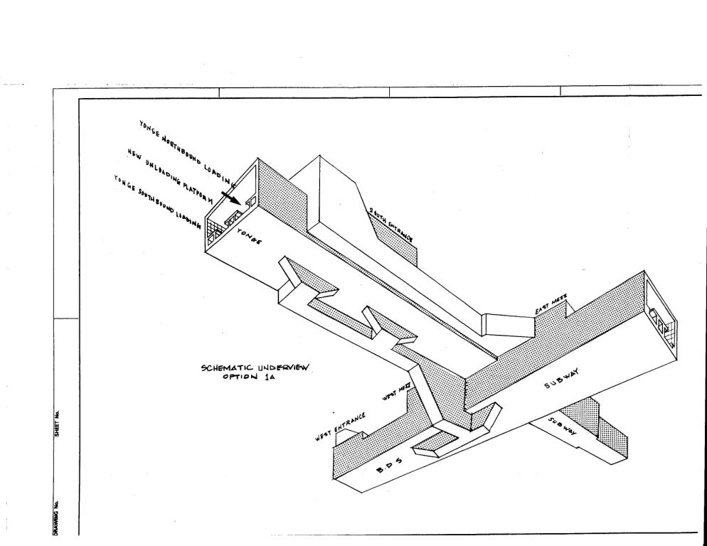
"Exhibit 4.1.1 (C) shows the south end of the station. The third platform is new, but the exits through 33 Bloor East have already been built roughly as shown."

So the south exits were built in anticipation of the 3rd platform plan being built.

Cool axonometric diagram from below:
exhibit412c.jpg


Part 7 included discussion about:
  • A double station with new platforms north of the existing Bloor Station
  • A bi-level station
  • Two versions of a diversionary route with a new southbound or northbound track and station
The "Divided Subway" concept with a line diverted either to the east under Park Road or
to the west under Yonge St. is shown below:

Park Road:
"Exhibit 4.4.2 shows the alignment with the new track swinging east from Rosedale Station and down Park Road.
The lines rejoin between Isabella Street and Wellesley Station."

exhibit442c.jpg


Yonge St.:
"Exhibit 4.4.3 shows the alignment with the new track swinging west from Rosedale Station and down Yonge Street.
The lines rejoin between Charles and Isabella Streets."
exhibit443c.jpg

"
 
Last edited:
I really like the use of each line colour on the platform columns. Nice little piece of intuitive wayfinding.

Edit: I just noticed the splash of green on the ceiling above the escalators down to Line 2 on the Line 1 platform, which I also love. It's great to see the TTC making the station design part of wayfinding, rather than just relying on signs.
 
Last edited:
Presentation on said project at the Dec 8 board meeting:

View attachment 367954

TY for posting!

Comments: Ceiling finish, I like the slatted look, similar choice to what they did at Union. Their new standard panel which they appear to be using on the platform itself I'm less enamoured by.

In respect of the walls, they seem to be going for a play on vitrolite, in yellow and white on the upper level.

Personally, I find it a tad garish.

Lighting, I like the new platform lighting, and like that all the pipes and conduits are again within the ceiling.

Something I don't see in the render is any retail. if that isn't being contemplated that would seem to be an oversight.


I'll stand by my comments above and say I find the use of the green on the garish side.

Also, why are they retaining the ugly platform lighting on this level? They've done it decently for Line 1, they should match the effort on Line 2

*****

Overall, a fairly impressive layout shoehorned into a very busy space.

But I'm leaning under-whelmed on the finishes.

They should be among the most changeable things both in terms of ease and cost; and accordingly I think I will push for some improvement.
 
Well now, this quiet report to next week's gov't and licensing Ctte got my attention:


Note that I am not linking the background file as it is not yet live.

The report seeks authority to expropriate such portions of 2 Bloor East and 90 Bloor East as may be necessary for the Station Expansion Project.
Otherwise known as The Hudson's Bay Centre.

Interesting move! Negotiations over the future of the site have been dragging on; it would appear the City has decided to light a fire under the negotiations....

From the Report:

1647358320283.png


More when the main report goes live (hopefully)
 
This may be related? https://retail-insider.com/bulletin...partment-store-in-downtown-toronto-exclusive/

The exit of Hudson’s Bay from the complex this spring will usher in redevelopment. A Brookfield representative went on to say in the statement, “We are excited by the opportunity to re-envision and transform this key asset at one of the most important locations in the City of Toronto. We will be submitting an application to the City of Toronto for planning approvals to bring Brookfield’s vision for the future of the property in the coming months.”

That vision wasn’t explicitly shared, and plans are expected to involve a partnership with the City of Toronto which has earmarked well over a billion dollars to overhaul the subway interchange under the Hudson’s Bay Centre. Some are also speculating that the on-site office tower at the Hudson’s Bay Centre could be demolished for a much taller building.
 
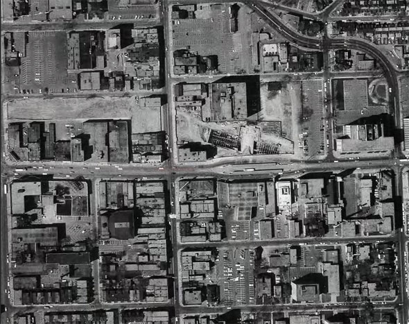
20150825-YongeBloor-Aerial.jpg

From the air in 1964, showing the complex construction work linking the Bloor-Danforth and existing Yonge subway line. Empty patches of land and parking lots reveal the path of the underground tunnels.

From link.


Good photo, I thought I'd blow it up a bit for people to see the detail a bit more easily:

1648065151839.png


I also thought I'd throw in one with some labels for those who might find it difficult to orient themselves:

1648065688982.png
 

Back
Top