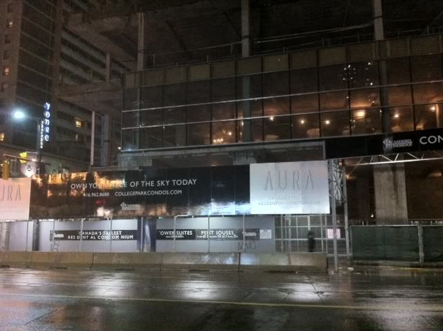
Toronto Aura at College Park | 271.87m | 78s | Canderel | Graziani + Corazza

Oh, so every building needs to have patterns on their glass?

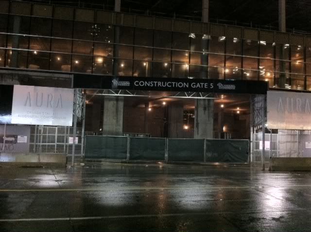
No, certainly not. The new RBC Dexia building down near roy thomson hall and the new four seasons up on bay both have beautiful and very minimalist glass facades, as does the new Rotman expansion on U of T's campus. But Aura's glass doesn't really look like these either, does it? I have a hard time putting my finger on it, but something about the Aura glass just looks clunky and unconsidered.
 
And just to underscore that this is a design issue and not a quality issue, it's the same curtainwall supplier for Aura, RBC Dexia, and Rotman.
 
The design of the podium is already so overwrought (sloping wall here, cutout there, projection over there, random balcony here, etc) that is really doesn't need any more confusion coming the execution of the facade. I think it's going to look even more sloppy once they add the panels and signs and other random doohickeys all over the place.

And to repeat the earlier point, this isn't about the quality of the cladding, this is about the usage of the cladding. It just doesn't look like any thought has gone into it

I think you've nailed it, whatever. The base of Aura - which is the part that everyone will see up close - is a mishmash of notches and boxes that jut out for some unknown reason. The sad thing is that boxes and notches work beautifully in, say, a Teeple-designed building where they form a cohesive design element, but here they seem to be tacked on like a working class uncle's attempt at enlarging his home with window boxes and sheds.

With respect to the glass, I don't like how there are two horizontal bands. It cuts the glass up into 3 little squares, ruining the verticality of those expansive commercial ceiling heights.
 
Relax folks, it's one partial level of curtainwall, give it a chance!
 
There is a "hate anything big" element on this board. And of course the crew with a preference for one particular design house.


We need to see a few more levels of cladding, plus we need to see how it (cladding & design) integrates into the tower portions.
 
There is a "hate anything big" element on this board. And of course the crew with a preference for one particular design house.

We need to see a few more levels of cladding, plus we need to see how it (cladding & design) integrates into the tower portions.
Caltrane, that's a bit of a blanket assessment. I agree that this glass could be done better, but I certainly don't fit in with the "hate anything big" nor do I have a preference for any one particular design house. Actually, looking back at the past page there's a few of us that don't fit into those categories.

Nobody is saying the sky is falling, but I think it's ok to voice some concerns over it. Some valid points have been raised.
 
fantastic night/evening pics drum! some of them look surreal!

wow. it's is going to be awesome leaving the delta chelsea and just looking up at this monster! what a huge building. a city changer and most definitely an area changer!

and i honestly don't think buyers care about the cladding on a building, nor can really tell the difference/set a standard for the cladding... it's not a deal breaker in any way,
 
Cellphone shots just now

photo-799.jpg


photo-630.jpg
 
Caltrane, that's a bit of a blanket assessment. I agree that this glass could be done better, but I certainly don't fit in with the "hate anything big" nor do I have a preference for any one particular design house. Actually, looking back at the past page there's a few of us that don't fit into those categories.

Nobody is saying the sky is falling, but I think it's ok to voice some concerns over it. Some valid points have been raised.

Seems to me that it's looking very much like the rendering (which I loved). Even the variation in size seems to match the rendering. I think it's going to look amazing!
 
Seems to me that it's looking very much like the rendering (which I loved). Even the variation in size seems to match the rendering. I think it's going to look amazing!
The renderings are nice, they look great. This coming from someone who has created renderings for a few developers. But they certainly don't show the randomly-sized glass panels we're seeing. But not that I would expect to necessarily see those in the renderings - I know it's impossible to get every detail right.

The facade already has to deal with a number of shapes and variations of the building's design. To me, the inconsistency in glass panes could end up making the building feel more messy and garbled than it already is or need-be. From a distance it won't matter at all, but from up close it will be noticeable.
 
Here are a couple of relatively simple but much more interesting applications of glass here in Toronto:

View attachment 8128
View attachment 8129
View attachment 8130

Here you see a bit of play with proportion, transparency, variability - and this is all in surfaces that are just as flat/planar as Aura's.

What's interesting is that the most interesting designs in built form and in the details is showing up in public sector/publicly funded buildings like the ones shown here. Don't expect much from the private sector...bottom line driven, this much creativity would cut into their profits.
 
Last edited:
I have said something similar in the past, referring only to the U of T as a great leader in architecture for the city, but you are right - that could be extended to the entire public sector...
 

Back
Top