News   Apr 26, 2024
 2.4K     4 
News   Apr 26, 2024
 590     0 
News   Apr 26, 2024
 1.2K     1 

Toronto Architecture From The 1960's and 70's

McHugh writes something like "You can tell this design was a compromise."

i never liked the exterior of Toronto Reference, much as i wanted to. there's just something lumpen, closed off, and inert about it.

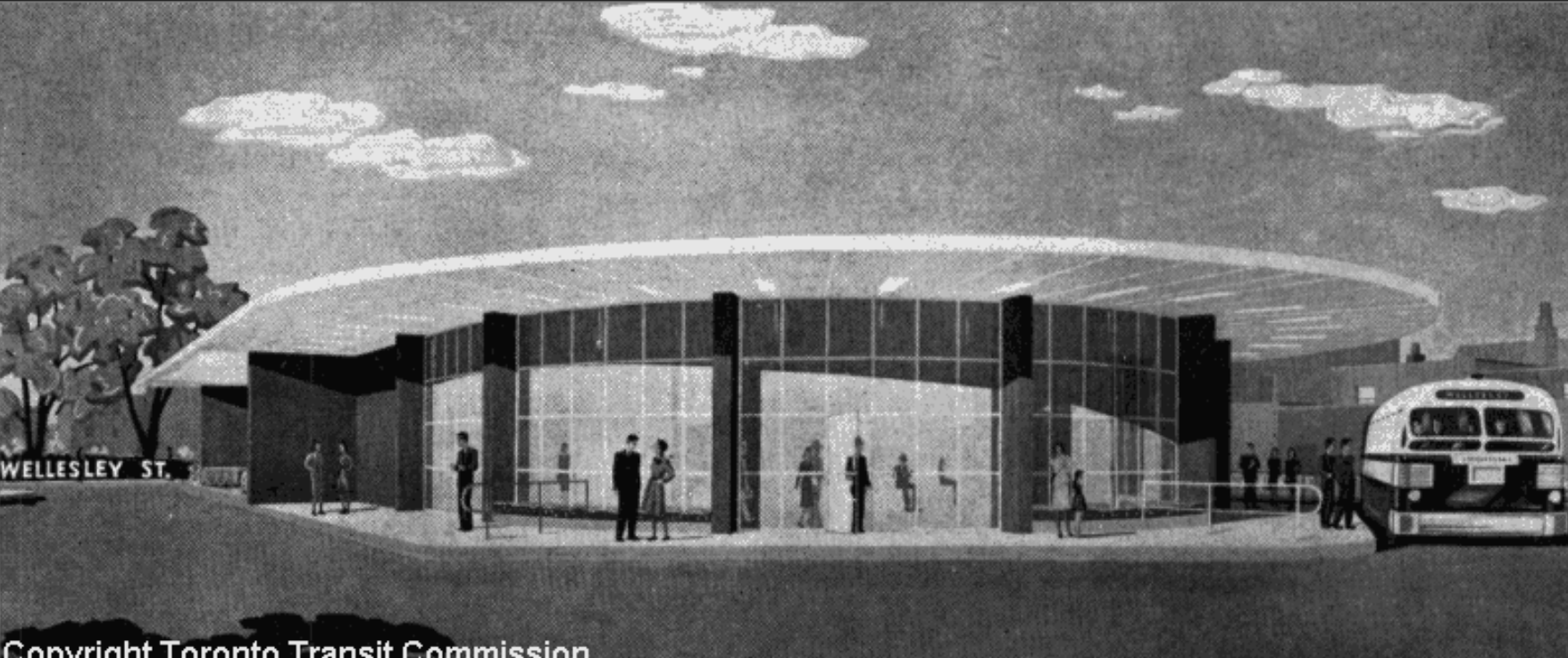
from the illustration its hard to tell how translucent or reflective it was meant to be, but to me the original design is vastly superior. there's something politely Pompidou-like about it, and it is much more connected to its surroundings. its a shame it wasn't built....
 
Here's one (architect?):

Parkin.

For a building that was added to the Inventory of Heritage Properties in 1984, the canopy is in extremely sad condition:

*None* of the Yonge Subway stuff added to the Inventory is presently in a cendition befitting their Inventory status.

But to be fair, the basic bones of Wellesley Station are still there, functioning as they ever did--the grotesque parking garage may overwhelm it, but at least it "spans" it rather than obliterating it. And I wouldn't be surprised (esp. given the Kyle Rae/Wong-Tam aesthetes in the neighbourhood) if any future rehab of the station involves something of a "restoration"--even if with a more durable material in lieu of Vitrolite.

The Google view definitely doesn't flatter.
 
i never liked the exterior of Toronto Reference, much as i wanted to. there's just something lumpen, closed off, and inert about it.

I don't mind it, mostly because of its Aalto-meets-70s-neovernacular qualities which soooo befits modern libraries--even if it winds up looking like the World's Largest Neilson's Chunk in the process. More "comfortably containing" than "closed off"; and the critical point of entry to the SW (and a rite of passage for many a young student commuting in from Yonge/Bloor station) made up for the fortressness.

Ironically enough, if anything about Metro (yeah, I still call it that) Reference is "lumpen, closed off, and inert", it's Ajon Moriyama's glass box which replaced the old main entrance and was meant to recall his father's original proposal...
 
wow, i wonder what led to the imposition of that wall of horrible brown sheet metal across the top of the building. second story parking? surely there was another way....

39c7e660.png

7f505867.png

The west facing units in the condominium directly to the east of Wellesley station provide a glimpse onto the roof, where a swimming pool and basketball court have been built to serve the apartment building to the north of the station.

I like the intention behind the construction of these amenities atop an existing building, but it seems a shame that they would do so on a station that had some credibility in its design. Then again, when the "Continental Tower" (15 Dundonald) was built in the early 1970's I don't think maintaining a design from 15 years prior was considered a priority.
 
Then again, when the "Continental Tower" (15 Dundonald) was built in the early 1970's I don't think maintaining a design from 15 years prior was considered a priority.

Ironically, the "cheaping out" that resulted in the present garage structure probably also excused the piggybacking rather than demolition of Wellesley Station...
 
Definitely underappreciated...though its stance relative to the street is definitely also of the sort that would have been decried by the Postmoderns...
 
The Kelly Library at St. Michael's College, UofT is a great example of a more 'squat' brutalist building in the city. Built in 1969, designed by John Farrugia.

7923134228_92df360661.jpg


The window hoods help to keep direct sun out of the building to protect the collections. Apparently angled so that the high summer sun is blocked out, but the lower and weaker winter sun is allowed in.
7923135464_f42963c155.jpg


Great example of the 'corduroy' patterning in concrete.
7923134892_663d1df03a.jpg
 
Definitely underappreciated...though its stance relative to the street is definitely also of the sort that would have been decried by the Postmoderns...

the site is on a slope, but it is unfortunate that they decided to go with a unfriendly granite skirt to deal with the gradient. it becomes slightly irksome as it ascends to to the height of a half-wall where the building meets the corner.
 
Last edited:

Back
Top