News   Nov 22, 2024
 793     1 
News   Nov 22, 2024
 1.4K     5 
News   Nov 22, 2024
 3.5K     8 

Toronto Architecture From The 1960's and 70's

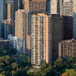
The Masters B, Etobicoke, 1974. Designed by Kelton Architects and Planners

^One of my favourite apartment blocks in the city.
And yes, I even like 77 Elm, and the Sheppard Agincourt Towers.
Also a big fan of the White Oaks/Marlborough Court towers in Oakville (although they all kind of look the same).

With regards to brutalism, I've paraphrased it before and I'll paraphrase it again:
"I love it. God help me, I do love it so." - and even when it's not done all that well.

I don't know, it might have something to do with growing up in London, under the shadow of the megalithic Middlesex County Courthouse:
http://www.emporis.com/building/middlesexcountycourthouse-london-canada
 
When it comes to precast concrete, nothing in my view, comes close to surpassing Habitat/67 in Montreal.
I absolutely love it!
 

Attachments

  • Habitat 67.jpg
    Habitat 67.jpg
    45.6 KB · Views: 749
Great thread!

Locally, I mourn the loss of the poured concrete entrance and stairwell of the Albany Medical Clinic on the Danforth.
 
The Ontario Science Centre opened on Sept. 26, 1969. It was designed by architect Raymond Moriyama starting in 1964.

ontario_science_centre.jpg


The flaw with the Centre is its auto-orientation location and parking lots. Hopefully, they'll do some work to make it more transit-friendly when the Crosstown LRT opens.
 
Interesting to note that Fred Beer recently passed away:

http://v1.theglobeandmail.com/servlet/story/Deaths.20120508.93293490/BDAStory/BDA/deaths

For those that don't know, Beer Precast was a pretty forward thinking concrete company that helped develop techniques for building with exposed concrete.

thank you for that! i wasn't aware of him, or his company...
interesting article about New City Hall and precast concrete. apparently Beer Precast was the subcontractor for the tower portion...

http://www.cpci.ca/?sc=potm&pn=monthly32004

"The Toronto City Hall, completed in 1965, was one of 50 projects honoured to celebrate the 50th anniversary of the Precast/Prestressed Concrete Institute. The organization selected the 50 most significant projects using precast concrete components with selections coming from nearly 400 candidates nominated by PCI member companies."
 
Great thread!

Locally, I mourn the loss of the poured concrete entrance and stairwell of the Albany Medical Clinic on the Danforth.

it was sad when they knocked that building over i agree. it seemed to disappear overnight.

even worse, what is going up in its place looks to be shaping up to be a design-build monstrosity...
 
When it comes to precast concrete, nothing in my view, comes close to surpassing Habitat/67 in Montreal.
I absolutely love it!

you are right, there is nothing in Toronto proper that can compete with the epochal world-altering importance of Habitat...

we have a lot of fantastic concrete buildings in the city, but the Safdie is Unesco grade.
 
Another (raw, unfinished) concrete thing in Toronto to consider: Macy DuBois' Central Tech Arts School. (Somewhat makes up for the loss of his 45 Charles)
 
^Indeed

77354246.jpg


Schools, in particular, tended to have a knack for interesting architecture back then. Lord Lansdowne comes to mind, as well as the brutal Bloordale Middle School:

67503224.jpg
 
Another (raw, unfinished) concrete thing in Toronto to consider: Macy DuBois' Central Tech Arts School. (Somewhat makes up for the loss of his 45 Charles)

Beautiful little building, outshines Ross&Macdonald's main building by a mile.

New College would be his triumph if they landscaped it properly.
 
Southern Ontario certainly jumped into the post-Stalin Stalinist minimalist look with both feet in the 60s and 70s. I can't call what we're seeing here truly "ugly", but depressing and spirit-crushing, yeah. There's a lot of this stuff I really won't miss when the time comes to replace it with condo towers shaped like Halle Berry in an evening gown or something.
 
question about 60's and 70's architecture

This seems like a pretty informed thread, so maybe a good place to ask a few stupid questions. It seems that a lot of brutal buildings have some less-than-functional aspects, such as:

1. Main entrances often seem to be located at building corners and often seem to involve a lot of stairs and ramps because they're either significantly above or below sidewalk grade level (Robarts, for example). In general main entrances seem kind of self-effacing and don't provide any sense they lead to something significant. Perhaps part of this was the auto-centric nature of the city at the time (Four Seasons or Sheraton entrances).

2. Windows seem to be generally quite small and interiors have little natural light (second floor of old Four Seasons podium).

3. They often put in these strange half-stories so that entrances and whatever street level interaction there was were located below sidewalk grade, often with a fenced-off recessed space between sidewalk and building. But then they sometimes cantilevered out over the lower floor, providing pretty much continual self-shading. Again, why did architects and builders of the time generally seem to minimize natural light? I'd get it in Marseilles, but this is a cold climate.

4. The buildings seemed to deliberately isolate themselves from their surroundings with the use of massive blank walls in prime view locations (HBC store's big concrete wall at Bloor and Yonge, or the Reference Library's huge brick wall on the Yonge Street side). Were either of these features considered good design elements even at the time?

If form followed function in the post-WW2 period, it seems that a revolution occurred in the 60's and 70's where function was pretty much thrown out the (tiny) window and form was deliberately ugly. Is that too harsh a conclusion? We have so much of this style in Toronto, and it obviously can't all be torn down, so I'd be interested in hearing what makes these buildings decent architecture, aside from the esthetic appeal of masses of raw concrete.
 
Southern Ontario certainly jumped into the post-Stalin Stalinist minimalist look with both feet in the 60s and 70s. I can't call what we're seeing here truly "ugly", but depressing and spirit-crushing, yeah. There's a lot of this stuff I really won't miss when the time comes to replace it with condo towers shaped like Halle Berry in an evening gown or something.

if you find Brutalist architecture depressing, i don't see much reason to be posting here, as your opinion isn't all that relevant to the thread.
 

Back
Top