You are using an out of date browser. It may not display this or other websites correctly.
You should upgrade or use an alternative browser.
You should upgrade or use an alternative browser.
Toronto Architecture from the 1940's and 1950's
- Thread starter thecharioteer
- Start date
LowPolygon
Senior Member
Though by this evidence, they might have been "fantastic" on more of a Moscow than Montreal level. And besides, Dolphin's somewhat later TTC HQ might be the stodgiest, most constipated piece of 50s retardataire Toronto ever saw...
hey its not that bad!
http://en.wikipedia.org/wiki/William_McBrien_Building
though its true he was a man who struggled with the language of postwar modernism...
also, he was almost 70 when he designed it. that was back when 70 was old, and not the age of rock stars like Mick Jagger.
thecharioteer
Senior Member
Thanks, wwwebster! The Mechanical Building is one of my personal favourites. Bay/Wellington today? I think that its present unfortunate appearance goes beyond "facelift"....
Attachments
thecharioteer
Senior Member
One of the oddest medley’s of modern, deco and neo-traditional architecture in the city is right across the road from the library at 25-27 St. Clair E.
The Arthur Meighen Building, from 1954 was designed by Charles B. Dolphin(1888-1969). He is also the architect of the epochal Consumer’s Gas building on Yonge St, (1930) and the Postal Delivery Building that is now Air Canada Centre (1941). So this is rather a late work of his.

I agree, deepend, a very unique building, both stylistically and in its use of materials.
Attachments
thecharioteer
Senior Member
Another library by Arthur Eadie, three years earlier than Deer Park.
The George H. Locke Memorial Library, 1949, Beack & Eadie. SE corner of Yonge and Lawrence.

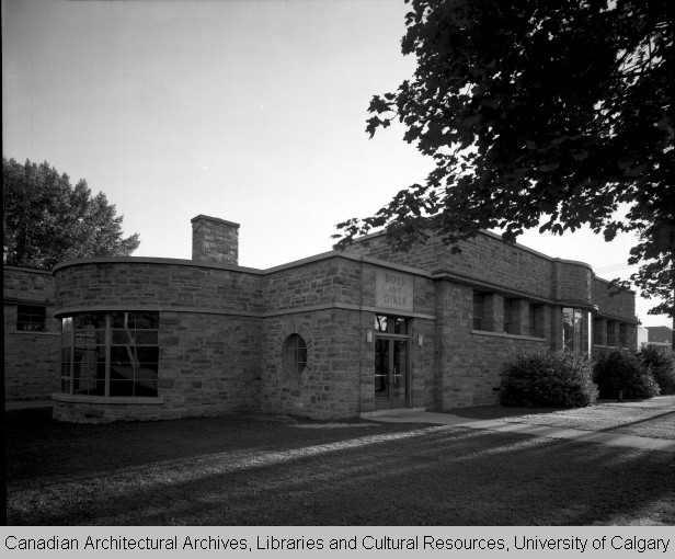
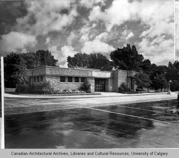
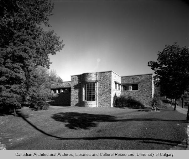
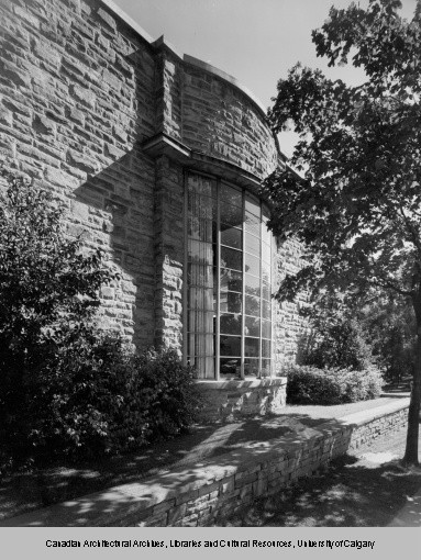
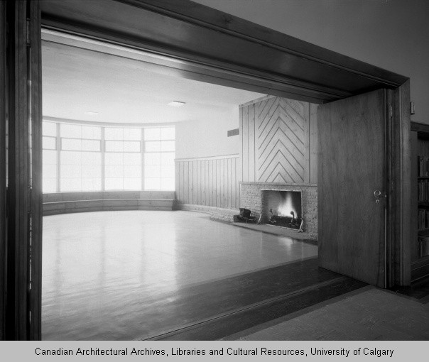

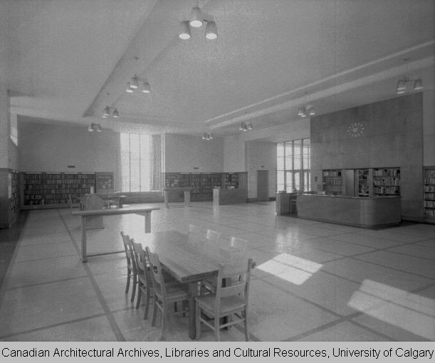
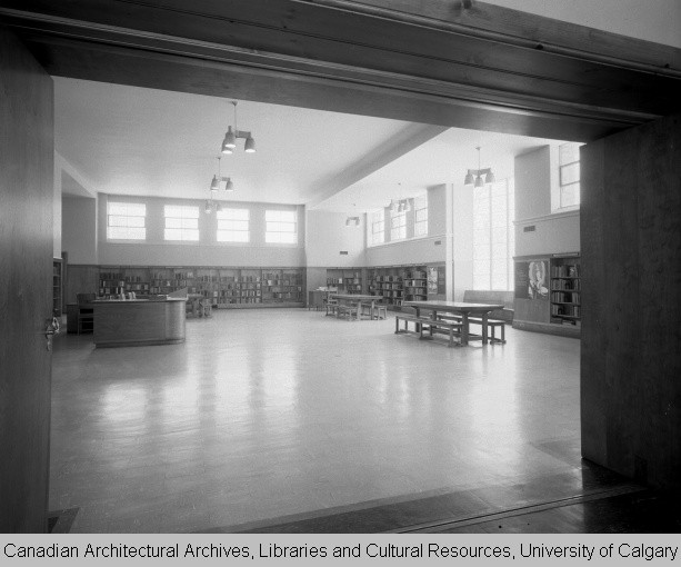

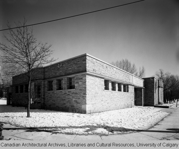


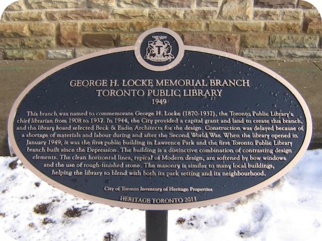
The George H. Locke Memorial Library, 1949, Beack & Eadie. SE corner of Yonge and Lawrence.
Attachments
-
 locke.jpg87.8 KB · Views: 1,238
 -
 locke2.jpg92.6 KB · Views: 1,283
 -
 locke3.jpg94.7 KB · Views: 1,126
 -
 locke4.jpg49.7 KB · Views: 1,140
 -
 locke5.jpg86 KB · Views: 1,111
 -
 locke6.jpg62.9 KB · Views: 1,095
 -
 locke7.jpg69.6 KB · Views: 1,141
 -
 locke8.jpg76.3 KB · Views: 1,115
 -
 locke9.jpg67.2 KB · Views: 1,113
 -
 locke10.jpg92 KB · Views: 1,105
 -
 locke11.jpg92.4 KB · Views: 1,128
 -
 locke121955.jpg92.1 KB · Views: 1,185
 -
 George_H_Locke_Memorial_Branch.jpg64 KB · Views: 1,107
 -
 George_H_Locke_Memorial_Branch_Plaque.jpg65.2 KB · Views: 1,105
Last edited:
adma
Superstar
Re the Locke Library: probably useful to think of it as a post-WWII "sequel" to the Runnymede Library (Beck & Eadie being John Lyle's successor firm)
IIRC it was a total demolish/rebuild.
Bay/Wellington today? I think that its present unfortunate appearance goes beyond "facelift"....
IIRC it was a total demolish/rebuild.
AlbertHWagstaff
Senior Member
IIRC it was a total demolish/rebuild.
Adma is correct. I think it went down around 1993-94. In its last couple of years there was a "Metro Paradise" discount store on the ground floor which gave the building an extra dose of seediness with its posters all over the place, "Bre-X certificates $10!" etc. When the building closed, the store moved to Yonge St. next to the Dineen Building and I think some of the tacky posters live on even though the store is gone. Moose actually did a then-and-now on the Yonge St. building a while back featuring those Bre-X posters.
thecharioteer
Senior Member
Adma is correct. I think it went down around 1993-94. In its last couple of years there was a "Metro Paradise" discount store on the ground floor which gave the building an extra dose of seediness with its posters all over the place, "Bre-X certificates $10!" etc. When the building closed, the store moved to Yonge St. next to the Dineen Building and I think some of the tacky posters live on even though the store is gone. Moose actually did a then-and-now on the Yonge St. building a while back featuring those Bre-X posters.
Quite right, gents. The current building (220 Bay) was designed by Page & Steele and was completed in 1995. My mistake.
Speaking of facelifts, the most flamboyant example has to be 100 University. The original building was designed by L. Forster in 1959 (hard to find a pic of it), and its current incarnation was by WZMH in 1994.
100 University (behind):
Today:
Attachments
adma
Superstar
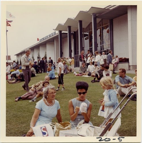
One thing I was wondering about in that shot: what does the letter "S" on the bag stand for?
Ex-Montreal Girl
Active Member
One thing I was wondering about in that shot: what does the letter "S" on the bag stand for?
I can't answer that except to say it isn't Simpson's. I can say that it appears that the ladies packed something of a picnic and would probably have used saved paper shopping bags from nicer stores because that's what we ladies do (or did) in such situations. I never toss my bags from Holts' or Prada.
Now consider the subjects. Three generations, all in matchy-matchy pale blue. Grandma in a multi-strand pearl necklace (probably cultured), daughter is fashionably-coiffed in a bouffant, and child adorably garbed in white. All of them overdressed for the occasion, even for the times which I guess to be early 1960s.
All this tells me that they came from out of town, perhaps as far away as Oakville. They're dressed up for the city, although they are at the CNE. Therefore, I can only conclude that the bag comes from some local ladies' better quality clothier.
thecharioteer
Senior Member
Now consider the subjects. Three generations, all in matchy-matchy pale blue. Grandma in a multi-strand pearl necklace (probably cultured), daughter is fashionably-coiffed in a bouffant, and child adorably garbed in white. All of them overdressed for the occasion, even for the times which I guess to be early 1960s.
Great analysis, Ex-Montreal Girl! But, were they real that overdressed for the times?
http://gorillasdontblog.blogspot.ca/2012/06/anything-goes-saturday-hither-and-yon.html
Attachments
J T CUNNINGHAM
Senior Member
The greatest problem when one is wrestling a 'gator is not getting him/her too excited.
(Weak heart.)
Regards,
J T
(Weak heart.)
Regards,
J T
Anna
Active Member
One thing I was wondering about in that shot: what does the letter "S" on the bag stand for?
I can't answer that except to say it isn't Simpson's. I can say that it appears that the ladies packed something of a picnic and would probably have used saved paper shopping bags from nicer stores because that's what we ladies do (or did) in such situations. I never toss my bags from Holts' or Prada.
It's also possible the bags came with free samples/deals from the Food Building, or brochures from the Better Living Building. There appears to be a second 'S' bag just in front of the stroller.
LowPolygon
Senior Member
It's also possible the bags came with free samples/deals from the Food Building, or brochures from the Better Living Building. There appears to be a second 'S' bag just in front of the stroller.
a much more more likely scenario...
Conrad Black
Senior Member
Could the S stand for Savette which I remember from Town and Country Mall (now Centrepoint)?
