Toronto 88 Scott Street | 203.9m | 58s | Concert | P + S / IBI

Maybe the plan is to incorporate the existing deco building into the podium of the tower, a la 1 King West.

Yes, the older building (minus the two or three floors added in in the 1970s (?) will be maintained and the tower is in (or on top of) the north west corner of the site. There is still talk of having some offices in the building with retail along Wellington and Scott Streets. Page+Steele are apparently the lead architects.
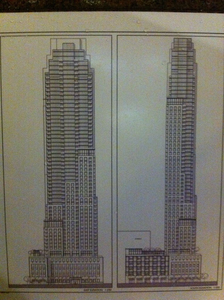
 
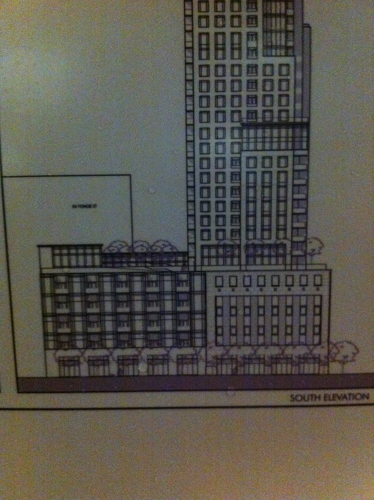
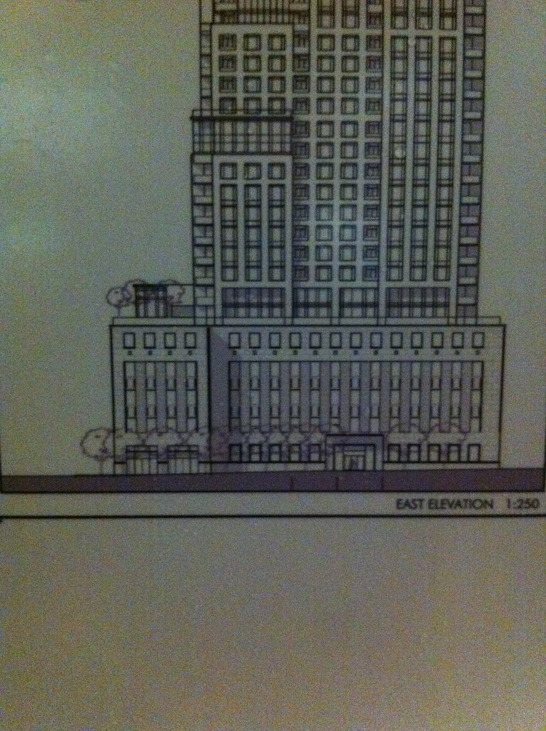
Got some renders for everyone! Was walking down Wellington this evening when I came across the 'application submitted' poster on the building. Here are some shots I snapped of the elevation drawings. Sorry for the grainy resolution, they were taken in low light.

First is the full drawing showing both the East and South elevations:
5760291769_48577f144b_b.jpg


Closeup of the podium, South elevation:
5760841998_44ab96b869_b.jpg


Closeup of the podium, East elevation:
5760295217_51f499881c_b.jpg
 
Wow! What a change from that hulking, oppressive beast at 501 Yonge!

This is it, some setbacks, some different materials.. Looks wonderful!
 
Very true, I felt like I was gonna have a heart attack when I saw the 501 Yonge renders...this one made my evening in comparison
 
I would love some precast in our skyline right about now.

Those one in a million glass boxes sprouting everywhere need start having dialogue with other styles.

Keep in mind the height of this building (195m) means that the ceiling heights will be a tad taller.. Maybe this is a luxe building which will receive decent treatment.
 
Keep in mind the height of this building (195m) means that the ceiling heights will be a tad taller.. Maybe this is a luxe building which will receive decent treatment.

We thought that with Uptown, didn't happen. But there's plenty of room for optimism here. Now this is an area to reach for the sky, not Yonge & Alexander.
 
We thought that with Uptown, didn't happen. But there's plenty of room for optimism here. Now this is an area to reach for the sky, not Yonge & Alexander.

Concert seems like a solid developer. The Berczy is perfectly suited to the area and will use real stone for its facade. Its Vancouver developments are also quite nice. This isn't a developer that develops midmarket condos en masse. They go after the higher end of the segment.

Personally I'm just excited a building with a bit of girth, some setbacks and not draped in glass is finally reaching for the sky. This will help gradually reduce the skyline from its current monolithic terminus at Scotia Plaza/Commerce Court.
 
Setbacks? Opaque materials?

I never thought I'd see the day when I'd prefer a design by P+S over a design by aA.
 
Last edited:
Now thats a classy design. This will look like it's been here for years and have a "solid" powerful look. Very befitting a powerful financial hub.

(I do wish they would lose the balconies though)

Very nice. Let's hope aA reads these posts.
 
Beautiful! i love the setbacks and stone/precast cladding. I cant wait to see a shiny glossed up render of this when they release it.
 
So who says to can't make a judgement on a building using an elevation drawing.

This building looks pretty good, also looks taller than it's 192 meters.
 

Back
Top