Toronto 2180 Yonge | 247m | 65s | Oxford Properties | Hariri Pontarini

Better, but I would have preferred to see an enlarged mid-block park instead of lumping the park space to the south west corner of the site. The placement of the towers still feel off and overly deferential the SFHs around the site.

Oh and that accessible route at the corner looks kind of ridiculously inconvenient.

AoD
locating the park in that location will maximize sunlight access to it. It's likely the best location for it.
 
Better, but I would have preferred to see an enlarged mid-block park instead of lumping the park space to the south west corner of the site.

Mid-Block, if you mean midway between Yonge and Duplex would automatically run into strata issues over the subway tunnels. Parks won't accept 'strata' if it can help it; as it means the park being scraped off every few decades for membrane repairs.
 
Hariri Pontarini was the architect for some of the pieces of the PCP-led puzzle earlier on, and now it's just Hariri Pontarini. David Pontarini was one of the presenters last night.

They did say not to get hung up on the architectural details at this point; it will take years to build this out, and some aspects will change.

42
Fair enough! Hope that gets reflected in this threads header at some point too... 😼
 
Fair enough! Hope that gets reflected in this threads header at some point too... 😼
Once we have the numbers from the submission, we'll update the database file, and the thread title will be changed auto*magic*ally.

42
 
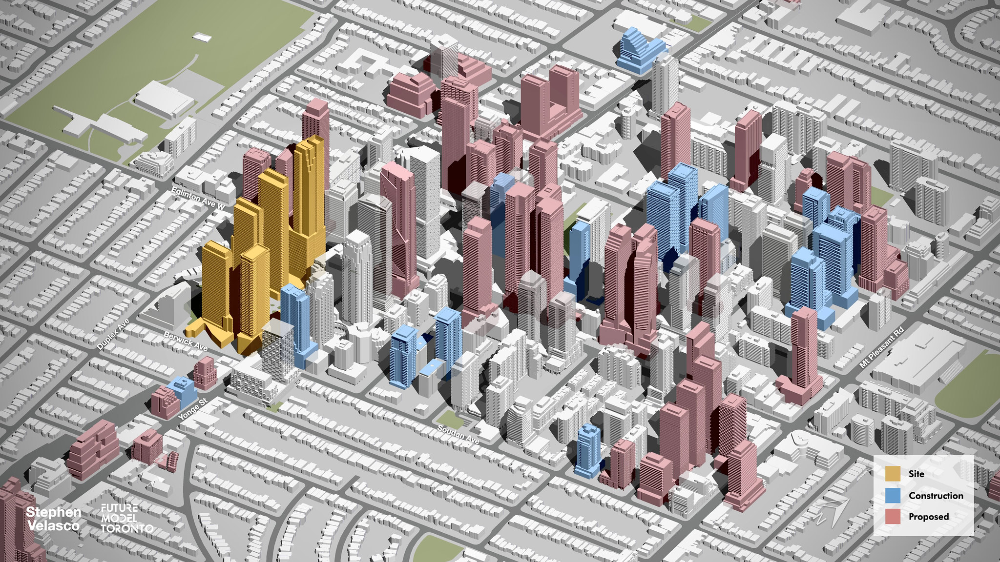
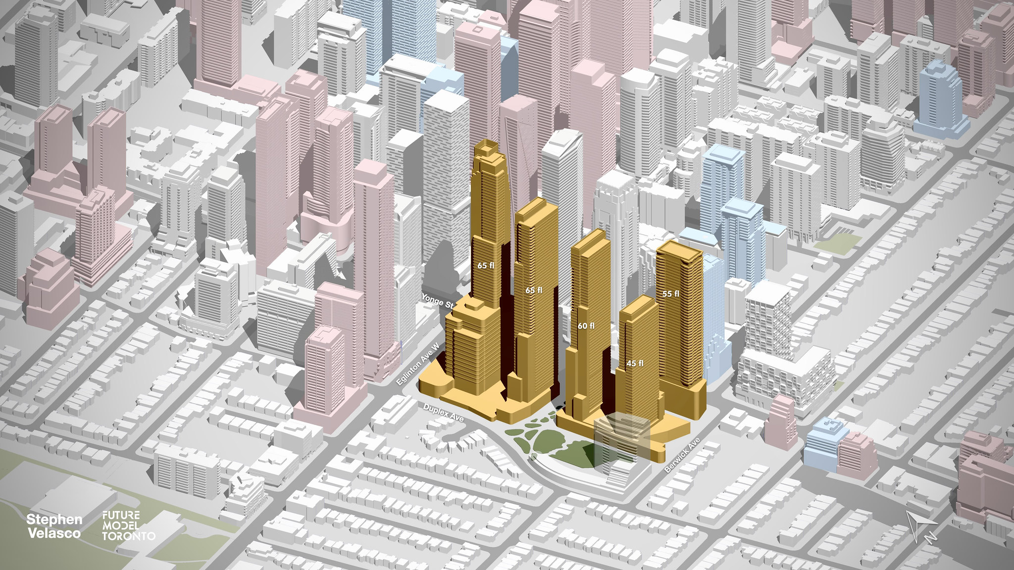
Early look at the overall massing in context:

52565509095_da27889431_k.jpg

52564595682_dee1d6b0f8_k.jpg
 
A much improved proposal overall for me. The density is a bit heavy but justifiable sitting on top of two subway lines. Good preservation, a better job breaking up the podiums, and from a top level looks like a better pedestrian experience.
 
Last edited:
The designs of the two southernmost towers look more jumbled and cheap, with ugly cutouts and jenga boxes etc.

The previous render showed more elegant tapered NY style stepbacks. This new one looks like a clunker.
 
The designs of the two southernmost towers look more jumbled and cheap, with ugly cutouts and jenga boxes etc.

The previous render showed more elegant tapered NY style stepbacks. This new one looks like a clunker.
Tbh I'll take clunkier towers for the death of that atrocious cull-de-sac. Also if this is HPA, the towers will most likely look good in the end.
 

Back
Top