Toronto 191 Bay | 301.74m | 64s | QuadReal | Hariri Pontarini

I dunno... the spire looks like it's trying too hard. Not a fan of these pointy spires in general.
I think they'll get away with it in the eyes of the public if they just switch it with a radio tower like One World Trade Center in NYC did.
 
So…

That's not a very clear look at the building, but it looks clear to me that the latest version has a faceted exterior again, and that's quite the spire, but at the same time, I don't see an entry for redeveloping the site on Toronto's Development Applications page anymore.

Hmm.

42
I like the new version but im also worried about application missing on TO Development page.
 
and did anyone notice the look out/ restaurant on top? imagine the views from there.
1622550254594.png
 

Attachments

  • 1622550221364.png
    1622550221364.png
    1.2 MB · Views: 143
Last edited:
A couple of screenshots of a larger render posted in April 2020 by Zec Consulting (Note: source address below not linked as site may not be secure).

A better look at the top floors and spire.
cc3-1.jpg

cc3-2.jpg

 
I like the spire. Would really help this stand out
I’m not nearly as educated as most of you guys, so maybe you can help me out here. So does this mean the project is gaining traction? Or simply kicking tires?

The part I don’t understand is if The Hub was having trouble finding tennants, commerce court would be in the same boat no??
 
I think it is also worth noting that HPAs website uses the older renderings on their project page. It could be due to the fact that they never updated their site with the revised design in the first place, but I am actually finding it quite difficult to find images of the revised designs outside of UrbanToronto. Everywhere else seems to be going with the original.
 
Even though a third design has not been submitted to the City yet, I do know that one was created over the last couple of years. No idea if it's totally ready to submit yet, but as that hasn't been so far, then QuadReal has their reasons. Some members here should remember that developers are not working to your timeframe, but to their own, and there could be a million reasons why they haven't pulled the trigger yet.

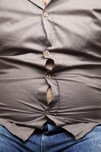
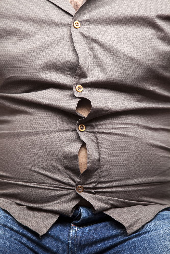
In regard to the pending resubmission design though, assuming the new rendering shows something that's mostly ready to go, it combines elements from both the first and second submissions, rather satisfyingly. It no longer looks like someone bursting out of their suit like the first version did, while unlike the second version it's no longer a boring (but elegant) box—the facets will give it personality the box version lacked. Is that a projecting glassed-in balcony we can see on the west side of the upper storey amenities?

Looking forward to an eventual resubmission, whenever that is, the plans, and more renderings!

42
 
I like the third one better than the other two.
On the third, the various angles match the angle of the roofline required by shadowing restrictions.
It seemingly doesn't have the fat cat bursting shirt buttons of the first design (it looks like a cladding change to de-emphasize it).

bursting-stomach-340x509.jpg

 
https://pin.it/2KEaEpP
I would have to disagree. The “buttoned up” version was actually quite elegant. I’m not entirely seeing that it was “busting at the seams”.

But, I’m also not upset about the new iteration either. This building is in good hands with HPA.

73D7E2EF-A425-4F37-B15A-73B0C80FA6A1.jpeg
Edit: to show thumbnail for context
 

Back
Top