You are using an out of date browser. It may not display this or other websites correctly.
You should upgrade or use an alternative browser.
You should upgrade or use an alternative browser.
Toronto 100 Queens Quay at Sugar Wharf | 117.34m | 25s | Menkes | B+H
- Thread starter themarc
- Start date
bilked
Senior Member
Deadpool X
Senior Member
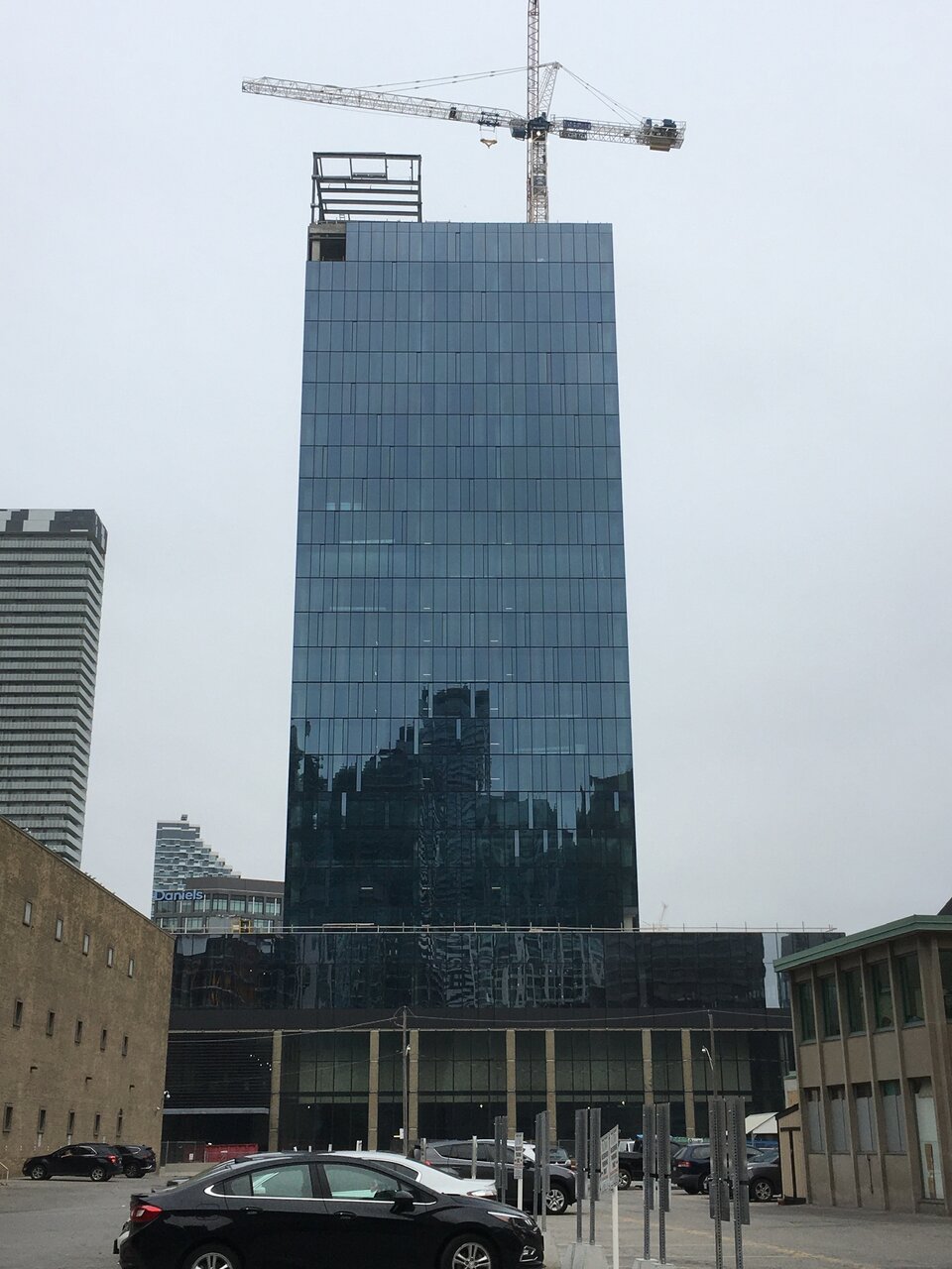
Daniels' masterpieces are making their presence felt on this building too
Rascacielo
Senior Member
From yesterday
Rascacielo
Senior Member
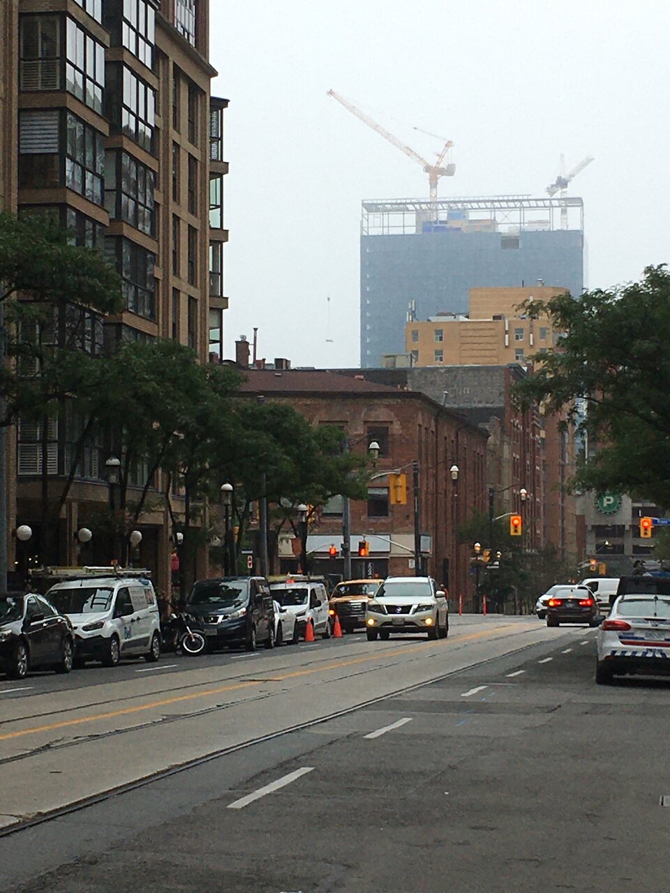
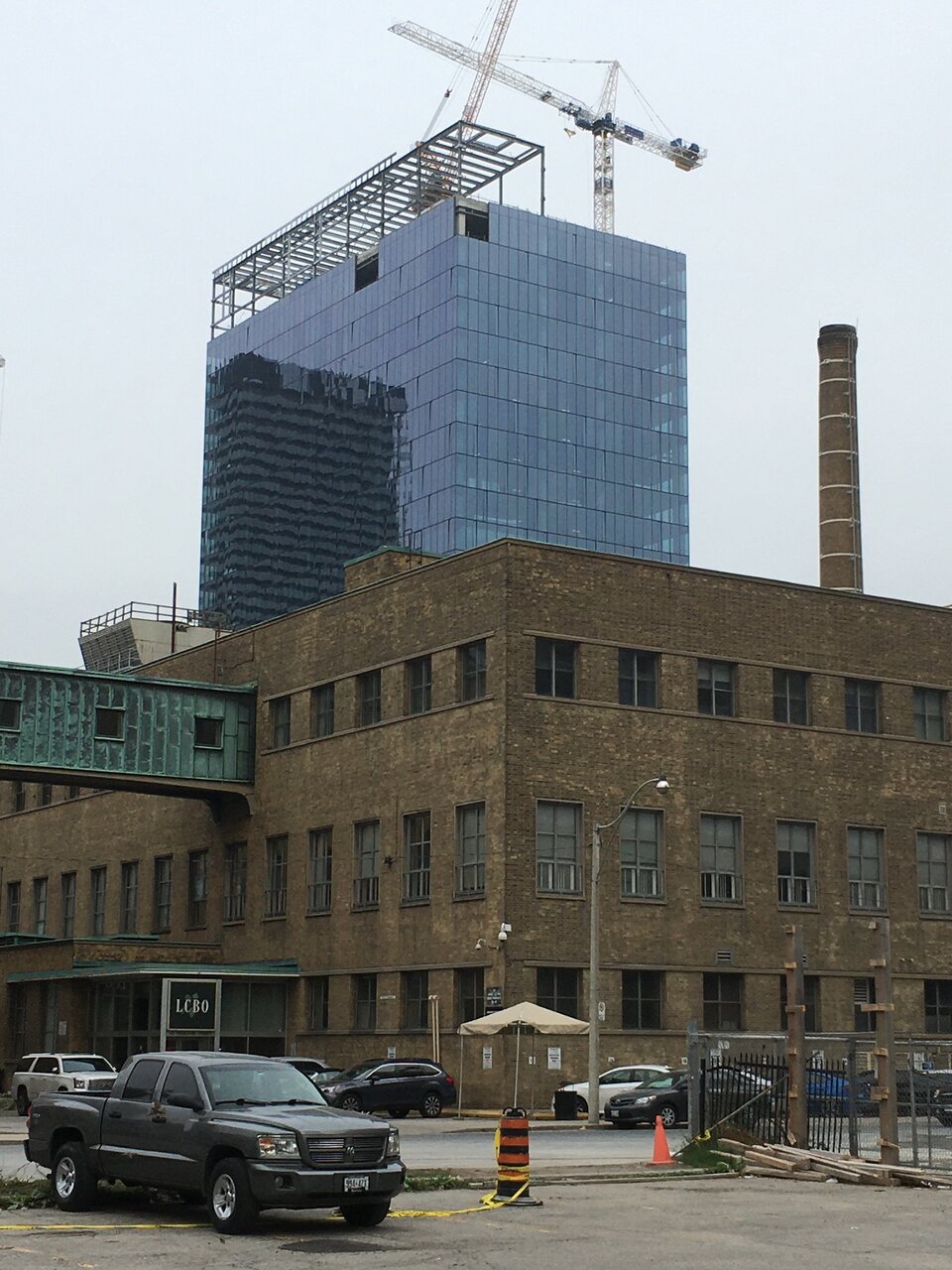
Today
000
Senior UT Member
Does anyone know the future of the Redpath refinery?
Automation Gallery
Superstar
Yup it's staying there for a while and going nowhereDoes anyone know the future of the Redpath refinery?
androiduk
Senior Member
Sweet!
drum118
Superstar
Sept 06


Perkie
New Member
The worst new building in Toronto, even more so than its twin College Park. Not an ounce of creativity or single thought to design other then the most for the least amount of money and effort. Shame on LCBO
ushahid
Senior Member
Seems fine. What's wrong with it? And why shame on LCBO? They are not building it.
adHominem
Senior Member
The worst new building in Toronto
Oh, my sweet summer child.
TossYourJacket
Senior Member
Someone hasn't seen Design Haus on College yet apparently
DavidCapizzano
Senior Member
I think the design is very boring but they used high quality glass and it seems well detailed. I think the initial design with the one storey pavilion/podium was a lot more elegant and the new design with the cantilevered 3rd storey is a bit goofy looking. I would give it a 75% as of now, but I'll wait until it's complete and landscaped before passing a final grade. Using some kind of accent glass like a mirror or frosted finish for the inset bits on the tower would have helped this one feel like more than just a glass box.
Riseth
Senior Member
It's not awful but it's literally a glass box, nice glass but still nothing special at all. Plus it's killed one of the best views of the city from Polson Pier along with the Daniel's Condos.The worst new building in Toronto, even more so than its twin College Park. Not an ounce of creativity or single thought to design other then the most for the least amount of money and effort. Shame on LCBO