You are using an out of date browser. It may not display this or other websites correctly.
You should upgrade or use an alternative browser.
You should upgrade or use an alternative browser.
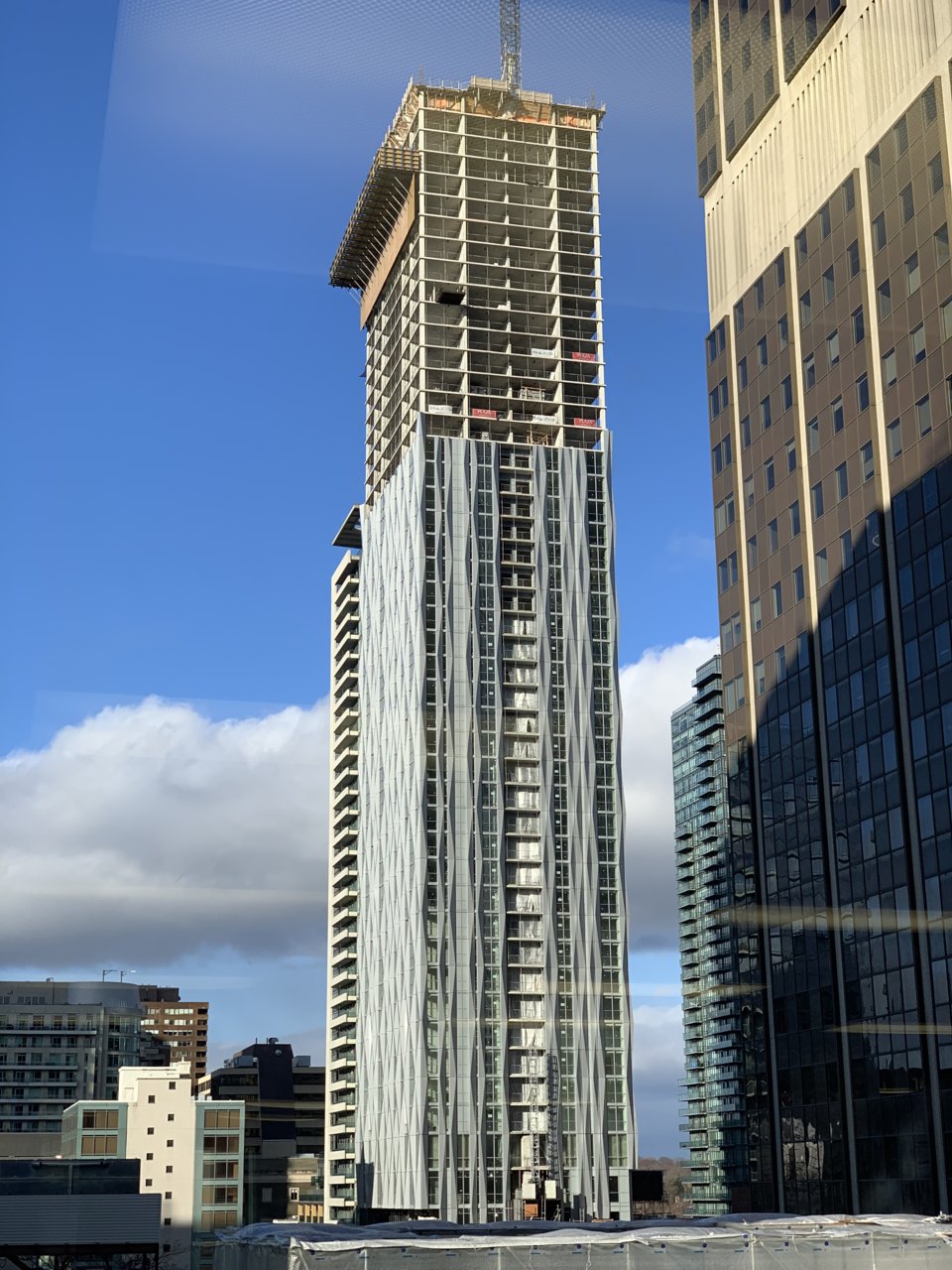
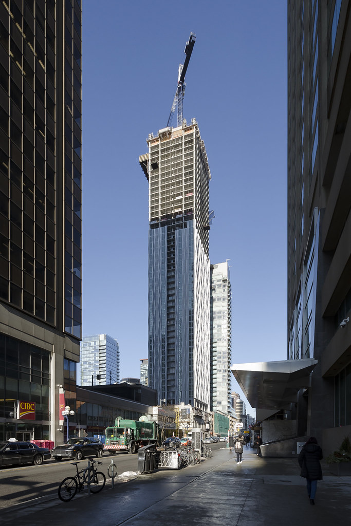
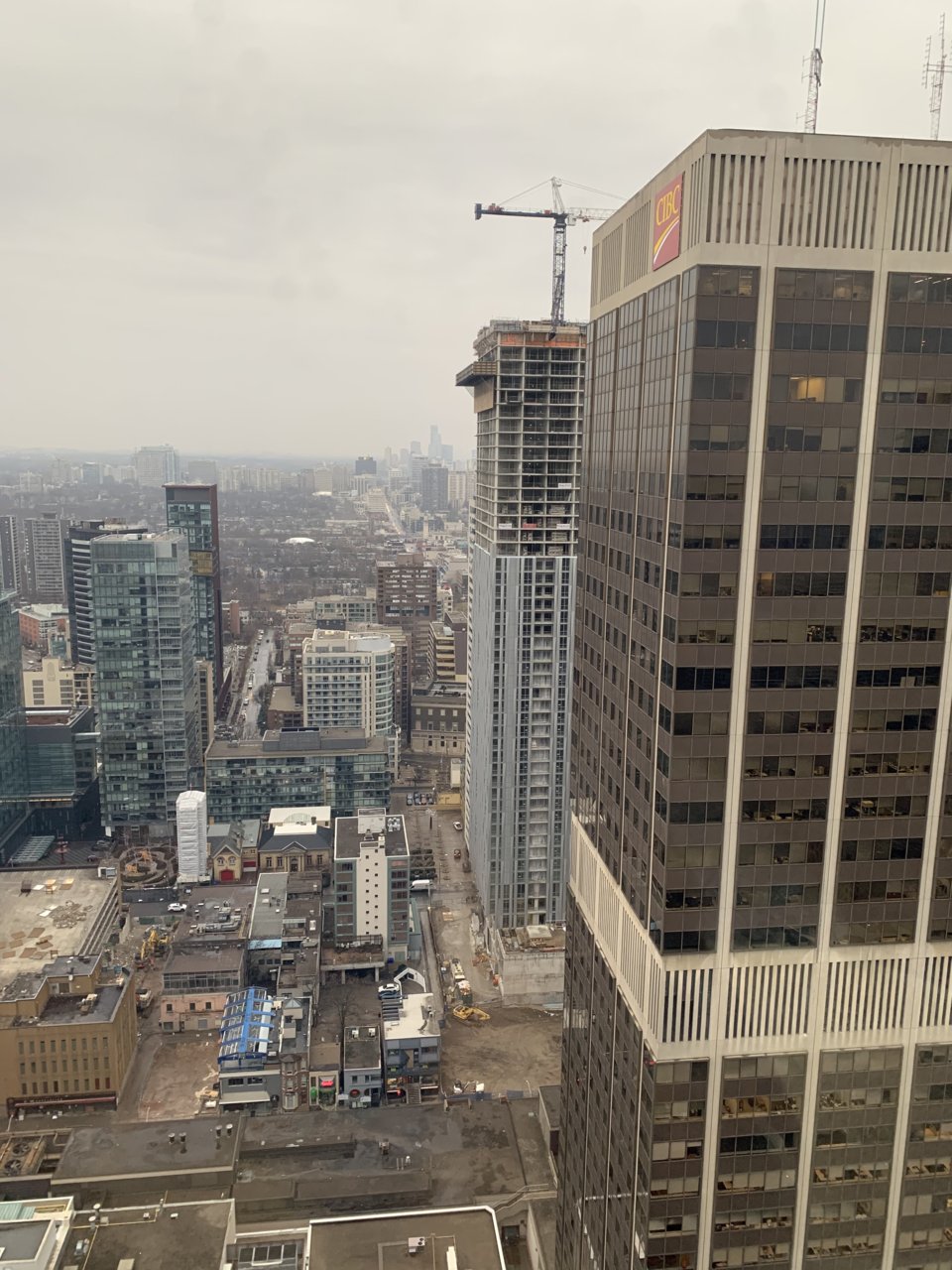
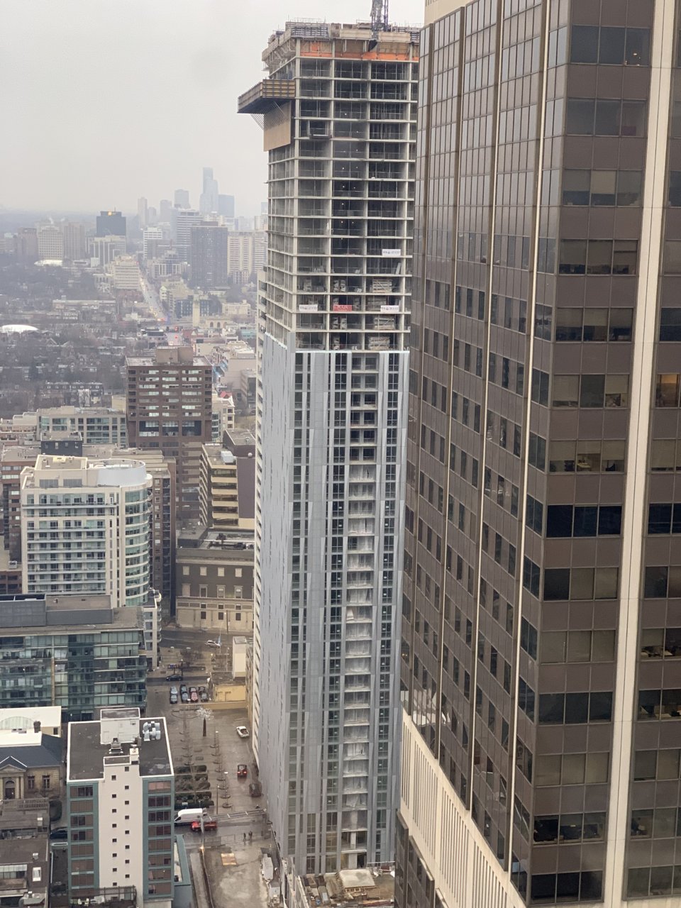
Toronto 1 Yorkville | 183.18m | 58s | Bazis | Rosario Varacalli
- Thread starter cruzin4u
- Start date
Benito
Senior Member
Today.
willwu
Active Member
today。
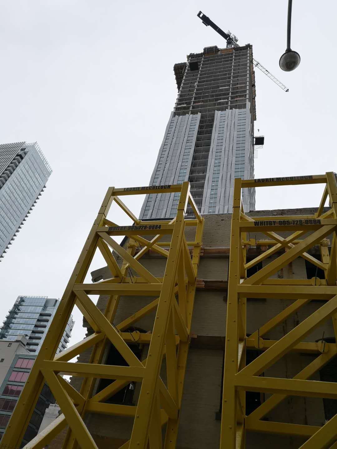
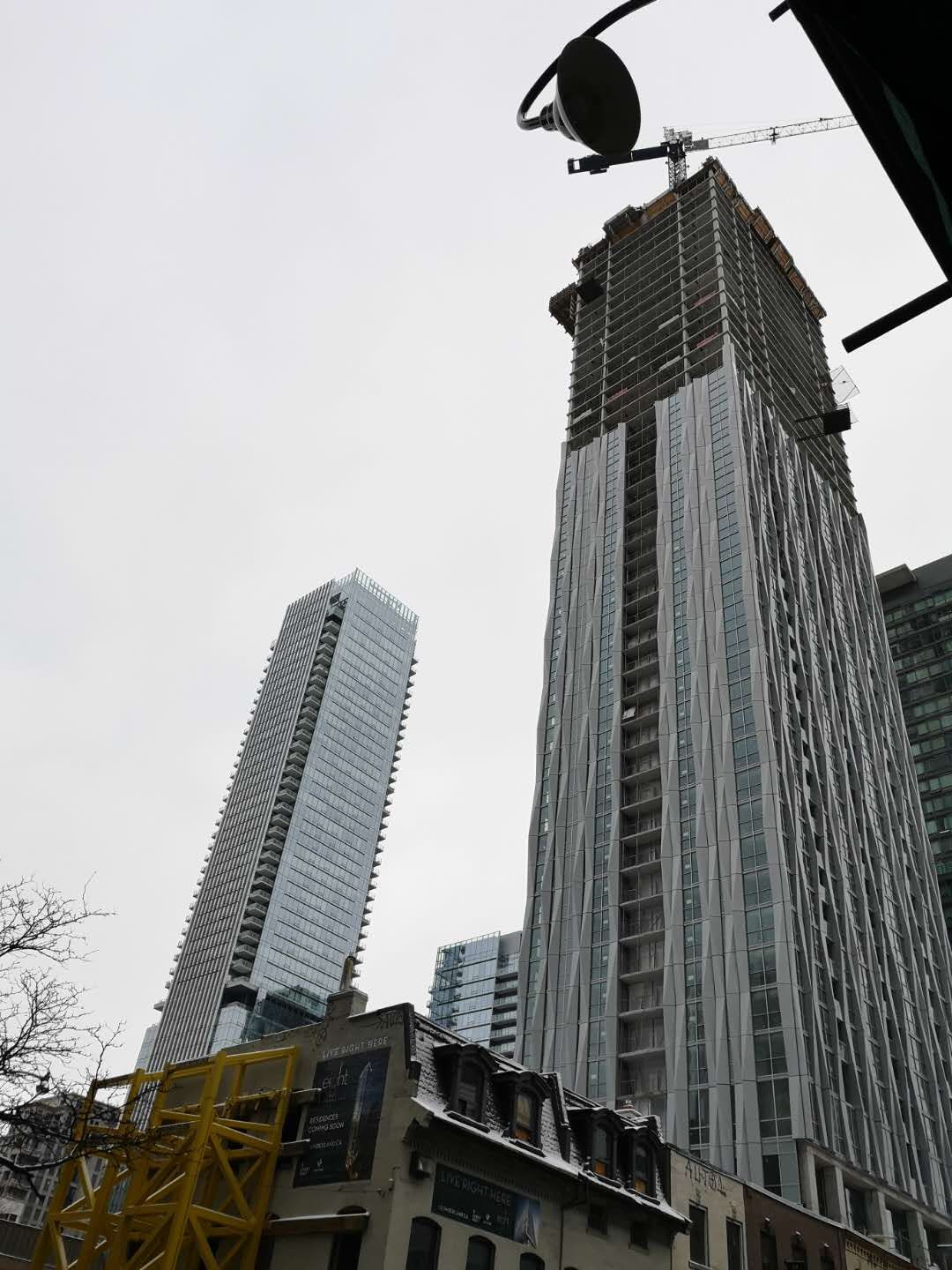
Bayer
Senior Member
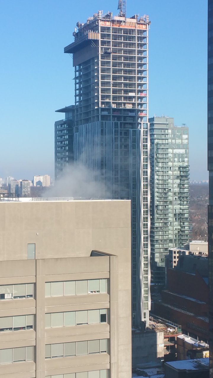
Today.
ADRM
Senior Member
Think we're between 48 and 50-ish stories up, now.
oresama
Active Member
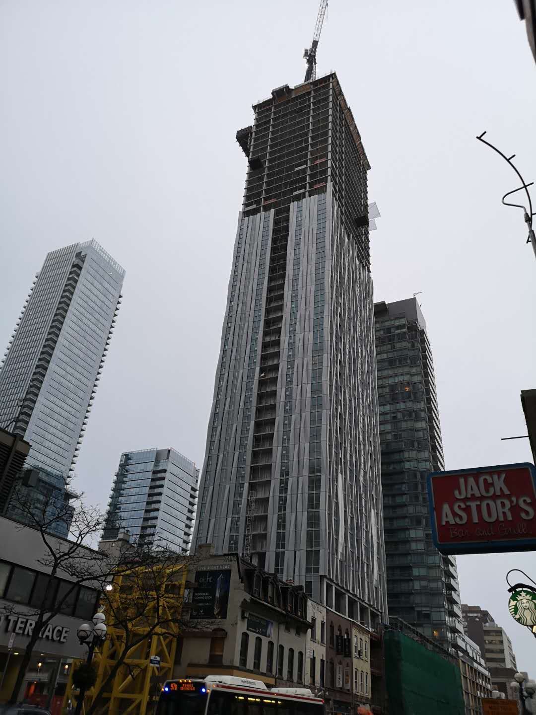
Spandrel aside, this tower might just have stunned us if its fins were coloured like that of 60 Colbourne.
Automation Gallery
Superstar
As is It's still a stunner for the average person passing bySpandrel aside, this tower might just have stunned us if its fins were coloured like that of 60 Colbourne.
alklay
Senior Member
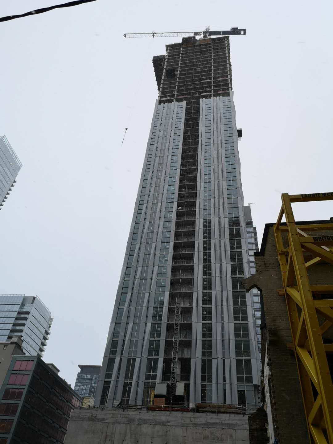
I want to like this tower, but I just don't. And I am not sure why. Is it the fact that it the material looks like cheap and thin aluminium. Is it because of the presence of spandrel and the disjointed use of same? Is it because the spacing between the flowing ribbons is inconsistent and not particularly harmonious?
Or is it because of all these design flaws?
Or is it because of all these design flaws?
Midtown Urbanist
Superstar
I am just disappointed that I will have to associate Yorkville with this and other like buildings now.
MafaldaBoy
Senior Member
willwu
Active Member
today。
Auraz
Active Member
I am just disappointed that I will have to associate Yorkville with this and other like buildings now.
Yorkville needs new energy. You should welcome it. Why else go there other then Whole Foods? Maybe Nespresso? This shouldn't disappoint you as much as on the other end of Cumberland/Yorkville.
Yegger
Active Member
I'm hoping that the crown may resolve the design a bit more. As far as I'm concerned, the main issue is the material selection amplified by the ratio of grey fin to glass. It looks like a scrunched up aluminum foil to me. I do appreciate that it offers something different and hope that once yorkville is built up, the variety in styles will make Yorkville more unique than any other neighbourhood in the city.
Koops65
Senior Member
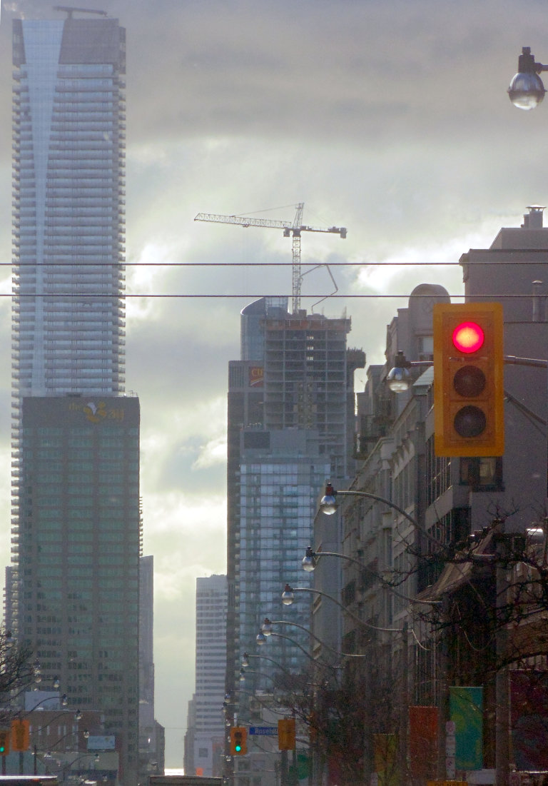
By me today:
Benito
Senior Member
Today.
