News   Nov 04, 2024
 251     0 
News   Nov 04, 2024
 568     4 
News   Nov 04, 2024
 737     1 

Ryerson: Business Building (Zeidler)

A

Archivistower

Guest
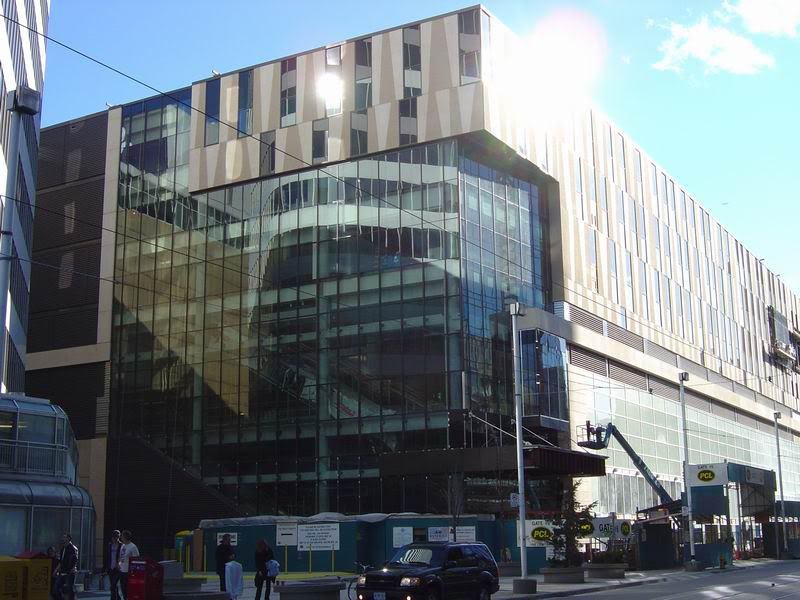
My only real photo that might be of interest from Doors Open is below, the Ryerson building from on high, showing the interior opening on the upper floors.

ryerson.jpg
 
Might that be the ugliest thing ever built in Toronto?
 
Because it's relatively short and won't impact the skyline, it is sufficient if it has a good ground level presence. From what I've seen when passing by, I think it will succeed at that.
 
You know a building is in trouble when the interior courtyard looks a little more interesting than the exterior.
The building is a pretty unsightly from a block or two away, but up close it doesn't look quite as bad.
 
Kind of wished they used a more glassier and facade like the interior courtyard or the glass used on NE corner of the building. What a waste... *sigh*
 
Hopefully when the retail moves in and all the signage is put up it will look better. For now, it's a real eyesore.
 
I was at Zeidler's offices yesterday for Doors Open and spoke with the architect of this building - apparently it was supposed to be clad in stone, but Cadillac Fairview wouldn't pay for it, so they settled on expensive precast instead.
 
That's going to be an interesting component, the courtyard. I must admit I'm not falling in love with it as it's seen here.
 
"Because it's relatively short and won't impact the skyline, it is sufficient if it has a good ground level presence. From what I've seen when passing by, I think it will succeed at that."


How very Canadian!
 
The one bit of good news is that its the glassy part of it is that faces east, ie. Yonge and Dundas. So the view from there, where most of the pedestrian traffic is, isn't quite as nauseating.

DSC03058.jpg
 
Y'know what? I'll go to bat for this one. During construction, I was horrified, especially when I first saw that strange duo-tone cladding.

But the building gets the Most Improved Student award for really shaping up as a package deal one the windows went in, completing the broken-up effect. It seems to be more than the sum of its parts.

I wish I could offer a more articulate defense of the thing. But I'm a fan.

And as for buildings that look better on the inside than the out, you could add the U of T grad residence and New College to that list.
 
I hate the brown aluminum siding, to me this building is on par with the torch.
 

Back
Top