


Blixtein
Active Member
This project proves that money does not buy taste.
|
|
|
"They fit in well. No worse than the other buildings in the surrounding area such as Minto Yorkville, Stern Building or Prince Arthur."
At times the chat on this site can be intimidating or, better, enlightening to fellows like myself sans fine arts degree. Fortunately, once in a while, someone drops the ball. Regency as good as Prince Arthur or One St Thomas? Get real.
...
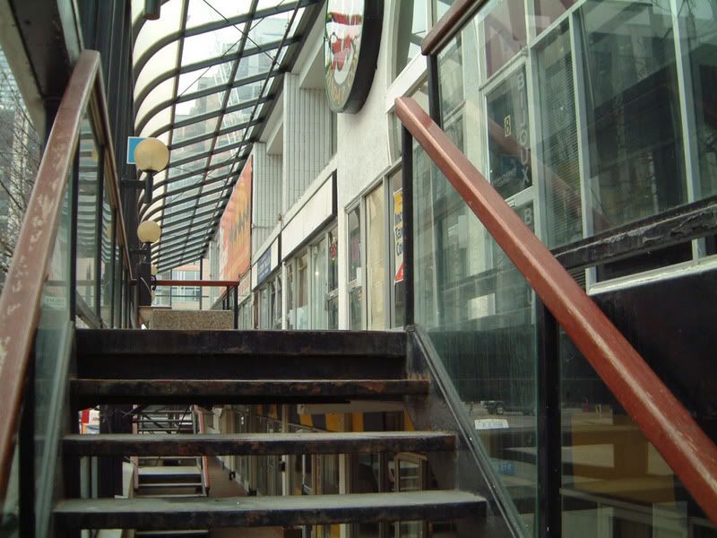
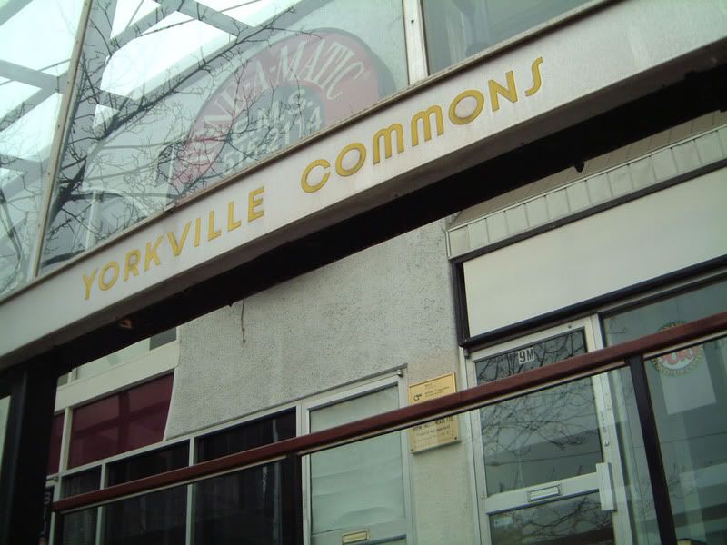
From the pics, it looks an awful lot like 1 St. Thomas. Perhaps in real life it looks much worse. That is the problem sometimes with looking at projects on this board. Pics dont always do a building justice, and sometimes they do it too much justice.

It might come as a surprise, but some of the purchasers might have bought on the basis of what would be found inside.