Northern Light
Superstar
So I made my contribution to derailing the One Yonge thread by joining a discussion on the quality of public art.
While that thread should get back on track; I thought the subject worthy of further discussion.
Rather that have the thread be too esoteric.......I would ask people discuss what they like or dislike using real, installed, public art, in Toronto.
What pieces do you value? What installations have made a lasting, positive impact on a public space, in the realm of popular opinion, or your personal one?
If you personally feel a piece is a success or failure, try to iterate why; if the piece has clearly achieved either status in the public imagination, please offer up the consensus as you understand it.
Please list the title of the piece and the artist if you know them the location of the installation; and provide a photo credit if the photo is not your own.
I'll begin with some of the public art in Toronto's subway system.
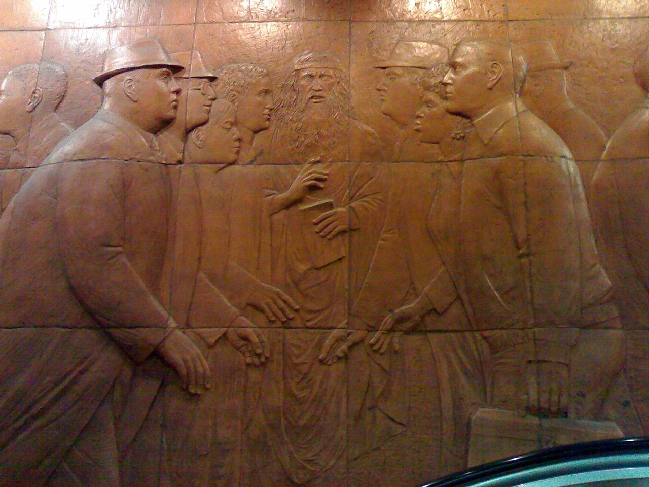
This is a piece entitled cross-section by artist William McElcheran
from: https://en.wikipedia.org/wiki/Toronto_subway_public_art#/media/File:Dundas_TTC_mural_meeting.jpg
Photo by: https://www.flickr.com/photos/kieranhuggins/
I really like the warmth of the colour tone and the material palette
It feels older than Dundas Station (though it isn't)
I think its the most aesthetically redeeming bit of Dundas Station.
I don't know that I would want to see it cover every wall at the station; but I always thought it would have been nice to see it extend throughout the lower tunnel and up to the northbound mezzanine.
*****
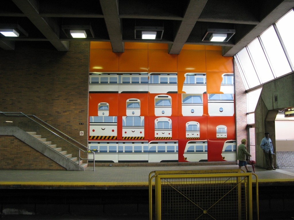
I'm also keen on this piece at Eglinton West Station by artist: Gerald Zeldin entitled Summertime Streetcar

 en.wikipedia.org
Photo by:
I enjoy it for its Toronto-centricity; its addition of bright-colour to a well-designed by otherwise dark station; and for its recognizable yet somewhat interpretative take on Toronto's historical PCC streetcars.
*****
By contrast; there is some more recent art I'm less keen on.
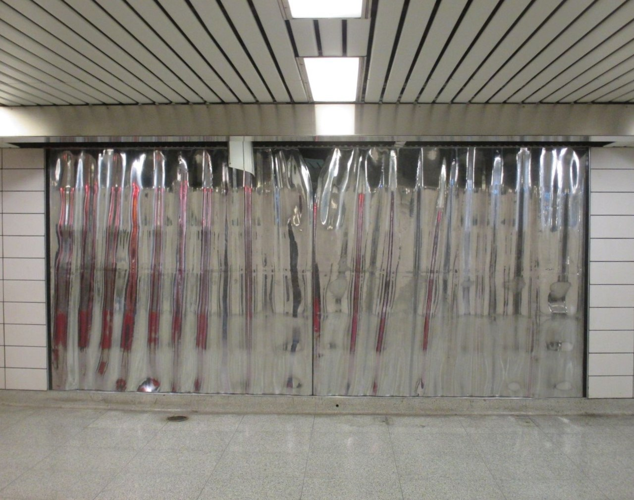
This piece by Jennifer Davis and Jon Sasaki entitled Forwards and Backwards at Coxwell Station:

 en.wikipedia.org
Photo Credit to Wikipedia poster: TheTrolleyPole
To me the piece is bland in its own right..........but it also provides insufficient contrast to the surrounding white tile (it would look better up against a bolder coloured backdrop).
Its also too small and awkwardly placed to make a good visual statement.
The texture/nature of the piece doesn't lend itself to mass appreciation, and lacks some detail that would convey the skill that was required to produce it.
Finally, I don't like this installation by artist Rebecca Bayer at Sherbourne station much:
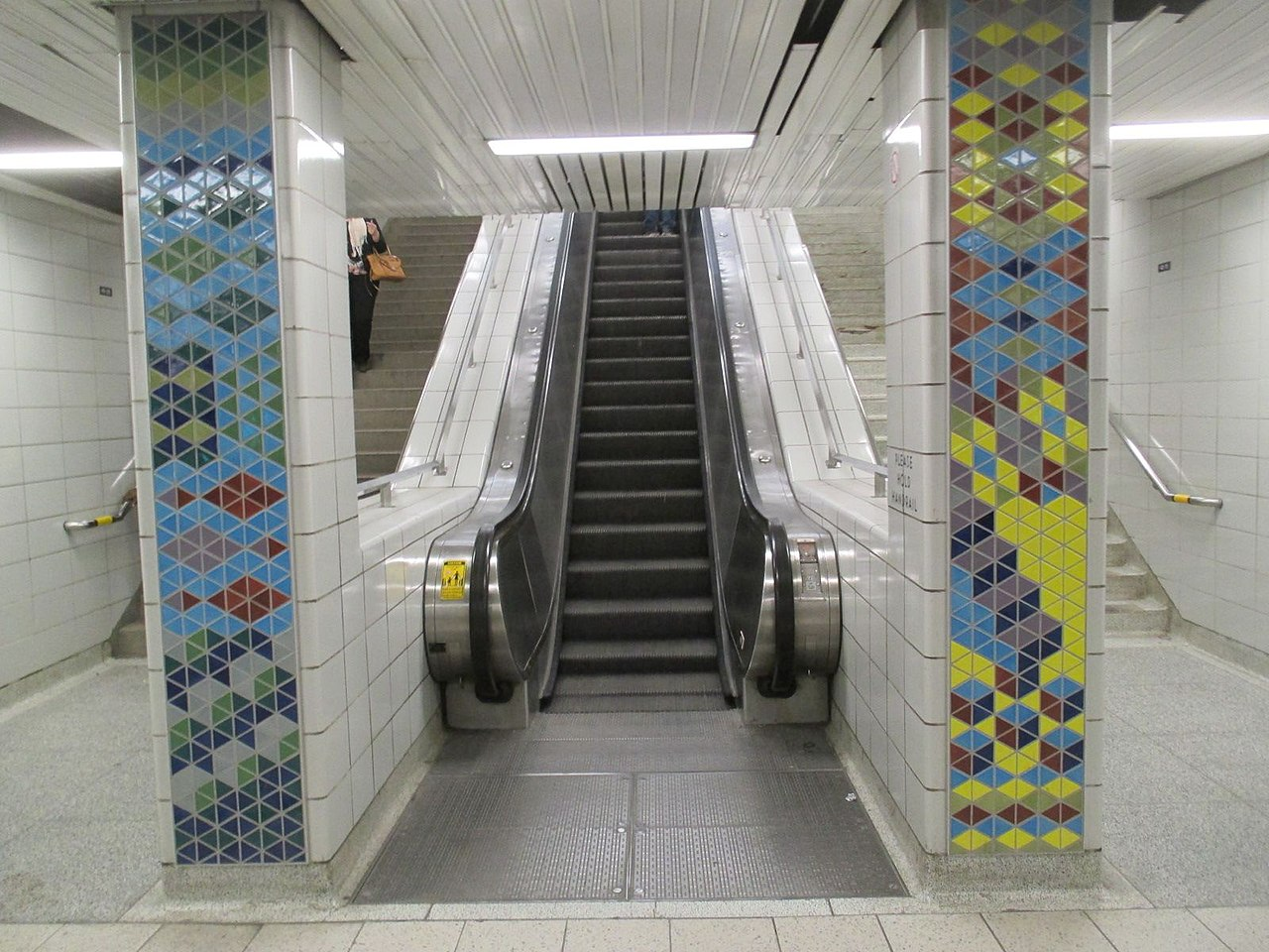

 en.wikipedia.org
Photo Credit to Wikipedia user TheTrolleyPole
I like the tiles themeselves and the colour.
They have all the potential to take one away from the drabness that is Sherbourne Station.
The problem I have is the way the installation/art was done was a number of these small, column-like pieces.
To me, it feels after-thought'ish.
I appreciate that the budget didn't allow for re-doing the entire station, or anything close.
But I think it would have read better as a piece along the entire length of one sets of stairs or taking over most of the mezzanine; perhaps providing a neutral-coloured break somewhere if it took over that entire space.
Instead it seems like disconnected fragments that don't really add anything to the station as a whole.
While that thread should get back on track; I thought the subject worthy of further discussion.
Rather that have the thread be too esoteric.......I would ask people discuss what they like or dislike using real, installed, public art, in Toronto.
What pieces do you value? What installations have made a lasting, positive impact on a public space, in the realm of popular opinion, or your personal one?
If you personally feel a piece is a success or failure, try to iterate why; if the piece has clearly achieved either status in the public imagination, please offer up the consensus as you understand it.
Please list the title of the piece and the artist if you know them the location of the installation; and provide a photo credit if the photo is not your own.
I'll begin with some of the public art in Toronto's subway system.
This is a piece entitled cross-section by artist William McElcheran
from: https://en.wikipedia.org/wiki/Toronto_subway_public_art#/media/File:Dundas_TTC_mural_meeting.jpg
Photo by: https://www.flickr.com/photos/kieranhuggins/
I really like the warmth of the colour tone and the material palette
It feels older than Dundas Station (though it isn't)
I think its the most aesthetically redeeming bit of Dundas Station.
I don't know that I would want to see it cover every wall at the station; but I always thought it would have been nice to see it extend throughout the lower tunnel and up to the northbound mezzanine.
*****
I'm also keen on this piece at Eglinton West Station by artist: Gerald Zeldin entitled Summertime Streetcar

Toronto subway public art - Wikipedia
I enjoy it for its Toronto-centricity; its addition of bright-colour to a well-designed by otherwise dark station; and for its recognizable yet somewhat interpretative take on Toronto's historical PCC streetcars.
*****
By contrast; there is some more recent art I'm less keen on.
This piece by Jennifer Davis and Jon Sasaki entitled Forwards and Backwards at Coxwell Station:

Toronto subway public art - Wikipedia
To me the piece is bland in its own right..........but it also provides insufficient contrast to the surrounding white tile (it would look better up against a bolder coloured backdrop).
Its also too small and awkwardly placed to make a good visual statement.
The texture/nature of the piece doesn't lend itself to mass appreciation, and lacks some detail that would convey the skill that was required to produce it.
Finally, I don't like this installation by artist Rebecca Bayer at Sherbourne station much:

Toronto subway public art - Wikipedia
I like the tiles themeselves and the colour.
They have all the potential to take one away from the drabness that is Sherbourne Station.
The problem I have is the way the installation/art was done was a number of these small, column-like pieces.
To me, it feels after-thought'ish.
I appreciate that the budget didn't allow for re-doing the entire station, or anything close.
But I think it would have read better as a piece along the entire length of one sets of stairs or taking over most of the mezzanine; perhaps providing a neutral-coloured break somewhere if it took over that entire space.
Instead it seems like disconnected fragments that don't really add anything to the station as a whole.
Last edited:


