News   Nov 22, 2024
 400     3 
News   Nov 22, 2024
 1.1K     3 
News   Nov 22, 2024
 389     0 

One of the most befuddling floor plans I've seen

tripwire

Active Member
Member Bio
Joined
Sep 28, 2015
Messages
887
Reaction score
1,771
From: https://www.rightmove.co.uk/properties/77803635#/
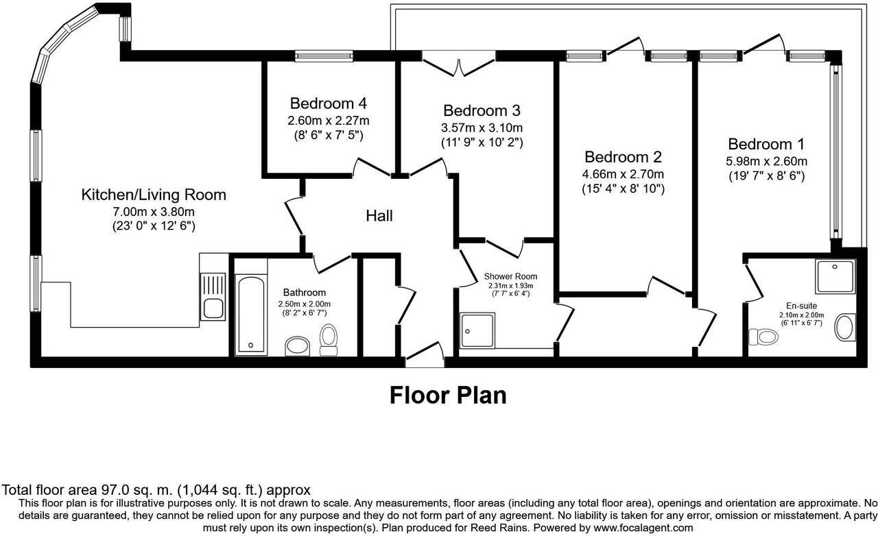


94193_LIV210021_FLP_00_0000.jpeg


So many problems:
* Bed 1 and 2 trapped by shower room!!!
* Where to put beds in Bed 3 and 4?
* So much wasted square footage from hallway
* So many doors!
 
I once saw a condo unit in Yonge & Merton area where the (not very large) living room was filled with the stairs to the upper floor and where the doors to bedrooms and bathroom in the upper level 'lobby' had to be opened/closed taking GREAT care not to hit any of the other open doors. Poor design is universal!
 
that shower room is ridiculous. Beds 3&4 are pretty clearly designed for twin beds only. I would argue that Bed 4 is really only suitable for an office.

Could the thought with the "shower room" be that its more of a utility space to wash your dog off or something? I can't see functionally why that space is needed as a shower space as both other bathrooms have showers as well.
 
I don't even understand how this floorplan can be offered.

The notion that you can't access a bedroom w/o going through a room where someone may require privacy and might even place a lock on the door is rather unpalatable and perhaps dangerous in the event of a fire.

I hate the thought of government micro-managing development more than it does; excepting things that reasonably belong in health/safety, building code/fire code.

But this sort of thing makes me think we need a law that says you can't call it a bedroom or market it as such if you have to go through a bathroom to get there.

But then of course, someone will make it so you go through a laundry room........ :rolleyes:
 
i feel like bedroom 5 should just be an extension of the living room but otherwise this is a massive improvement with minimal actual changes 😌
yes for a typical family living there you are right,maybe even bedroom #4 could be a smaller office den.

but this is student housing and trying to max. out profits and most students would not care about having a large living room , maybe even I would convert the small closet into a smaller bathroom toilet & sink only
 
yes, that is an awkward floor plan, but in Europe it’s typical to have entrance hallway closed off including to the living area, probably for better privacy and sound. It’s often see a room with just a toilet (hence the term “water closet”), and the bedrooms tend to be on the compact side with just enough room for a bed and a nightstand, just like the bedrooms you see here in newer condos. This building was probably converted from another use so it might have been limited to some of the existing walls and structure.

If I had to redesign this I would flip the plan around. Have the master bedroom and ensuite on the left side of the unit and put the kitchen and living area to the far right to take advantage of the large windows and access to the terrace.
 
If I had to redesign this I would flip the plan around. Have the master bedroom and ensuite on the left side of the unit and put the kitchen and living area to the far right to take advantage of the large windows and access to the terrace.
go for it and design it and post the photo on here 👍
we should have a game on here , where people redesign bad floor plans for fun
 
If I could redesign the unit, I would have bedrooms 2, 3 & 4 with common bathroom on the left side - all 3 bedrooms would be substantially bigger and better laidout.

Principal bedroom & ensuite would remain at the right side of the unit.

LR/DR/kitchen would be in the centre measuring ~20' × 20' with access to the balcony.
Kitchen would be L- shaped ~ 15' × 9' with 9' island & along the south wall.
 

Back
Top