News   Apr 24, 2024
 845     1 
News   Apr 24, 2024
 1.2K     1 
News   Apr 24, 2024
 597     0 

Museum Station

The main problem with that ceiling is all the surface wiring. It wouldn't look so bad if the wiring was concealed.

The TTC has no consistency whatsoever right now. Their own new signage model (a great one at that) is right there to be implemented at Museum (and should be implemented in all new station redesigns/renovations).

Agreed although I'm not sure you could hide all the conduits behind the signs you could certainly find a way to have less visible. I'm not sure why they can't have a larger conduit that fits multiple wires rather than installing new conduits every time they have something new to hook up on the roof. It looks to me that the one over the track didn't even need to be on the roof since it doesn't seem to connect to anything. It is obvious the TTC cares little about the aesthetics of stations when installing conduits. When people run wires around their home they certainly wouldn't simply staple them to the centre of the ceiling and would put some effort to hide them in ceiling corners or behind baseboards and crown moulding. You hardly need a drop ceiling to reduce the number of conduits they are running.

The worst example of conduits is the passage way to the Union streetcar platform. That platform only opened in the 90s and there is so much crap attached to the ceiling already.

The pictures of the exit signs show how the station was originally designed... with no wires visible.
 
Arts on Track is an initiative of the rich rogue benefactors, not of the TTC. When you're a rich rogue benefactor you select your own designer and design. That's how top-down works.
 
It's a whole new Museum Station

museumtoday.jpg


Compared to the render

71a9b25d49988acf2d70dd3e1af9.jpeg


By Zosia Bielski, National Post
Management consultant Robertson Boyle took a different route to work this morning so he could be among the first to see the new-look Museum Station, and liked what it suggests about the future of transit station design.
“I think each TTC station has its own personality. Each of those stations is in the heart of a community. Who knows what creative minds can come up with.”
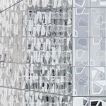
After its $5-million revamp, Museum station is now lined with hieroglyphs, First Nation house posts and Doric columns. Carved of foam, clay and cement, the pillars are based on artefacts from collections in the Royal Ontario Museum and Gardiner Museum, spectacularly revamped institutions that sit above the station.
“As an art lover I love this idea. The design reflects what is happening above,” said Awet Tekeste, a University of Toronto architecture and planning student currently studying the Libeskind Crystal.
As a design lover, Joe Clark — the gadfly known for championing the TTC’s unique fonts and tiles — hates the re-design.
In an oversized patchwork sweater, Mr. Clark wove through the crowd of dignitaries gathered on the station platform today. The “amateur typeface historian” introduced himself to journalists and presented them with a pamphlet: “The new Museum station: Hot...or not?”
“The new columns are cute,” the transit activist begins, then blasts “elites [who] don’t actually ride the subway” and “corporate donors,” individuals Mr. Clark believes persuaded the TTC to revamp for the benefit of their own tax write offs.
The Museum station revamp cost $5-million: $2-million from private donors (including $1-million from the Budd Sugarman foundation), $2-million from the province and $1-million from the TTC.
Mr. Clark complained the new Museum signage - large and decorated with hieroglyphs - is spaced too tightly, and that smaller versions cannot be seen from the traincar window because they are set too low on the walls.
Mr. Clark pointed to the “legions of transit fans in Toronto and around the world” who loved the TTC’s unique typeface and tile heritage, now set to disappear as 63 of the system’s 69 stations prepare for a makeover as part of a $275-million station modernization program.
TTC commissioners voted last month to scrap the uniform tile motif in its stations in favour of unique designs. “We have a public transit system that has the same design scheme as a public bathroom,” Councillor Joe Mihevc, a TTC commissioner, said last month.
Ms. Tekeste was not certain how the TTC would manage individual looks for more obscure stations on the line, or find equally enthusiastic philanthropists to fund the facelifts.
“I’m not quite convinced that it will work at other stations in other parts of the city. Where are you going to find the resources? I don’t think they’re going to find the money to do the other 63, so stick with this one,” said Ms. Tekeste after she snapped photos of the columns.


http://network.nationalpost.com/np/...08/04/08/it-s-a-whole-new-museum-station.aspx

That picture actually makes it look decent. I just wish the wiring wasn't left exposed like that.
 
I just got back from taking a quick look and photo session.. the station looks great if you're on the train... since you don't see the ceiling... but once you get off and see the ceiling, it really does take a lot away from it. Even just painting it black would have been better than the white. Black paint probably would have helped to remove some of the glare in the station and made it a little softer - the fluorescent lighting is a bit out of place next to the incandescent (! not LED!) lighting.

With this station, there is now yet ANOTHER new signage style! The "Next Station" placard on the walls has been replaced with another new version.... yet at St George Station, there were none to be seen -- I almost boarded the wrong train, since it displayed "Kennedy" at the front, despite heading westbound, and the lack of directional signage anywhere completely disoriented me...

Anyway... pictures!

Full album here:
http://www.facebook.com/album.php?aid=2161551&l=dff58&id=122602698
http://299bloorcallcontrol.com/2008/04/08/museum-stations-new-clothes/

n122602698_35430398_2916.jpg

n122602698_35430408_1876.jpg

n122602698_35430409_3867.jpg


Another new style of signage:
n122602698_35430394_7455.jpg


This guy was waiting forever for a train:
n122602698_35430413_1491.jpg
 
n122602698_35430394_7455.jpg


wow you'd think they would have just kept using the ones that they have all over the place now. :rolleyes:
 
New Arts at Museum Subway

TTC unvieled to day for a long waiting new arts at museum subway.subway wall and pillars are so beautifull, I had no camera when a passed today.please go and see it I hope someone will take good shot.
 
Wow, not as bad as I thought. The columns look like they are of good quality, and I think most people will forgive the exposed wiring above the central row of lights because it is, after all, a subway station.
 
It doesn't look too bad, it's just a shame all the harsh florescent lighting and plain white paint makes the whole place so sterile and bland overall.
 
i think it looks amazing!!!! wish it looked better like that rendering with the nice ceiling with bright lights... but still, i think it really looks great and interesting. love it.
 

Back
Top