News   Mar 28, 2024
 1.3K     3 
News   Mar 28, 2024
 675     2 
News   Mar 28, 2024
 938     0 

Museum Station

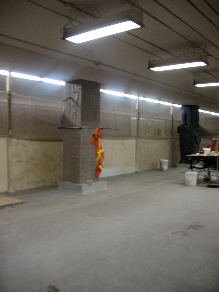
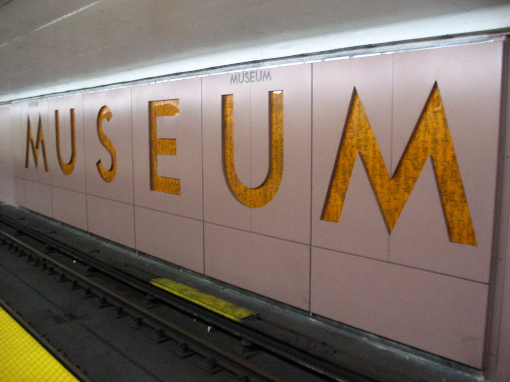
Wow, this is what passes as art? The average subway rider doesn't care to see vulgar Vaudeville nudes. If St Patrick's done over to reflect OCAD/AGO why can't it be in good taste? If artworks must be displayed it can be done creatively through a framing motif rather than a running panel. The colour scheme doesn't have to change either (lets reserve that rainbow look for Wellesley). Here's an example of better ideas:

ekaiserwilhpark9zb.jpg


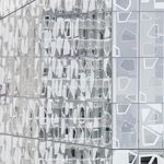
From Rhine-Ruhr, Germany. Take note of the protruding objects on the wall.

277325080_ab7dc61efc_o.jpg


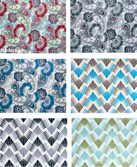
Various colour schemes the TTC could use for the backdrop, in keeping with the original green/dark spectrum tiling but with a more art-themed aesthetic.

277119614_f56f95d82d_o.jpg


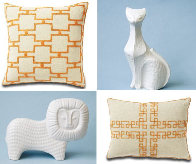
The forefront, could have four images protrude/'jump out' from the tiling such as demonstrted in this example (perhaps imagery reflecting OCAD/AGO). This could occur in a sequence of image(s) then station name sign repeatedly. In keeping with the art theme, each mural would be distinctly picture-framed. Share your thoughts :cool:!
 
Unless they are going to have tile cleaners back on the payroll, there is no use putting in patterend tiles as they will just get all dirty.

That is on of my biggest beefs with the TTC stations. The walls are SO DIRTY. The other is that the ceilings are always in some state of disrepair.
 
Interesting ideas, regarding the protrusions. I wonder how that would work on the narrow, and potentially crowded platforms?

With regards to the patterns, they look sharp now, but I suspect they will quickly fade from vogue and be seen with ridicule. One advantage to the BD line's colour and simple tile aesthetic is that it doesn't age. It doesn't look terribly flashy, but after 40 odd years, it still looks simple and clean (if you ignore the grime). It is also remarkably immune form personal preference, even if it tends to the bland. How many can really object to Ossington's colour scheme?, and compare that to a paisley-esque pattern.

So why mess with St. Patrick? Keep it green, use the TTC font, and call it a day. If it is that important to have the sation reflect the neighbourhood, then rename it AGO/OCAD (like Beri-UQAM).
 
Giambrone claims the system is cleaner, but I can't say I believe him.

The tracks are a little cleaner. About a year ago there was a small fortune to be made with discarded bottles on the tracks at Lansdowne.


Littering is still a persistent problem. Can't blame young Adam for that.
 
What they should do is enforce the existing subway by-laws. I have never ever seen a single person getting fined for littering.

And seriously, I wonder when are the majority of scatchitti made? It sounds like they need random patrols of the trains and/or undercover riders.

AoD
 
When I saw the supergraphic lettering on Museum today, it looked like grime got into it already, unless it's part of the "hieroglyphic effect"...
 
Still not sold on the color of the panels, but it makes the station look a lot better. Will not make the unveiling for the end of the month as plan, but will for mid Feb. Still got to put the ceiling up as well new lights.

If this was a TTC project, we would not see an unveiling until the summer.

The grim on the wall is not only from the construction, but TTC crew doing rail replacement and welding of the rails. Ventilation was on full force yesterday afternoon and that the first time I have heard it over the last few months since construction started.

If this station turns out close to the rendering drawings, there hope for the other stations to be even better than this one.

Working on the end wall of the jail
2184939576_20ef2326cd_b.jpg


Not sure if this is a bench or not as it was not there before construction and there are 2 of them on the platform.
2184938782_ac1fb41495_b.jpg


2184937964_64e43828b3_b.jpg


I hope they plan on taking this panel up the stairs wall.
2184150447_c171e4ddcc_b.jpg


2184936482_25e350635b_b.jpg


2184148939_ed070c6a3d_b.jpg


2184935030_de40b96dac_b.jpg


2184147647_8789274f5a_b.jpg


2184933710_09453aab94_b.jpg


For the last column to be done as all the rest are finish or about to be.
2184146081_129cf368df_b.jpg


There are two of these on the platform and are new. Must be for info.
2184145253_499a6be644_b.jpg


You can see the new floor tiles for the visual impair. You also can see were the new concrete floor has been install. Still say they will have to grind the floor down, not polish it as plan to try to get to look the same.
2184931448_fd4d3b1aa2_b.jpg


I like this as it enhance the station. It matches the existing station font and this will please some people.
2184930718_f4ec056799_b.jpg


2184929936_5509154bc6_b.jpg
 
ugh.... that would just be tacky, even fpr thiis makeover.

are they doing anything to the mezzanine level? I don't recall that they are... and if they aren't, that is going to be one horribly mismatched station.
 
The Museum makeover is moving fast and looks great. I am looking forward to seeing it when completed. Btw, is it only the platform area that is getting the remake or the mezzanine and entrances as well?
 

Back
Top