News   Nov 11, 2024
 289     1 
News   Nov 11, 2024
 270     0 
News   Nov 11, 2024
 410     0 

Miscellany Toronto Photographs: Then and Now

I fail to see a significant difference, other than the black and white photography, the cars, the overhead wires and the style of dress.

I agree... This is one of those rare cases when the re-do made an improvement. I rather like the sleek newer version. It maintains the lines of the original but better.

It's like a prototype of a car is always waaaay sleeker and cool looking than the production model. Yet this is "as if" we ended up with the prototype after all. :)

Yeah, this from the guy who questioned the O'Keefe Centre's heritage value because it was only built in 1960.

Here we go again.
 
Last edited:
It may have been more for streetcars than cars as the tracks are prominent in all those pictures.

From Unbuilt Toronto (parts of which are available on Google books)


From a the Dec 16, 1911 Toronto Star article
Hocken and Spence Cross Swords in Tube Debate - Optimistic Controller Hocken says Toronto Needs Tubes Now and Argues That They Will Pay From the Start – Spence Would Unify Surface Lines, Leaving Tubes to 1921.
- quoting Controller Spence

p.s. There is also a set of pictures at the Archives for the Church Street extension -showing what Asquith, Ellis, Collier, Park & Davenport looked like in 1930.
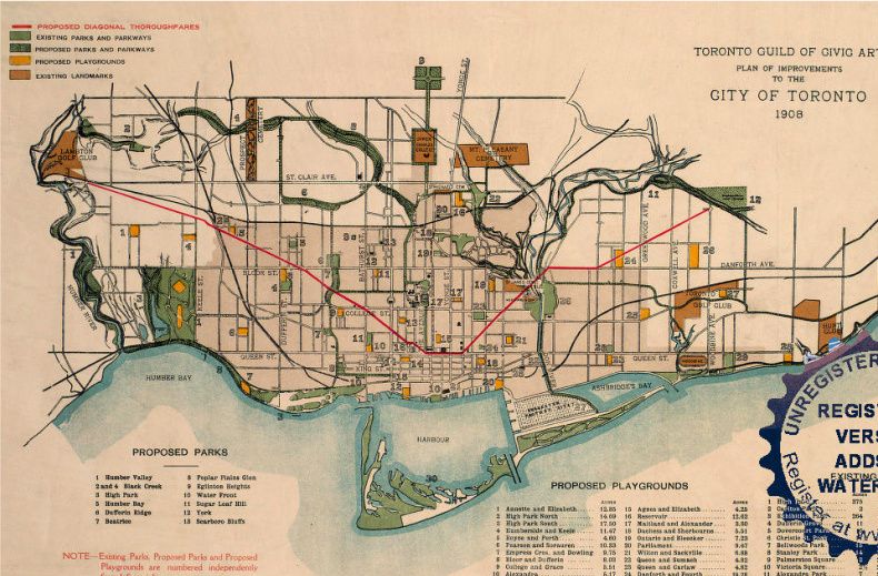
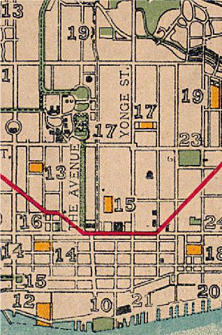
Thank you for this, Anna. Interesting to see that when the Toronto Guild of Civic Arts released its Plan of Improvements in 1908, it looked like it was Elizabeth Street that would be extended northerly, not Terauley. Would have been very different for the U of T campus, Midtown and Yorkville if that had happened.

1908full2-1-1.jpg
1908-1-1.jpg
 
I agree... This is one of those rare cases when the re-do made an improvement. I rather like the sleek newer version. It maintains the lines of the original but better.

It's like a prototype of a car is always waaaay sleeker and cool looking than the production model. Yet this is "as if" we ended up with the prototype after all. :)

Right. ADDING a racing stripe of brown granite kitchen tiles; ADDING honed granite tiles to the base, and covering up the original stone; ADDING “deco-styled†sconces; ADDING a smoked glass cantilevered awning, totally destroying the drama of the entrance, and ADDING lame-ass corny LED screens to the corner of the building is so uh, sleek.

C3l.jpg


I suppose you like this ‘improvement’ as well.

suttonBaySt.jpg


suttonEntrance.jpg
 
Yeah, this from the guy who questioned the O'Keefe Centre's heritage value because it was only built in 1960.

Here we go again.

I think you have the wrong forumer... I have never made a comment about the O'Keefe Centre like that. At least that I can think of.... Please direct me to the post so I may see what you mean. In actuality I am indifferent to the O'Keefe/Humingbird/Sony Centre.
 
Right. ADDING a racing stripe of brown granite kitchen tiles; ADDING honed granite tiles to the base, and covering up the original stone; ADDING “deco-styled†sconces; ADDING a smoked glass cantilevered awning, totally destroying the drama of the entrance, and ADDING lame-ass corny LED screens to the corner of the building is so uh, sleek.


I suppose you like this ‘improvement’ as well.

WOW! So aggressive!... It was my opinion... Of which I am entitled... No need to be so caustic... I suppose you designed the original 800 Bay Street and I impugned your vision? For that, I am sorry they destroyed YOUR building. You obviously take this SOOOOO personally because I have somehow insulted your taste. You sir, then did the same by trying to insult my taste by bringing in a "So if you like this then you must like that" kindergarten-style argument.

CHILLAX!!!!!

yes, you are 'entitled' to your 'opinion', so uhm, opine away, i guess.

its just that to claim that "This is one of those rare cases when the re-do made an improvement" is an utterly ludicrous thing to assert.
 
yes, you are 'entitled' to your 'opinion', so uhm, opine away, i guess.

its just that to claim that "This is one of those rare cases when the re-do made an improvement" is an utterly ludicrous thing to assert.

IN YOUR OPINION... I think your posts would be so much easier to take if you prefaced it with... "I think"... or "IMO". You have ONE view it is not the right view NOR is mine... That is the nature of opinions.

I embrace diversity and value other views. You seem to be of the nature of "be like me -BE LIKE ME!" and are somehow deluded that your taste is the right one.... THERE IS NO RIGHT ONE... They are tastes.
 
Miscellany Toronto: Then and Now never fails to amaze me...

Mustapha:11/19 That Scotiabank pic definitely dates from the mid 70s-Note
the Ontario permanent plate on the front of that Pontiac(?) AZJ*746 - Those were first issued in 1973 and stayed with the auto until the Plate to Owner program began in the early 80s.

That Varsity Rest pic E on Bloor is also 70s - with a Ford Mustang,a VW and a Chevy Nova pulling into traffic noted. My father once owned a '77 Nova so I recall them well.

Adma: On the topic of Cities Service perhaps BP took over those stations in Canada and the US ones became CITGO-I recall that growing up as young as I was then here on LI in which Cities Service became CITGO.

With all the old sights being posted and their modern counterparts noted today
this is ALWAYS quite interesting-that 1908 map from Charioteer a good example!
Thoughts and insight by LI MIKE
 
yes, you are 'entitled' to your 'opinion', so uhm, opine away, i guess.

its just that to claim that "This is one of those rare cases when the re-do made an improvement" is an utterly ludicrous thing to assert.

Go deepend. The "improvements" were a total degradation of the original architectural integrity of what was a fine modernist building. They were unnecessary and only served to ... well, actually, I'm at a loss to understand what the "improvements" served - certainly nothing aesthetic.
 
IN YOUR OPINION... I think your posts would be so much easier to take if you prefaced it with... "I think"... or "IMO". You have ONE view it is not the right view NOR is mine... That is the nature of opinions.

I embrace diversity and value other views. You seem to be of the nature of "be like me -BE LIKE ME!" and are somehow deluded that your taste is the right one.... THERE IS NO RIGHT ONE... They are tastes.

I find that when someone resorts to asserting one’s ‘right’ to one’s ‘opinion’, it tends to follow on the heels of said individual having stated something rather stupid; in this case asserting that gaudy, trendy ‘improvements’ created by some no-name hack firm 35 years after the fact are somehow superior to the architect’s original design for the building.

Just so you know, I routinely defer to people whose point of view I respect, or to people who know more than me. (how else does one learn?). Its just that, in the present instance, I simply don't buy the kind of relativism you're selling.

Whether you like it or not, there are good buildings and bad buildings; brilliant buildings and awful buildings; bad renovations and great renovations, etc etc. This is not a matter of taste. Some things (whether books, buildings, artworks, pieces of music...) are works of genius, and some things are crap. Everything exists on a spectrum. For me, the goal is always to learn to recognize excellence in all its forms, and to learn to recognize things that are of lesser value.

To imply that all things are somehow ‘the same’, and that all opinions and tastes are somehow 'equal' is a recipe for total mediocrity. It’s the reason Toronto is saddled with so much second-rate development. According to this kind of thinking, both The Beatles and Nickelback are equal, because some people ‘like’ the Beatles and some people ‘like’ Nickelback. Why not just accept that there is such a thing as quality? Or to reverse it: why not just accept that there is such a thing as bad taste?
 
Last edited:
November 22 addition.


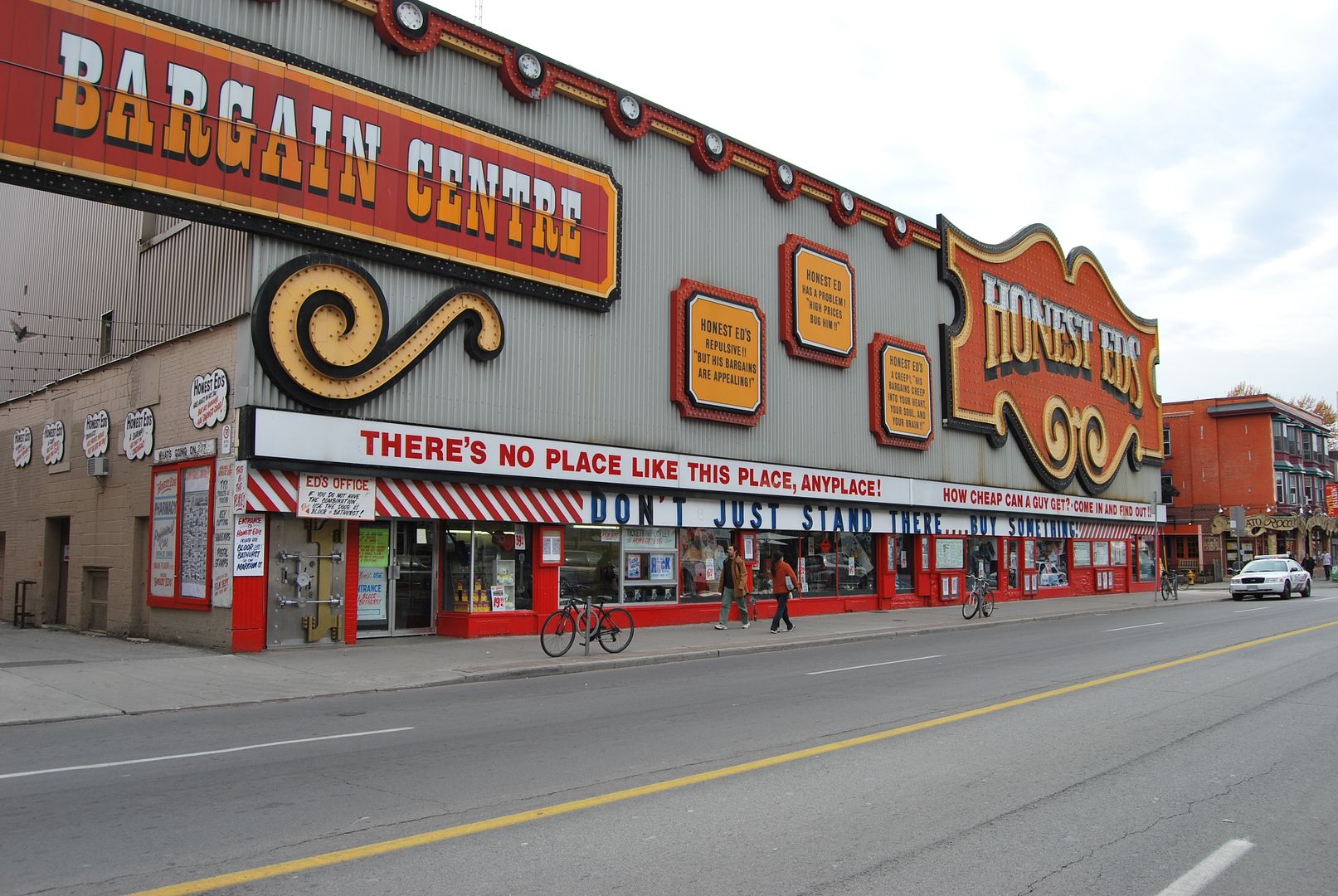
Then: Looking SW along Bloor from just W of Bathurst. Toronto Archives photo description date is given as: "... 196?".

fo1257_ser1057_f1257_s1057_it0465.jpg


Now: October 2009.

DSC_0018.jpg
 
I think you have the wrong forumer... I have never made a comment about the O'Keefe Centre like that. At least that I can think of.... Please direct me to the post so I may see what you mean. In actuality I am indifferent to the O'Keefe/Humingbird/Sony Centre.
Okay, honest error: got "Traynor" and "Dugmor" confused.

But, regardless: to think what you're suggesting "improves" the design is like saying a Victorian commercial front would be "improved" through additional pseudo-Victorian detail (or, worse, EIFS). Uh....no.
 
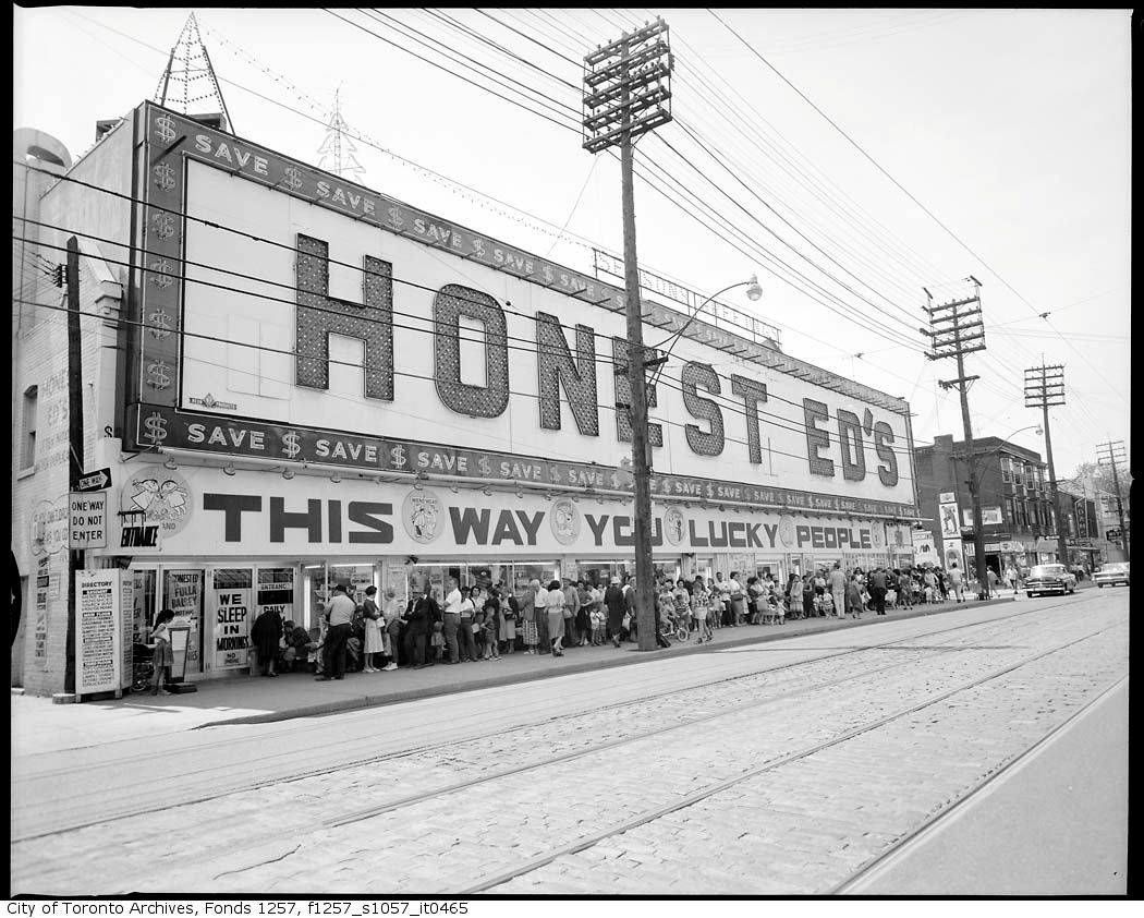
Honest Ed's looked so much better in the before picture. It certainly acts as an abrupt segway in between the Annex and Korea town.

One can't help but wonder if the place is even profitable. With all that real estate it's downright silly they never put in a full size grocery store (there is a grocery section but it's quite sad), it would be great for the area (price chopper prices) and would pull in a lot more people who would start buying their random crap (saw a Nintendo Wii knockoff called the MiWi last time there lol). It's amazing how many people I meet in Toronto who have never even been in the damn place despite living down the street from it. In it's current state this has to be one of the most tragic missed retail opportunities in any major city anywhere.
 
Last edited:

Back
Top