News   Nov 12, 2024
 628     1 
News   Nov 12, 2024
 509     1 
News   Nov 12, 2024
 596     0 

Miscellany Toronto Photographs: Then and Now

A few of the lost buildings and streetscapes of "Bay" Street:
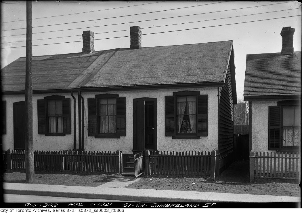
s0372_ss0003_it0303.jpg


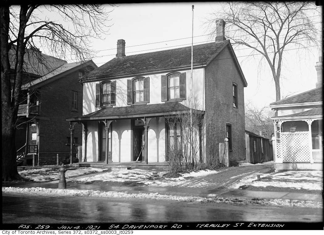
s0372_ss0003_it0259.jpg

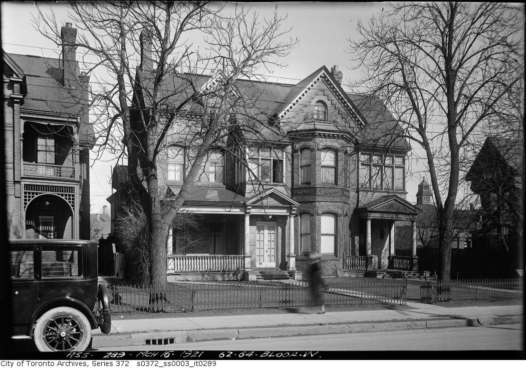
s0372_ss0003_it0289.jpg


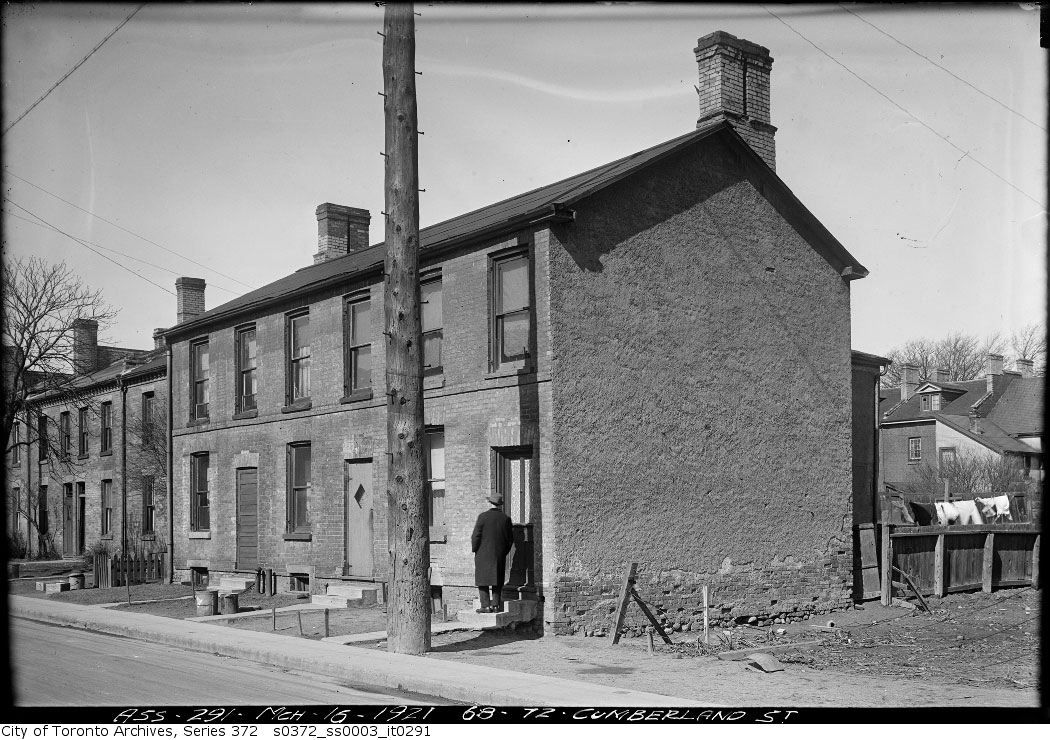
s0372_ss0003_it0291.jpg


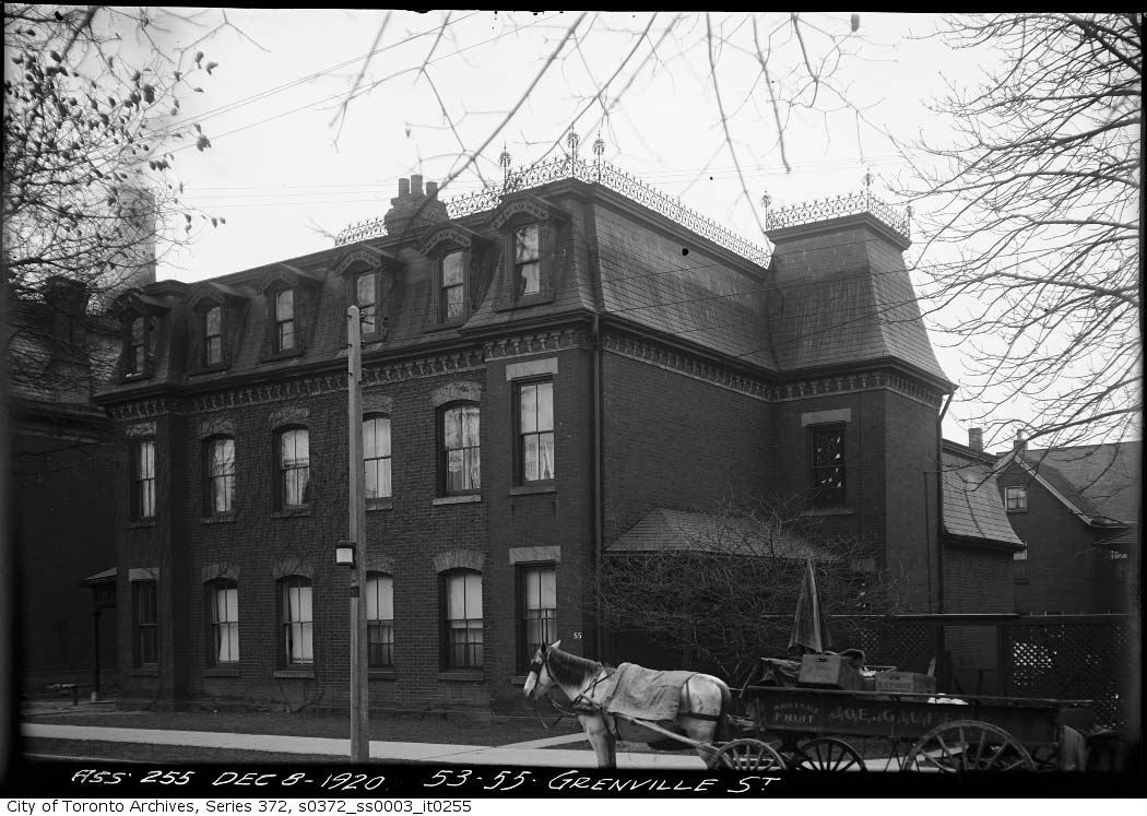
s0372_ss0003_it0255.jpg


these are all gorgeous. i love the incidental and transient details you find in these 'anonymous' images. they remind you this is a particular millisecond of time, a specific year, month, day, hour and second--never to be repeated: a young child's face in a window; a broom left leaning on the porch, with the open front door revealing a wallpapered hallway; the blur of a hurrying woman; a man knocking at a front door, with the clothes blowing on a washing line in the backyard; a horse drawn cart delivering fruit.
 
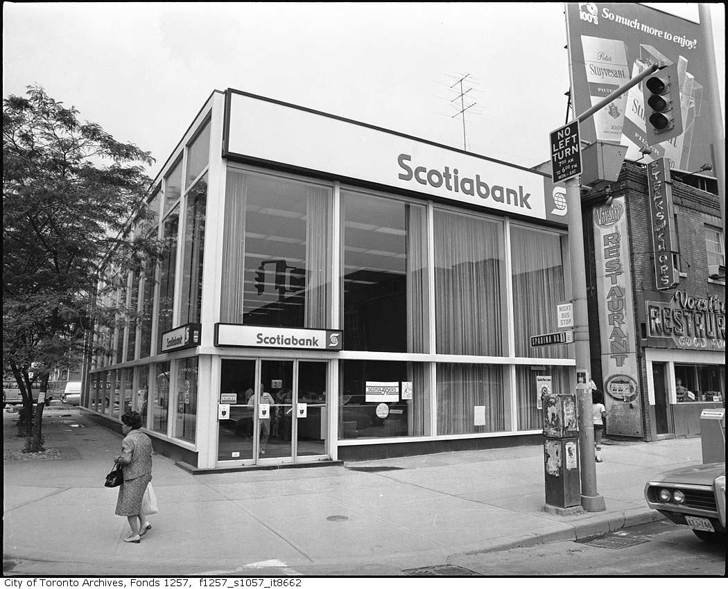
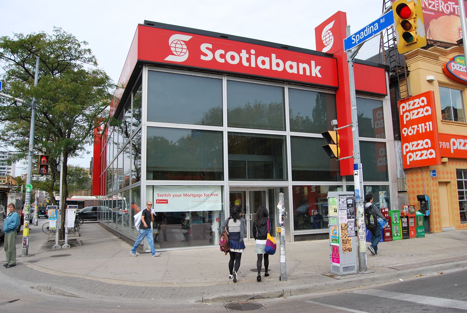
this is one for the architects and designers among us to ponder. the 'Now' version is not particularly awful, and is in some ways not all that different from the original building. however, four major changes have been made:

1. the glass in the curtain wall is now broken up into a far more pronounced grid, and the drama of the large panes of glass is gone.
2. (most importantly, i think) the glass is now more or less flush with their frame, rather than being recessed.
3. they have moved the entrance further over, from the corner to the left middle of the facade.
4. they have recessed the entrance, and created a vestibule.

are all of these changes just change for changes sake? just the waxing and waning of trends in renovation and 'updating'? there doesn't seem to be any particular reason to do any of them. none of them are fatal, but they have definitely weakened the impact of the building...

From the Panda archive:

http://contentdm.ucalgary.ca/cdm4/item_viewer.php?CISOROOT=/pan&CISOPTR=6435&CISOBOX=1&REC=18

Parkin's Yonge/St. Clair branch:

http://contentdm.ucalgary.ca/cdm4/item_viewer.php?CISOROOT=/pan&CISOPTR=5101&CISOBOX=1&REC=2

Parkin's Don Mills branch:

http://contentdm.ucalgary.ca/cdm4/item_viewer.php?CISOROOT=/pan&CISOPTR=8167&CISOBOX=1&REC=9

... and if you really want to compare how the forces of horror vacui that now stalk the land have debased the Queen/McCaul branch - both inside and out - compare these pristine images to the visually degraded clutter that's there now:

http://contentdm.ucalgary.ca/cdm4/item_viewer.php?CISOROOT=/pan&CISOPTR=4069&CISOBOX=1&REC=10

http://contentdm.ucalgary.ca/cdm4/item_viewer.php?CISOROOT=/pan&CISOPTR=4064&CISOBOX=1&REC=20
 
4118372588_cf3a8b12c2_o.jpg


4118372594_c80e4865f9_o.jpg


Pizza Pizza has become a total menace. they are destroying every building they inhabit with their gross, gaudy, tasteless branding. could they pick an uglier colour scheme? and what's up with the 'harlequin'-style orange and white tile job? the whole thing looks like absolute crap.
 
Agreed!

NE corner of Bloor and Spadina.

BloorandSpadinaNE1960s.jpg


DSC_0016.jpg


this is one for the architects and designers among us to ponder. the 'Now' version is not particularly awful, and is in some ways not all that different from the original building. however, four major changes have been made:

1. the glass in the curtain wall is now broken up into a far more pronounced grid, and the drama of the large panes of glass is gone.
2. (most importantly, i think) the glass is now more or less flush with their frame, rather than being recessed.
3. they have moved the entrance further over, from the corner to the left middle of the facade.
4. they have recessed the entrance, and created a vestibule.

are all of these changes just change for changes sake? just the waxing and waning of trends in renovation and 'updating'? there doesn't seem to be any particular reason to do any of them. none of them are fatal, but they have definitely weakened the impact of the building...

I'm no Architect, but knew there was something I liked better about the Old (1960's?) ScotiaBank!
Thanks for pointing out the details. No matter how small, they really do make a remarkable difference!

Scotia 1960's screams "look at me, come iside!"
Scotia 2009 is whispering, "look at me instead of everything else that looks the same!"
 
are all of these changes just change for changes sake? just the waxing and waning of trends in renovation and 'updating'? there doesn't seem to be any particular reason to do any of them. none of them are fatal, but they have definitely weakened the impact of the building...

Adding the additional set of horizontal window frames, while seeming minor, makes the building look heavier and shorter. Sometimes it's the small things that can make the worst difference; like the gradual removal of ornamentation from older brick and stone buildings over time. I think as much as it's done as a change of aesthetic thing, it's done primarily as a lazy alternative to properly fixing up ageing exterior features.
 
The pictures of Yorkville before Bay was cut through once again confirm my suspicion that if I were blindfolded and somehow magically transported back in time to 1925 or so, I would literally have no idea what city I was in. Even if I were told it was Toronto, I'd probably be completely lost.
 
From the Panda archive:

http://contentdm.ucalgary.ca/cdm4/item_viewer.php?CISOROOT=/pan&CISOPTR=6435&CISOBOX=1&REC=18

Parkin's Yonge/St. Clair branch:

http://contentdm.ucalgary.ca/cdm4/item_viewer.php?CISOROOT=/pan&CISOPTR=5101&CISOBOX=1&REC=2

Parkin's Don Mills branch:

http://contentdm.ucalgary.ca/cdm4/item_viewer.php?CISOROOT=/pan&CISOPTR=8167&CISOBOX=1&REC=9

... and if you really want to compare how the forces of horror vacui that now stalk the land have debased the Queen/McCaul branch - both inside and out - compare these pristine images to the visually degraded clutter that's there now:

http://contentdm.ucalgary.ca/cdm4/item_viewer.php?CISOROOT=/pan&CISOPTR=4069&CISOBOX=1&REC=10

http://contentdm.ucalgary.ca/cdm4/item_viewer.php?CISOROOT=/pan&CISOPTR=4064&CISOBOX=1&REC=20

thanks for posting these links--its amazing to see the Parkin in its pristine minimal perfection. its heartbreaking that we can't leave these buildings alone. unfortunately, the harmony and balance of elements is so delicate that that are incredibly easy to deform, and the endless market obsessed, trend driven fiddling has ruined almost all of them.

one of the saddest of course is 800 Bay Street. in the dark days of the late 1980's its owners saw fit to cloak its base in the cheap and cheesy 'pomo stylings' of the time, and to utterly destroy the impact of the upper floors with a completely inappropriate new set of windows.

8001.jpg


800.jpg
 
CNE Automotive Building

A while back there were mentions of the CNE Automotive Building - the place that's currently undergone extensive renovations.
I've just found one of my 60-year-old photos of a car show in that bldg.
I'm not sure of the date - 1950?
 

Attachments

  • sb4a8af44cc236b.jpg
    sb4a8af44cc236b.jpg
    37.6 KB · Views: 482
  • tely-aug-22-1929-automotive.jpg
    tely-aug-22-1929-automotive.jpg
    72.2 KB · Views: 452
  • CNE Automotive Building c.1950.jpg
    CNE Automotive Building c.1950.jpg
    116.5 KB · Views: 493
charioteer. thanks for all these! i had no idea Bay was stitched together in that way...it partly explains why there isn't a single early 20th century building left standing on Bay St between Walton and Bloor--outside of the little house on the NW corner of Gerrard and the covered up Bistro 990 building south of St. Joseph...

Glad you enjoyed them! What bothers me about the Terauley Extension and the creation of Bay Street, as we now know it north of Queen, was the lost opportunity. This was a project solely driven by traffic engineers, with no thought to urban design, future built-form and city-building. Running new streets through an older urban fabric is not a new phenomenon (from Ancient Rome to Hausmann's Paris), it's all in how it's done.

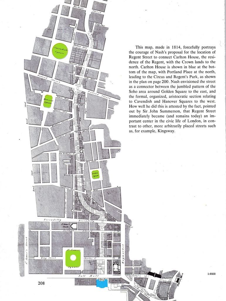
John Nash's design of Regent Street is a case in point. Not only was it designed to enhance significant existing buildings, it was created hand-in-glove with the buildings that would flank it. In Toronto, no thought was given of what would replace all these demolished houses; perhaps that's why the street became so popular for car dealerhips and parking lots. The Extension had, in fact, de-urbanized a swath through the heart of the City for over 40 years, and still has a lack of character, even with all the new buildings.

Imagine if Bay Street had been designed to preserve the church at Grosvenor which would have formed an axis to the view from the south. Likewise, the terminus at Bloor, in which a Circle (similar to the one at Spadina north of College) could have been created. Certainly the junction with Davenport is an urban design muddle.


Illustration of Regent Street from Edmund Bacon's Design of Cities

2007-10-02-1927-53_edited.jpg
 
Keep in mind that when the Terauley Extension was built, much of what it went through was either a "slum" or not deemed particularly cherishable in the name of "progress". (And in whatever way, they probably *were* hoping for Haussman-like streetwalls...whenever.)

And IIRC the Bloor + Spadina Scotiabank might already have been reskinned by circa 1980; so we're definitely talking about "datedness" vs changes in fashion here...
 
Keep in mind that when the Terauley Extension was built, much of what it went through was either a "slum" or not deemed particularly cherishable in the name of "progress". (And in whatever way, they probably *were* hoping for Haussman-like streetwalls...whenever.)

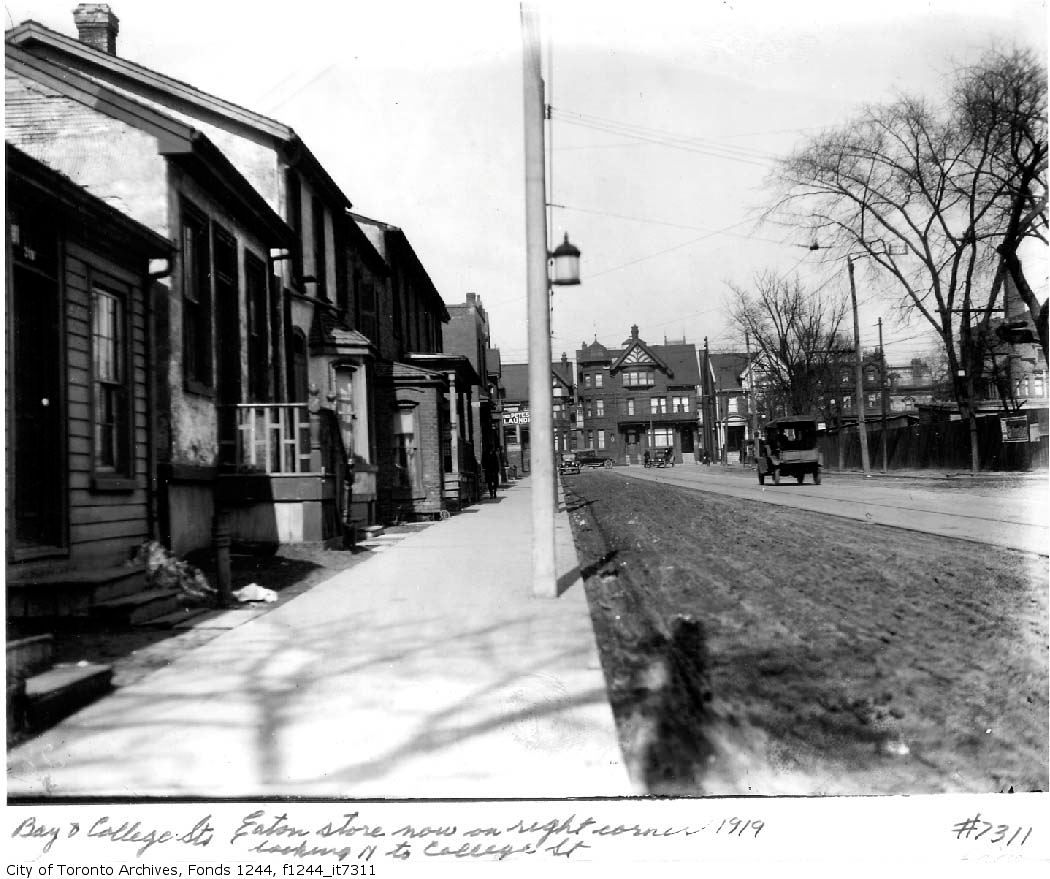
I'll grant you that when the plans were first drawn up (1912), Terauley Street itself ran through the heart of the "Ward" and could be classified as a slum. However, north of College, judging by the quality of the homes photographed, and the proximity of Jarvis Street-quality mansions around Queen's Park and on Bloor Street, the neighbourhood seemed solidly middle-class, comparable to the Annex architecturally and demographically.

It's curious to me why the need to blast a road (demolishing not only houses but churches and schools) through a thriving neighbourhood was apparent in 1912, a period in which the automobile was not yet dominating the City (remember that the widening of Jarvis and construction of Mt. Pleasant did not occur until the late 40's). Not sure when the actual construction took place, but it would appear to be late 1920's.

Bay, looking north from south of College, pre-extension:

f1244_it7311.jpg


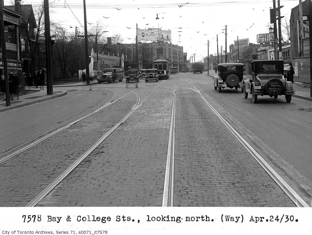
Post-extension, same view:

baycollege.jpg


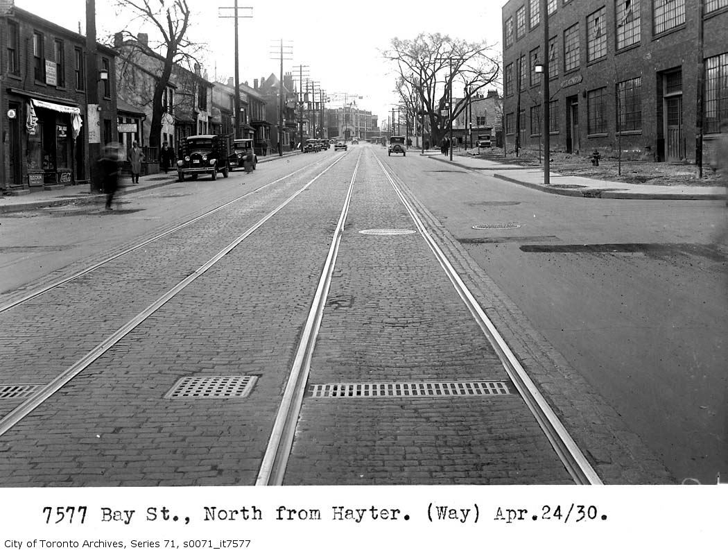
From Hayter Street:

bayhayter.jpg


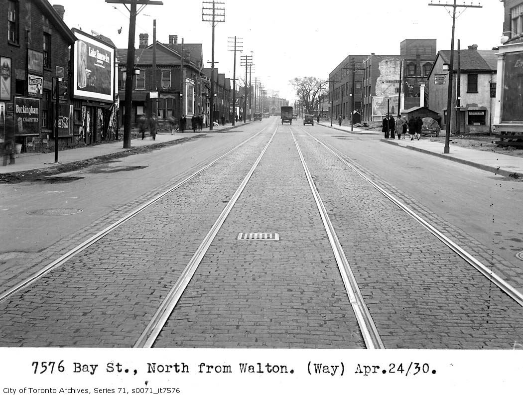
From Walton Street:

Baywalton.jpg


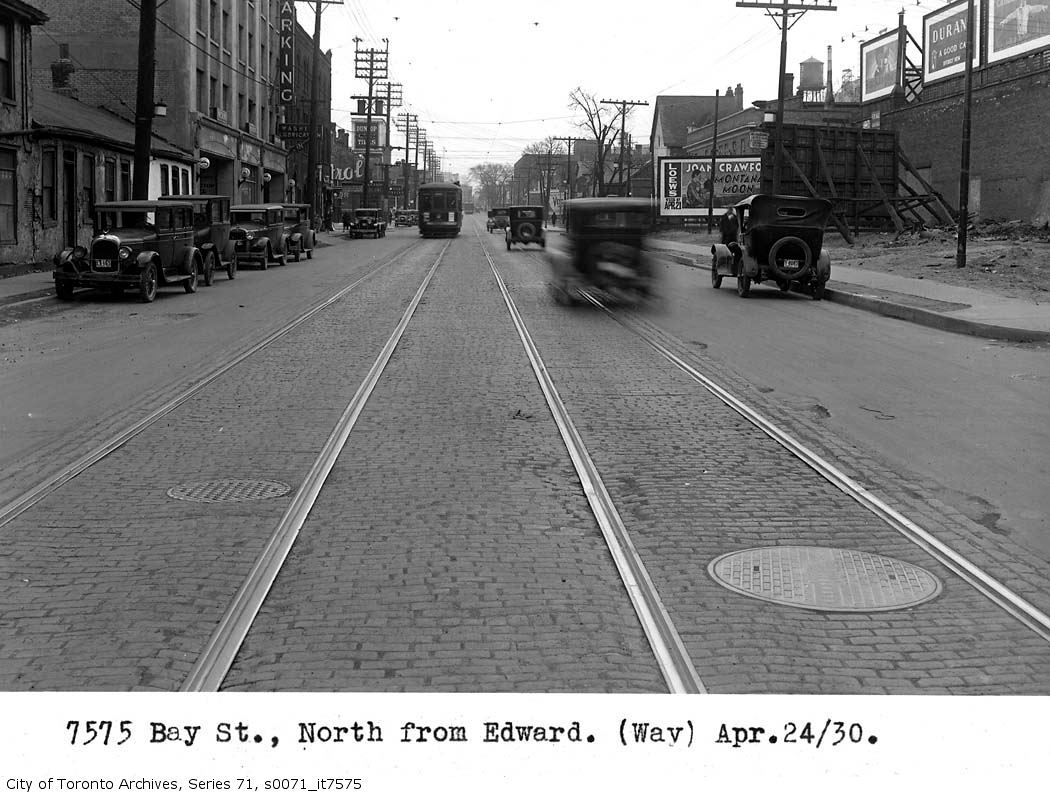
And from Edward Street:

s0071_it7575.jpg
 
Last edited:
It's curious to me why the need to blast a road (demolishing not only houses but churches and schools) through a thriving neighbourhood was apparent in 1912, a period in which the automobile was not yet dominating the City (remember that the widening of Jarvis and construction of Mt. Pleasant did not occur until the late 40's). Not sure when the actual construction took place, but it would appear to be late 1920's.

It may have been more for streetcars than cars as the tracks are prominent in all those pictures.

From Unbuilt Toronto (parts of which are available on Google books)
The chief focus of the [Civic Improvement] committee’s report [issued Dec 1911] was road improvements, with Toronto’s lack of continuous thoroughfares seen as the most pressing issue. Two of its proposals to remedy this problem involved connecting existing smaller streets to produce an eastward extension of Dundas (from its terminus at Ossington) and a northern extension of Bay (it stopped at Queen).

From a the Dec 16, 1911 Toronto Star article
Hocken and Spence Cross Swords in Tube Debate - Optimistic Controller Hocken says Toronto Needs Tubes Now and Argues That They Will Pay From the Start – Spence Would Unify Surface Lines, Leaving Tubes to 1921.
- quoting Controller Spence
This method will also solve to some extent the down town congestion. Teraulay street ought to be opened out to Bloor street. This part of Controller Hocken’s plan ought certainly to be carried through at once. Then, the Avenue road and Dupont cars would go down Teraulay and Bay streets to Front, taking a great deal of traffic off Yonge street.

p.s. There is also a set of pictures at the Archives for the Church Street extension -showing what Asquith, Ellis, Collier, Park & Davenport looked like in 1930.
 
Last edited:
A while back there were mentions of the CNE Automotive Building - the place that's currently undergone extensive renovations.
I've just found one of my 60-year-old photos of a car show in that bldg.
I'm not sure of the date - 1950?


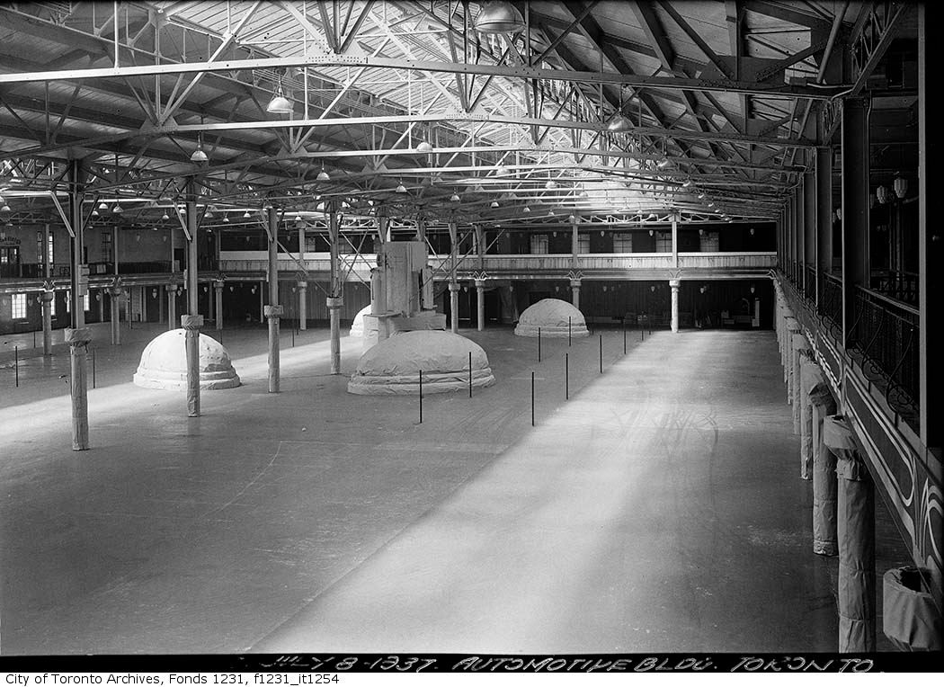
And here it is empty.

fo1231_f1231_it1254.jpg
 
thanks for posting these links--its amazing to see the Parkin in its pristine minimal perfection. its heartbreaking that we can't leave these buildings alone. unfortunately, the harmony and balance of elements is so delicate that that are incredibly easy to deform, and the endless market obsessed, trend driven fiddling has ruined almost all of them.

one of the saddest of course is 800 Bay Street. in the dark days of the late 1980's its owners saw fit to cloak its base in the cheap and cheesy 'pomo stylings' of the time, and to utterly destroy the impact of the upper floors with a completely inappropriate new set of windows.

8001.jpg


800.jpg


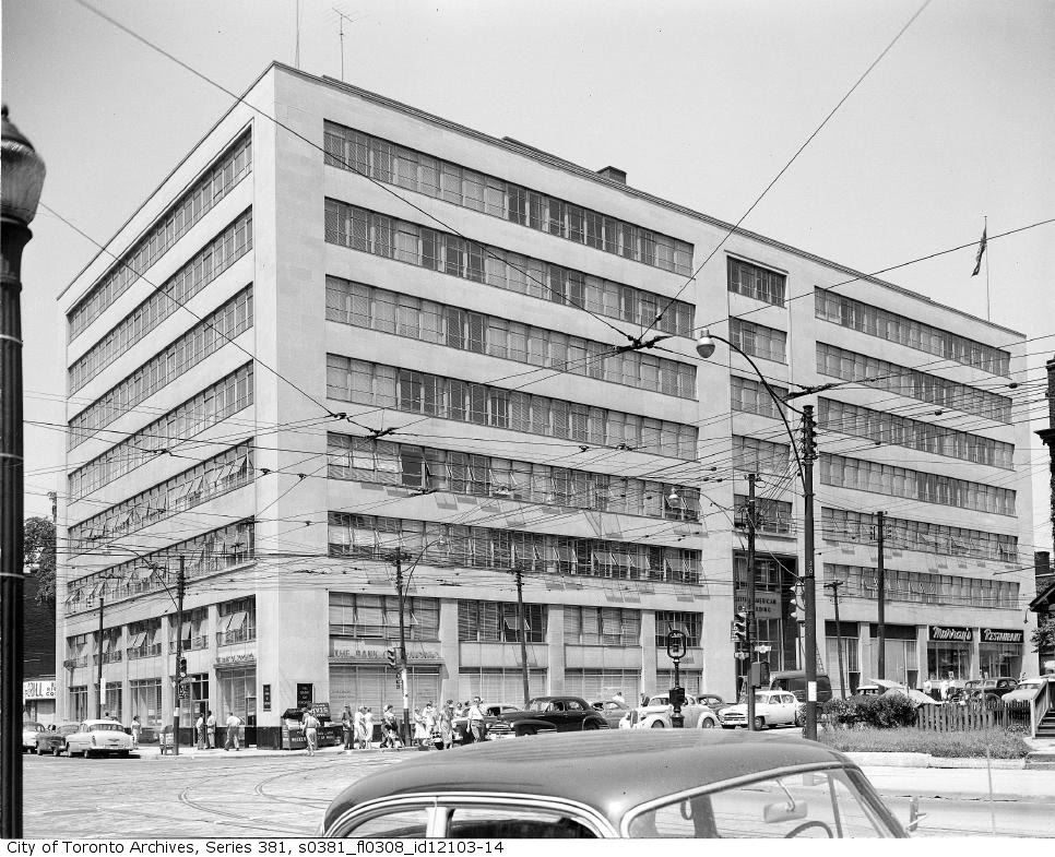
Back in the day:

ser381_s0381_fl0308_id12103-14.jpg
 

Back
Top