News   Jul 12, 2024
 1K     0 
News   Jul 12, 2024
 923     0 
News   Jul 12, 2024
 357     0 

Miscellany Toronto Photographs: Then and Now

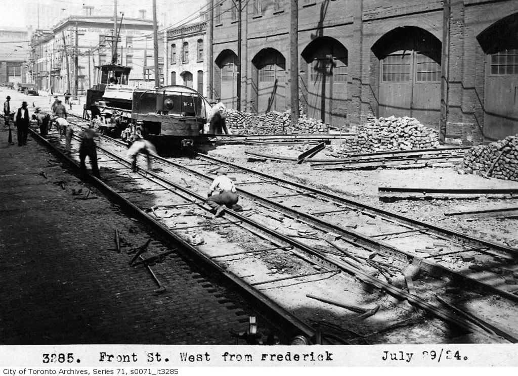
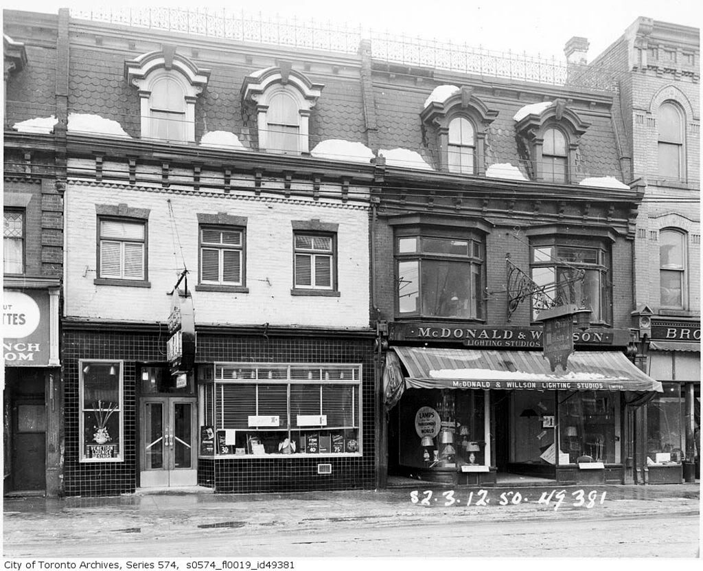
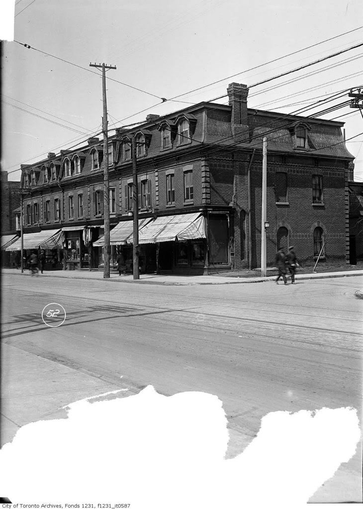
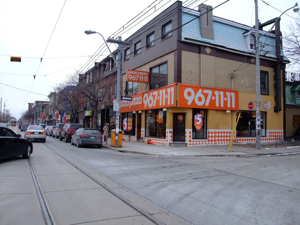
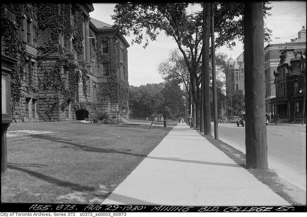
Sorry guys there were no trees in the old pictures either ...

There are more people for the reasons listed above but the picture of Toronto wasn't taken during a busy work day during the summer for one ... the older picture probably was.

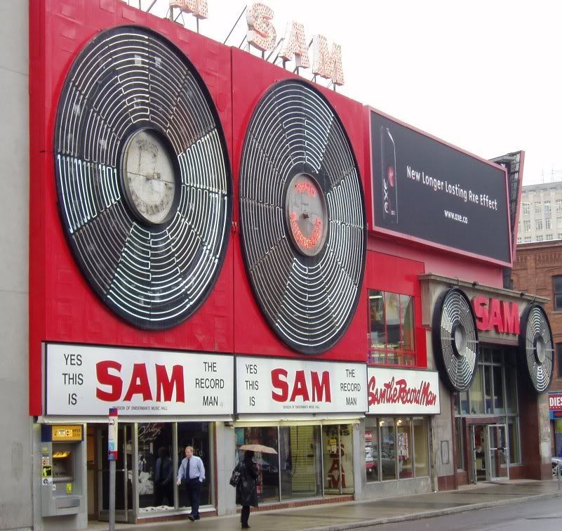
Moreover, I guarantee you if you compare downtown Toronto today out of work ours to the past you'll see way more people nowadays.

Another point, sure a lot of retail isn't on King anymore but it didn't disappear it shifted to other areas where there was no retail in the past. I don't see the problem here.

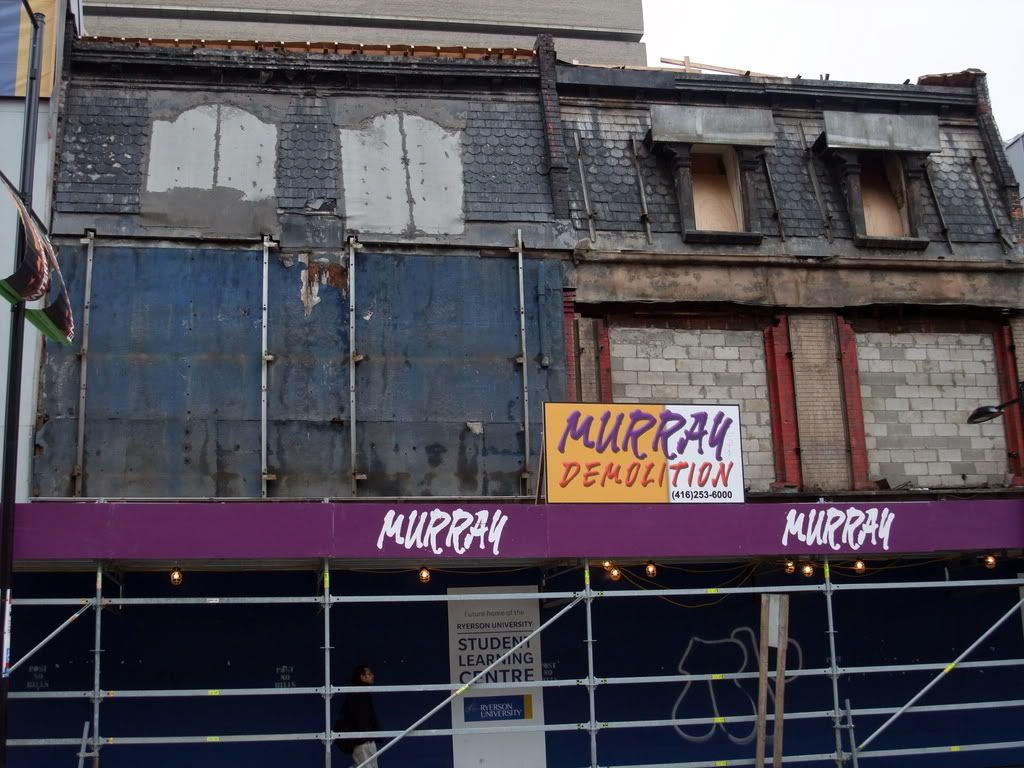
I do agree more trees would be nice, retail *maybe* as well.
 
March 8 addition:

Queen and Lisgar looking NW.

fo12315Cf1231_it0587.jpg


DSCF0404.jpg


Now, if you want the ultimate illumination of urban degradation, that Pizza Pizza takes the pizza pie.
 
^ Agreed. I mean, its pretty much written in stone that Pizza Pizza must grace every major intersection in the city. But do they have to plaster the facades with those hideous orange and white tiles and mustard-yellow stucco?
 
They're certainly eye catching
 
Pizza Pizza really does have one of the most atrociously ugly design standards of the major fast food chains. The colour scheme suggests that it was picked by someone with some potent combination of colour blindness and a debilitating mental handicap. Then again, it seems most of the major chains perpetrate horrific acts of urban design crime. I really wish there were bylaws against blatant ugliness in storefront design.
 
Pizza Pizza really does have one of the most atrociously ugly design standards of the major fast food chains. The colour scheme suggests that it was picked by someone with some potent combination of colour blindness and a debilitating mental handicap. Then again, it seems most of the major chains perpetrate horrific acts of urban design crime. I really wish there were bylaws against blatant ugliness in storefront design.

It seems we're on the same wavelength today egotrippin. Read my post about Transglobe in Toronto Issues.
 
It seems we're on the same wavelength today egotrippin. Read my post about Transglobe in Toronto Issues.

Indeed it does seem that way, I agree with you about those horrid blue signs. I really can't comprehend the thought processes of some people.
 
That pair's not so bad. A little more bucolic in the before photo but some nice additions in the after shot. If 'after' were taken in summer it might be a dead heat.
 
Ladies and gents.. March 9 addition:


College looking east from Kings College Road


ser372_ss0003_s0372_ss0003_it0873.jpg


This really is a very pleasant scene. The buildings are set back nicely with grass in front and lots of trees and ivy. There's no clutter on the sidewalks. The other thing I find striking is the diameter of that telephone pole in the foreground.
 
Re: Front and Freddy: The generous street-level arches on the new building at the right suggest a halfhearted homage to what went before - though I don't recall when the earlier building was demolished.
 
Another March 10 addition:

Does anyone know when the Sam The Record Man sign went up?

Before sign [way before :)]

ser574_s0574_fl0019_id49381.jpg


Later [stolen wikepedia pic].

WikiSam_the_Record_Man.jpg


Now [my pic; taken on Saturday]. Our 2 old girls come to light again.

DSCF0525-1.jpg
 

Back
Top